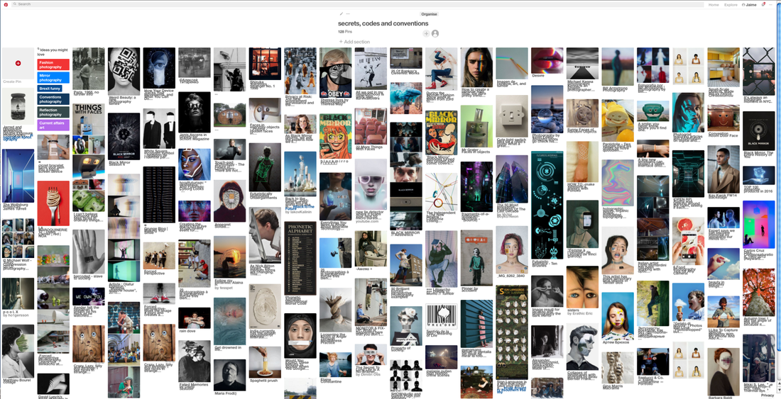
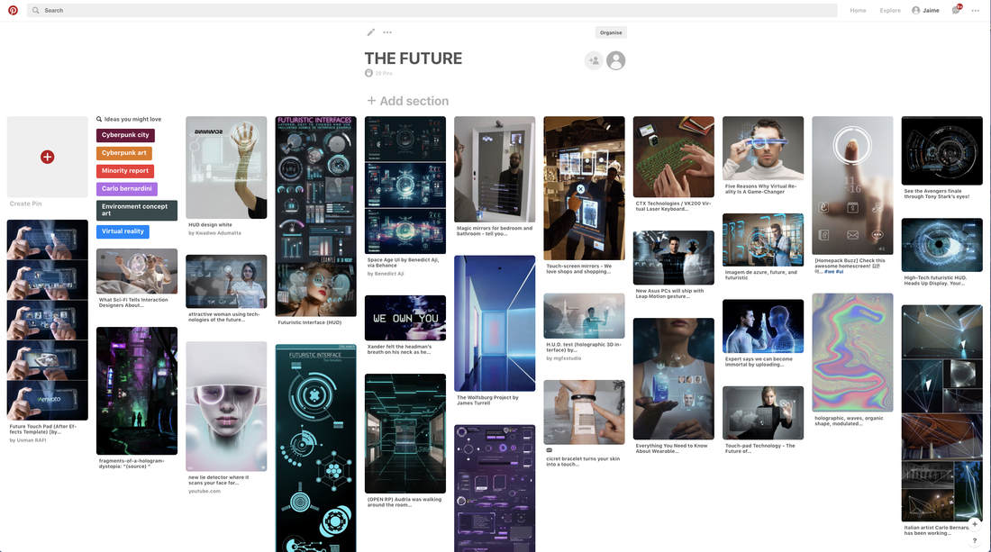
Pinterest Board
A Pinterest Board I created to help inspire ideas for my project. This was useful as it enabled me to explore different styles of work which I could incorporate into my own. View the full board here: https://www.pinterest.co.uk/jaimeonelson/secrets-codes-and-conventions/
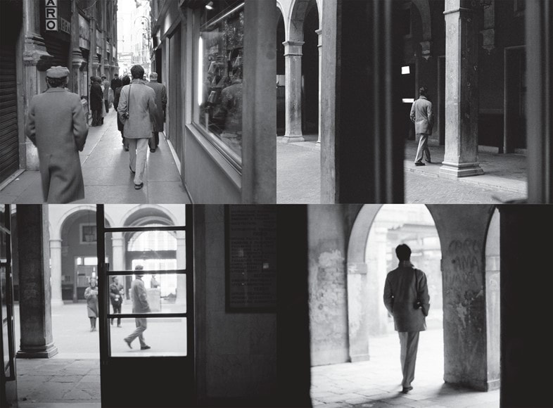
The Group Shot- Codes of Behaviour
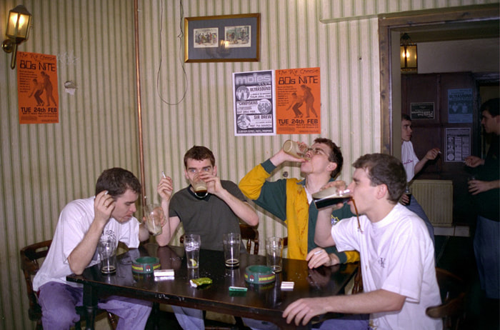
Paul M Smith
|

|
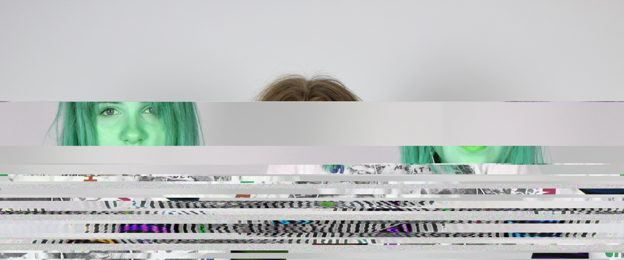
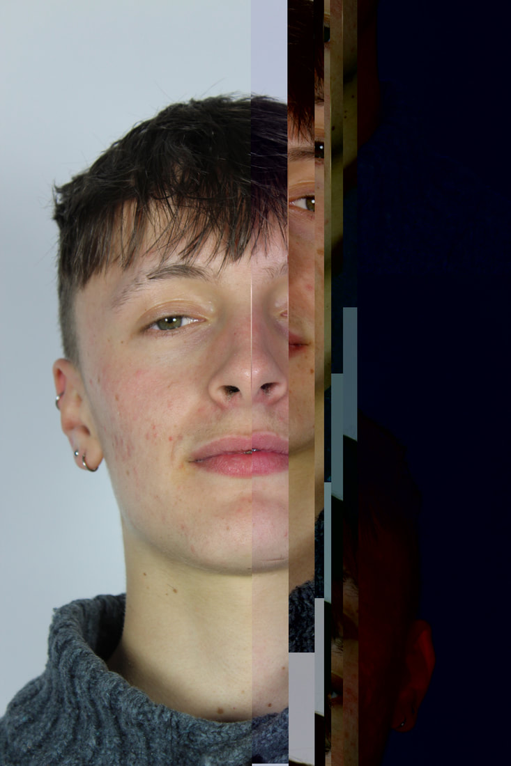
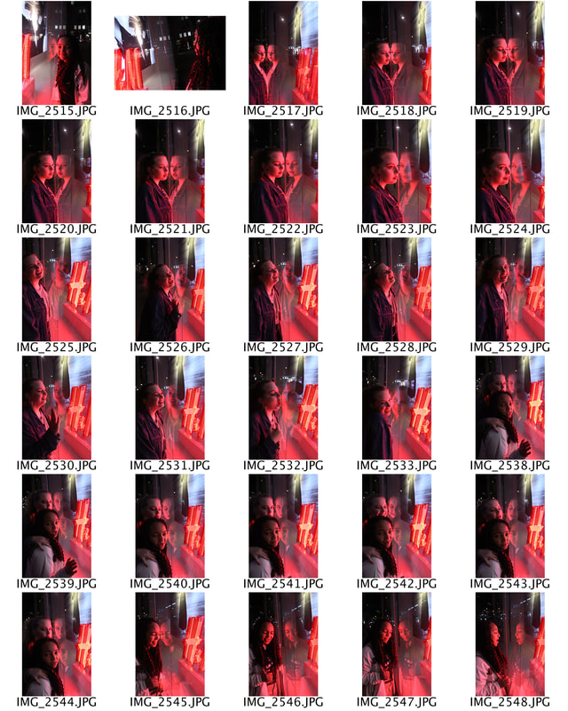
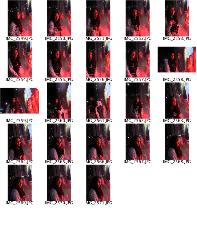
The group photo has powerful underlying conventions, whether a family portrait or a gathering of friends. These reflect codes of behaviour that shift over time. In the early 1990s Paul M Smith explored the convention of the "Team Photo" and the "Night Out" photographs where he would capture young men on nights out, at football matches etc. I find this an interesting, unconventional style of photography. This is because the duplicity/cloning of the subject gives it a non-naturalistic and unusual feel. I can appreciate the fact that Smith uses a range of camera angles and the idea of proportion to accommodate the particular shot and the feeling he wants to convey to his audience.
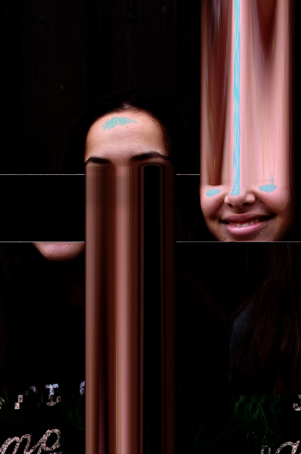
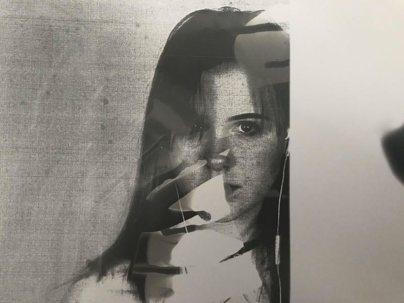
The Conversation
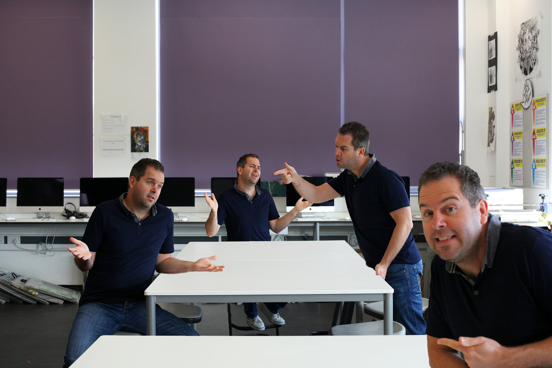
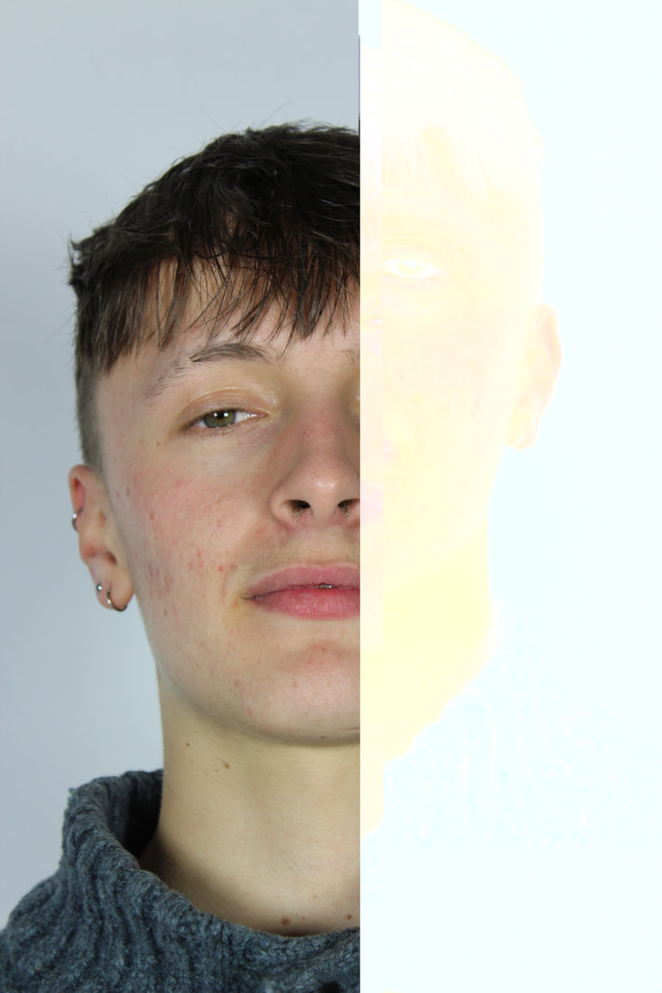
The idea of 'The Conversation' illustrates the codes and conventions of an individual's everyday life. The subject is captured carrying out everyday actions such as; having a conversation. It displays routines that are made on a daily basis and therefore reflect codes of behaviour. At the same time, the photographer challenges these conventions as the same model plays different roles within the frame. As well as this, the subject uses varying expressions, gestures and body language in each position so the audience can distinguish the difference between each role.
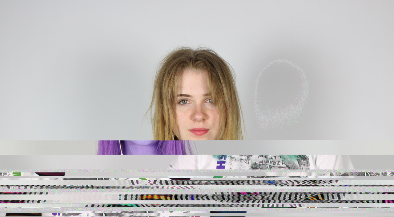
My response
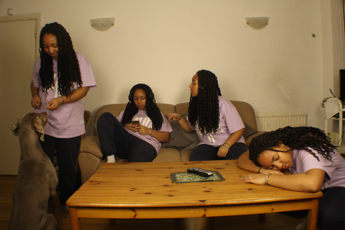
My intention for this task was to photograph a scene at home that illustrated my own conventions and behaviours. I chose to capture myself on an average day after school. In my roles, I appear to be giving a treat to my dog, texting, sleeping and talking. I used the above concepts shown by Paul M Smith to create this image. For this task, I had to put my camera on a tripod and made sure I kept it in the exact same place. As well as this, I put my camera on self-timer/remote setting. I kept the lighting consistent within each shot by using the same lighting and camera aperture settings. I took each shot separately and merged them together in Adobe Photoshop.
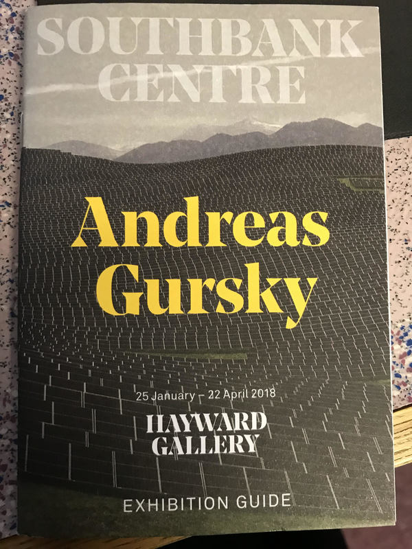
Andreas Gursky, The Hayward Gallery

|
Recently, I visited the Andreas Gursky exhibition at the Southbank Centre. The exhibition explored the work of Gursky through photographs he has made over the past four decades. I found the contrast in moods between each photo to be very interesting. This is because Gursky captured a range of different settings; vast landscapes, teeming crowds, massive man made structures etc. The exhibition was helpful as it enabled me to mind map a range of ideas for my current project. Gursky mentions 'My images are always interpretations of places'.
|
|
|
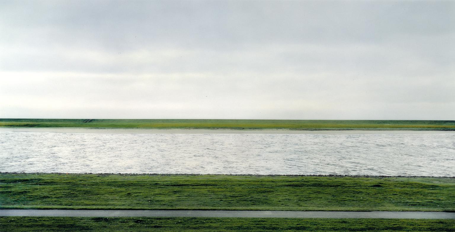
"Rhein II"
I can also appreciate the photographer's impressive scale and precision throughout his work. I felt he successfully accomplished the idea of making the audience feel a certain way throughout the different images. The photograph above conveys a feeling of emptiness and isolation especially due to the negative space in the top half of the frame. On the other hand, Gursky's photo of the hundreds of houses in a city suggests the impact of over population and tight and compact spaces.
|
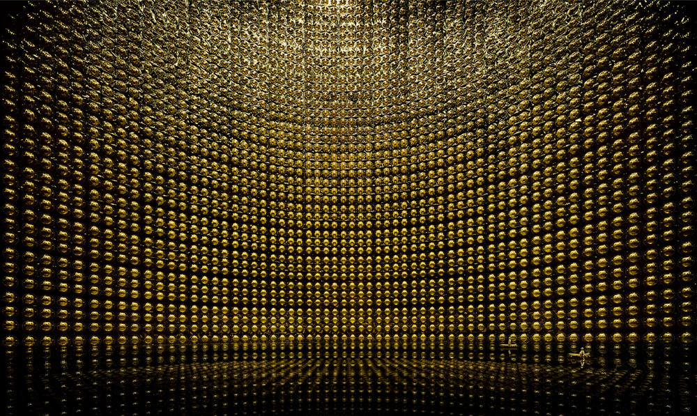
"Kamiokande"
In my opinion. in contrast to "Rhein II" a feeling of congestion can be noticed as the frame feels very busy as the (what appear to be lights bulbs), seem compact into a tight space. This contrasts with the image on the left as there is an element of closeness which makes the audience feel more included in the photo. The artist often represents architectural structure in many of his pieces. The use of perspective creates a rounded wide angle view of the subject- it is almost as if it is coming towards the camera.
|
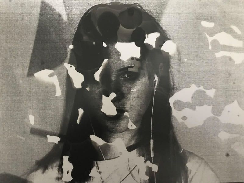
Exhibition Visit- "Unknown Knowns" by Siobhan Coen- Zabludowicz Gallery
I visited the "Unknown Knowns' exhibition by Siobhan Coen at the Zabludowicz Gallery. Coen reworks component parts of digital communication to examine visual perception and unconscious control. As the audio played, programmed pules of RGB light saturated a large print of brightly coloured pixels. This abstract image is activated into an all-encompassing and constantly shifting visual place designed to make the audience feel hypnotised and destabilised. The title of the exhibition and use of pixelated art interested me as I felt it related to the theme of 'Secrets, Codes and Conventions'. The pixels were constructed to create patterns and displayed a hidden meaning as heard in the audio narrative.
|
|
|
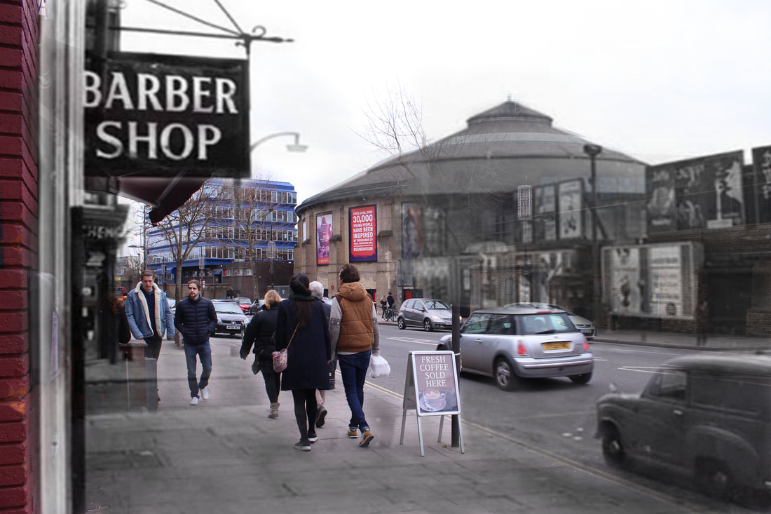
Secret Locations- Bomb Sites
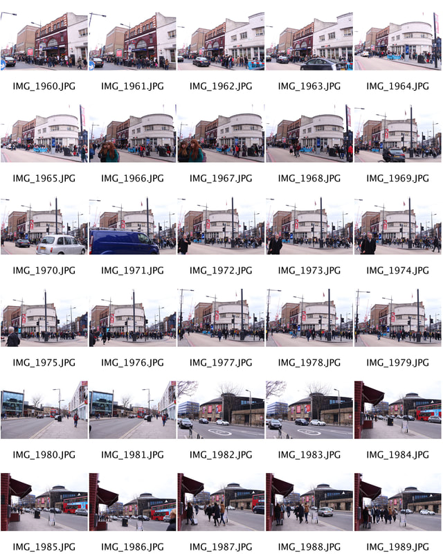
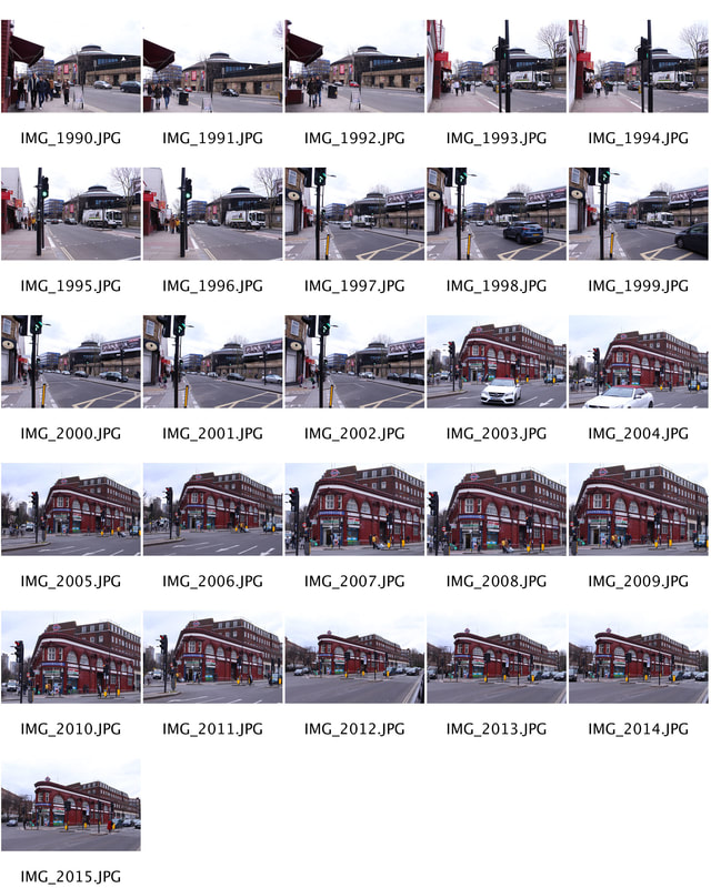
The Bomb Sight project is mapping the London WW2 bomb census between 7/10/1940 and 06/06/1941. The purpose of this task was to illustrate the drastic change in the same landscape over a certain period. I used the website www.bombsight.org to find places local to me where bombs had fallen in the 1940s. I then compared an old photo of that landscape which I found online with a new photo I have taken of the same landscape. I extended this project by merging some of my new images with the old images which had an interesting effect. I went back to see the landscapes across London that were bombed and consequently had their meaning and context changed through regeneration, building and, as a result, lost memories of a past generation.
Jim Dyson
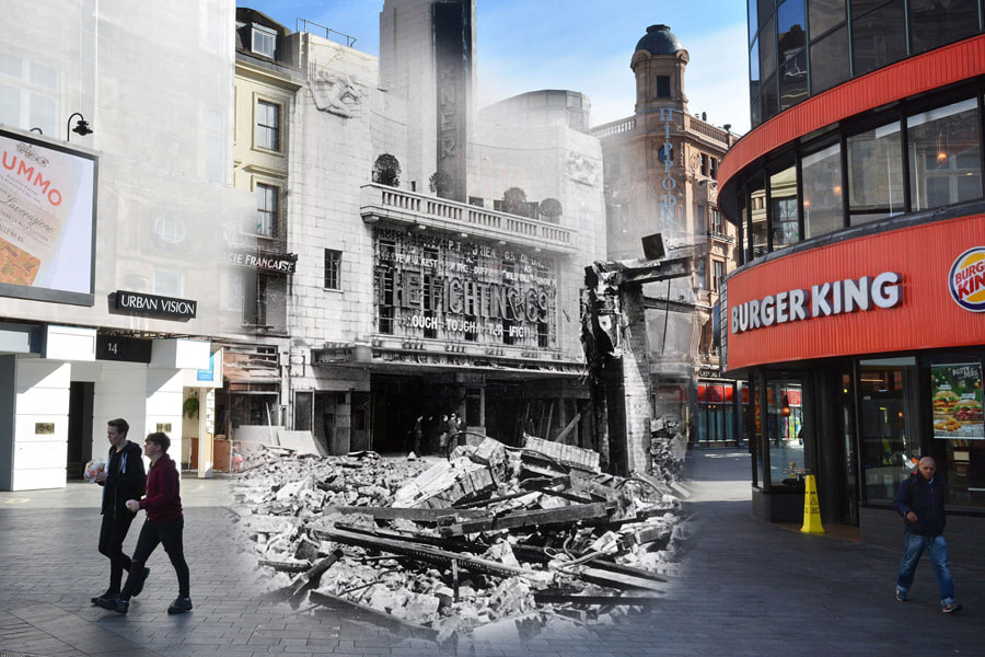
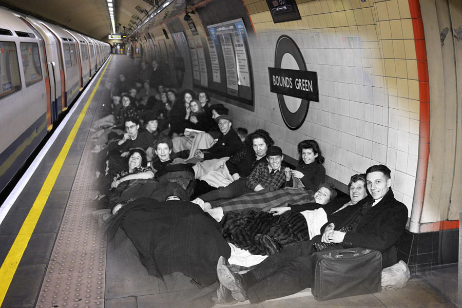
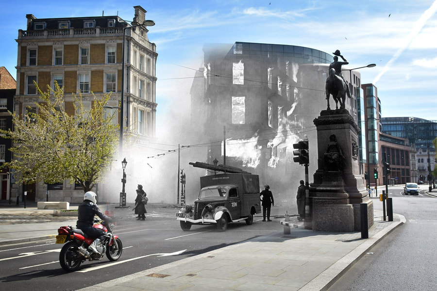
On May 11, the United Kingdom will mark the 75th anniversary of “The Longest Night,” the final horrible night of the Blitz—an eight-month-long aerial bombing offensive launched by Nazi Germany during World War II. Photographer Jim Dyson recently travelled to locations across London to make comparisons between scenes from the Blitz and present-day images, laying one on top of the other. The secrets that have now been covered are laid bare and the locations past lives are shown for all to see. I like Dyson's work as it makes a link between the past and the present. The past could be interpreted as a secret for the modern day audience as we will never exactly know or experience what life was like during The Blitz. In many ways, for us it will remain a mystery.
My Response
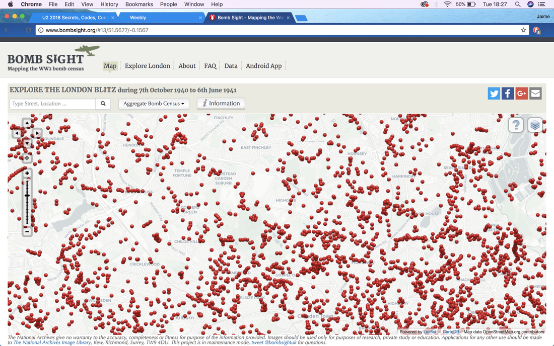
I found using my local area for this task extremely interesting as I was able to reflect on what the area looked like in the past and made me question what it will look like in the future. It made the project very personal to me which I also found intriguing. Below is a screenshot of www.bombsight.org. The red dots implicate where bombs had fallen.
|
|
|
Edits
|
NEW

|
OLD
|
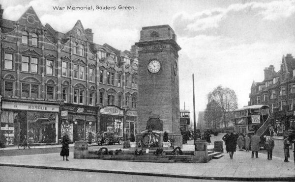
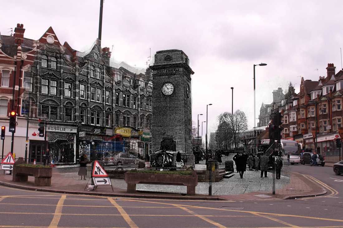
Golders Green (1930s/2018)

|
|
Originally, I thought this would be a fairly easy task. However, I soon realised this required me to find the appropriate, old photographs (from the internet) of the location I would then capture. I had to make sure my photograph was as close to the old image as possible (in terms of positioning, camera angle). I planned where I would capture the image before I started my shoot using google maps (google street view). My aim was to replicate as close as possible where the original (old photo) was taken- this would make it easier for me to edit the two in Photoshop.
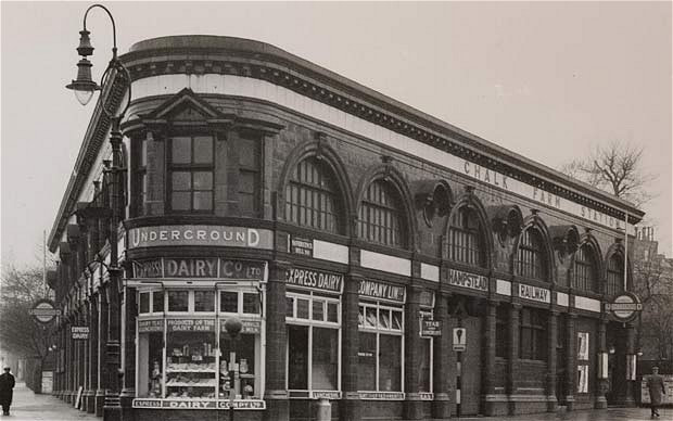
Chalk Farm Underground Station (1930s/2018)
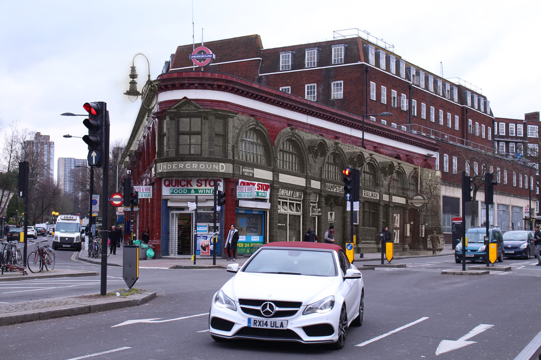
|
|
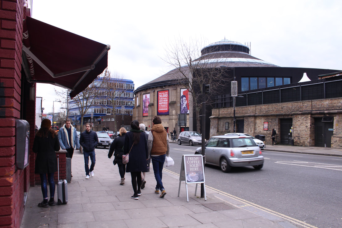
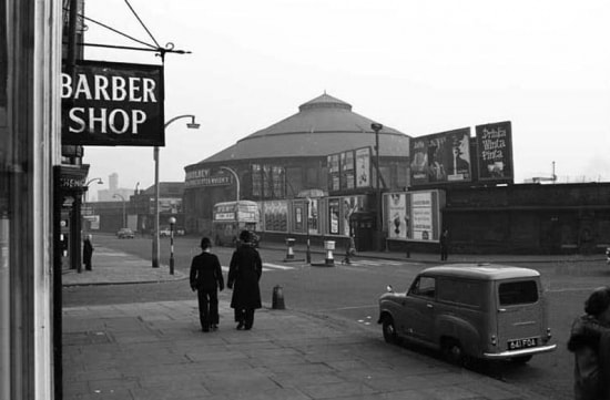
The Roundhouse, Camden (1930s/2018)
|
|
I found the merging of past and present landscapes an extremely interesting task also due to the fact I captured cars, people on their phones etc. I decided to keep these technological elements in the final photos as it exaggerates how much time has passed and the contrast in periods. It poses the question of what that landscape will look like and how the frame might change in the future. I used my knowledge of composition and the rule of thirds to structure my photographs. I positioned my subject in my frame as close to where it was positioned in the older image.
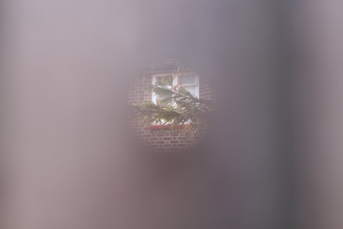
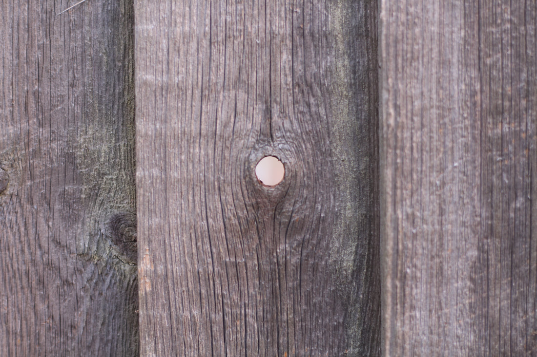
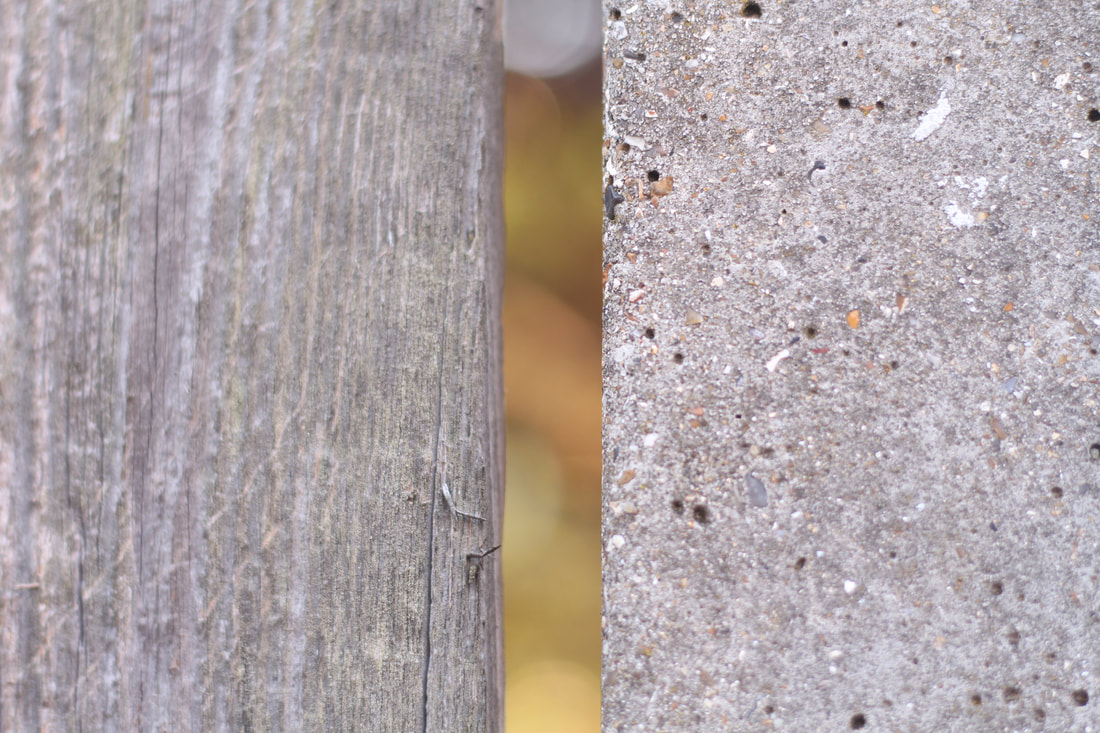
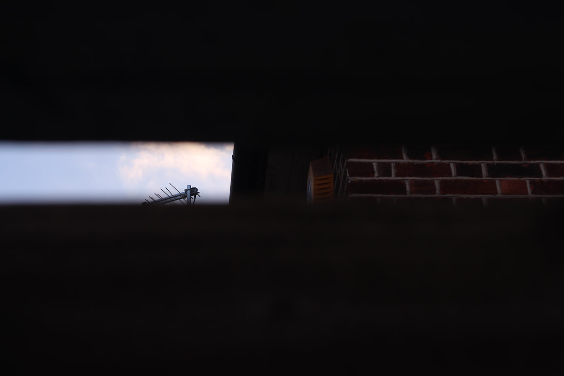
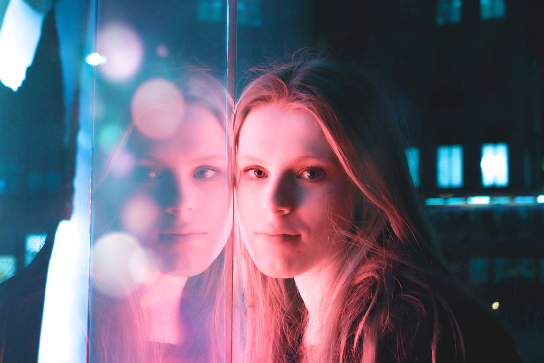
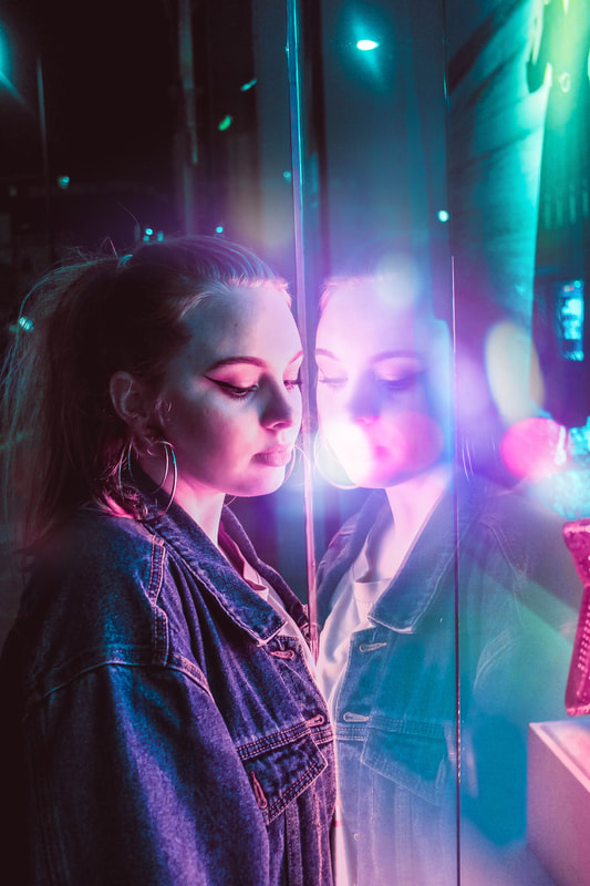
Hidden from Normal View
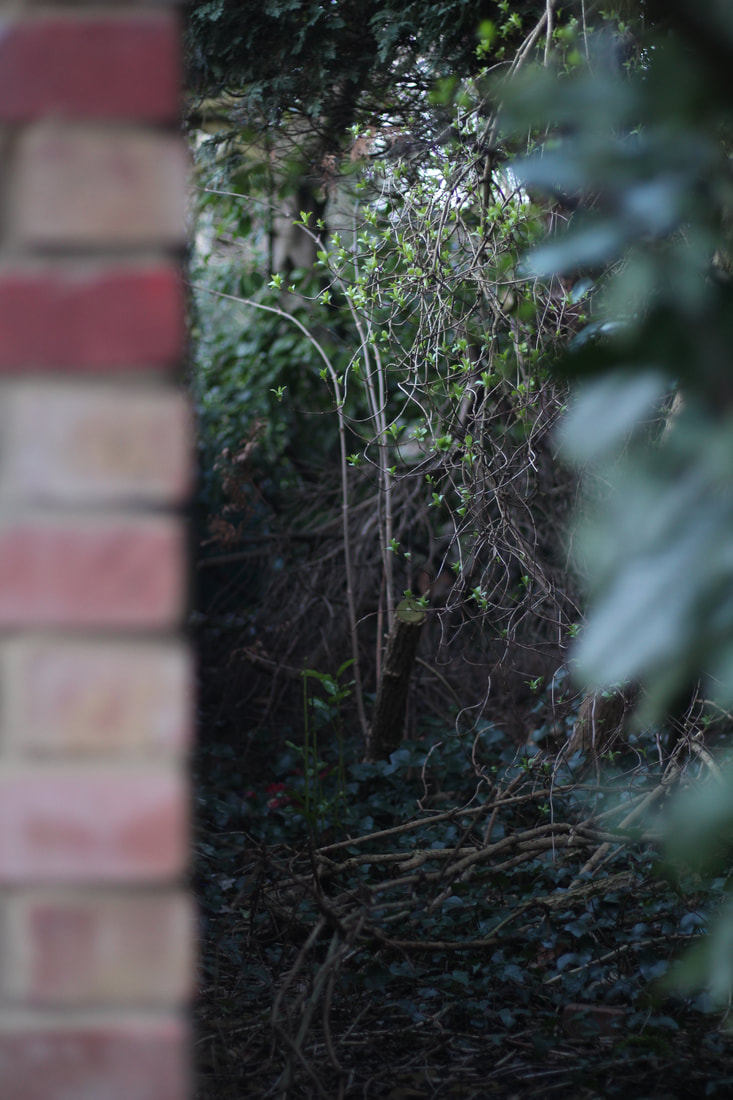
For this task, I took a walk through my local area. Although, I live in London (urban city), my area in particular seems rather rural with fields, streams and plenty of woodland nearby. I decided to capture secret places hidden from normal view on my walk. As well as this, I photographed places which were not necessarily "hidden" but often overlooked in the environment. I felt I captured the hidden beauty in these secret spots through my photographs.
Giles Coulon
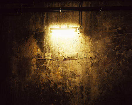
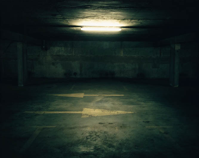
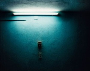
In his project "White Night", Giles Coulon takes photographs of hidden places that invite us to imagine the atmosphere of different parts of the city and of each spot lit place. Be it in a restaurant, in the entrance hall of a building, in the street or in an underground car park, each photograph inspires the viewer to look at these very familiar and unfamiliar places under a whole new light. I personally find his use of shadowing quite significant as it directs the audience to feel a particular emotion (perhaps frightened or a feeling of mystery). Without the use of the shadowing, a different emotion might have been interpreted from the image. The artist uses rather close up images such as the ones above, this may create a sense of intimacy. We, as a viewer can only see a proportion of the frame- we are restricted as to what we can see which again suggests 'a fear of the unknown'.
My Response
|
|
|
|
Selects
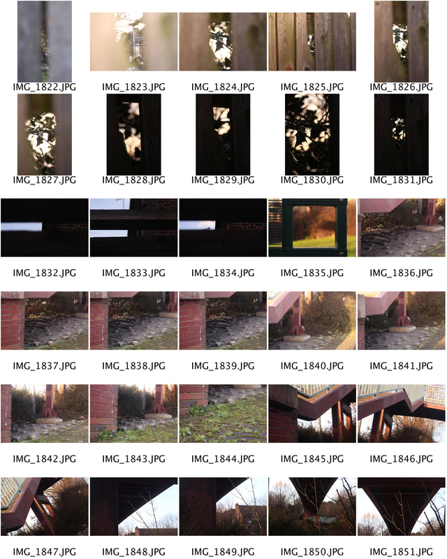
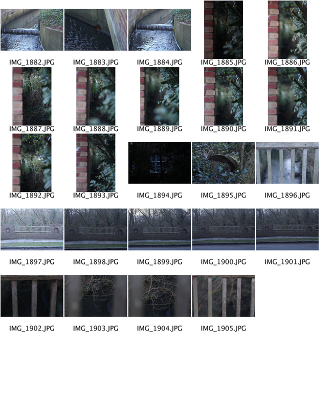
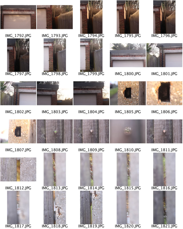
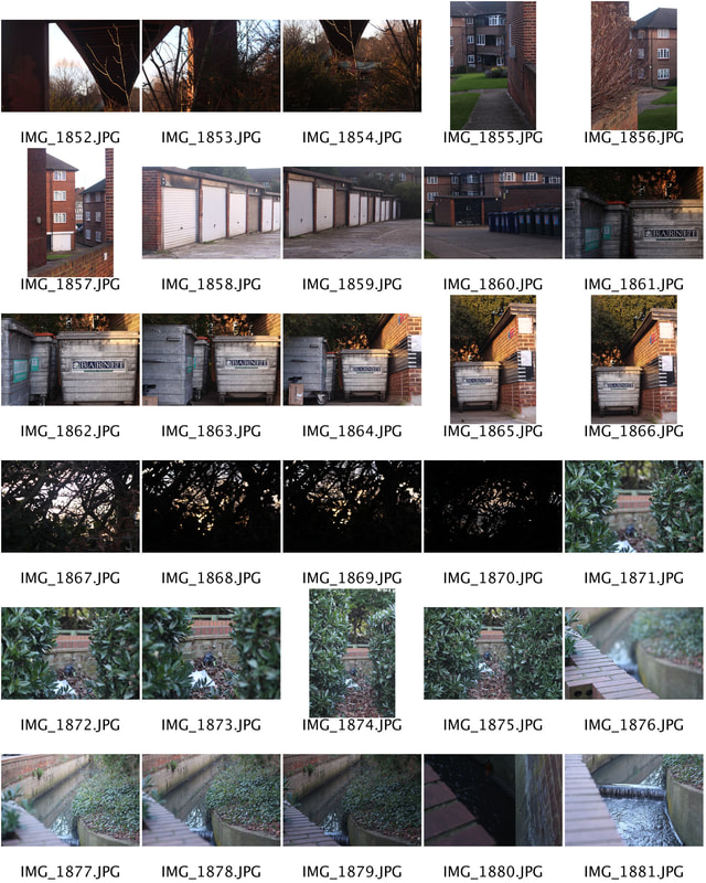
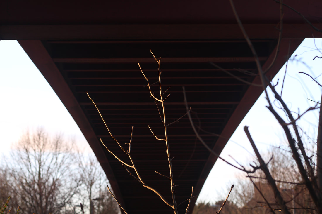
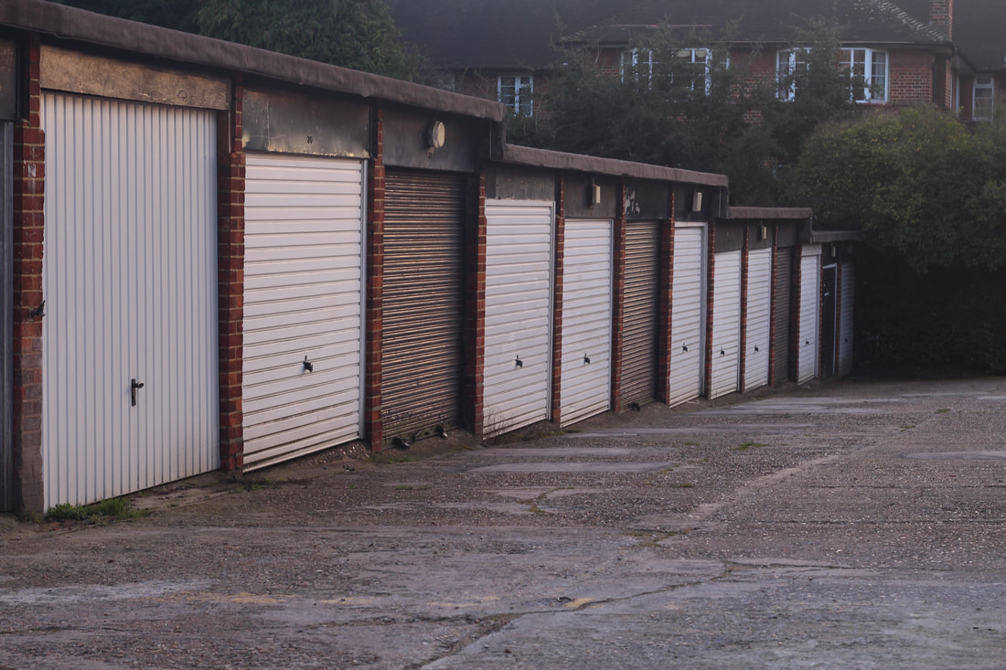
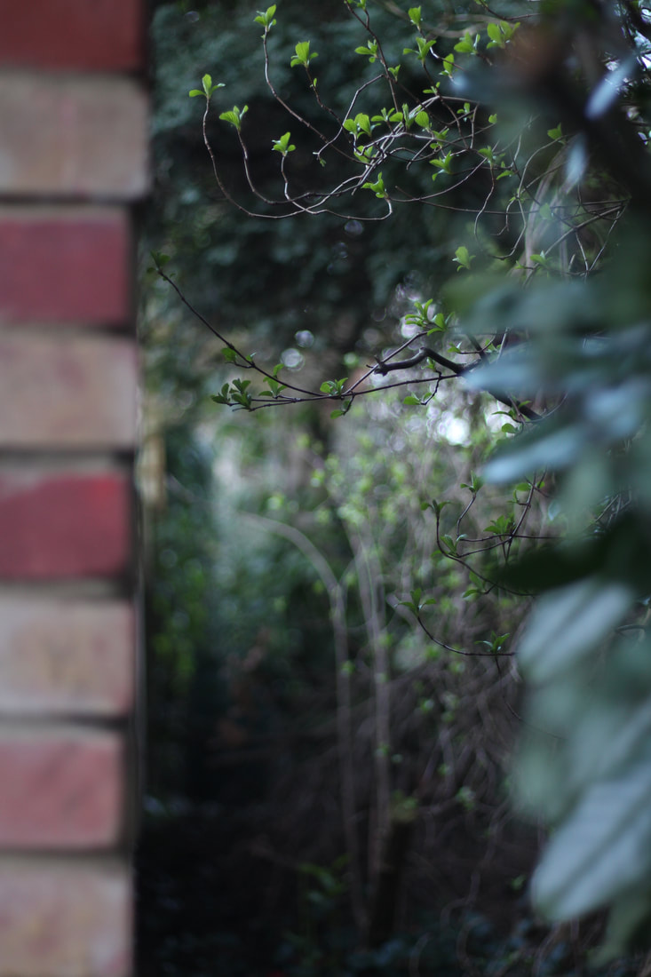
In contrast to the artist above, Giles Coulon, I preferred to capture my location in a more positive light. This was successfully achieved by using softer and lighter tones such as greens, greys, reds and yellows. I chose my selects purely on the basis of what I thought best represented the "hidden" place. I found the images photographed through the fence into my garden were particularly interesting due to my experimentation with focus. I used close up shots much like Coulon where the viewer is presented with a restricted view of the landscape. I used my 50mm (f 1.8) lens for this task which enabled me to get a shallow depth of field in some images with a blurry background. Gaps in between a fence is not something that is usually noticed on an everyday walk, therefore, I found the fence images most interesting to capture. As well as this, I photographed under a bridge, a line of garages and more. Throughout this task, I thought about how light and colour texture can create atmosphere within my photographs giving the viewer an insight into an unseen world.

|

|
|
|
|
|
|
|
|
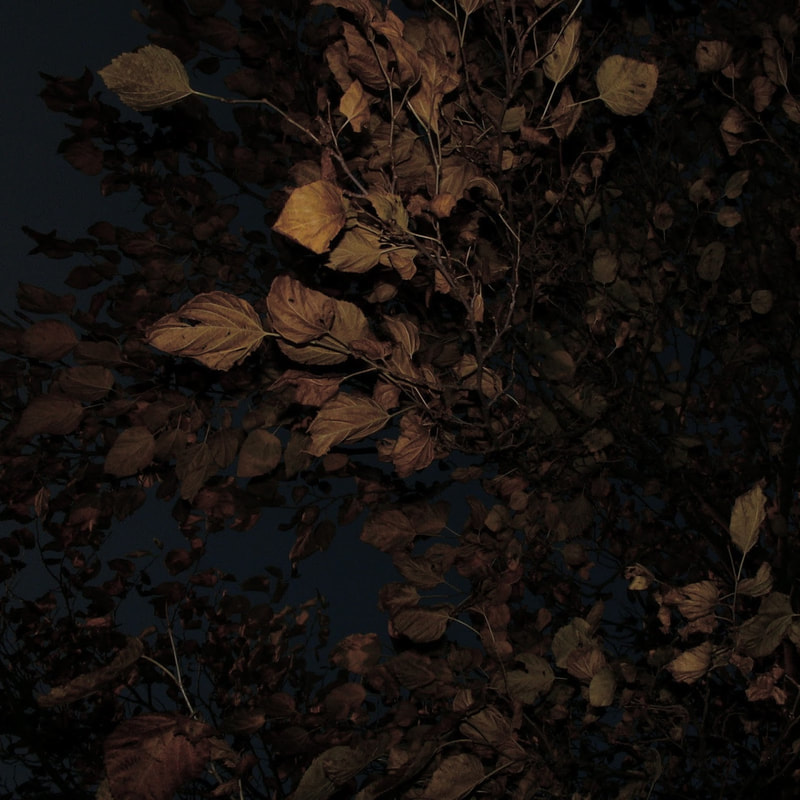
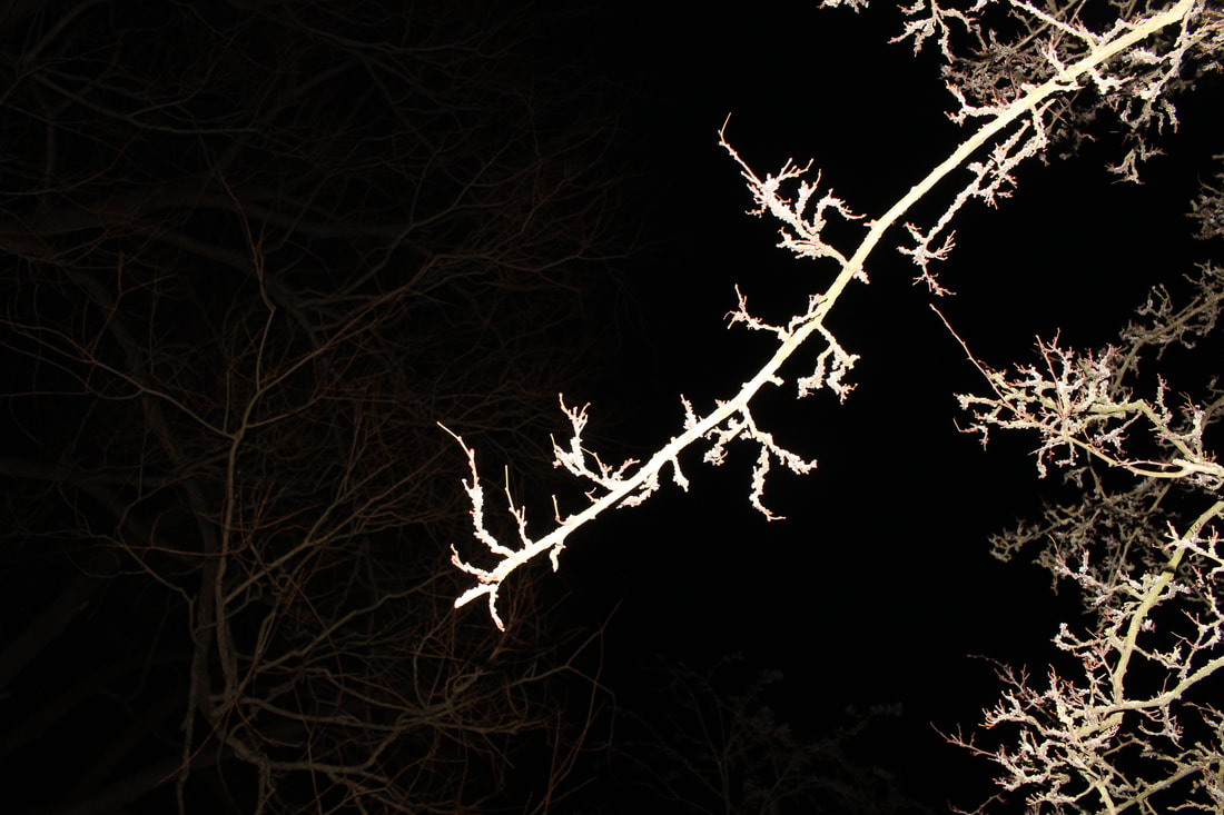
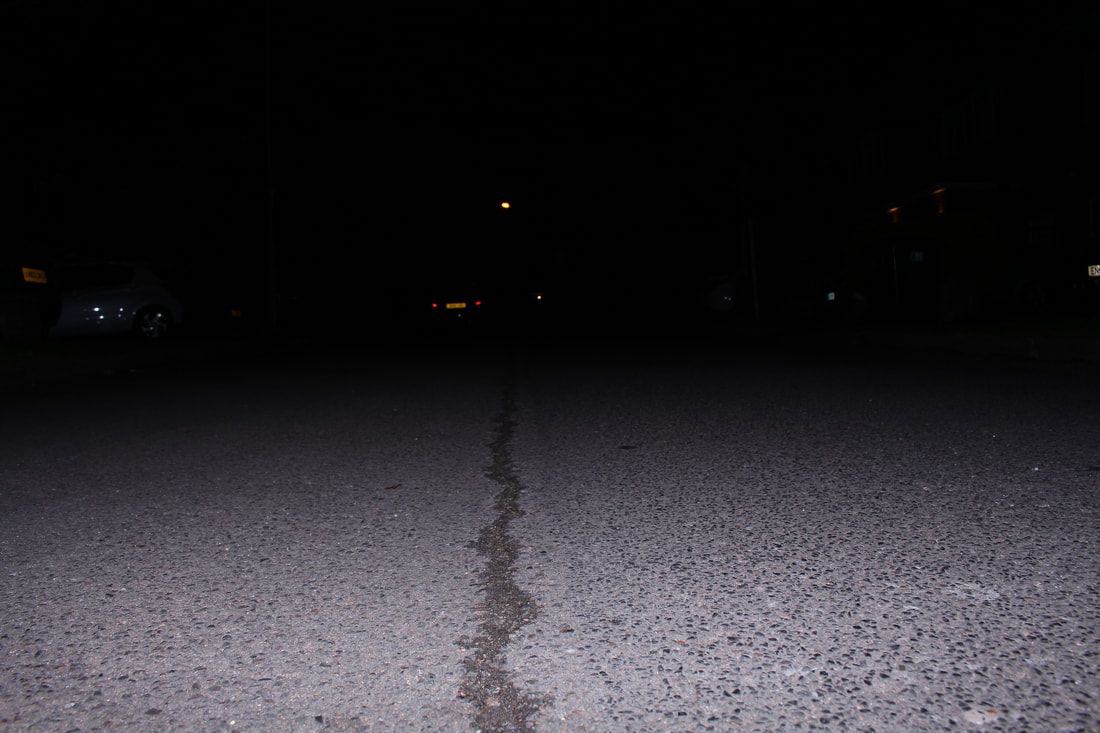
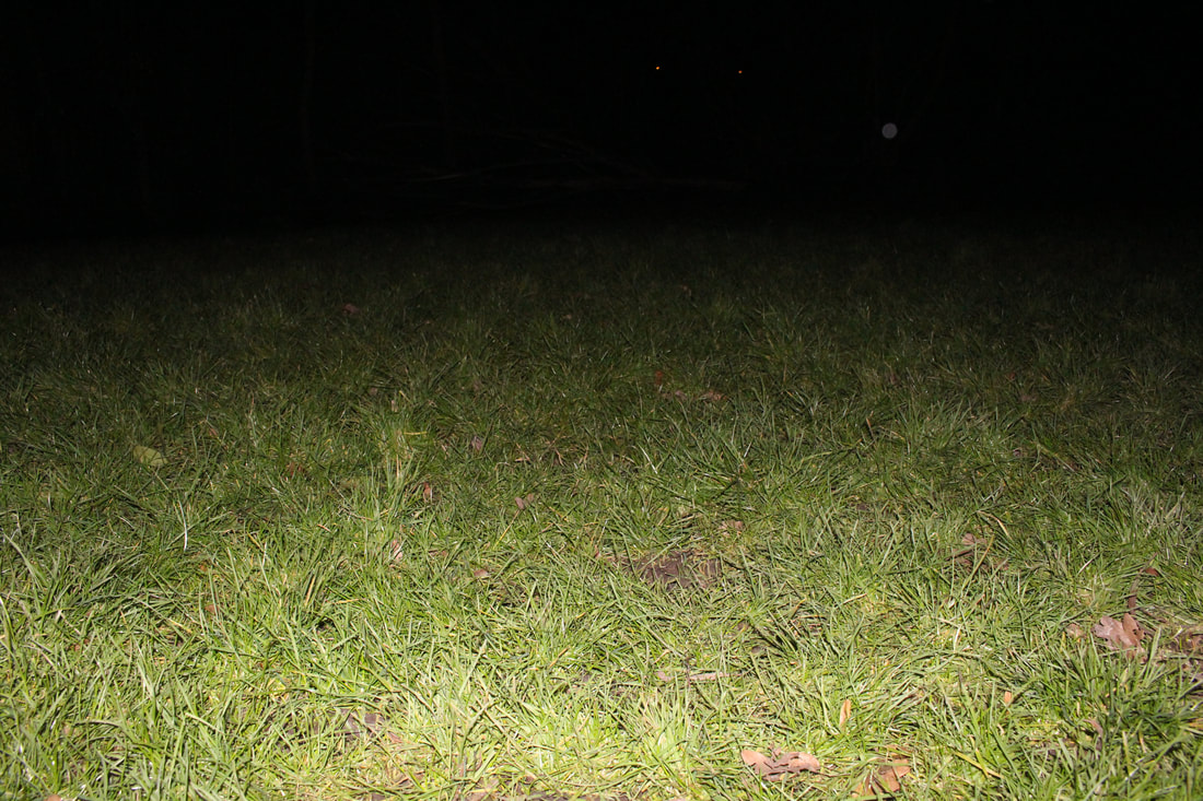
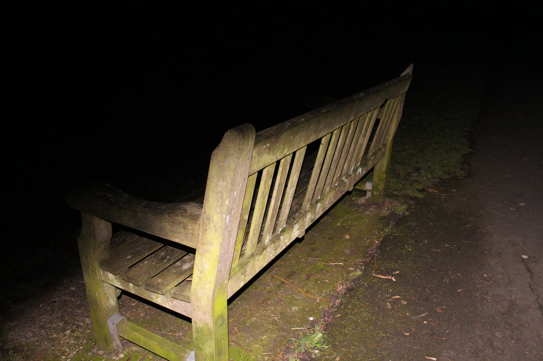
Landscape Flash Photography
For this task, I experimented with landscape flash photography at night. I went into a local park and captured my surroundings using my knowledge over aperture, ISO and flash for the best outcome. The aim of the tasks were to use the flash on my camera to light up just the foreground of the picture. I put the camera on a high ISO and put the setting to flash mode.
Nadav Kander
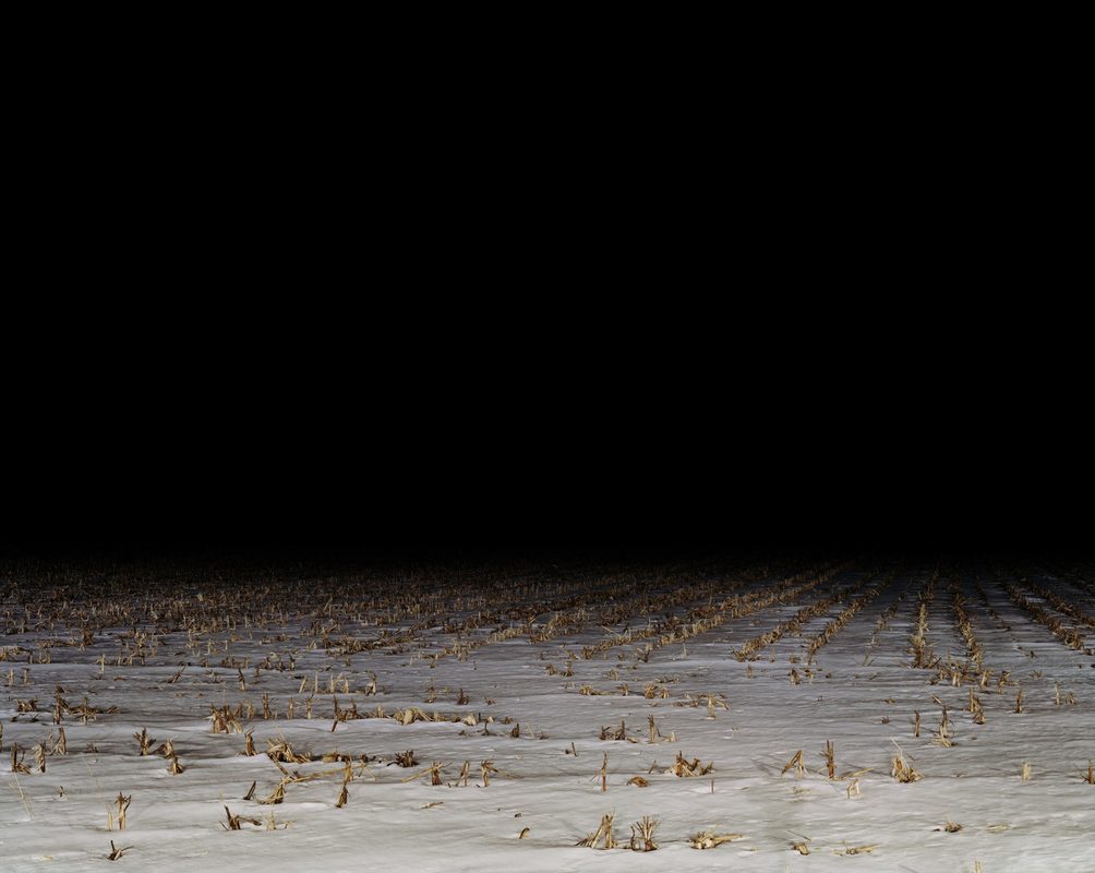
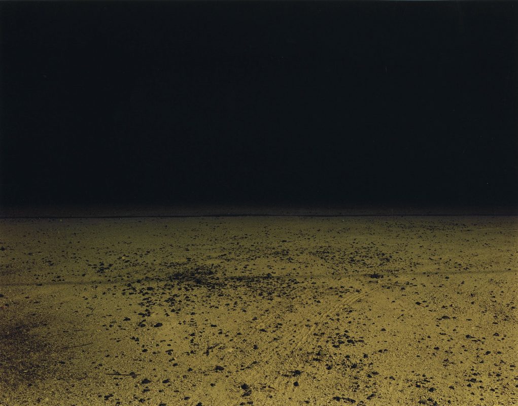
This series is in stark contrast to the idea of photography as a ‘decisive moment’. It presents views that cannot exist naturally. There is no natural lighting circumstance that would render a field gradating and falling into blackness. These are manmade views lit by manmade light.
Grant Simon Rogers
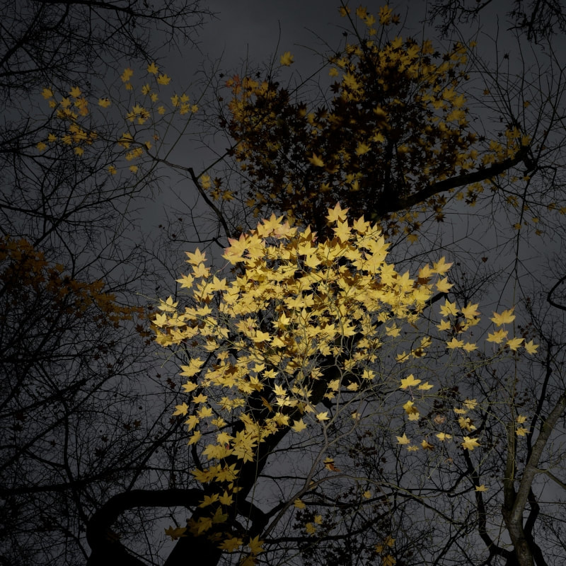
Grant Simon Rogers in his series 'Trees' breaks the convention of using direct flash at night and focuses on the foreground of the image. His intention is to highlight small aspects of the landscape and leave the background in dark mysterious tones. The flash presents the flowers as synthetic looking and in some ways surreal.
My Response
|
|
|
Selects
I chose these selects as I felt they achieved the effect Grant Simon Rogers and Nadav Kander aimed for in their photography. The photographs go against traditional photography due to the fact you would never see such vivid and directed light in a natural environment at night. It merges the idea of man made vs natural environments.
|
|
Artist&Me
Both images feature a natural vignette effect due to the direction of the flash. This makes the pieces look as if the subjects in the foreground are disappearing into the black background. In contrast, Rogers uses vibrant colours although, I have used more subdued tones.
|
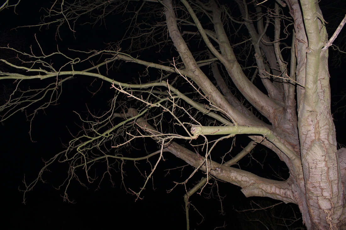
In both my photograph and Grant Simon Rogers' (left), I found the use of flash almost gave off a studio light kind of feel and ultimately made the photographs look like studio photoshoots. It was as if the subjects were captured on a black backdrop. I found the flash emphasised the varying textures throughout the frame ie- cracks in the bark of the tree compared to the seemingly smoother branches. The difference in texture add a sense of depth to an image and essentially make it more interesting to view. The subject stands out against the negative space as the flash is only focused on what is in the foreground.
|
|
|
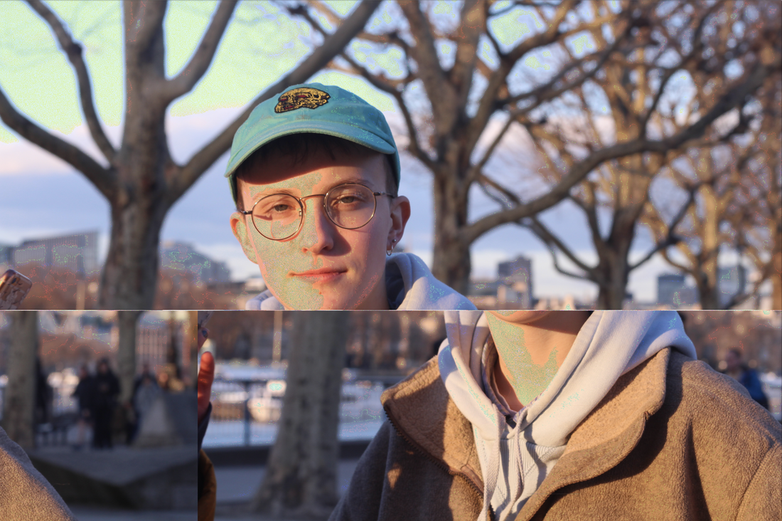
Glitch Art
Glitch art is the practice of using digital or analog errors for aesthetic purposes by either corrupting digital data or physically manipulating electronic devices. These corruptions or glitches can be exploited to add a unique dimension to photos. Personally, I find glitch art extremely interesting as it doesn't follow the conventions of traditional photography. I enjoy the spontaneity of glitch art, it takes the traditional structure of a photo and reconstructs it completely.
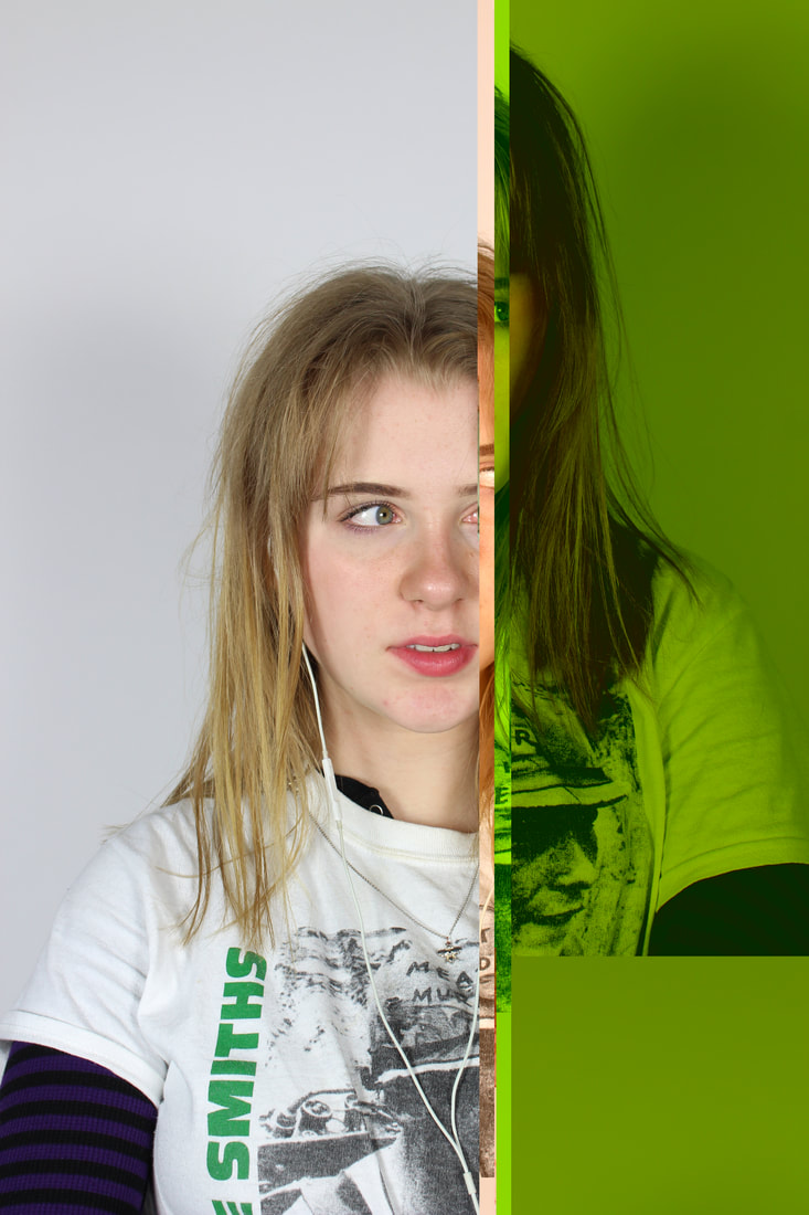
Heitor Magno & Unrad
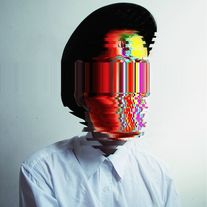
These artists explored ways in which they could manipulate the glitch effect even further. Magno (left) and Unrad (right) photoshop part of the glitch image back into their original portraits. Both images use glitching to destroy the structure of the models' faces and have made them almost unrecognisable. Personally, I prefer the image on the left not only because of the varying colours which make it exciting to view, but due to the fact the colours appear to have been carefully controlled throughout the glitch. There is a purpose and meaning behind how and where in the frame the glitch is apparent.
Making Glitches in Audacity
|
|
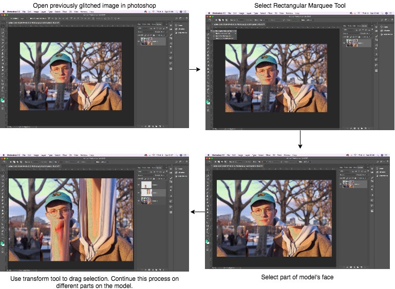
Glitch Extension in Photoshop...
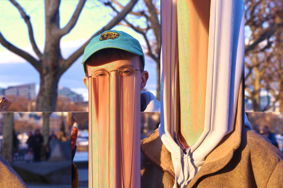
I feel I successfully achieved the glitch art effect. I find this art rather strange as I have fully distorted the model's features.
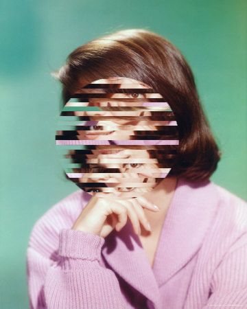
Artist&Me
|
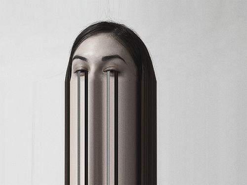
The photo above was made by Maykel Lima. Here, she liquified or smudged her portrait by dragging sections. This was the inspiration for my image on the left. I wanted to achieve the same liquified look as the artist. Unlike the artist, my photo is portrait and captures more of the model's body (head and shoulders) rather than a headshot style closeup. I felt this was effective as I was able to stretch the image extremely far to almost create the effect that it was going off the page. I dragged a selection from my model's eyes much like Lima did. I experimented with dragging from different points of the model's face to see what effects I could achieve. Maykel Lima's piece uses a more soft light with a white backdrop. However, I used a black backdrop with a more of a hard and harsh lighting style.
|
Making Glitches in TextEdit
|
|
|
|
|
|
|
Dark Room Glitches
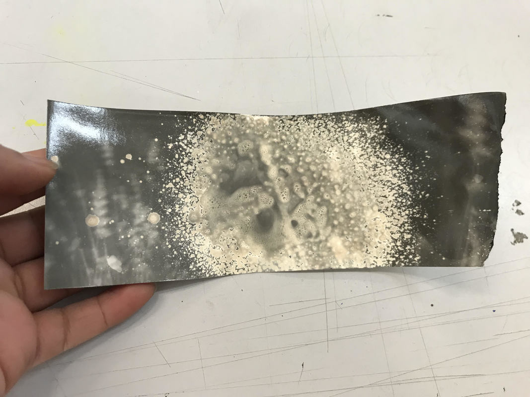
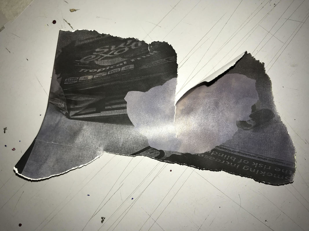
As an extension to the glitching task, I made glitches in the dark room. This was done by using bleach on the light sensitive photo paper. After, I placed the negative print over the photo paper and placed them under the photo enlarger. Then placed the photo paper in the developer, stop bath, fixer then the water (holding bath) and left to dry. As you can see below, I experimented with exposure times, presenting lighter and darker images.
|
|
|
The effect of the bleach, scratchings etc. are evident in the above images. They ruin particular parts of the image and create glitch-like abnormal patterns and shapes. Again, this represents the unconventional side of photography and the idea of destroying identity.
Artist&Me
|
There are similarities and differences between my image on the right and Amie Dicke's work on the left. Amie Dicke has sanded out all but a handful of parts of the faces and bodies of fashion models, taking the image out of context. This is similar to what I have worked towards in my work. My aim was to portray the idea of destroying a person's identity. On the other hand, I used a different method to create my work which I have explained in the above section. Dicke's piece does not contain any facial features which could suggest nothingness or emptiness. In contrast, facial features still remain in my photograph. It presents more of the idea the model is hiding a secret.
|
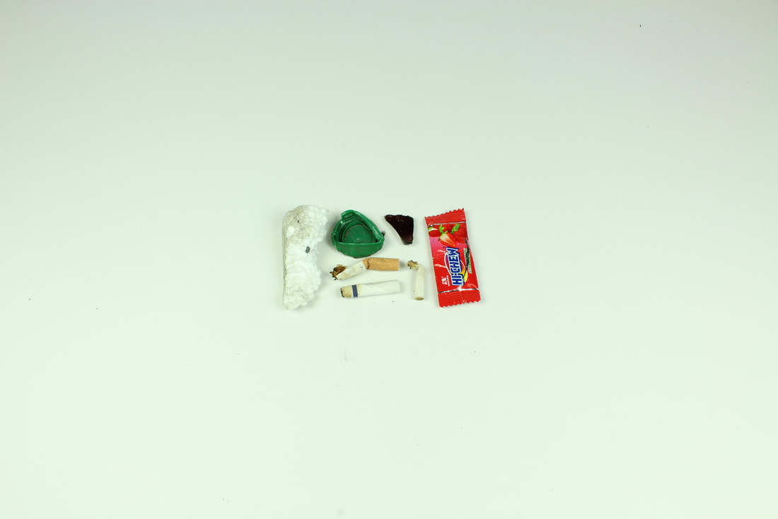
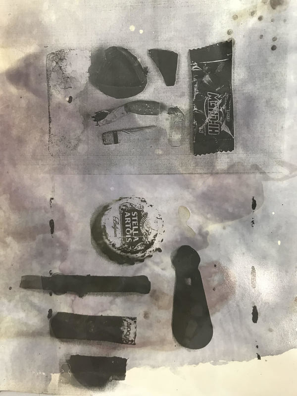
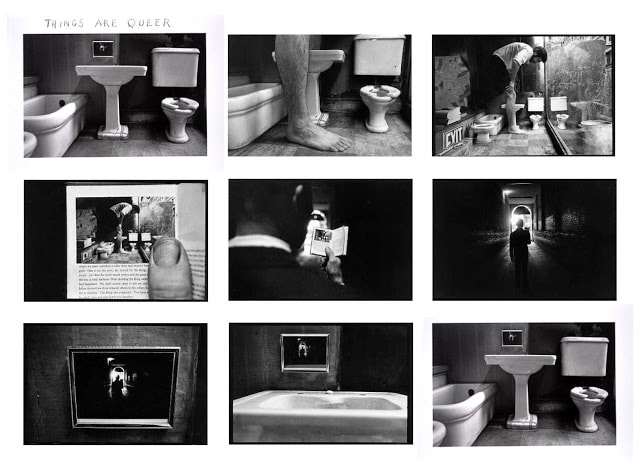
Hidden Beauty (Perfection in the Imperfect)
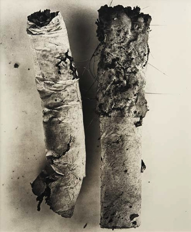
Irvin Penn
|
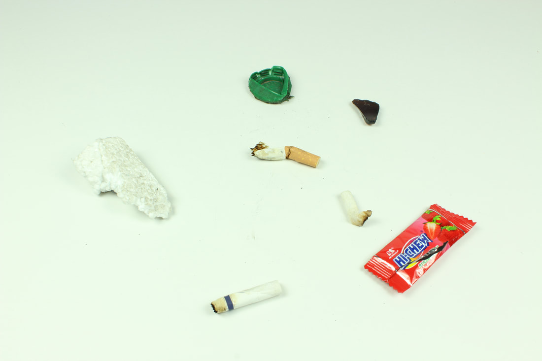
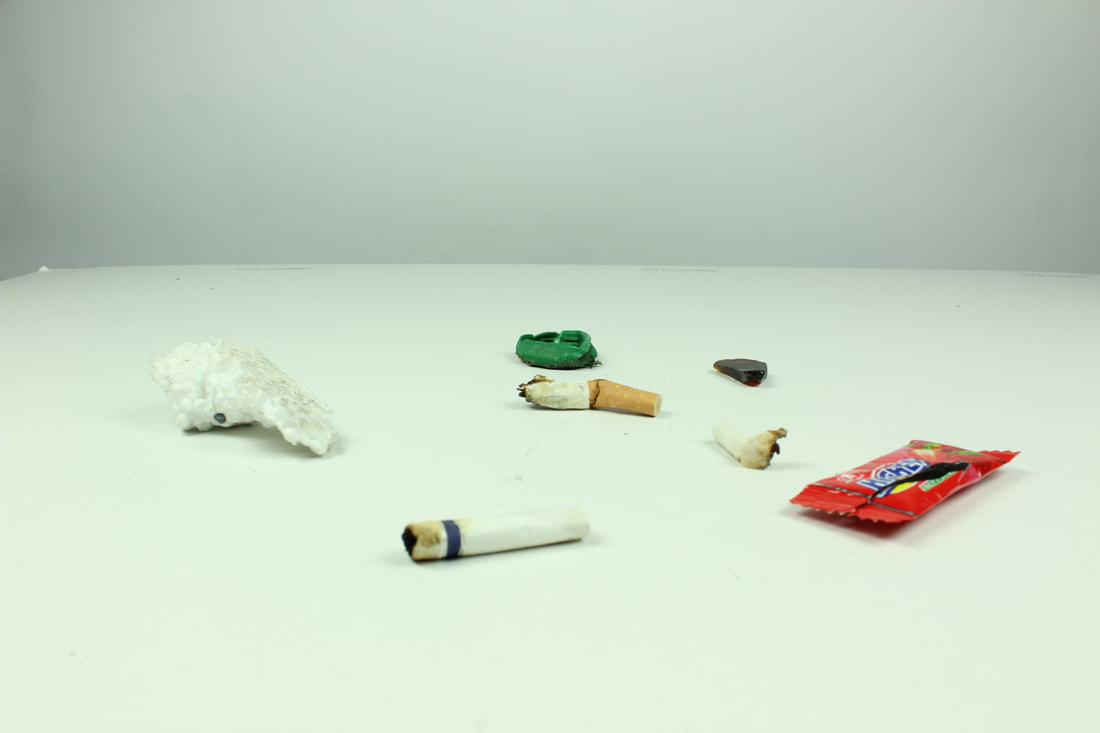
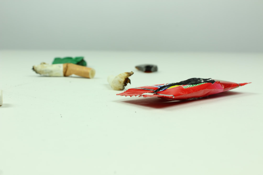
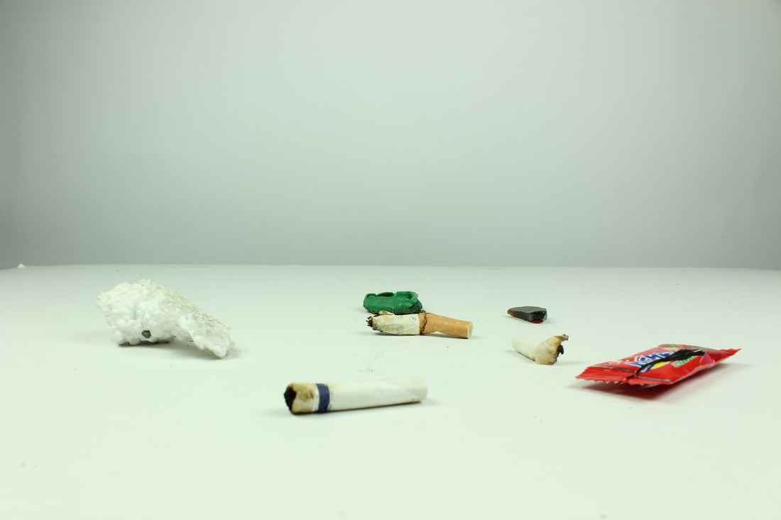
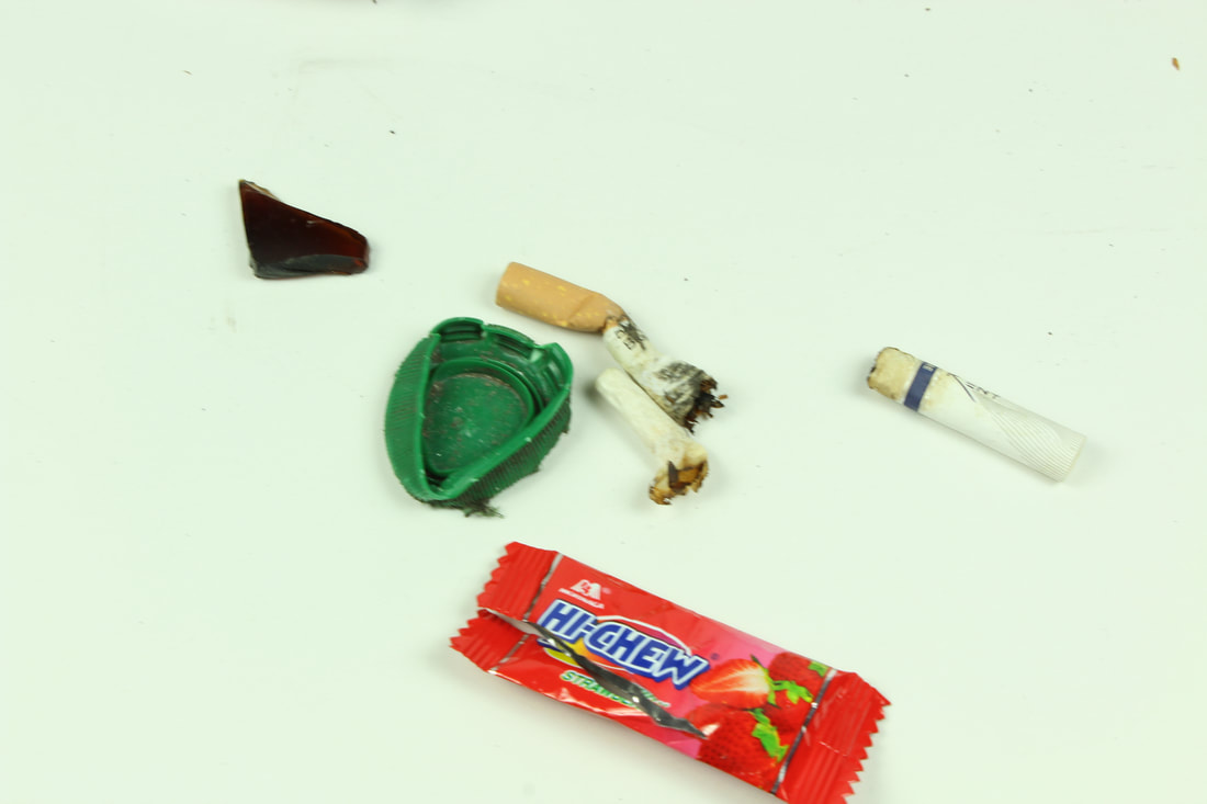
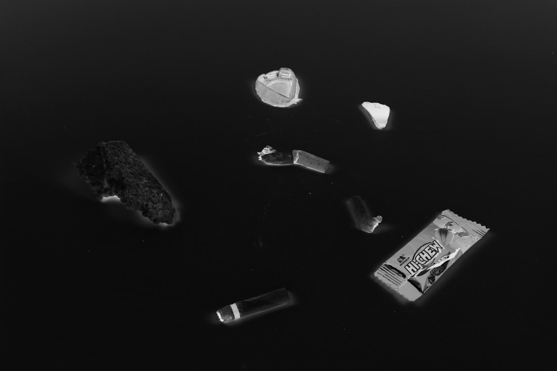
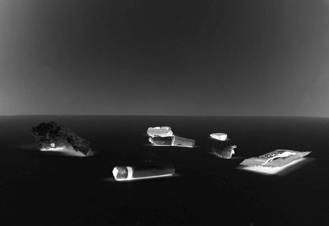
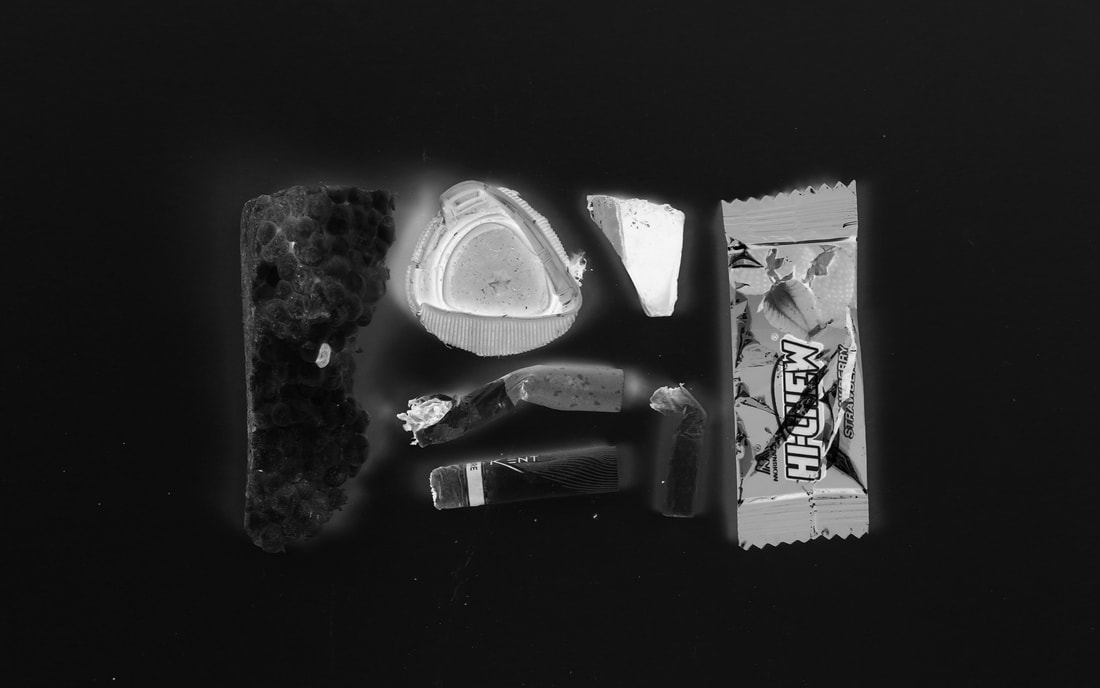
Irving Penn was an American photographer known for his fashion photography, portraits, and still lifes. From the 1930s onwards, he arranged everyday objects to create assemblages, which transcended their origins context and original purpose to become conceptual works of art. His 'Cigarettes' project focused on minimalist compositions of objects he found on the street which he then brought them into the studio and photographed. He challenged the conventions of art and transformed one of the most widely consumed and discarded products of consumer society.
|

|
Cigarettes sheds light on the development of the still life under Penn’s lens, whereby something as disposable and worthless as a cigarette butt is endowed with artistic value. I can appreciate the way in which the artist arranging the objects in a particular way in order to portray it's hidden beauty.
My Response
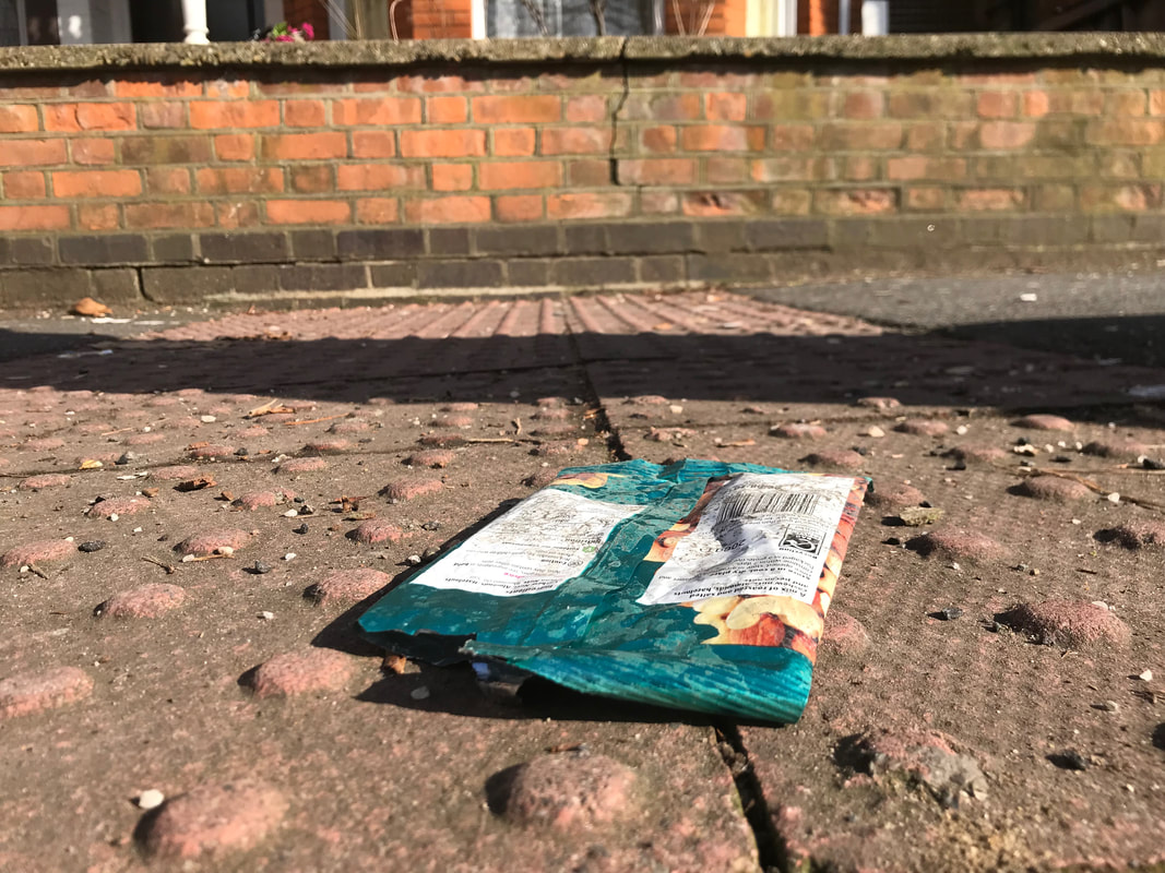
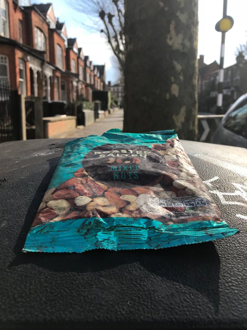

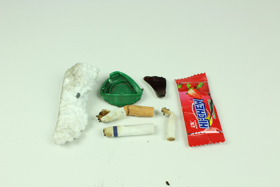
I looked for items of beauty in the world around me. I searched on the street for objects I felt could be represented in a different way which would express their beautiful or interesting side. I looked in everyday places and objects in my local area. The set of photos require the viewer to look deeper and beyond the apparent imperfection of the object before them to realise its inherent perfection.
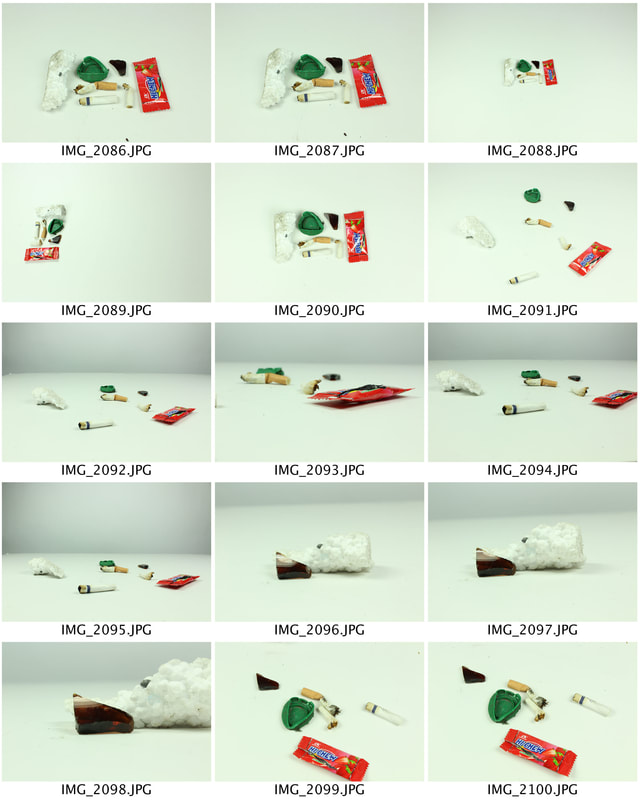
Using the work of Penn as inspiration, I took a series of images that create beauty out of everyday objects that I brought into the studio. My aim was to consider the lighting colour of the background and the relationship between the objects in my set up.
|
|

|
|
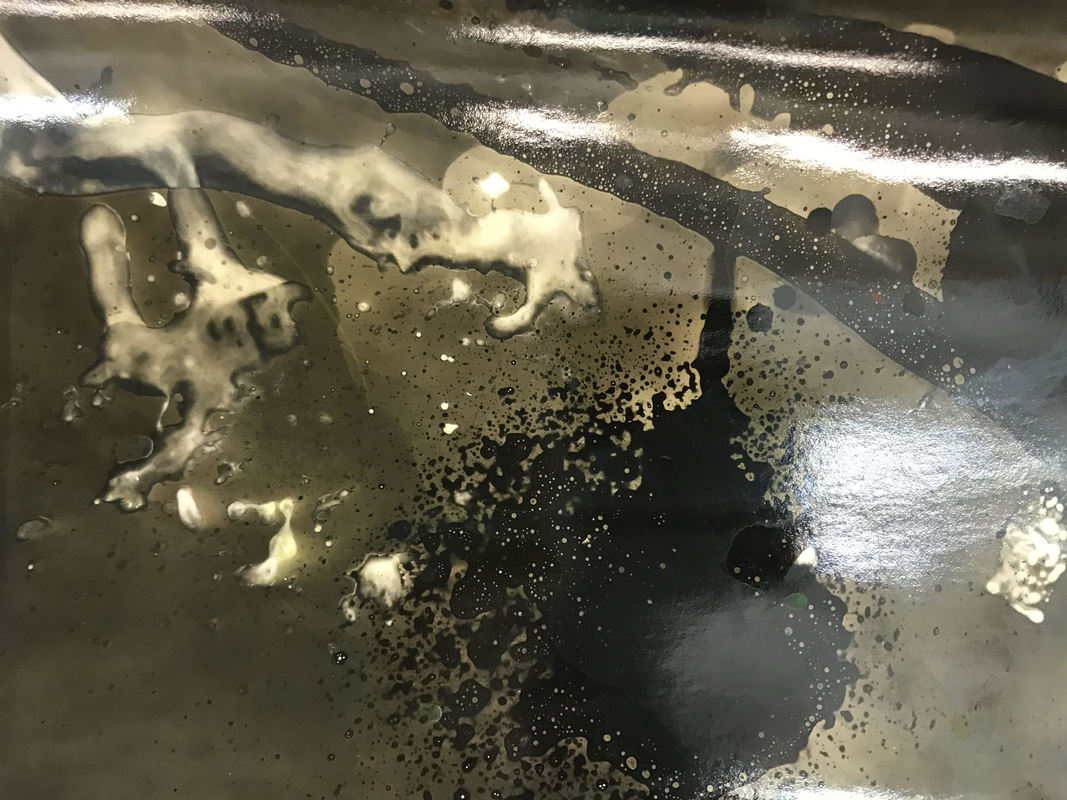
Compromises
Mariah Robertson
|
Robertson is an American photographer born in 1975. Some of her work include dust marks, light leaks and scratches which were traditionally seen as blemishes that impede a photograph’s depiction of reality. However, some photographers (like herself) have taken advantage of creative opportunities to explore the relationship between these unforeseen elements and the image captured by the camera. Thus, a style of photography considered to be unconventional and perhaps not explored very often. I like the abstract aspect of her work, we as the audience can only speculate what was of the original image. There is no sense of structure to the art which I find intriguing.
The Process:
In her work 11 Mariah Robertson creates both a photograph and a sculpture, 11 is made on a single roll of commercially available photographic paper, one hundred feet long and thirty inches wide. Robertson makes her pictures using analog darkroom processes—combining and enlarging negatives, placing objects directly on the paper and then exposing them, dripping or painting chemicals onto the paper, and exposing it to coloured gels (sometimes with a flashlight) and to other lights. |
My Response
For this task, using the images taken in the previous task and the work of Robertson as inspiration, I experimented in the darkroom using different paper and artistic techniques. The paper I was provided with was old and some had unexpected outcomes when developed. Similarly to the dark room glitches process, I used a range of cleaning products (dettol detergent), bleach on the light sensitive photo paper before placing it under the photo enlarger. This creating some interesting effects which can be recognised below. I found this task exciting due to the unexpectedness of it. You only have a vague idea of how the image will look after the process so most of it is guesswork. However, I like the spontaneousness of this task. The outcome of some of my images were not as planned (bottom right image) and i was not pleased with the image. I fixed the issue by applying less detergent in my next piece.
THREE STRANDS
FIRST STRAND
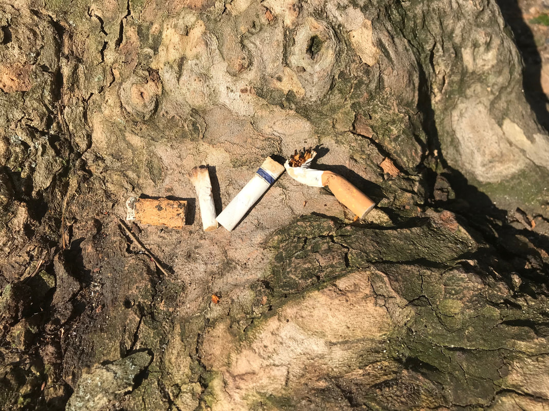
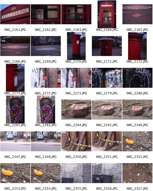
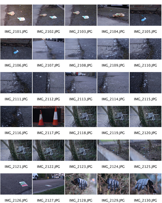
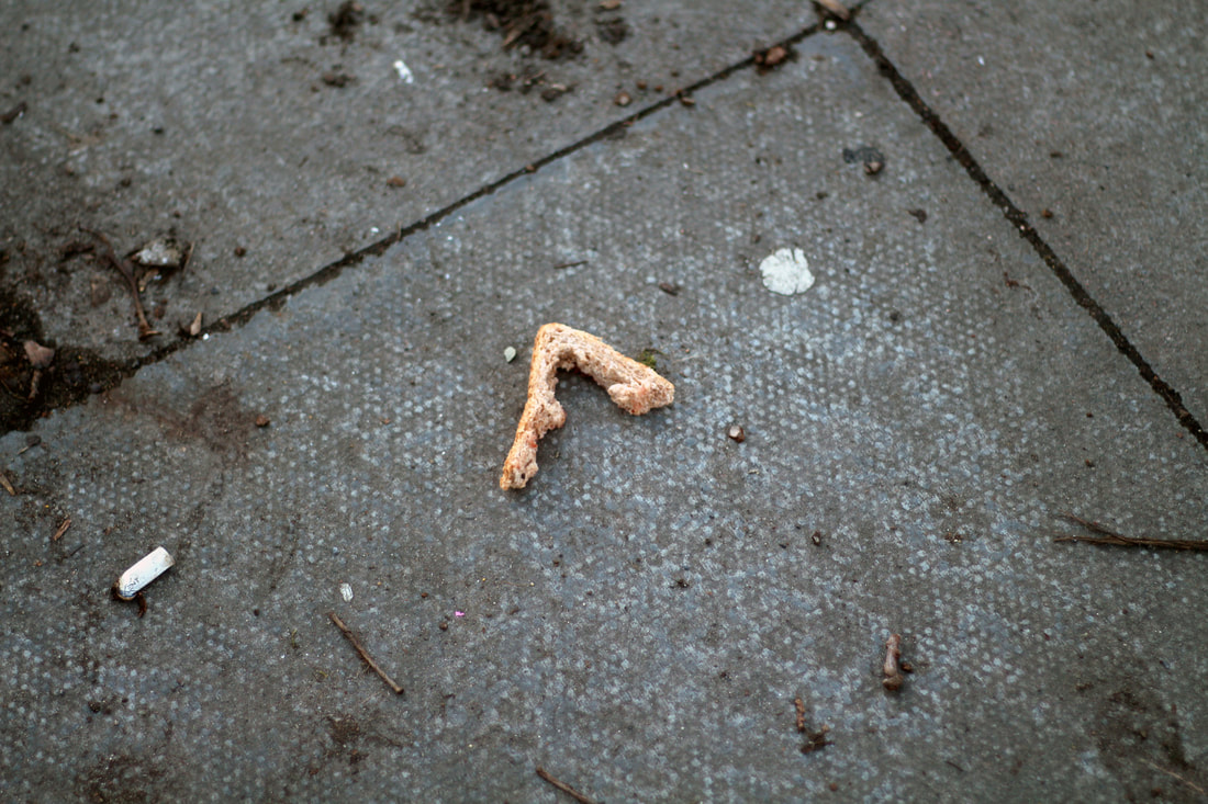
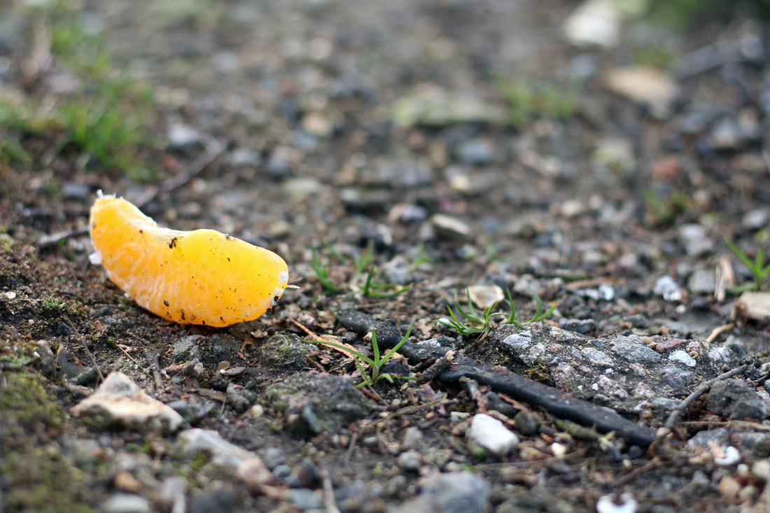
EVIDENCE OF HUMAN PRESENCE
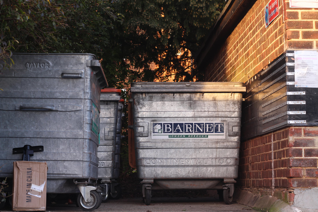
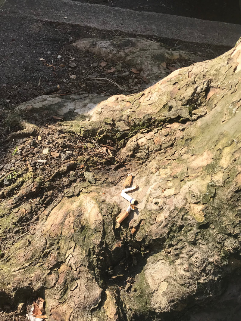
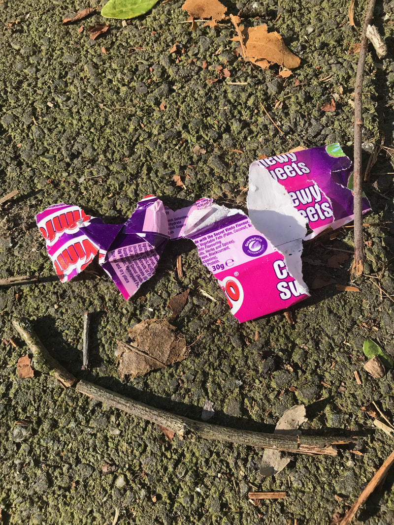
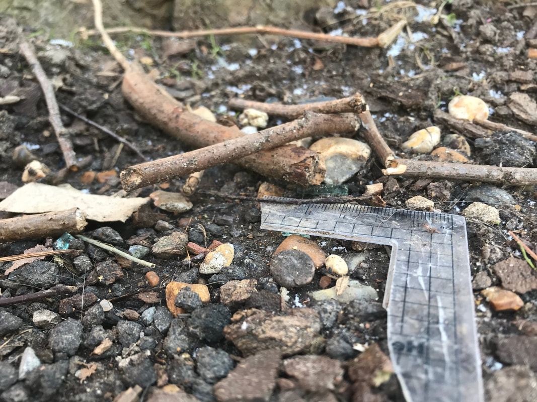
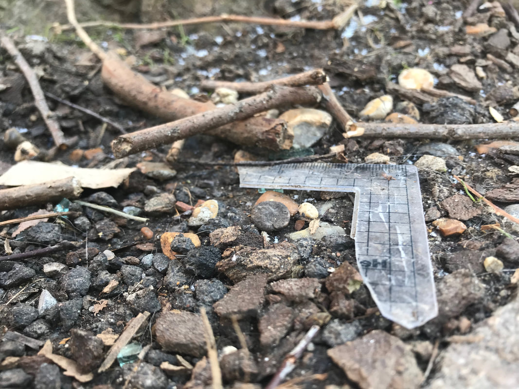
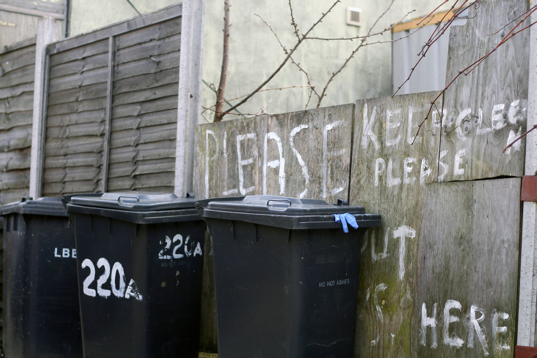
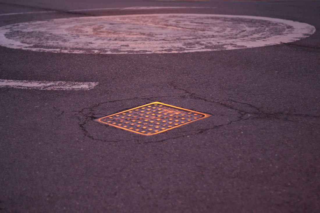
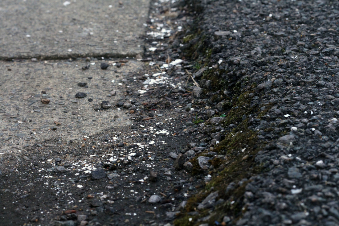
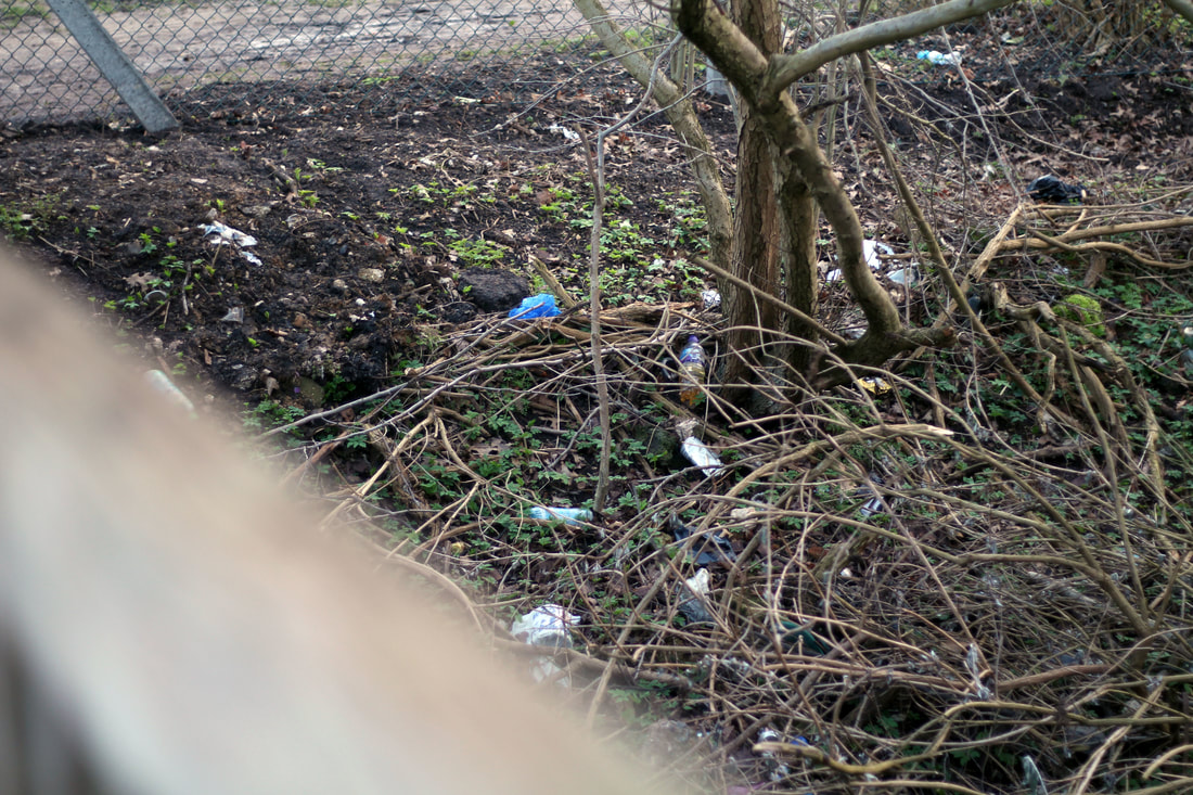
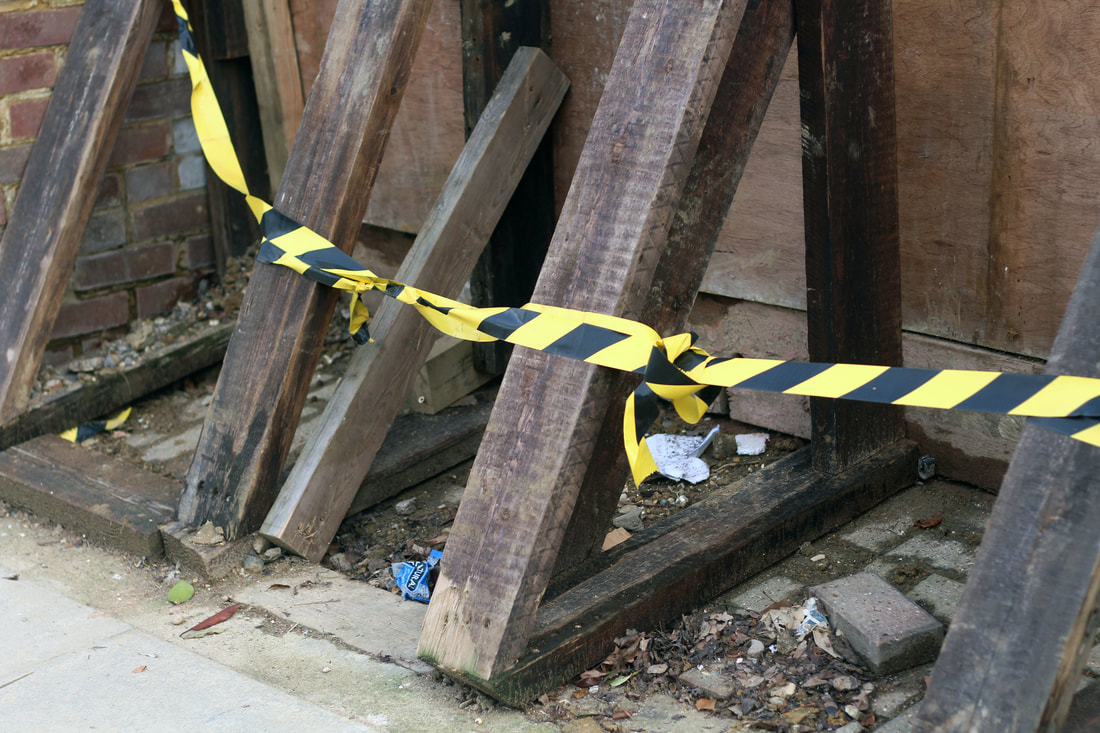
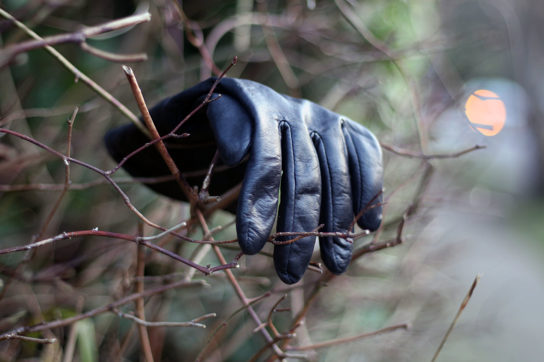
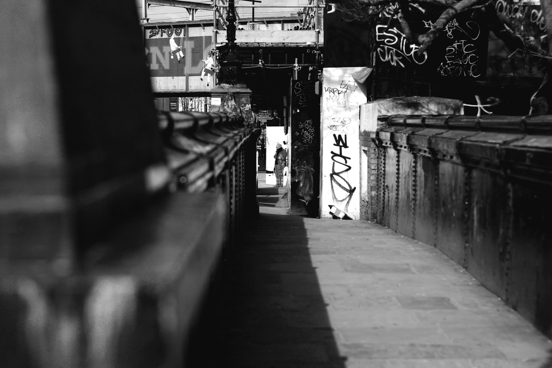
For my first strand, I decided to photograph 'evidence of human presence'. My aim was to capture an environment where it was obvious humans had visited and affected in one way or another (This refers to broken glass or cigarettes left behind, man-made structures, rubbish, ruins, derelict buildings etc). I began to observe aspects of my environment in a novel way- I found objects that I would not usually photograph which I found interesting. I found this supported the exam theme as the photographs display a sense of secrecy. The viewer is given very little detail over the context of the image. They can only suspect how and why the scene became how it did. I believe some images from this strand follow the conventions of a typical ignored and dismissed environment.
Nadav Kander
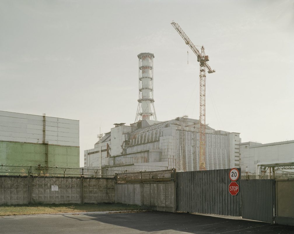
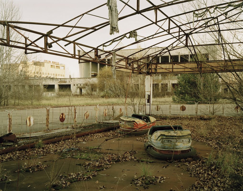
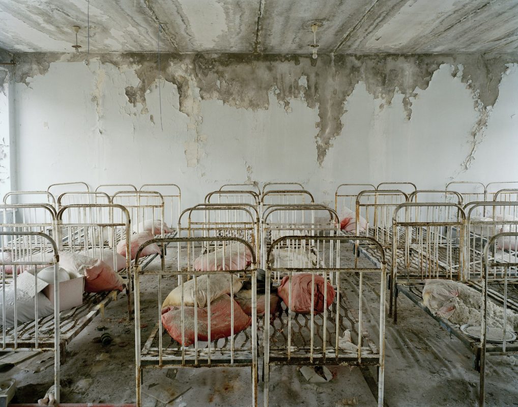
|
Nadav Kander is a London- based photographer, artist and director, known for his portraiture and landscapes (born 1961). In his series "Half Life" shot in Chernobyl. Chernobyl’s Nuclear Power Station exploded in 1986 leaving the surrounding area uninhabitable for many hundreds of years to come. It happened to be the 20th Anniversary since the explosion when Kander gained access as an artist to visit Chernobyl, photographing the deserted spaces in what was once a model Soviet City. I like his use of composition throughout his work. Where he positions his subject within the frame is extremely important to create a sense of isolation or particular emotion. I have noticed throughout this series of images that he tends to use wide angle shots. Perhaps this is to capture as much of the environment as possible. I can also appreciate the fact that the images show 'Evidence of Human Presence'. It is evident that humans had once occupied this area. It is interesting to see that was once a lively town has become a detached and unusual no-go zone.
|
"We all know atmosphere is there but it is something that is overlooked. However, in a photo, you can immediately tell whether that sense of atmosphere is created."
Nadav Kander (when the artist gave a photography lecture at my school). |
My Response
|
|
|
Selects
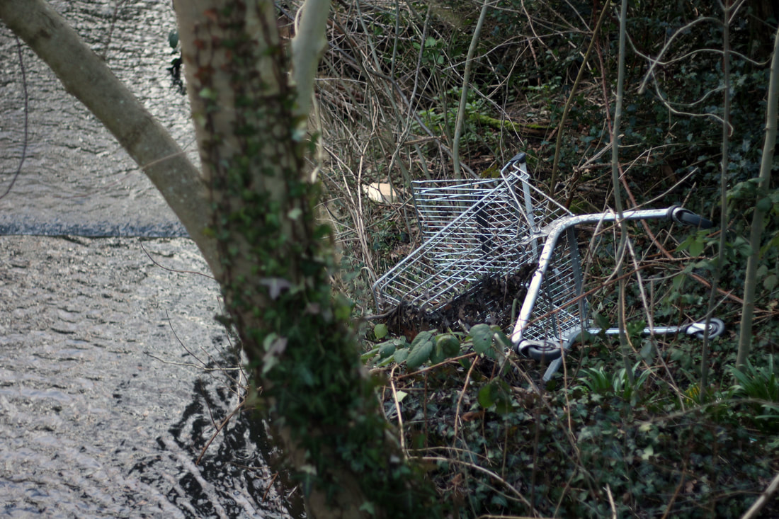
I in this photograph, I captured a shopping trolley by a brook. I used my knowledge of composition and the rule of thirds to create this image. The use of natural light worked effectively as the sunlight highlighted the trolley and the stream at the same time (which was what I wanted the viewer to be drawn to). I found it an unusual composition as I chose to make the background in focus as opposed to the tree trunk in the foreground. The image draws attention to the fact that an object has been found somewhere you wouldn't expect to find it and ultimately displays the idea of 'human presence'.
|
|
I do not believe this is my strongest strand, nevertheless, I found it intriguing that I was able to explore a different style of photography that I do not usually experiment with. Throughout my endeavours, I found 'evidence of human presence' all around my environment. It is hard to imagine a world without these little disruptions to nature (graffiti, left over orange, rubbish, man-made structures) and without them I believe it would seem lonely, almost as if humans do not occupy the space. This would highlight the mysterious elements to this strand which links to the exam theme.
SECOND STRAND
SURVEILLANCE PHOTOGRAPHY
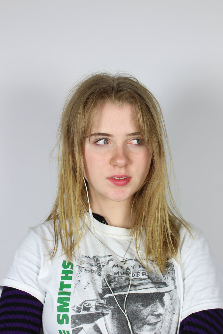
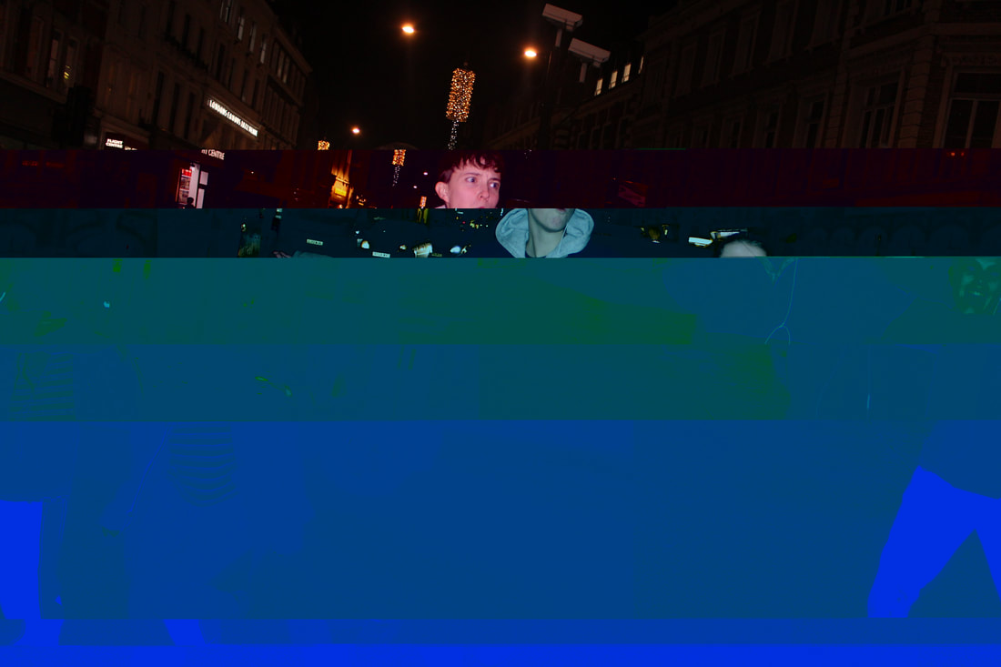
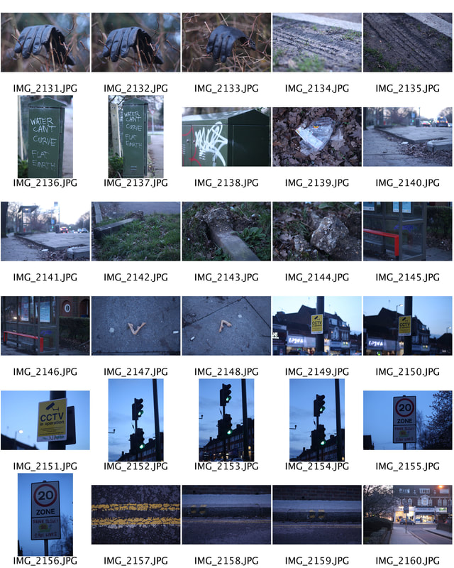
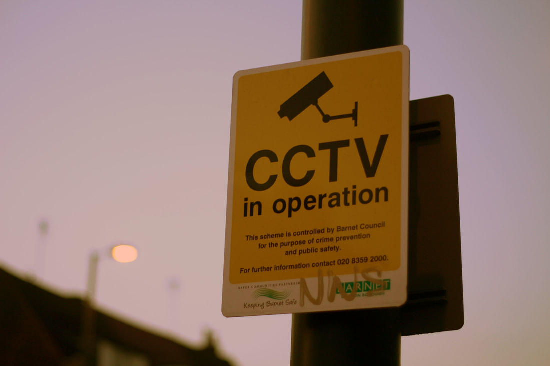
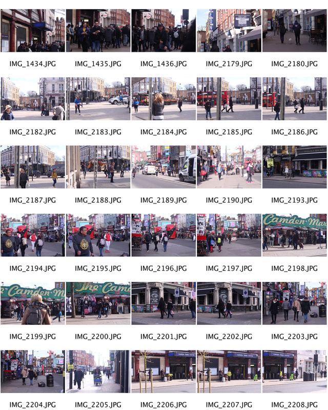
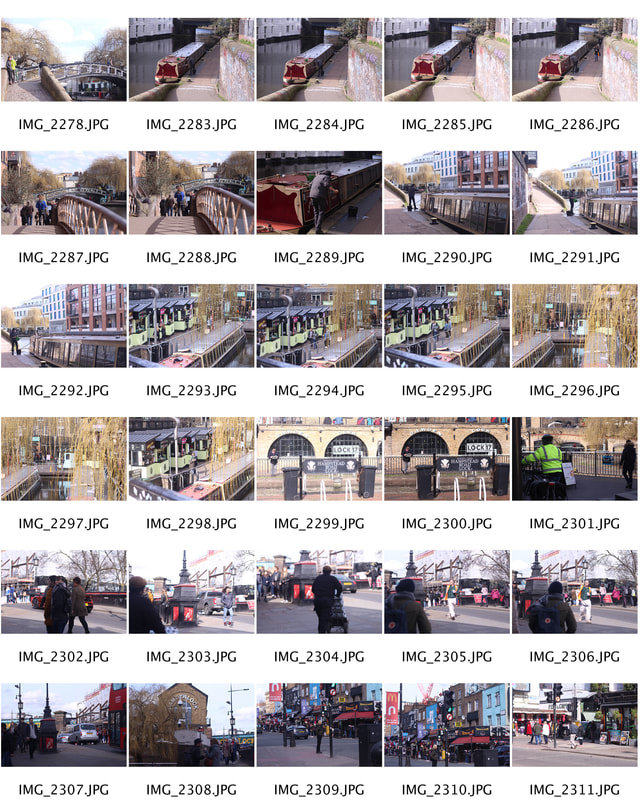
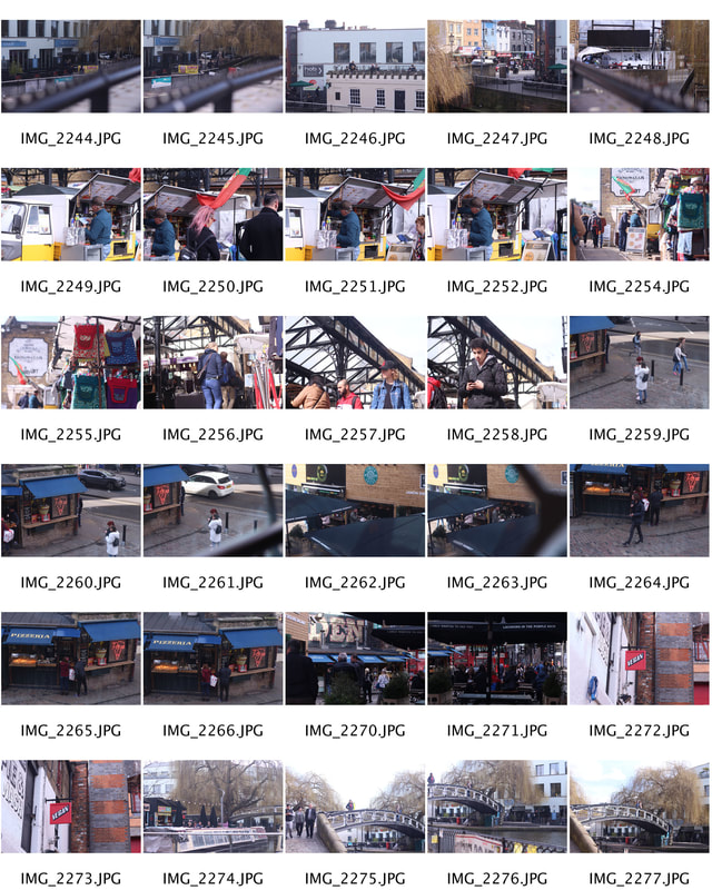
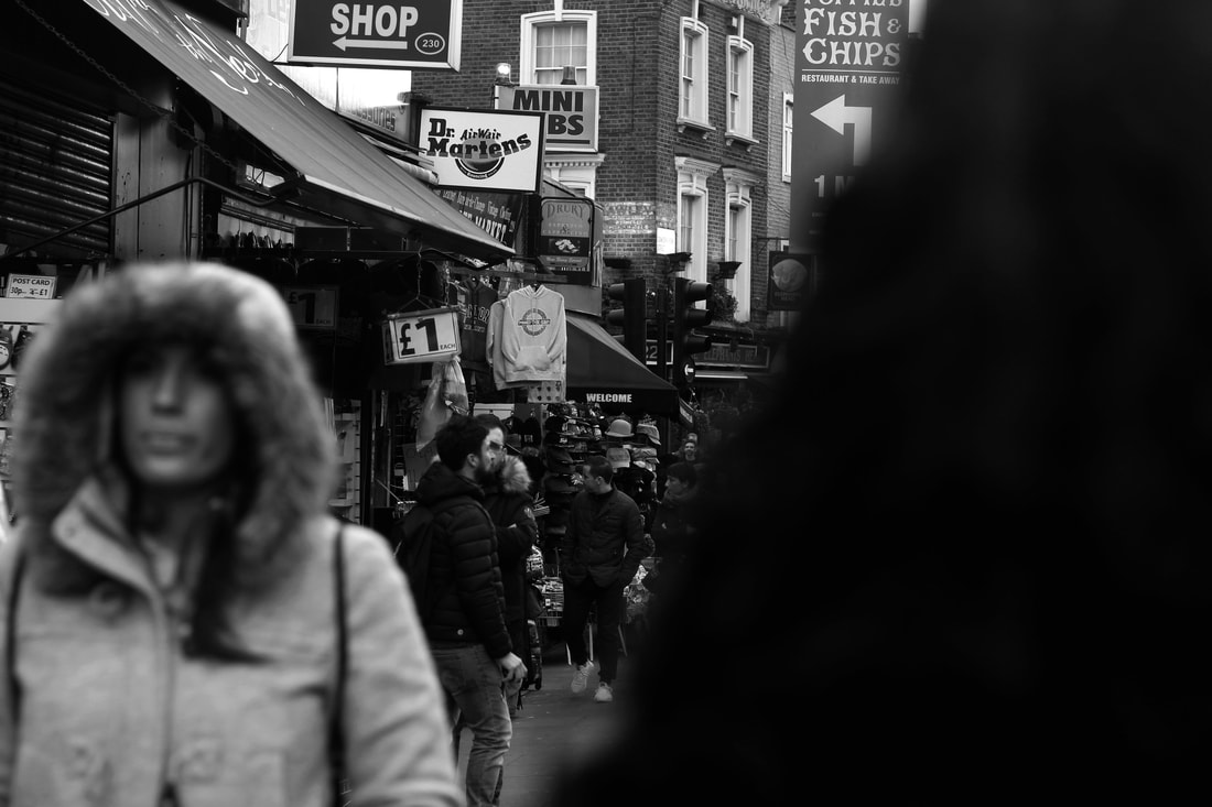
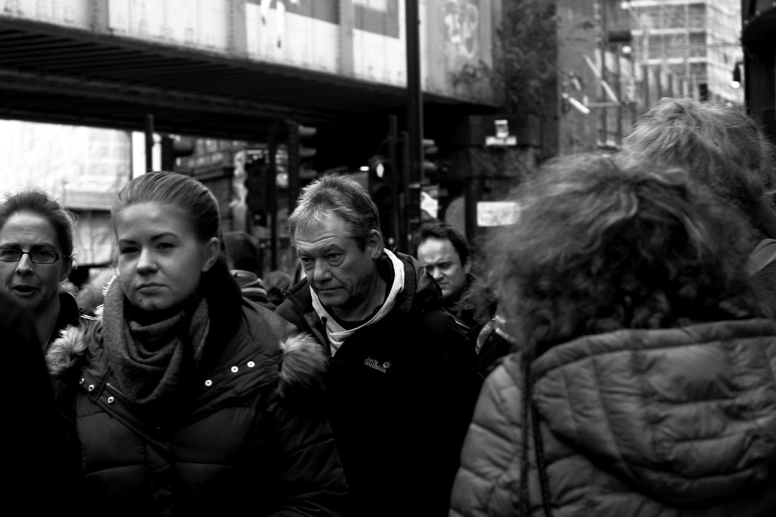
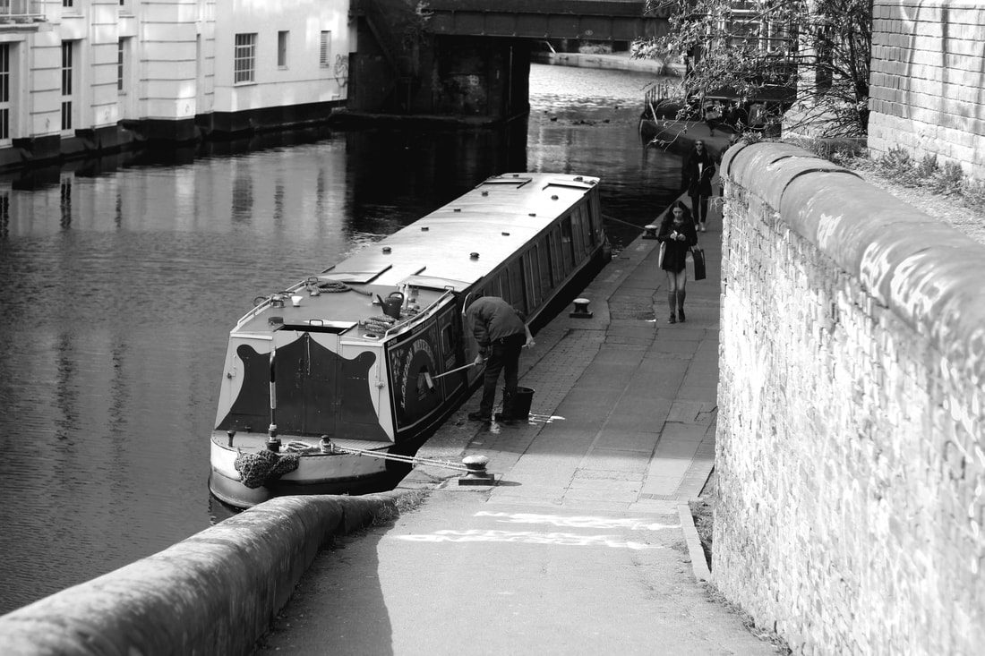
For my second strand, I have decided to explore the idea of surveillance photography. During this task, I will capture strangers going about their every day lives. The style of surveillance photography is supposed to look as if a spy is taking photos of their subject- viewing people from the perspective of a spy/the secret service. I wanted to reflect on issues of surveillance and privacy. I took images of people without the subject's consent. This will perhaps highlight society's indifference or ignorance towards surveillance. No one knows how many CCTV cameras there are in the UK. The best estimations put the number at 5m, or one camera for every 12 people. I thought this would be an interesting strand to photograph as it is secretive and quite a mysterious task.
Sophie Calle
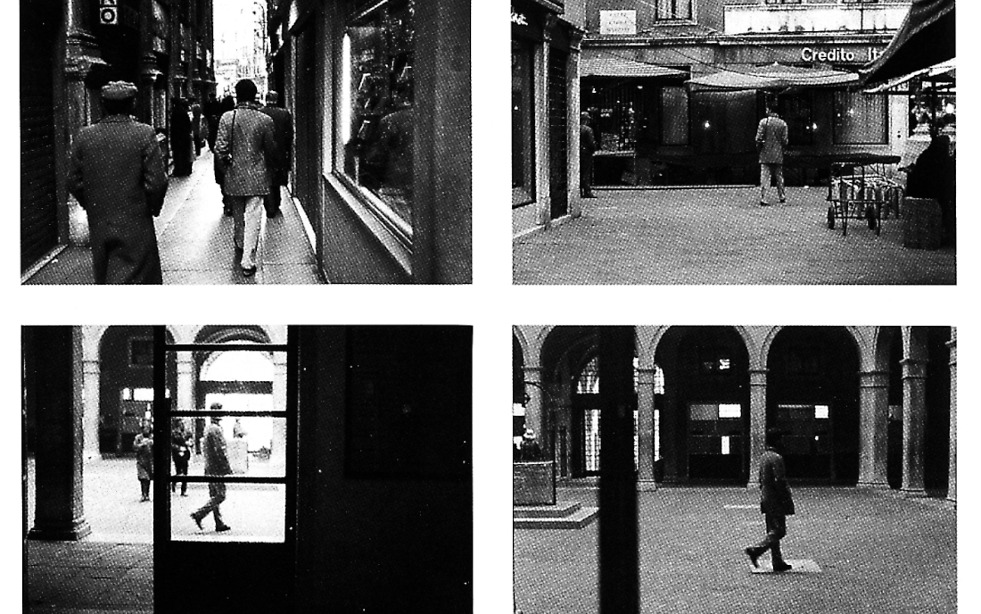
Sophie Calle is a writer, photographer, installation artist and conceptual artist from France. She blurred boundaries between public and private. In the pursuit of her art, she has become a stalker, a thief, famously finding a stranger's address book on the street, and instead of returning it, contacting everyone in it and asking them for a description of the owner. In this project, Calle caught people off guard- taking photos of people in shops, on the street, working from intriguing angles which replicated the movement/viewpoint from a stalker's perspective. I appreciate Calle's unique style of art- the use of a black and white filter in her images create a serious, dark, depressing and eerie mood. She positions her subjects in a way which automatically draws your attention. The artist uses the natural light in her images which makes the photos more realistic and produces a true representation of every day life. It is impressive that regardless of the background (ie a window, street), Calle is still able to keep the subject as the main focus. It is almost as if each photo holds a significant story which we will never find out.
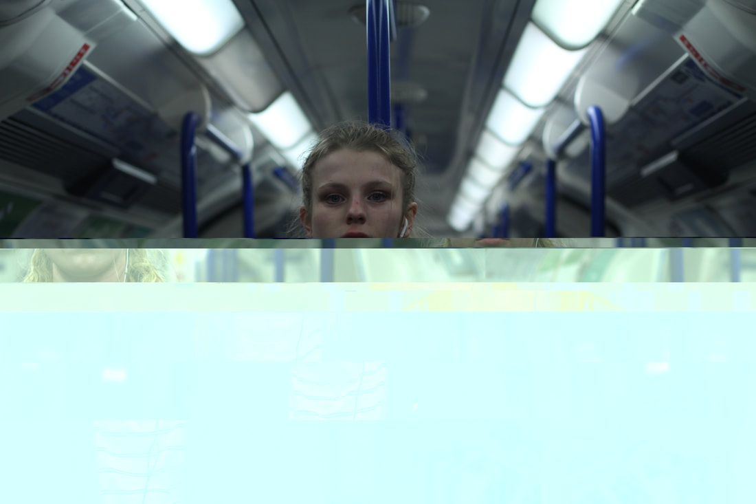
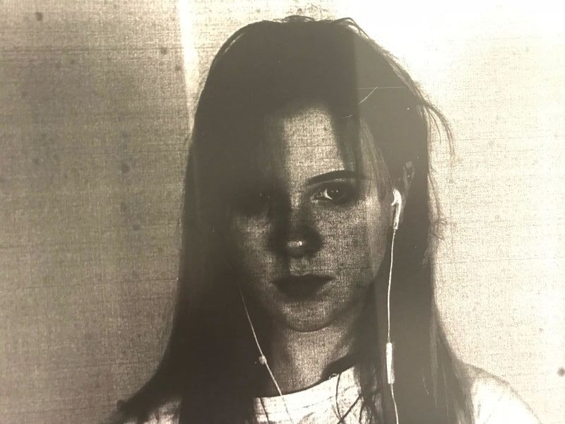
My Response
|
|
|
Selects
For this task, I went to Camden Town and photographed people without them realising (in most cases). I later made the images black and white in post production as I thought it looked more authentic and film-like. As well as this, the contrasting black and white colours are known for being mysterious and almost frightening. This task follows the conventions of a horror film. Each photo seems as if it holds a significant story about the subject. I found it interesting that I captured people completing every day actions (ie. eating, working, smoking, walking) and was able to turn it into peculiar pieces of art.
|
|
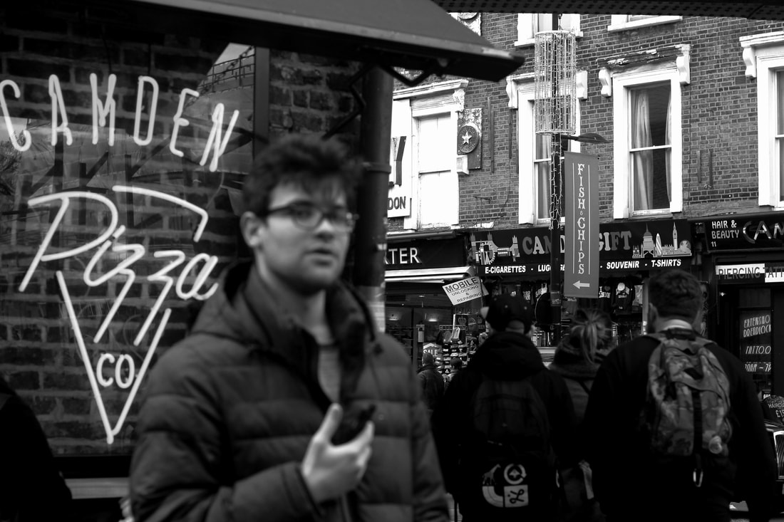
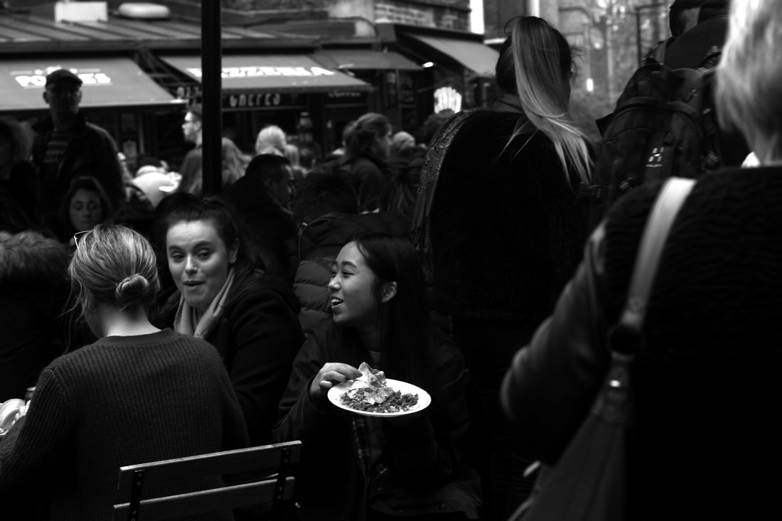
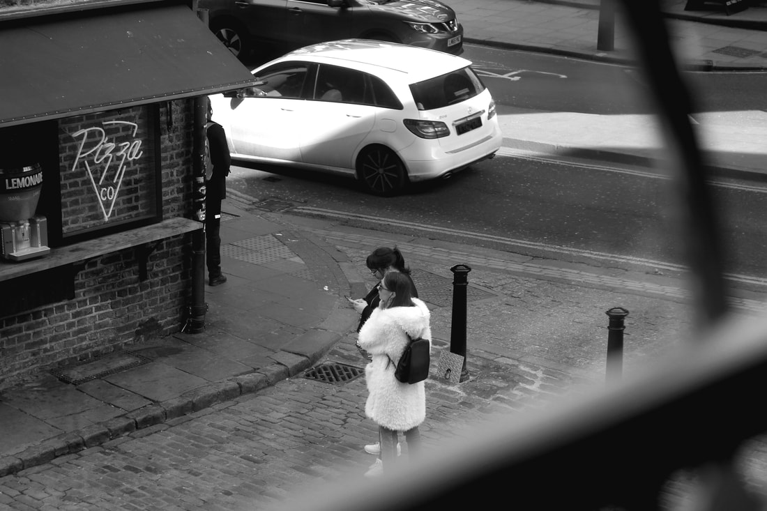

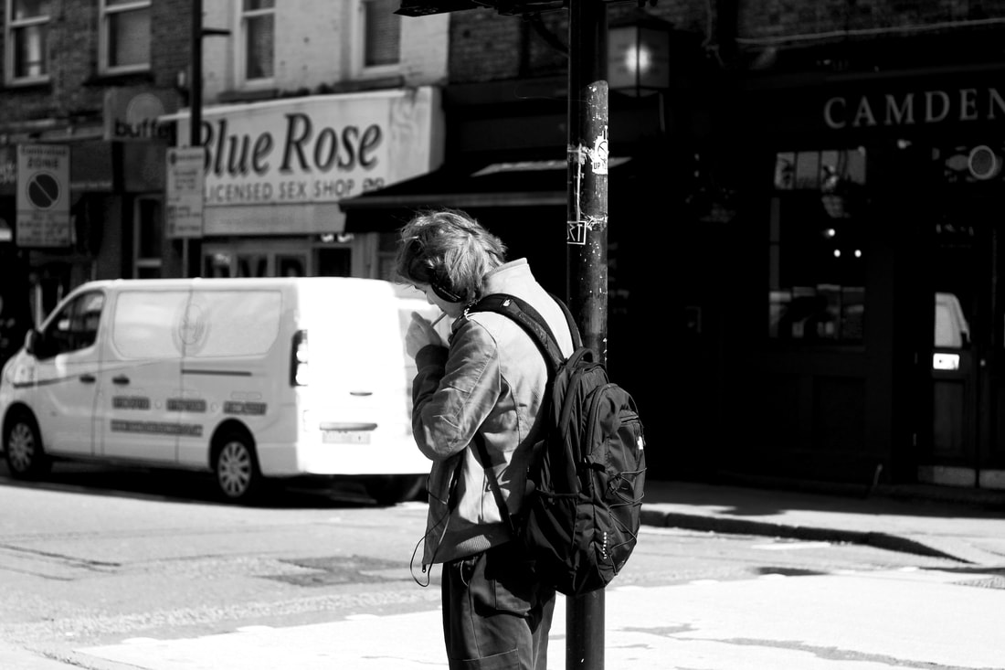
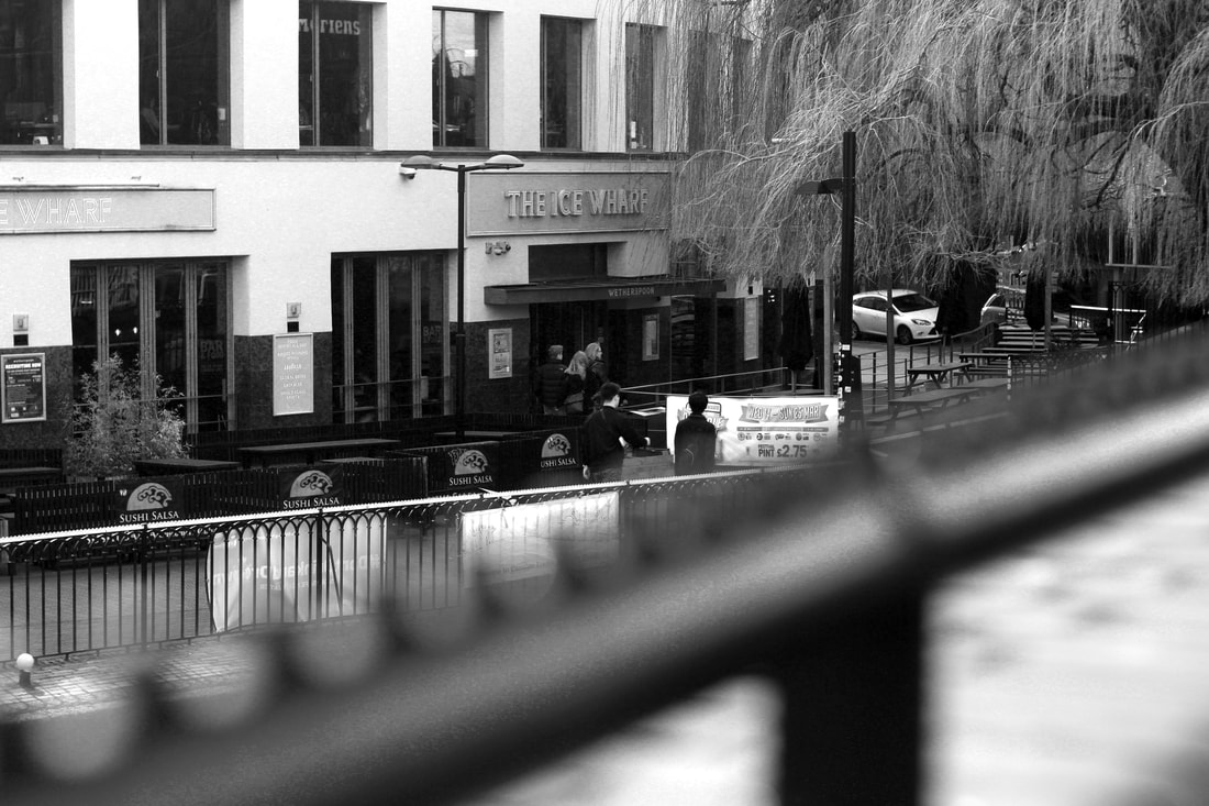
I positioned my subjects in particular ways around the frame. My aim was to draw your eyes towards the people rather than the busy background and I believe I did this successfully. I enjoyed capturing street photography as I captured peoples' true reactions/emotions when they are caught off guard and do not realise the camera is there. I used a range of wide shots, close ups, mid shots, bird's eye view etc throughout this strand. This was because I wanted to experiment with obscure angles much like the angles Sophie Calle used in her project. As well as this, I investigated what I chose to focus on within the frames of my photographs which I do not usually explore in such depth. As you can see above, in some shots I focused on the people and in other shots I concentrated on the background and made the people blurred (almost hiding their identity). In other photographs I used a hand rail, a wall, a lamppost to obscure part of the camera's view. This created the effect that I was spying or hiding from them. I found it exciting to step out of my comfort zone in this task and I am extremely pleased with the outcome of this strand.
THIRD STRAND
FUTURISTIC PHOTOGRAPHY
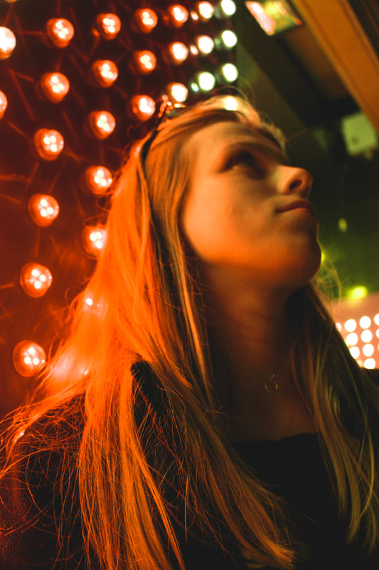
For my third strand, (which I will be developing further) I have decided to focus on futuristic styled photography. I find this strand works well with the theme of "Secrets, Codes and Conventions". This is because the future is unknown and holds many secrets which we, as society, will have to wait to be revealed. Throughout this strand I will be exploring the idea of futuristic photography including experimenting with colourful light, neon light photography, sci-fi holographic portrait photography and more. I like the fact I will be investigating the effect colour has on night photography in particular. The images produced within this project will follow the conventions of the Sci-Fi genre (eg. futuristic technologies, science, special effects, space etc). I am excited to photograph this strand as I feel the topic is very relevant to today's society and is not often captured.
Petra Collins
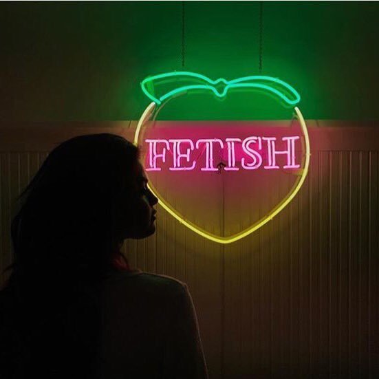
|
Petra Collins is an artist working in New York. Here, she photographs her model next to a neon sign. I can appreciate the fact that the majority of the image is in a shadow, except the sign in the centre which highlights just the tip of the model's face. I like how the green and yellow lights match the colour of the walls in the background. Your eyes are automatically drawn to the pink neon light due to the colour contrast. It seems as if the photo holds some sort of mystery or secret. The light creates a silhouette-like effect on the model (similar to what I have captured below.
"Light effects are just about as versatile as the imagination. The possibilities are endless" |
My Response
|
|
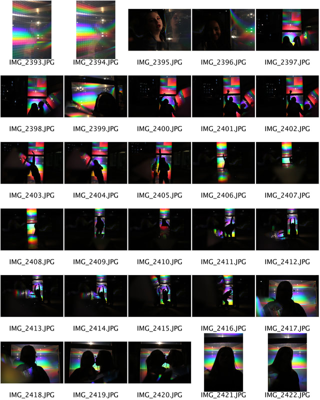
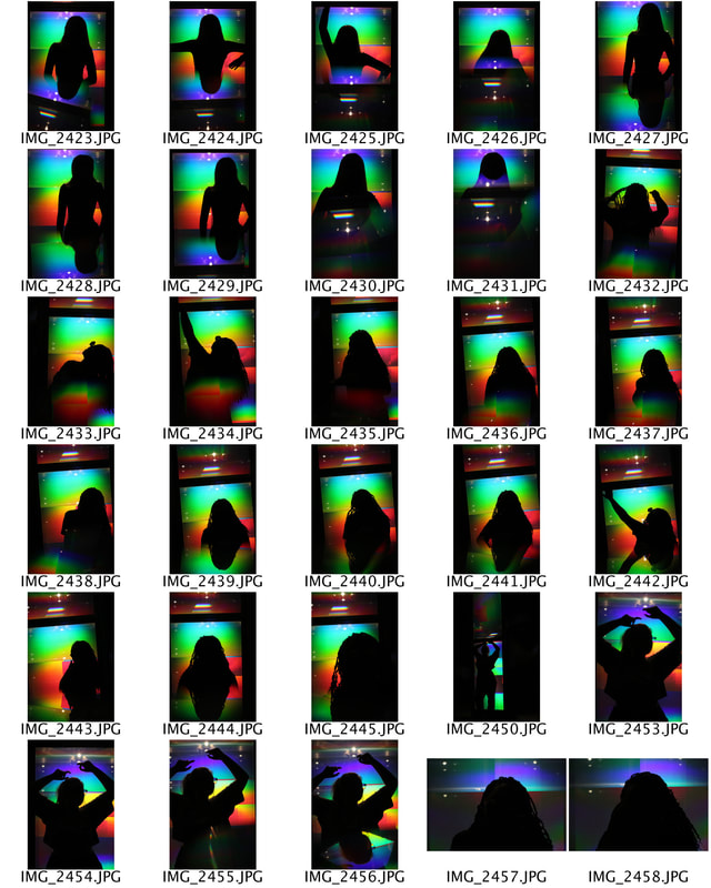
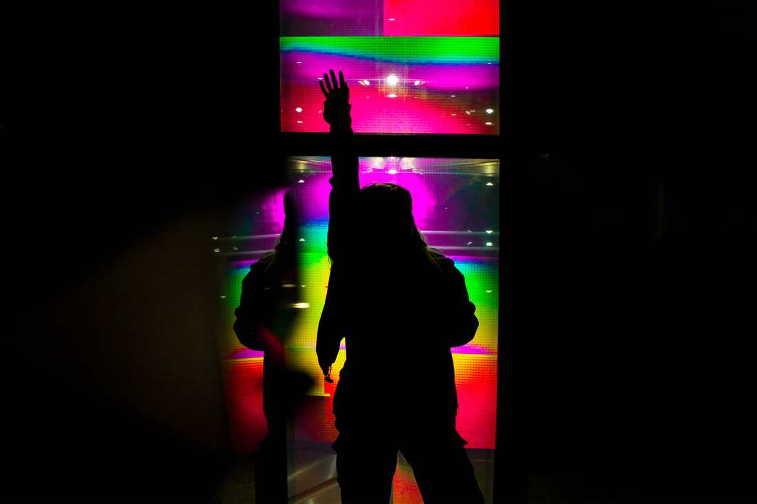
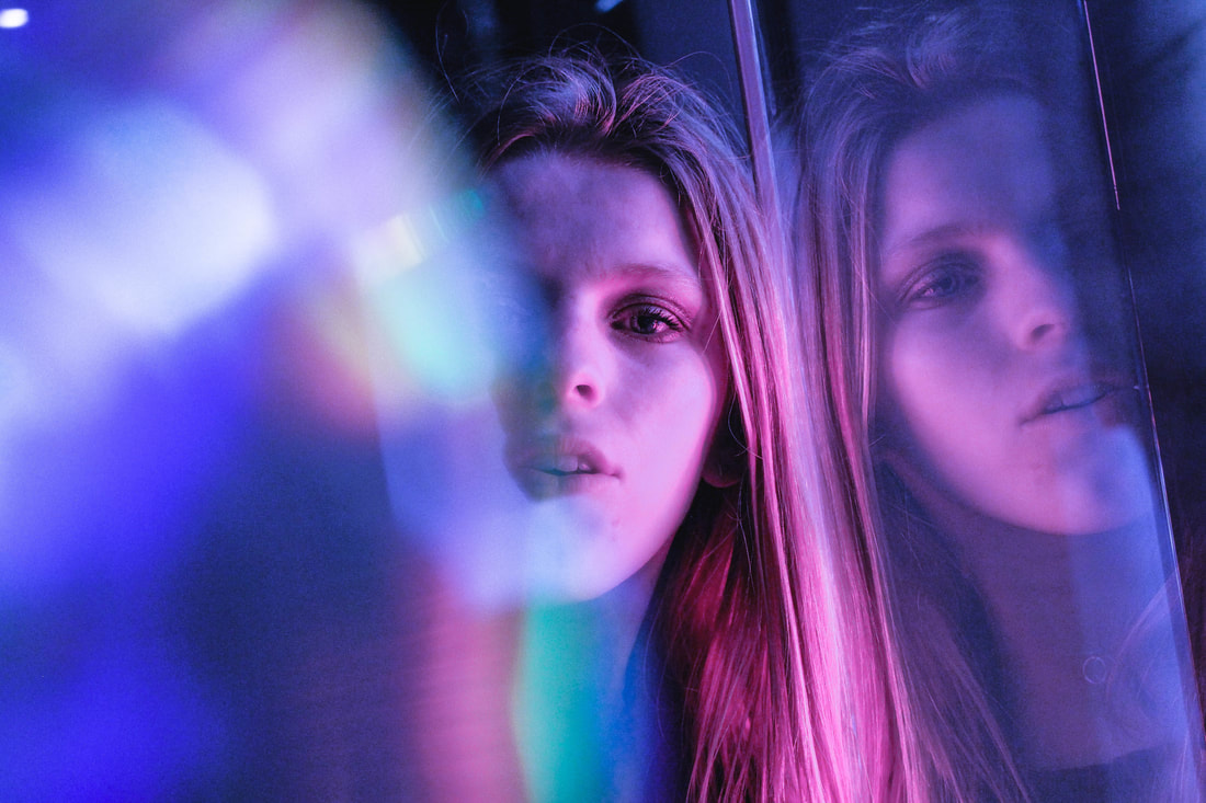
Here, I experimented with the effect coloured light has on night photography. This was accomplished by using vivid and bold reds, yellows, greens in the background of the silhouetted subjects below. I decided to begin my strand with this style of photography as I believed it carried futuristic and sci-fi qualities. The acidic and vibrant colours within the background of this set of photos play a large part in achieving this futuristic effect.

|

|
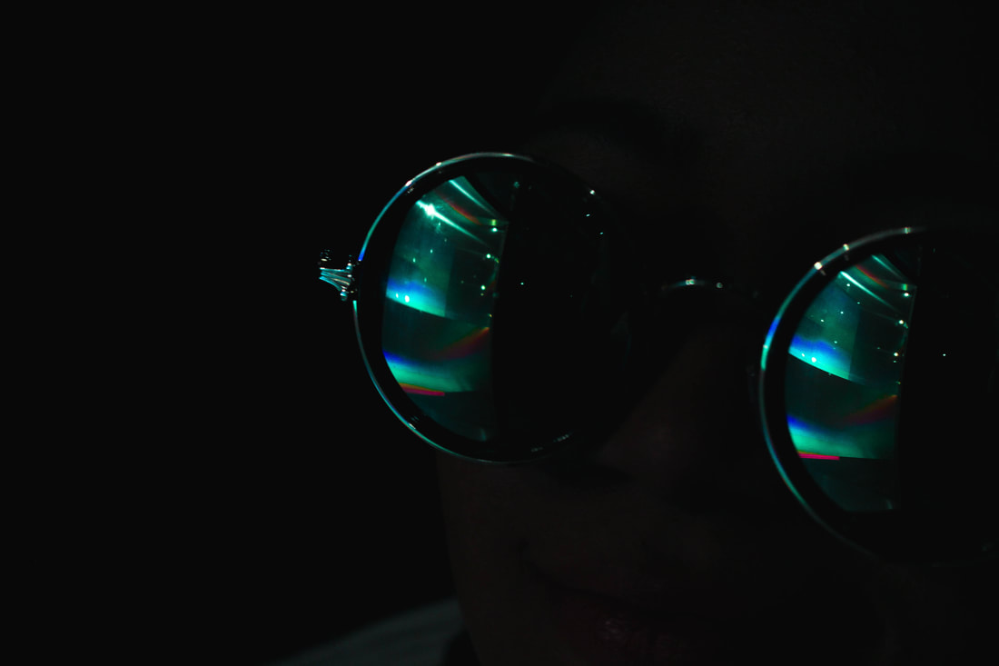
In order to create these natural reflections, I held a perspex glass prism up to the camera lens. I tilted and twisted the block in various ways to achieve different effects. Where I held the glass altered where the reflection would appear. This task required physics knowledge in order to find the best reflection. I liked this part of my task as I like the idea of merging of science and art. As well as this, I put reflective glasses on my models, again to achieve a futuristic and abstract style of art. Another way I created reflection was by holding a cd up to the lens (much like the prism) to create an interesting neon light effect. My intention was to emphasise the contrast between the bright/acidic colours and the dark silhouettes which I believe I did successfully. The lighting comes from behind the subject (meaning the subject is backlit). To take this set of images, I put my camera on a high aperture as the lights were severely bright.
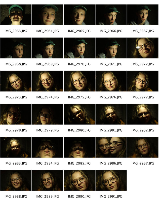
Development #1: Futuristic Photography
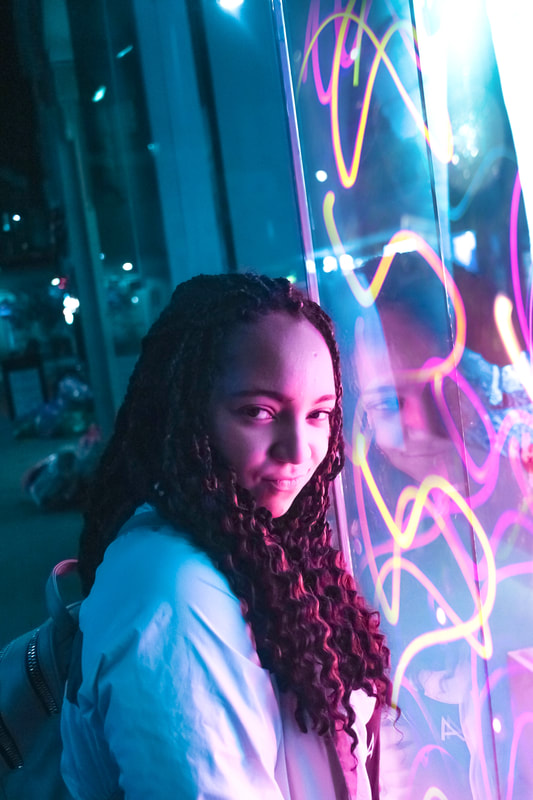
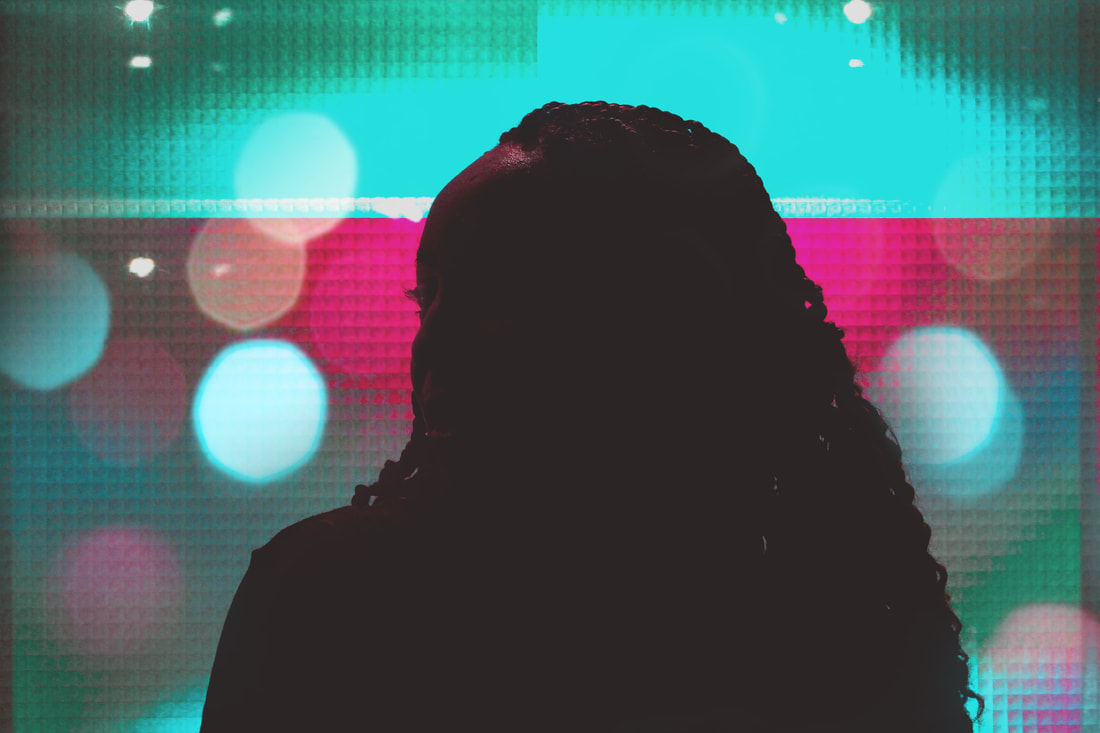
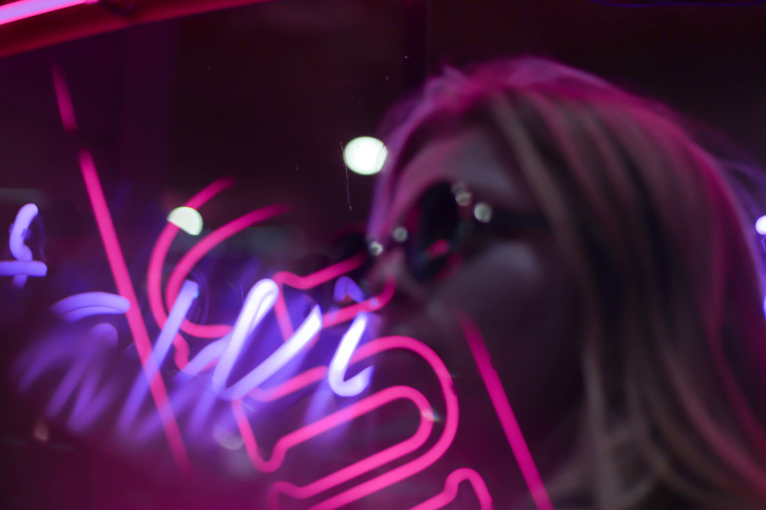
Neon Light Portraits
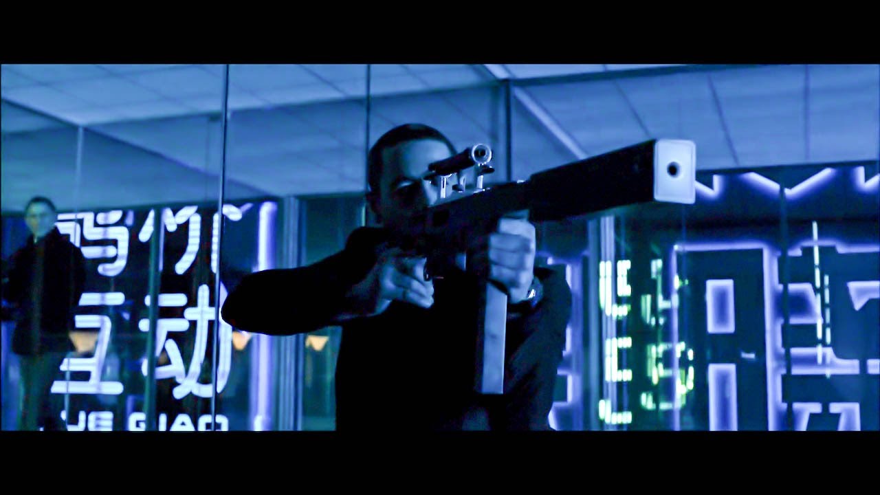
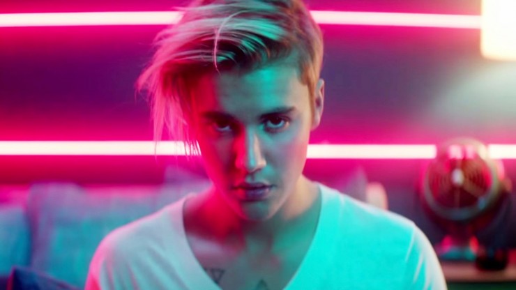
For the first development of my 'Futuristic Photography' strand, I have decided to explore the effect neon light has on the frame. I felt the need to expand on the use of colour in the previous section. Naturally, the term 'neon' ties with the idea of the future. Neon colours are said and have proven to be associated with space, sci-fi and the modern day- this can be recognised in various forms in the media industry such as films and music videos. (from the left- Skyfall film, What Do You Mean- Justin Bieber music video, Blade Runner film, Star Wars film), The use of neon helps to emphasise its futuristic elements as well as a modernist style setting, special effects etc.
Brandon Woelfel
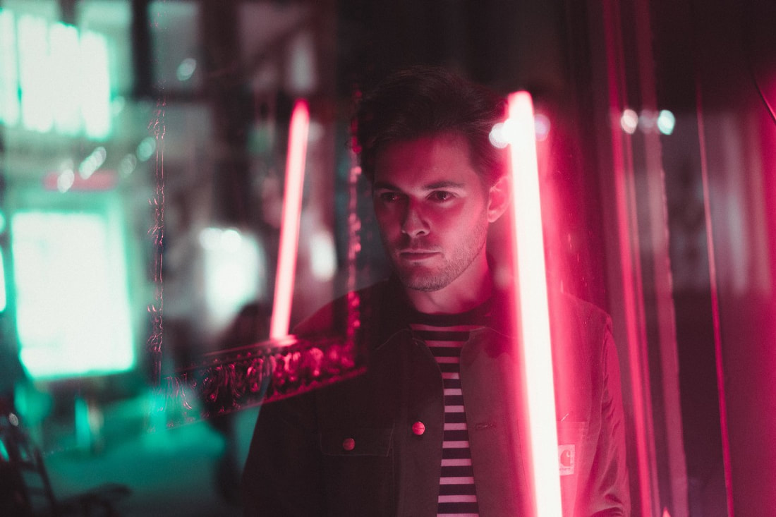
Brandon Woelfel is a photographer based in New York. He has a sensational eye for photography and in my opinion, his post production skills produce stunning pieces of art. It is said that Woelfel grew bored with taking basic portraits and wanted to 'switch it up' and use objects that you can even find around your house. He focuses and merges the idea of colour, light and reflections which is something I wanted to experiment with throughout my project. His images above come under the category of 'Neon Light Portraits'. I found this an extremely interesting style of photography to explore as I have never experimented with night time photography. As you can see from the images above, Woelfel uses the soft, fluorescent street lights to his advantage to create his photographs. They are usually positioned in the background, with the subject (model) in the foreground. In his other work, the light is directed from one side of the frame and creates shadows and highlights in different parts of the photo. Often the subject's face is lit on one side, leaving the other side in shadow/darkness. As well as this, the artist includes a little bokeh effect in post production which adds a sense of fantasy to its realistic style. After following Woelfel's art for a while now, i have come to realise that he is my favourite portrait photographer.
My Response
|
|
Selects
|
|
|
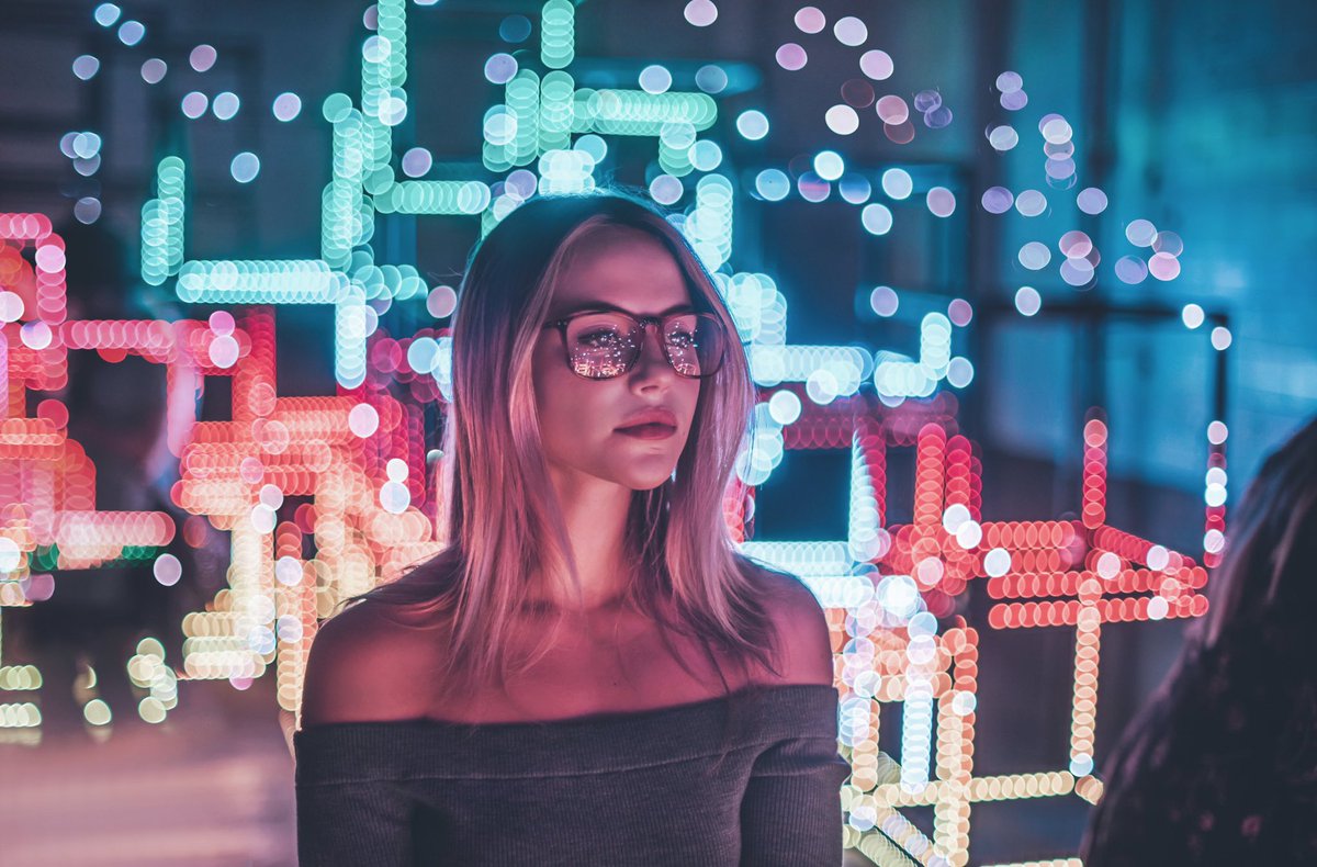
For this shoot, I went out at night with my friends to Oxford Street. We found neon light signs around town and I photographed my models next to them. I took a range of landscape (people) portraits and portraits. I altered the orientation to what I thought best fit the scene and position of the model. I believe I achieved the futuristic style of photography successfully through the use of lighting and composition. Originally, the colour of the light in some images were red. I changed this in post production by colour grading to generate more of a science fiction/outer space feel by using cooler tones- blues, purples, pink-purples in this set of images. Much alike Brandon Woelfel, I created a bokeh light effect in my photos. This was again to emphasise the photo's modernistic elements.
|
|
The Process...
(using Adobe Lightroom and Photoshop)
Development #2: Futuristic Photography
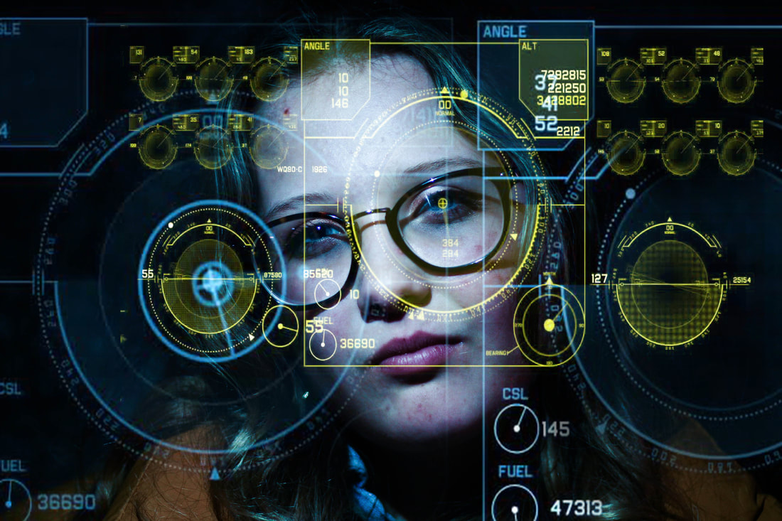
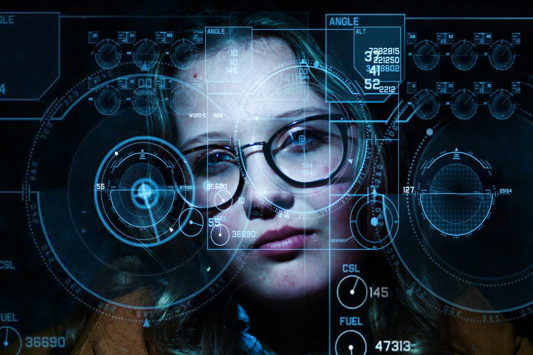
Sci-Fi HUD (Head-Up Display) Portraits
For my second development, I have decided to take the idea of futuristic photography in a different direction. In the previous development, I found the use of overlaying special effects and bokeh on my photos rather fascinating. I was afraid of and did not want to replicate my last set of images, therefore, I extracted the scientific elements (reflections) from the photographs above and translated it into my work below. I found I wanted to enforce and merge the idea of science and art together. As a result, I used my Pinterest mood board for research and came across particular scenes from Iron Man movies as shown below. However, I did not want to copy the exact format the creators used in Iron Man as I found that would seem uninteresting. Instead, I took elements from these scenes and used it as inspiration for my work below.
Inspired by:
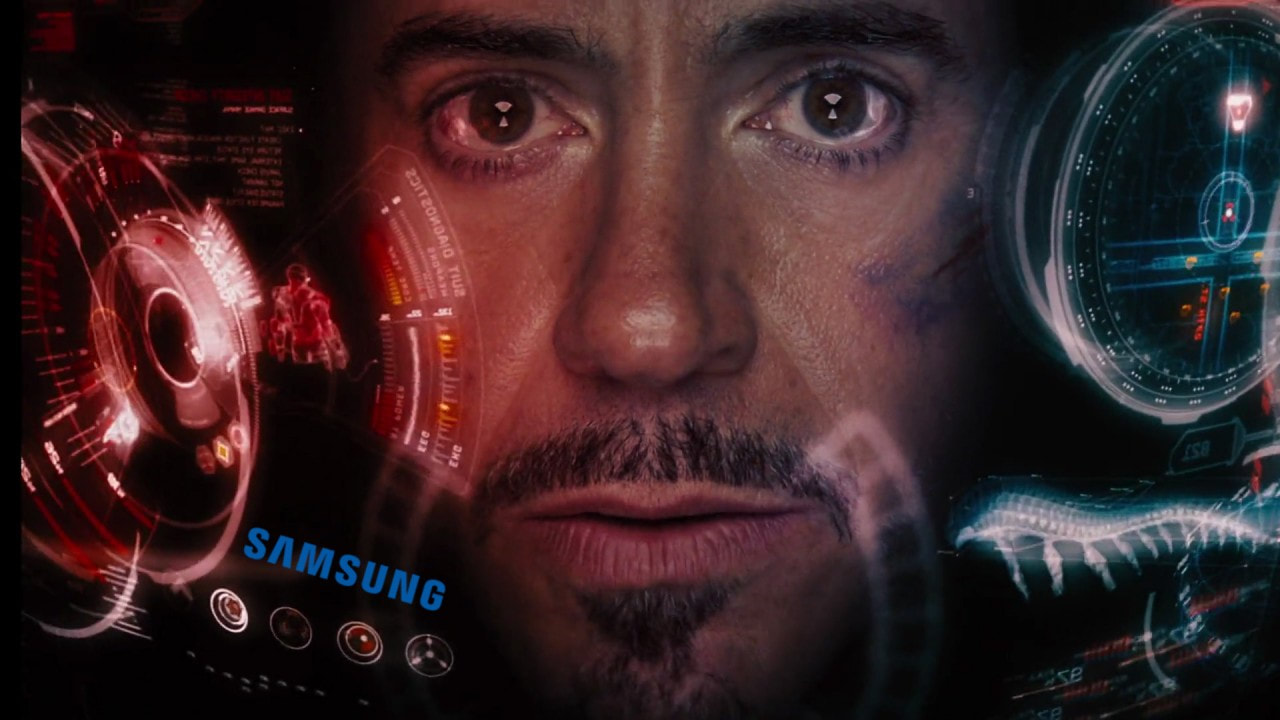
|
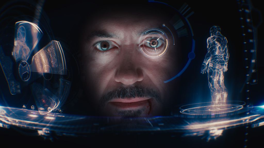
|
- Sci Fi HUD (Heads Up Display) used in Iron Man.
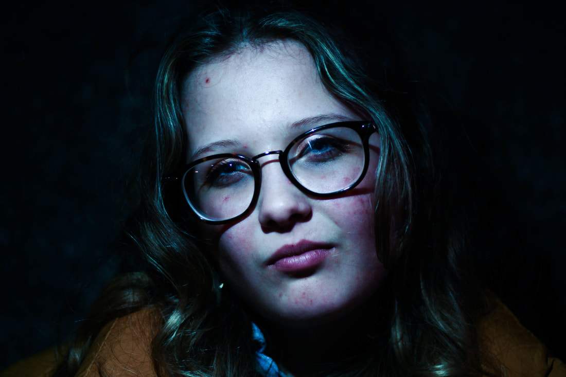
My Response
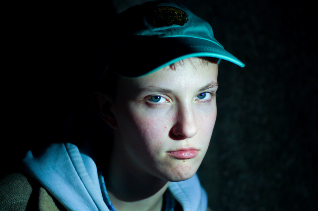
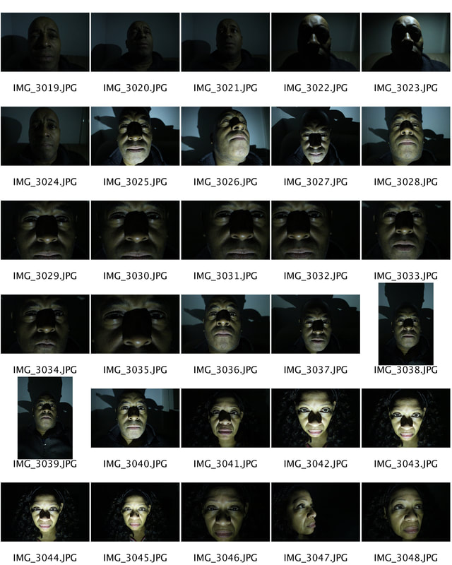
For this response, I photographed my models at night under a bridge to achieve a dark background- similar to the Iron Man images in the section above. I used a low aperture on my camera and increased my ISO slightly. Whilst taking the photo I asked a friend to hold a torch in front of the subject's face. I experimented with the direction of light (from the right, left, face-on) in order to achieve a shadow effect in different parts of the frame which created a sense of mystery or perhaps horror. This ties in well with the idea of the sci-fi genre which I have been exploring throughout my entire strand. Perhaps I will explore the effect of different coloured neon light on my subject in my future developments.
|
|
|
|
|
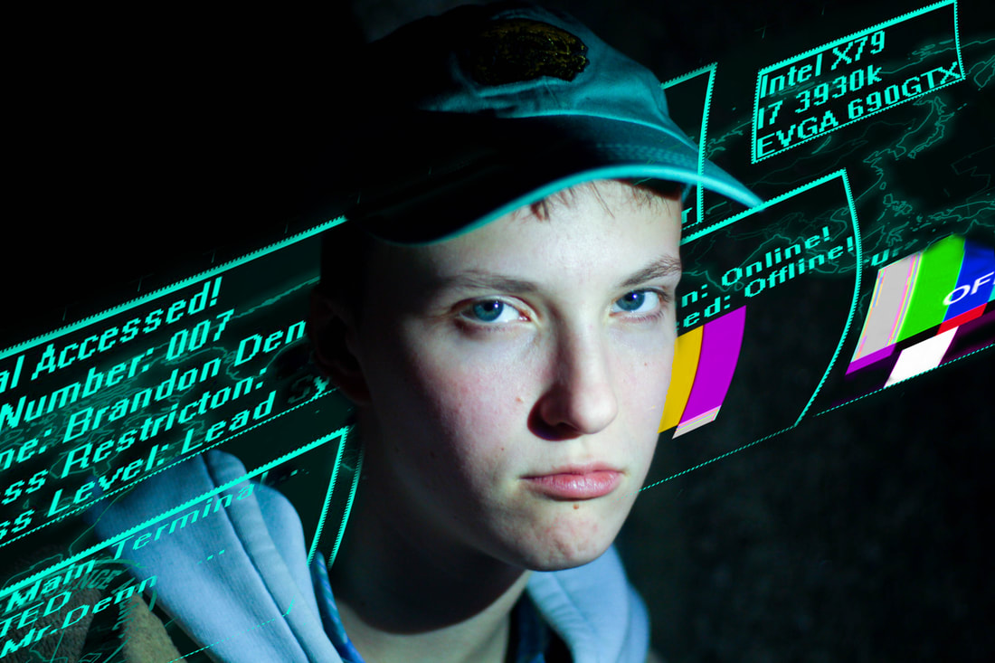
I believe I achieved a futuristic look within the above images by including scientific dials and diagrams. I made sure to position my subject in accordance with where I want the overlaying image to go. To make my pieces look more realistic I changed the colour of the light on the subject's face to compliment the colour of the diagram. Eg. I made the diagram pink and used the colour balance to give the light a pink/purple tint. This suggests the idea that the light is reflected off of the overlaying image. I used the manual focus setting on my camera to make sure my subject stayed in focus at all times. I experimented with the model's angles for variety- side angles, closeups, mid-closeups.
The Process...
(using Adobe Lightroom and Photoshop)
|
|
|
Development #3: Futuristic Photography
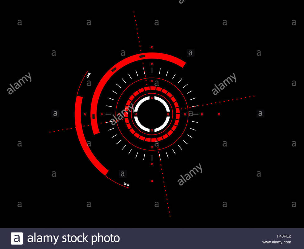
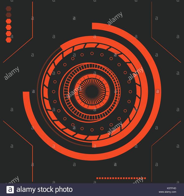
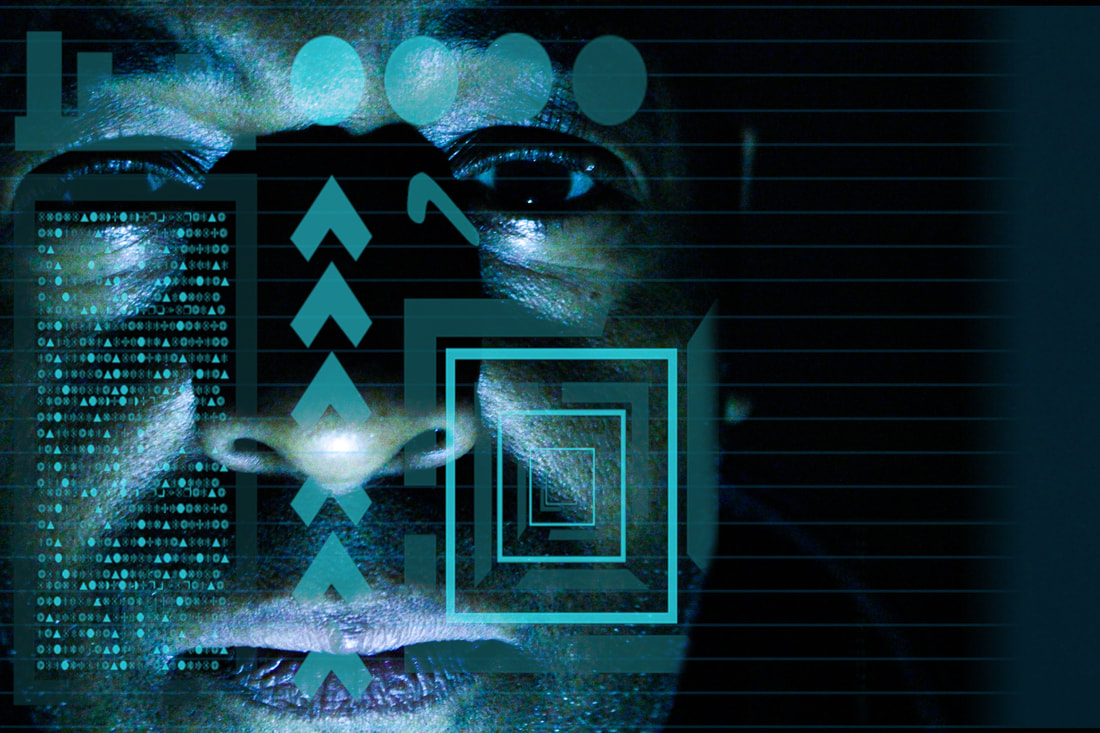
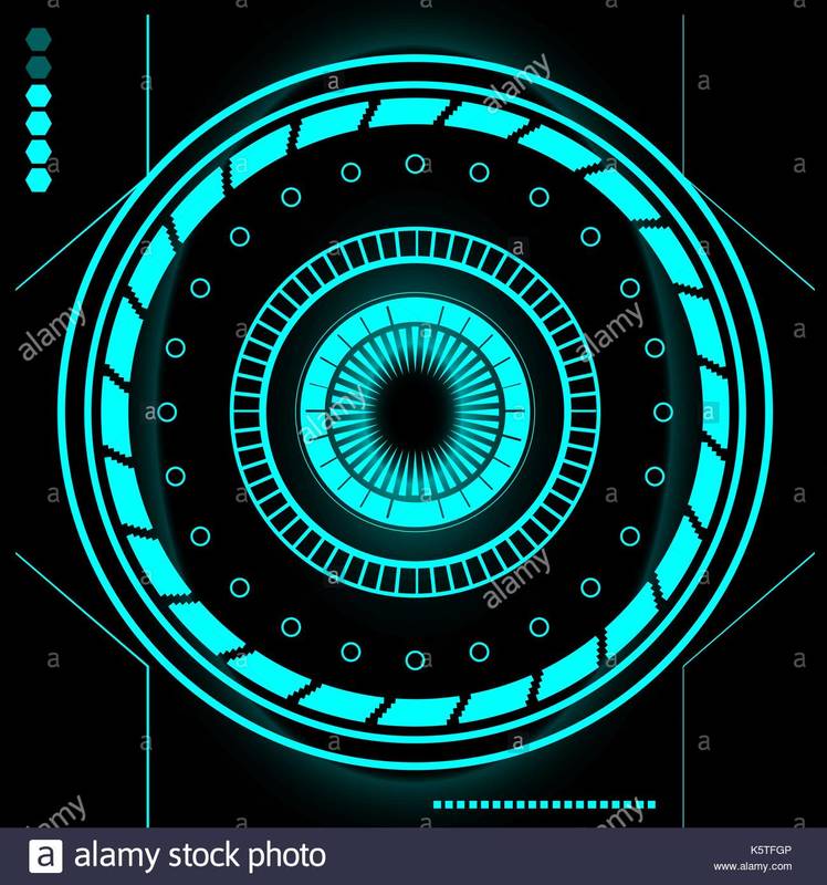
CONTINUATION: Making My Own Scientific Dials and Diagrams
For my third development, I have (similar to my last development) kept the same idea of taking closeups of people and applying scientific diagrams to them in photoshop to stick with my futuristic theme. I have begun to create my own dials and diagrams through using shapes, lines and numbers within my work. The images below helped to inspire the shapes I could create. It is almost as if they are targets which I thought was quite interesting to include in my work. It also gave me ideas on what colours I should use- bold, vivid colours- it grabs the audience attention and again links with the futuristic idea.
Mood Board
Inspired by:
Chris Forsyth
I found the work of Chris Forsyth extremely helpful throughout my research. I felt that Forsyth's style of futuristic photography portrays an animated, virtual looking location yet, it also has its realistic elements. His work suggests that this could be the future and makes the audience think. This is something I would like to achieve in my own work- something that for the moment seems surreal but is likely at some point to become reality. I can also appreciate the use of lines within his photos. In films, books and music videos the future is represented as being very structured in its architecture and societies. I felt this could be a reflection and direct reference to that. Bold and vibrant colours are used throughout his work perhaps to present his optimistic views on the future.
My Response:
Here, I have created my own scientific diagrams and have layered them over the images I have taken of my models above. I found this development interesting to undergo as there were a multitude of diagrams I could include in my work. Before each edit, I would check the original photograph and plan where I would place them on the subject's face. A little plan before each edit enabled me to stay on task and not go overboard with designs. I took these photographs at home with the lights off. I directed a torch at the model's face and experimented with the direction of light.
|
|
Making the diagram in Photoshop
|
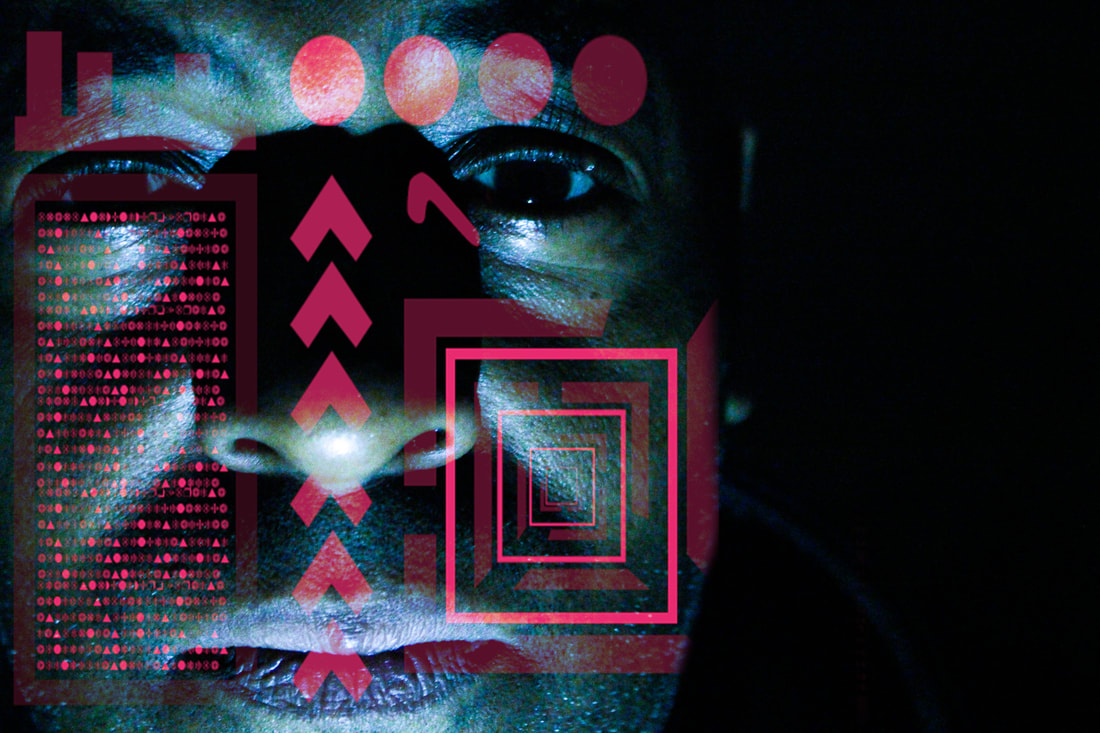
Artist & Me
|
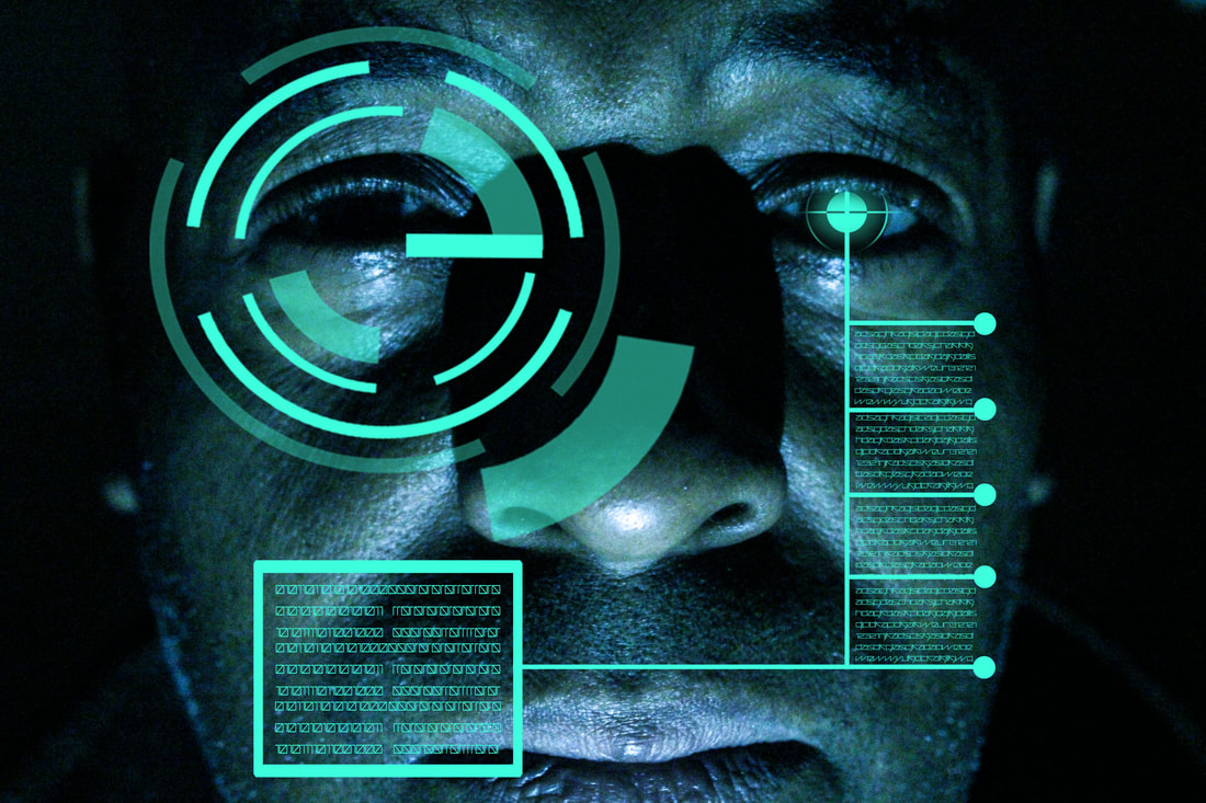
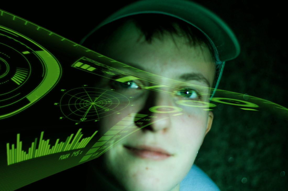
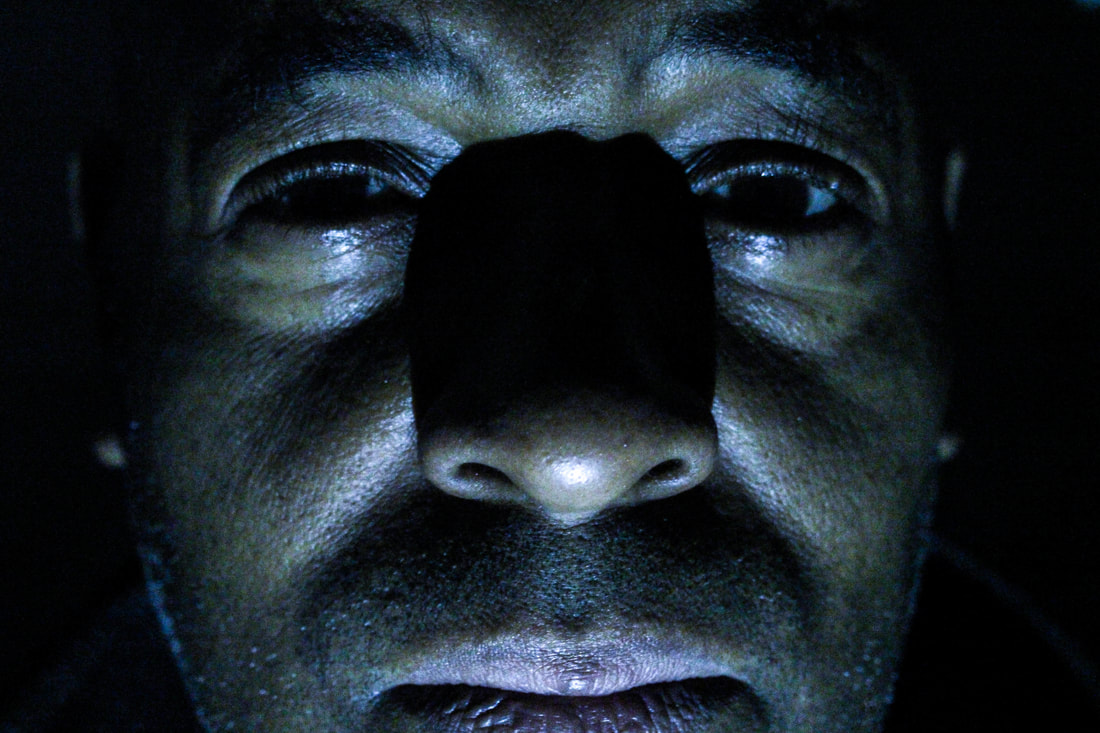
Much like the image on the left, my aim was to produce a cyber looking hologram over my image. I felt this was achieved successfully. I experimented with opacity levels in photoshop which made the diagram look more 3D and essentially more realistic. The artist's image has a circular shape over the eye of my model. This could suggest she is being analysed or targeted. On the other hand, it could be interpreted that she is a robot undergoing scientific procedures. Similarly, I have achieved this effect in my image also. I chose to include random text over my image which could be interpreted as data or coding. The artist's work has captured more of the subject's body than I have in my image. I felt the need to use a closeup to present a sense of intimidation in the eyes. The black background helps to portray this feeling of mystery and darkness.
|
|

|
The Process Of Making The Diagram
(Using Adobe Photoshop)
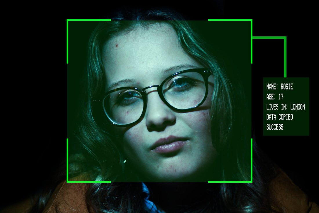
In this photograph I decided to use scientific looking diagrams to present information about the subject. I felt my images needed more purpose rather than incorporating random dials. This was accomplished by giving the overlaying text a meaning which provides the audience with a backstory into the photo. The image replicates a kind of fact profile which I thought was interesting to have in my work. It suggests the idea of our personal information being held by data technology.
Development #4: Futuristic Photography
Sci Fi Technology and Surveillance
At this point in my development, the link to 'secrets, codes and conventions' I feel has shifted slightly. I feel that it is less about the idea of the future holding secrets and mysteries but more about following the conventions of the sci fi genre and its futuristic technologies we witness in modern film and tv such as Ex Machina and Black Mirror. This will be carried out by overlaying hologram looking layers whilst continuing to use my scientific diagrams. For this development, I have decided to dive deeper into sci fi technologies and direct my focus onto security and surveillance. I suggest the idea of government being able to name and locate individuals with the advance in technology.
Inspiration
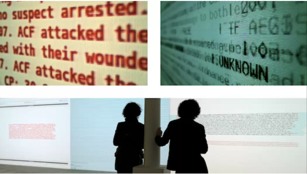
Sami Emory
|
Sami Emory is a freelance writer and editor based in Berlin. In this task he explores the intersections of surveillance agencies and operations with civic rights and privacy. I took this as inspiration as it made me think of what text I could use in my own work as well as the font. Graphics play an important role in my images as they add more depth and meaning behind the frame. The phrase 'Unknown' is mentioned in the artist's work on the left, which inspired me to use the word in my own pieces.
|
My Response
For this response, I used images from my surveillance strand to work on. I applied subject specific terminology relevant to security and surveillance to my work which make them more exciting to view. As well as this, I decided to make graphs, loading bars, menu bars and targets to illustrate to my audience that my photographs take place in a future society. I captured these images in Camden on a fairly quiet day which enabled me to get varying shot types- individuals and crowds. The photos with fewer/one individual(s) could be presented as isolated and vulnerable to surveillance.
I felt the need to make my photographs black and white as it follows the conventions of CCTV. I made sure to experiment with angle types (wide angle, bird's eye) in order to place the audience in a space where they are in the point of view of a stalker or surveillance camera. As well as this, in my second image I have included some personal information about the subjects in the frame- this could be the future of CCTV.
The Process
(Using Adobe Illustrator and Adobe Photoshop)
|
|
Development #5: FUTURISTIC PHOTOGRAPHY
Sci-fi Technology and Surveillance
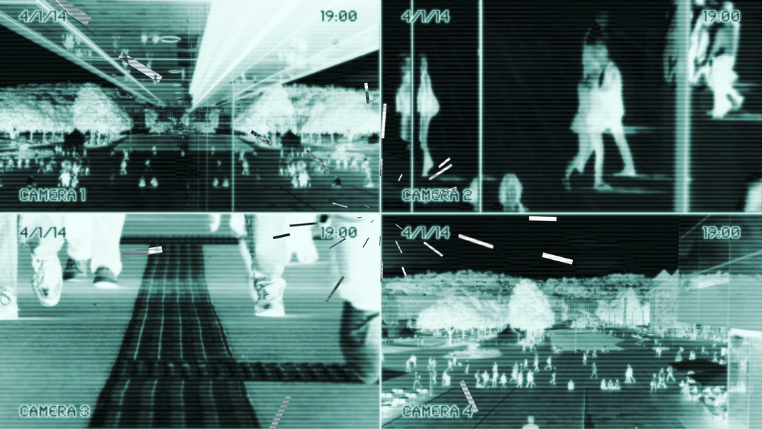
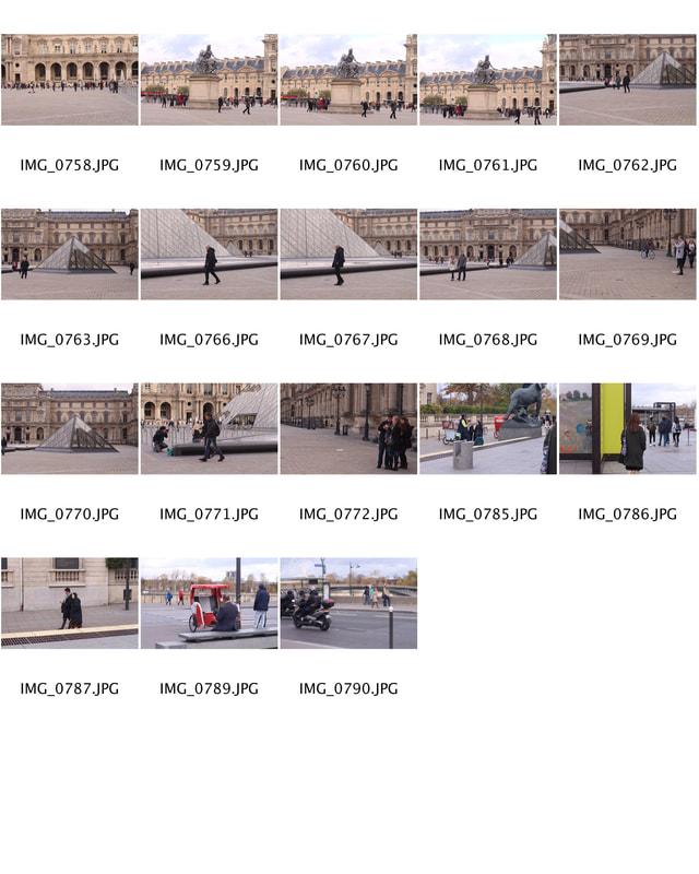
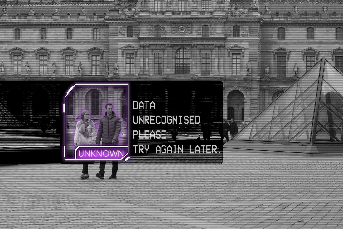
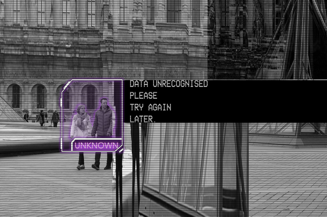
In the below section I have continued to make more images using a new set of photographs I took in Paris. I captured images of people at The Louvre, on the street and the Arc De Triomphe Du Carrousel- again promoting the idea of everyday life being altered by technology. I continued to use black and white images to further express the CCTV aspect.
|
|
|
|
|
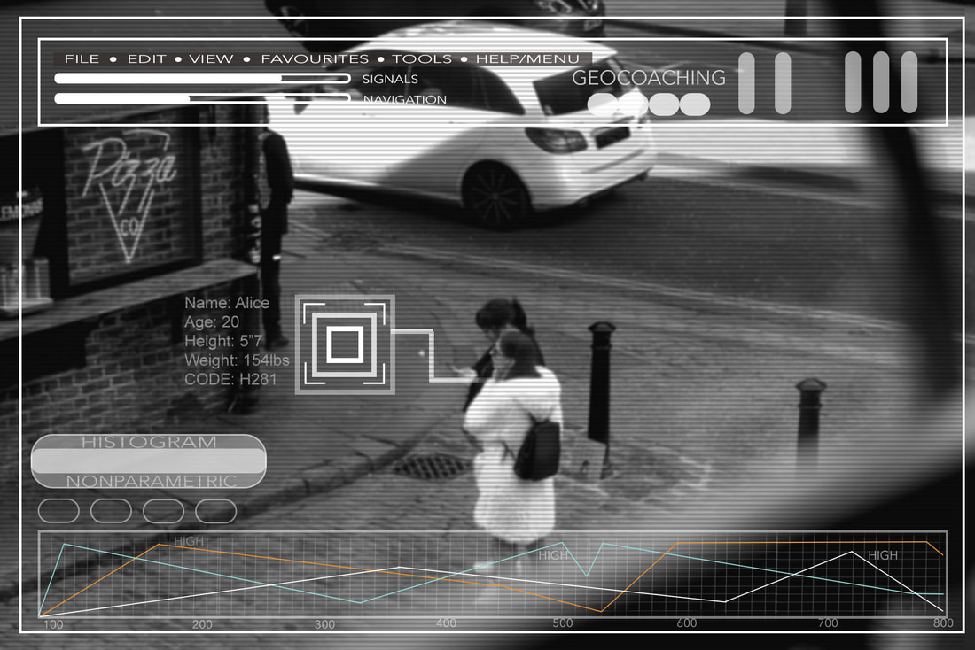
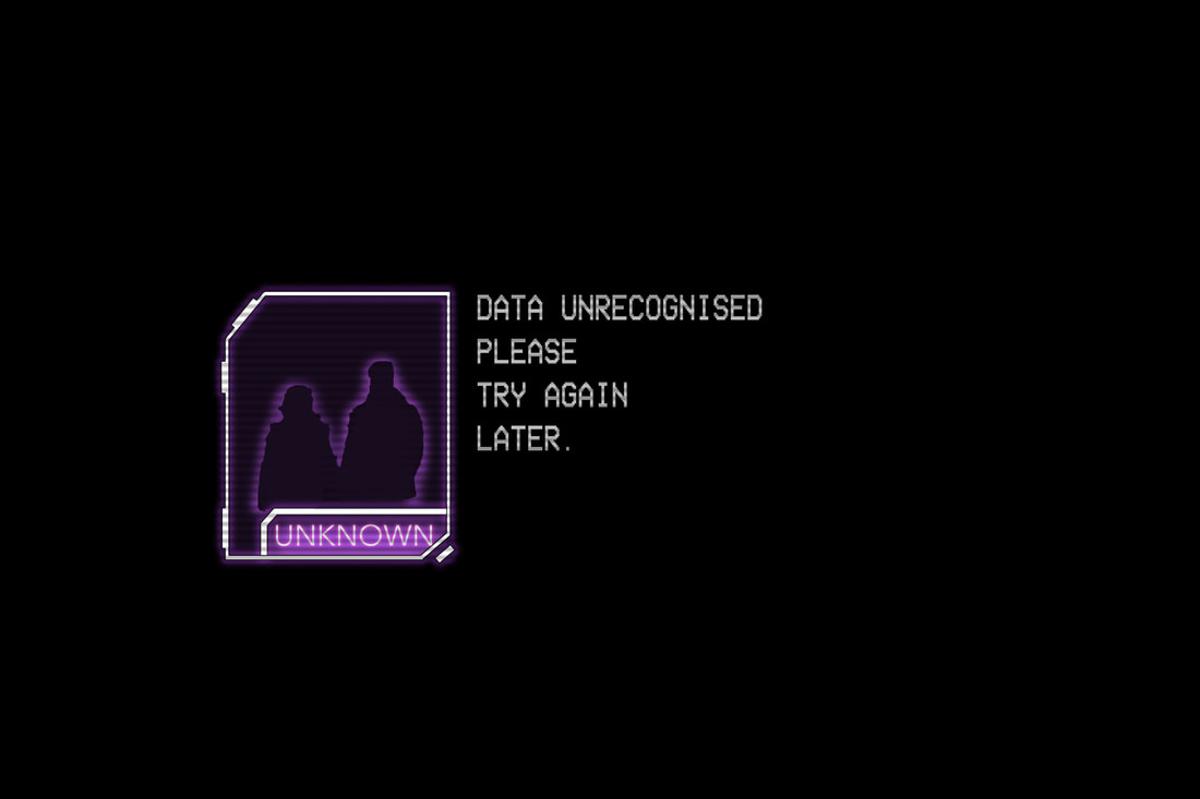
In these compositions, I created an sd card-like diagram to identify the subjects in the frame. I used an outer purple glow effect around the outline to make the target stand out as well as shadow where it says 'unknown' in order to create a 3D button effect. I found it appropriate to use an SD card within my images as they hold literal data which links to my idea of futuristic, sci fi and surveillance photography. I also added a purple glow around the people to make it obvious to my viewer that they are being selected or analysed. I find it intriguing by the fact that they are the only people in the foreground of the frame, suggesting they are the main suspects. It creates a sense of isolation and direct aim. Within the text, I included specific discourse relevant to my theme such as; data unrecognised and unknown as well as, the stereotypical text one would find on a corrupted computer "Please try again later". I altered the brightness of the image to make it darker to create a more mysterious looking piece.
|
|
"Do you trust future technology with your personal data?"
FINAL PIECE: FUTURISTIC PHOTOGRAPHY
SCI- FI TECHNOLOGY AND SURVEILLANCE (continued)
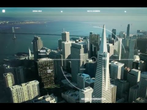
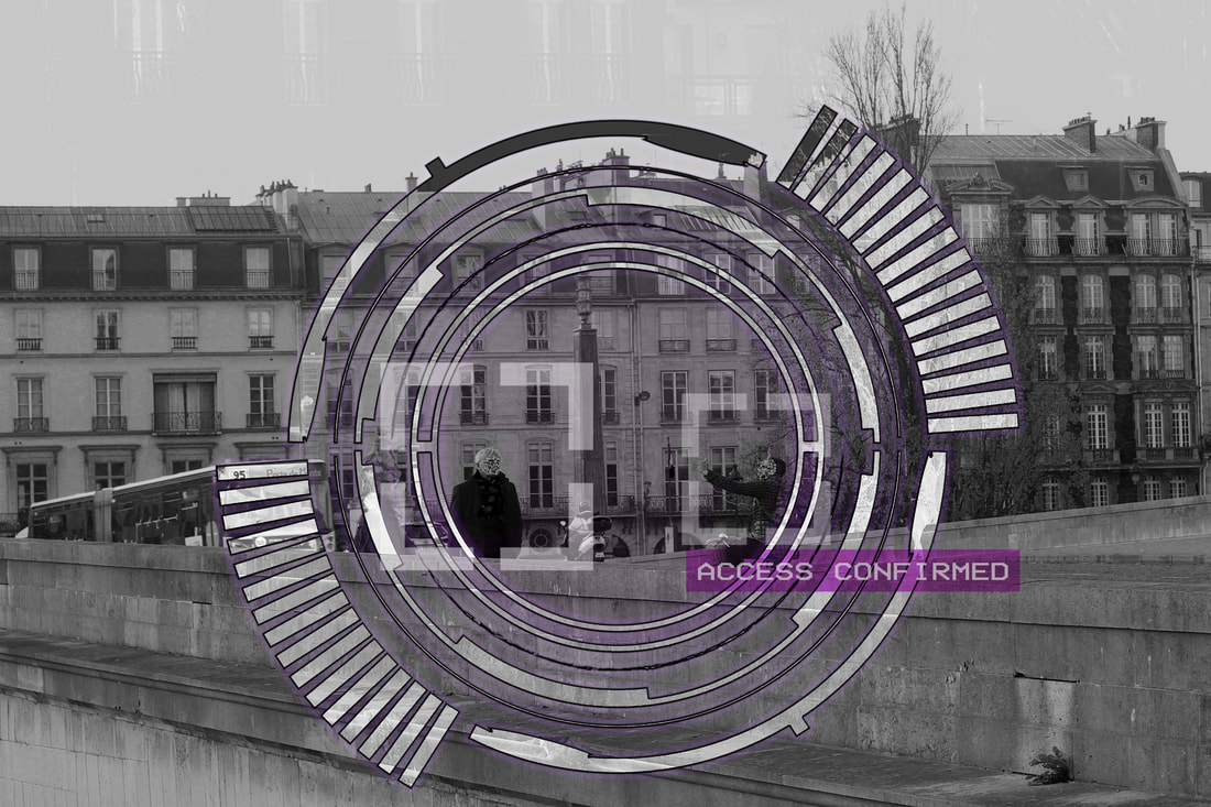
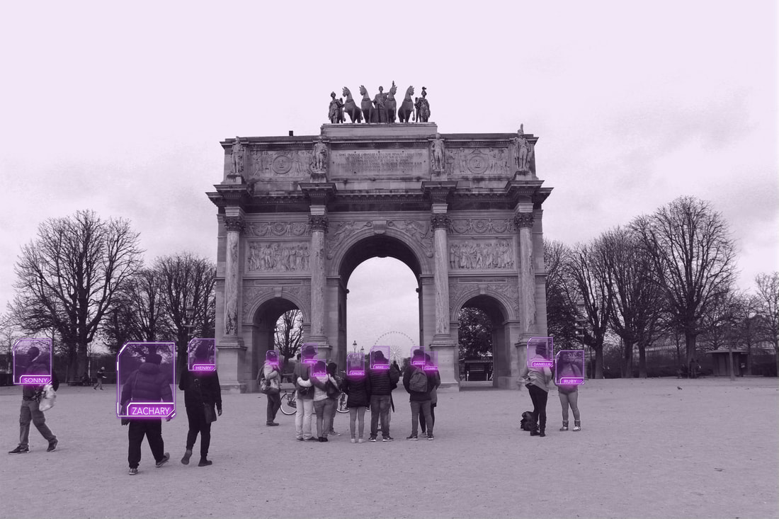
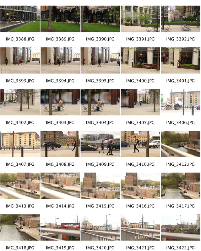
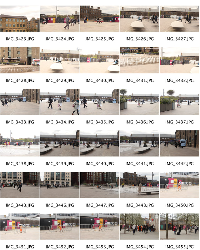
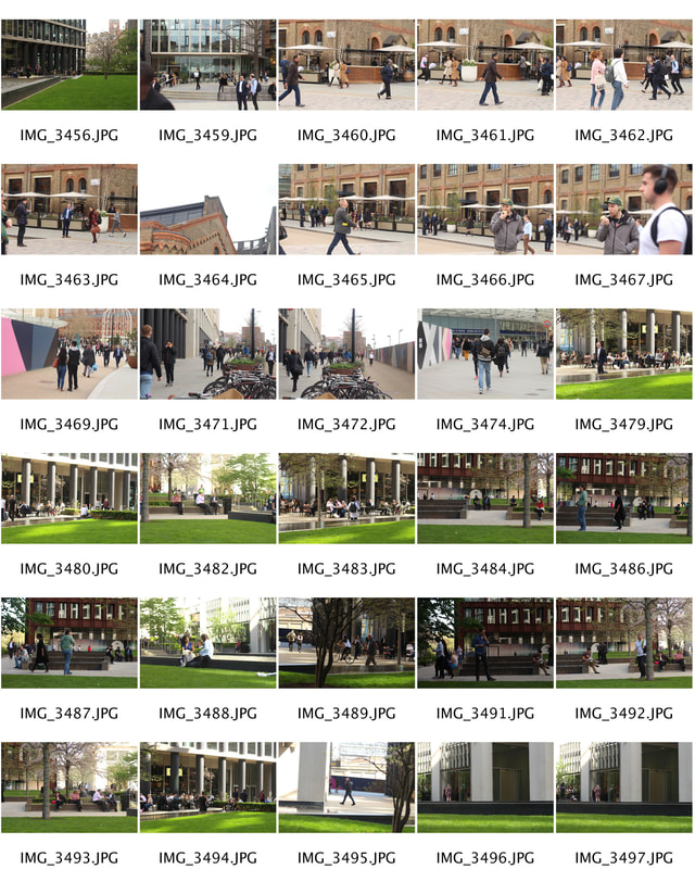
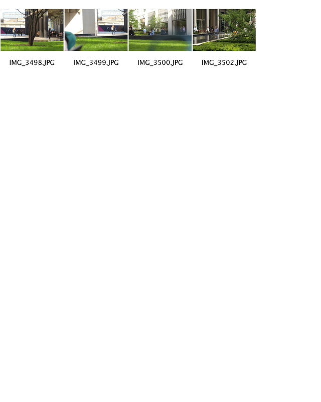
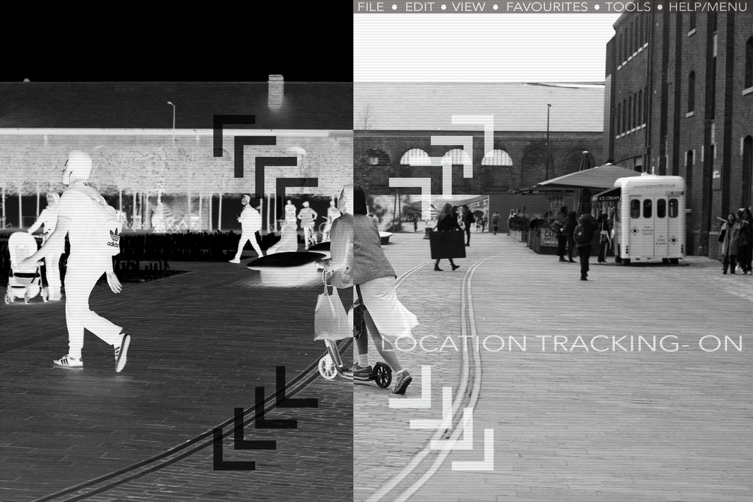
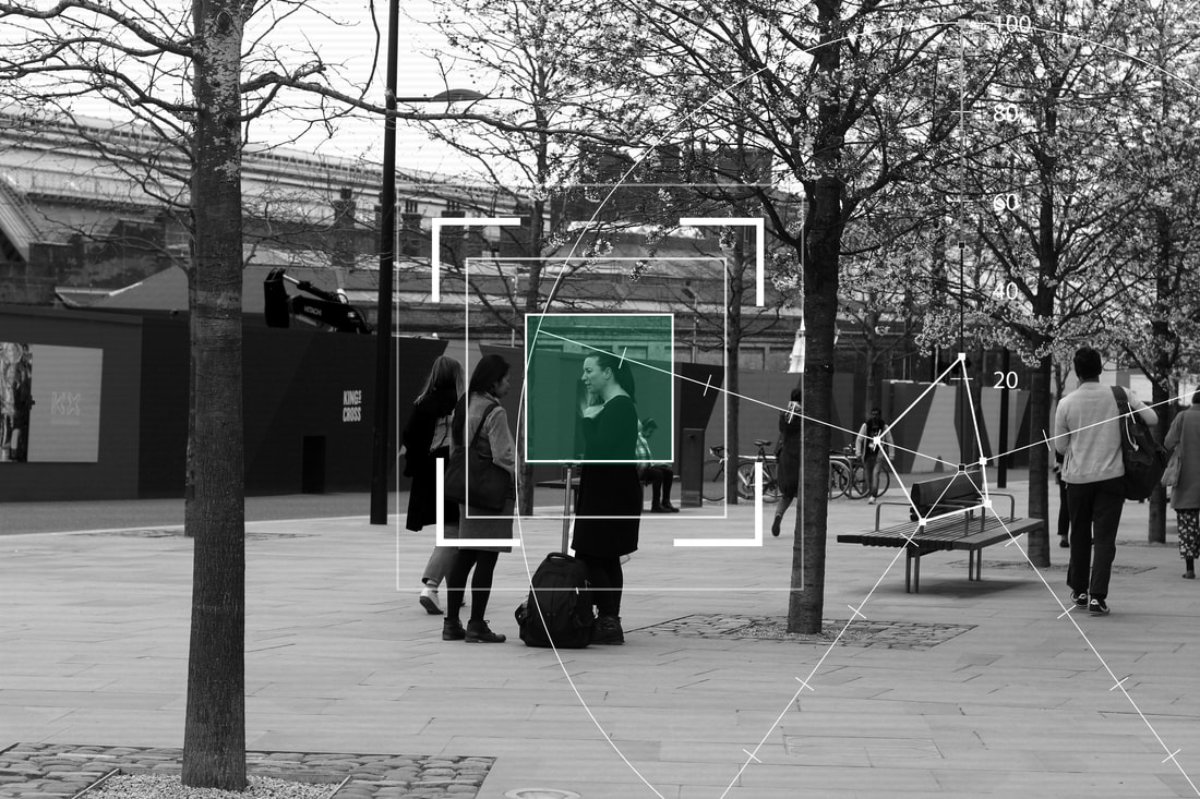
For my final piece, I have decided to continue with the theme of sci fi technology and surveillance. It is as if the camera can find out so much about a person in just one click of the shutter. The photos below were taken in King's Cross, near UAL (University of The Arts London). Therefore, it was rather busy at times which I felt benefit my pieces as it enabled me to capture a variety of people. My final project revolves around artificial intelligence and surveillance. The work below suggests the idea that we, as a society are constantly being watched and analysed by a greater force (ie. the government or perhaps the supernatural). I felt this was an intriguing topic to explore as it is so relevant to today due the increasing advance in technology. I explore the idea that people are being tracked or their personal data has been stolen. This is accomplished through the use of text, diagrams and composition which conform to the conventions of the science-fiction and futuristic genres.
Inspiration


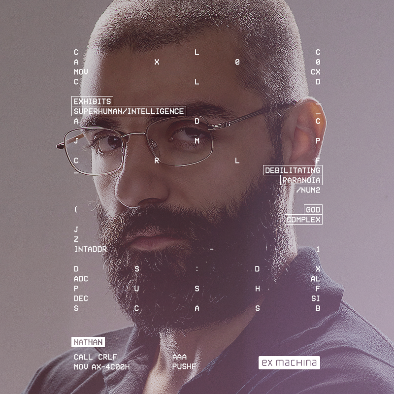
Inspiration: Ex Machina Film
|
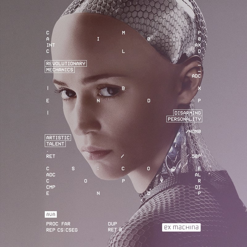
|
Ex Machina is a science fiction film set in the future based on a man and his self built robot. Although my work does not necessarily relate to these photographs below, I was intrigued by its use of graphics and text around the page- which is relevant to my pieces. Similar to what I have tried to include, the photographs display text in boxes, specific (most important) words are highlighted, there is a sense of line structure in regards to where they have placed the text. I found Ex Machina's promotion posters to be useful and I kept it in mind throughout my project.
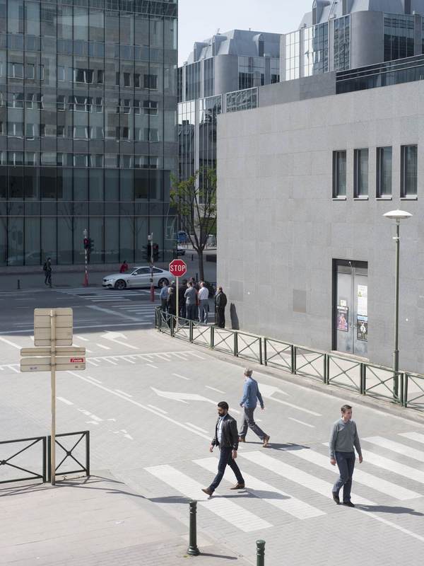
My Final Response
Most of my images leading up to my final piece have used close up shots of my subjects. I decided to change this for my final project due to the fact you can find out so much more about a person from their whole body language. Therefore, instead of closeups I chose to photograph people using mid-shots and wide angles. This also replicates the view of a CCTV camera. Using wider shots allowed me to express the landscape the people are being photographed in. I have used everyday locations such as the street, outside cafes, by a river etc to suggest the idea that this technology could have this type of impact on our everyday environments in the near future. -What was considered 'the surreal' is likely to become our reality. I aim to merge the conventional, every day situations with the futuristic.
|
|
|
|
Artist&Me
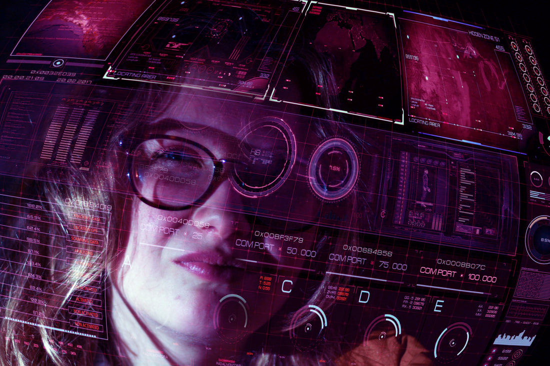
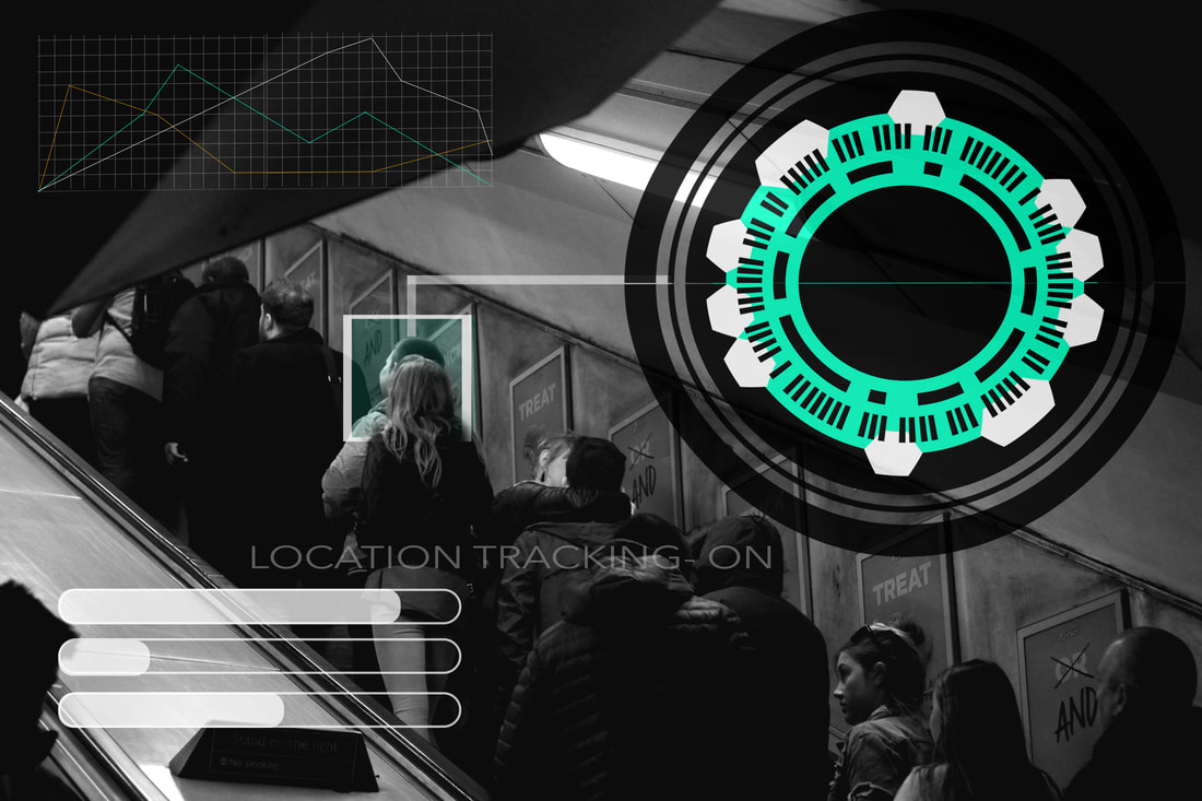
Esther Hovers' project (left) 'False Positives' is about intelligent surveillance systems. These are camera’s that are said to be able to detect deviant behaviour within public space. False Positives is set around the question of normative behaviour. It aims to raise this question by basing the project on eight different ‘anomalies’. These so called anomalies are sign in body-language and movement that could indicate criminal intent. It proposes a question to the audience over whether intelligent surveillance help us to safeguard our need for security.
Esther Hovers |
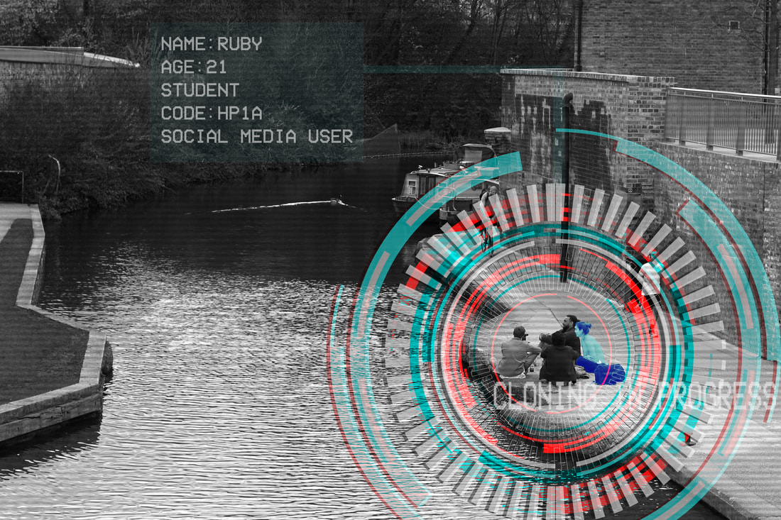
As soon as I looked through Hovers' project, I immediately noticed her constant use of wide angle shots. I found this interesting as I have used mainly wide shots for my final pieces (ie. the above image). I felt this was necessary as the audience are unable to gain knowledge about the people in the frame as it is hard to tell their facial expressions, in some cases hard to tell what they are doing or where they are going/whether they have good intentions. In my photograph above you cannot see the subjects' faces clearly at all. This adds tension and promotes the idea of hidden identity. This links to Hovers' idea of surveillance and deviance. Similarly, both images present a bunch of people in every day places (street/by a river). In my piece, the effect of this brings elements of reality to what looks like a seemingly unreal setting (due to the holograms).
|
|
|
|
There is a specific process for each photograph depending on the pattern or diagram. For most of my work I used both Adobe Photoshop and Illustrator. In some cases I used Lightroom. For these images I followed the same process as shown in the above section (Development #4). Please click on the images to make them bigger.
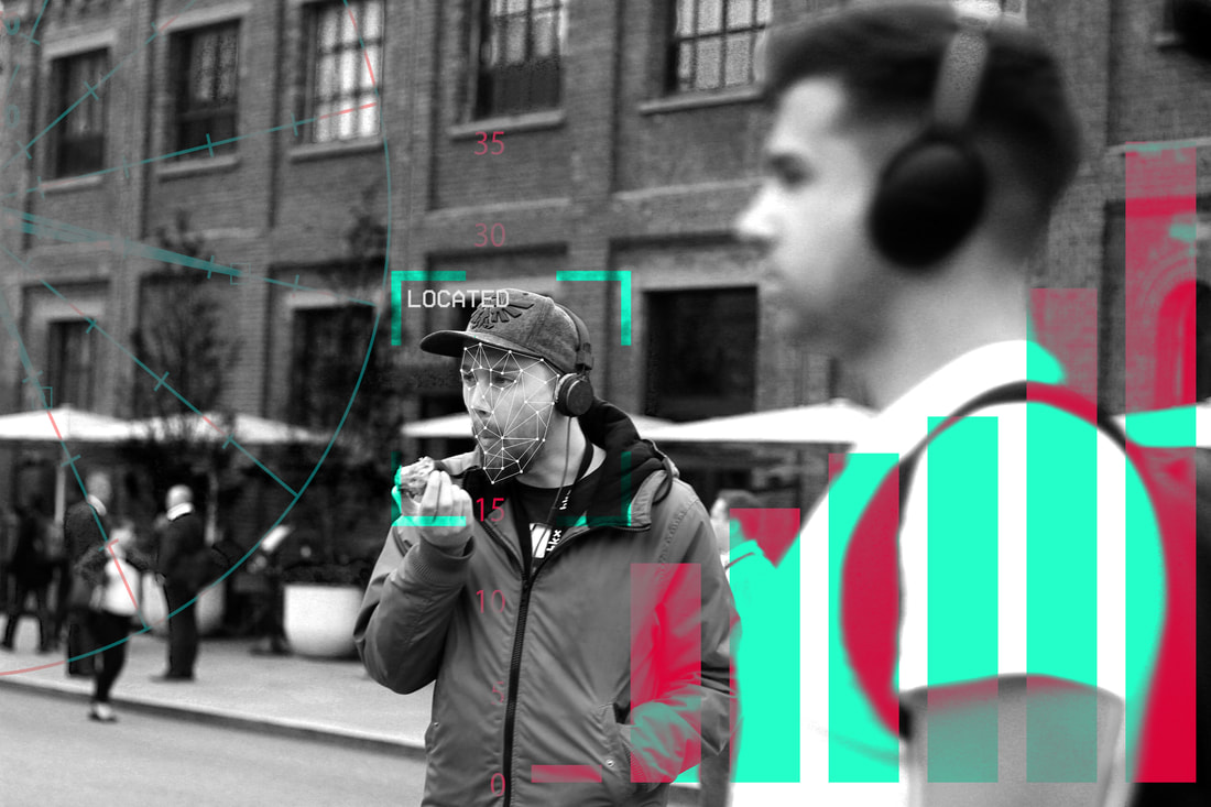
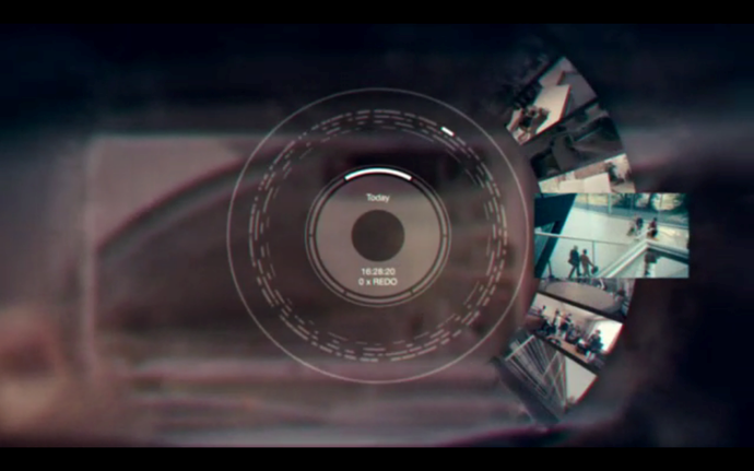
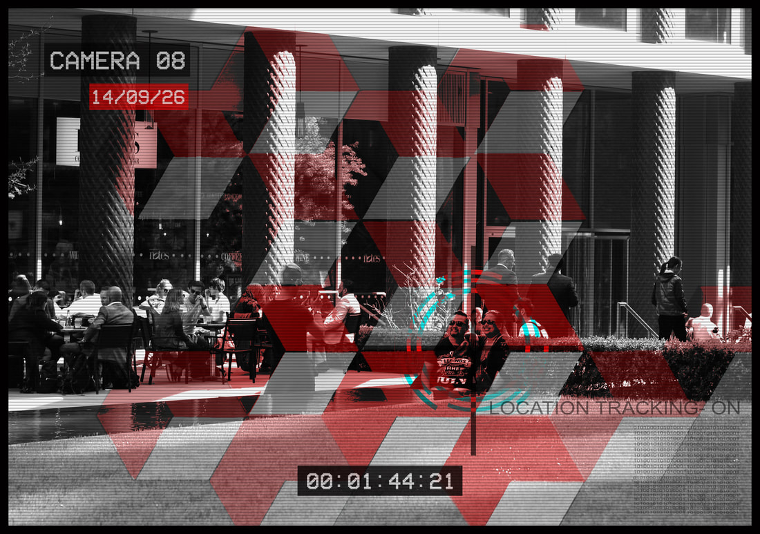
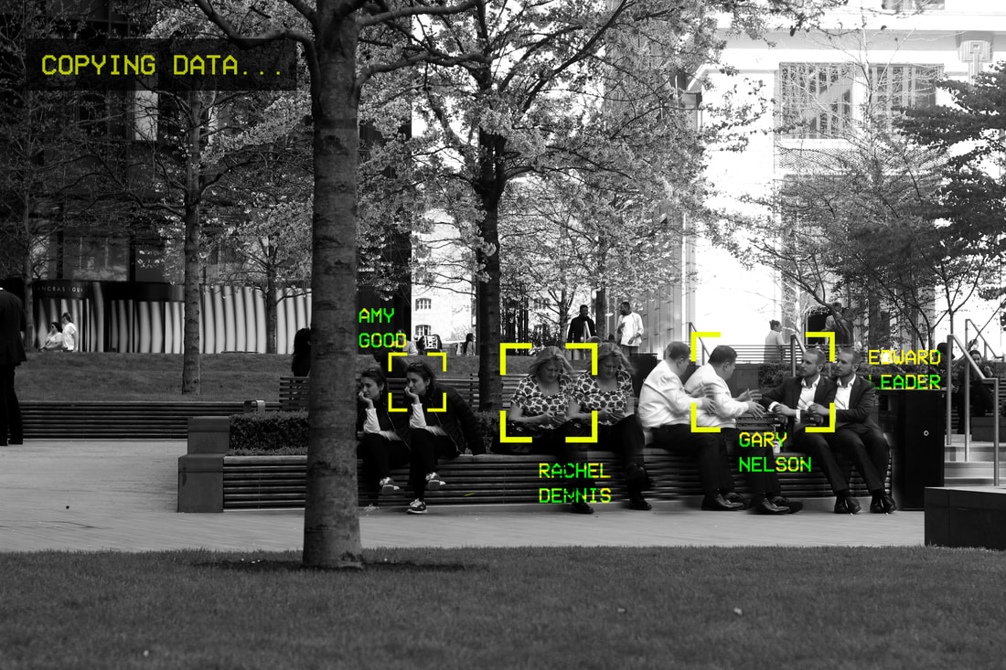
I felt this was one of my favourite pieces out of my collection. I love the contrast in colours between the ominous, dreary black and white and the more vibrant, uplifting reds and greens. I felt I achieved a holographic effect successfully through the use of bar charts, numbers and tables. I used text displaying "Located" to suggest the idea that the person is being tracked through an artificial intelligent technology. I found that using subject specific terminology was crucial within my final piece in order to make my work realistic (for the genre). Therefore, I used terms such as: tracking, copying, data, code and user. I thought i'd photograph a man eating an apple and use him as a 'located subject' because the action is such an everyday occurrence and is considered 'the norm'. My photography challenges this convention by incorporating futuristic signs and symbols- which is not considered normal. I tend to forget that there are in fact two people within the frame as I aimed to focus on the man eating the apple. It could be interpreted that the other man is blurred and out of focus as it relates to the idea of 'missing or hidden identity'.
Alternative versions of the images above:
|
|
Screenshot of the pattern/target I made in Adobe Illustrator.
|
I like the idea that each photo from my previous set of images are completely different and holds a different narrative which the audience are able to depict for themselves. My work is open to interpretation which I think makes them even more interesting. In conclusion, I feel I successfully made a collection of work under the theme 'Secrets, Codes and Conventions'. For my final pieces I used more close up portraits to make exposing the identity of the subjects even more evident.
