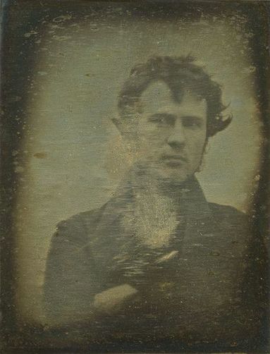
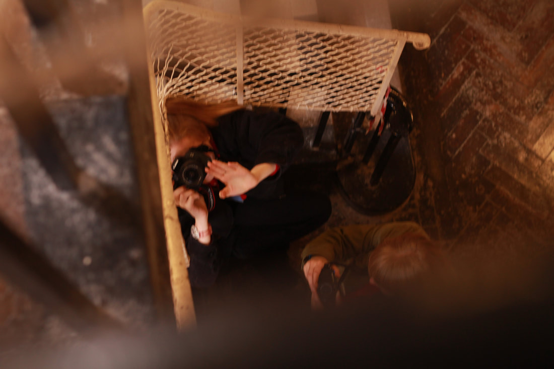
THE SELFIEThe first ever "selfie" was made in 1839 by Robert Cornelius. Since the 2000s selfies have become more popular over the years. The current obsession with photographic self-portraits (selfies) can be traced back to the origins of photography. Some suggest "selfies" are a form of art, others however, dislike the use of them on social media. Personally, I do take quite a lot of selfies with my friends. I think selfies are great ways of capturing great experiences/maybe bad experiences too? In my opinion, I believe selfies have become popular because of..
the increase of people with smartphones (with cameras). This makes the "selfie" process more accessible for the younger generations especially. I do not believe there are any "rules" to taking selfies. Yes, there are the typical facial expressions which can come across as boring and unoriginal. Though, I find taking a more original selfie looks more interesting and appealing. These abstract selfies (in my opinion) can include the obscured, the shadow selfie, selfies that project unrealistic proportion of scale, underwater selfies etc.
|
|
SELFIE ARTISTS
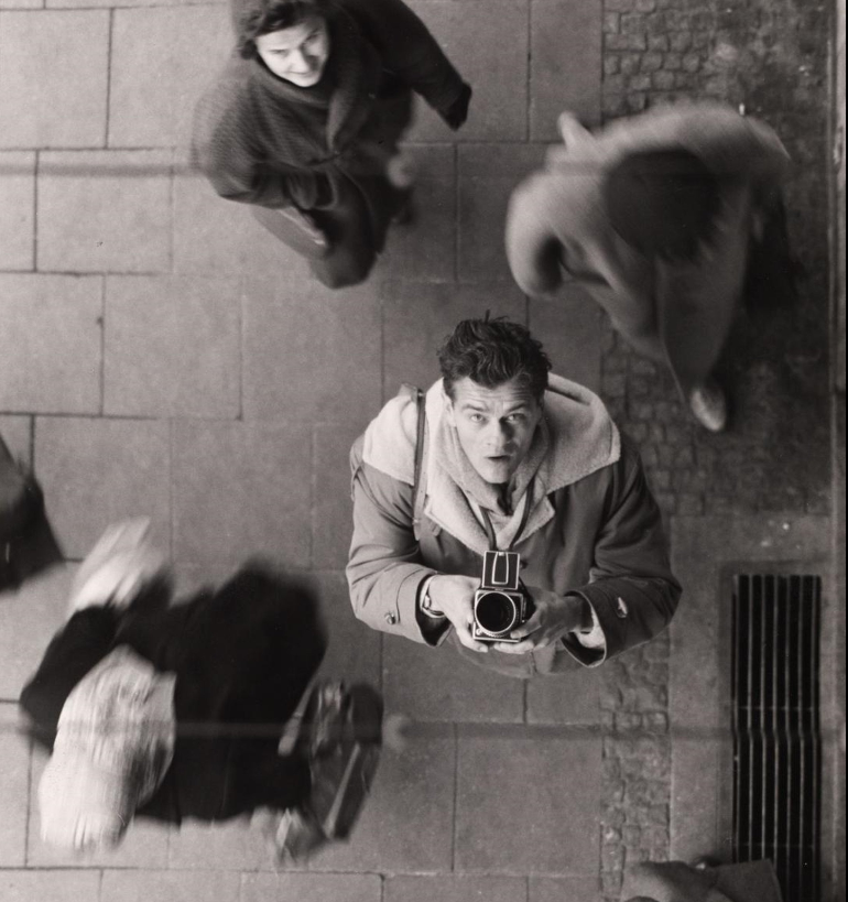
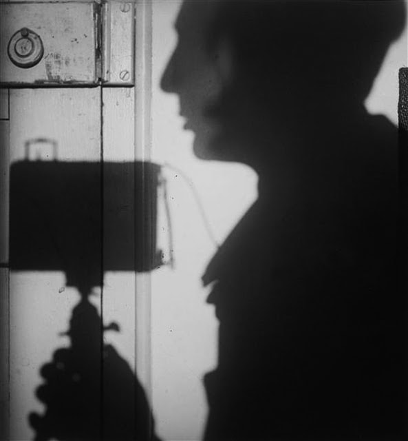
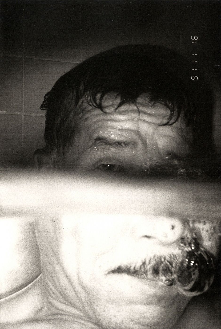
Artists who helped inspire my work include these above: (from left) Peter Keetman - Self-portrait with camera, André Kertész - Self-portrait, Paris, 1927, Masahisa Fukase - Bukubuku, 1992. I particularly like these forms of selfie as they are rather unique and defeats the stereotype associated with the word 'selfie'. It is almost as if each picture shown above carries its own story behind it. It is as if each image has been carefully constructed to display a certain emotion or meaning, unlike the typical selfies we see on social media nowadays. In my opinion, the photographs above do not display a sense of balance. I like the contrast between the highlights and the shadowing .
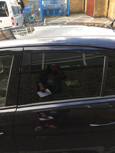
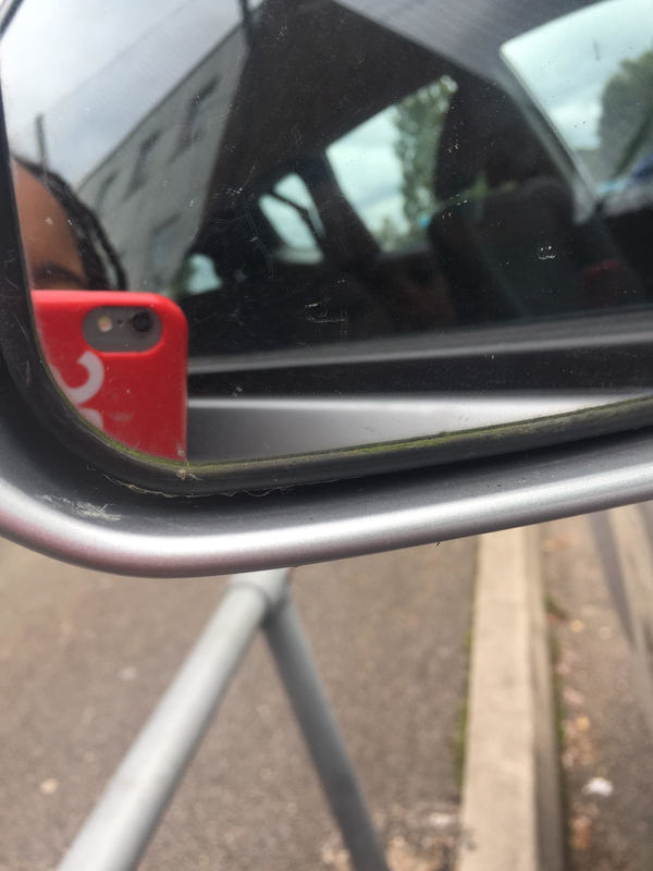
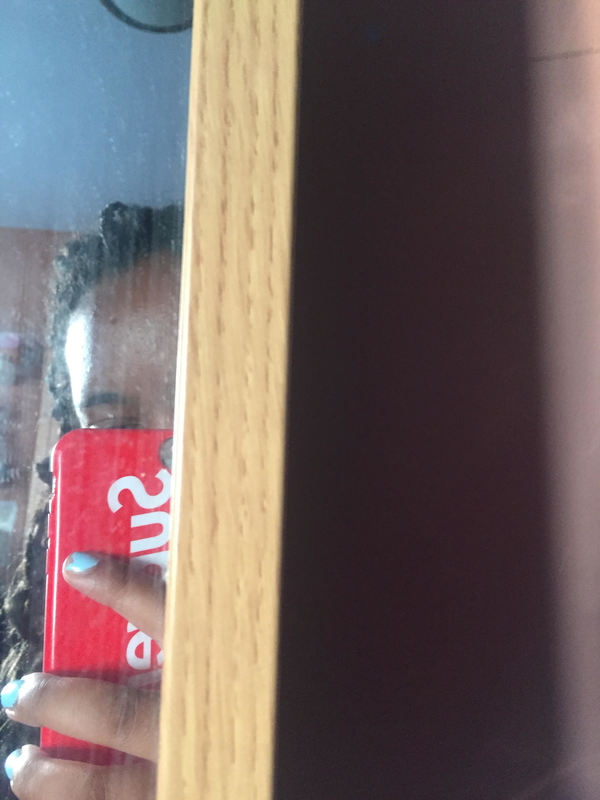
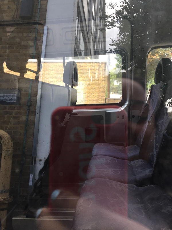
The Reflected Selfie
Here, we experimented with selfies by taking pictures of ourselves in a reflective surface, such as: a mirror or a window. This I found worked successfully as it achieved an interesting, almost abstract look.
|
|
|
|
|
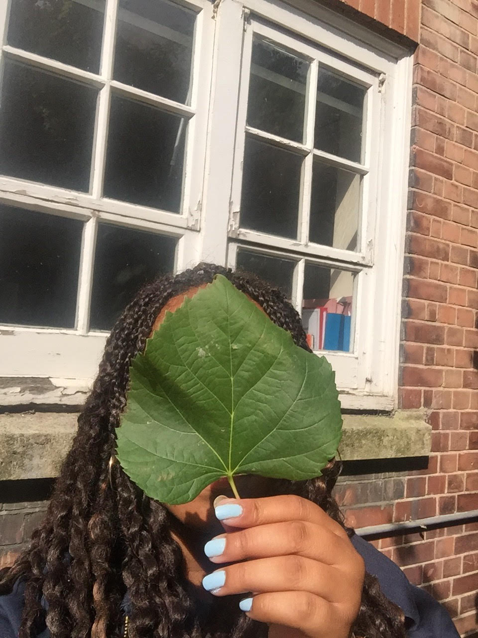
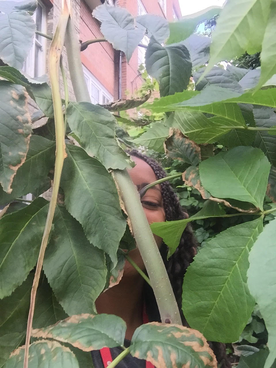
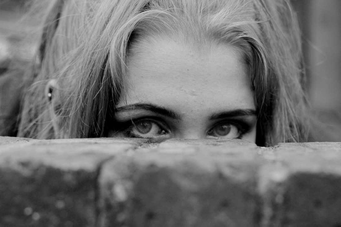
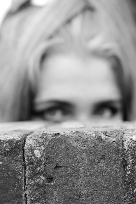
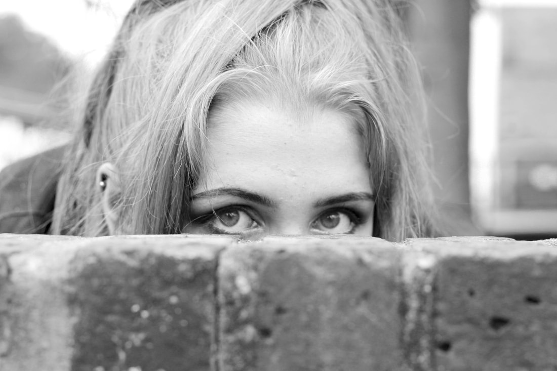
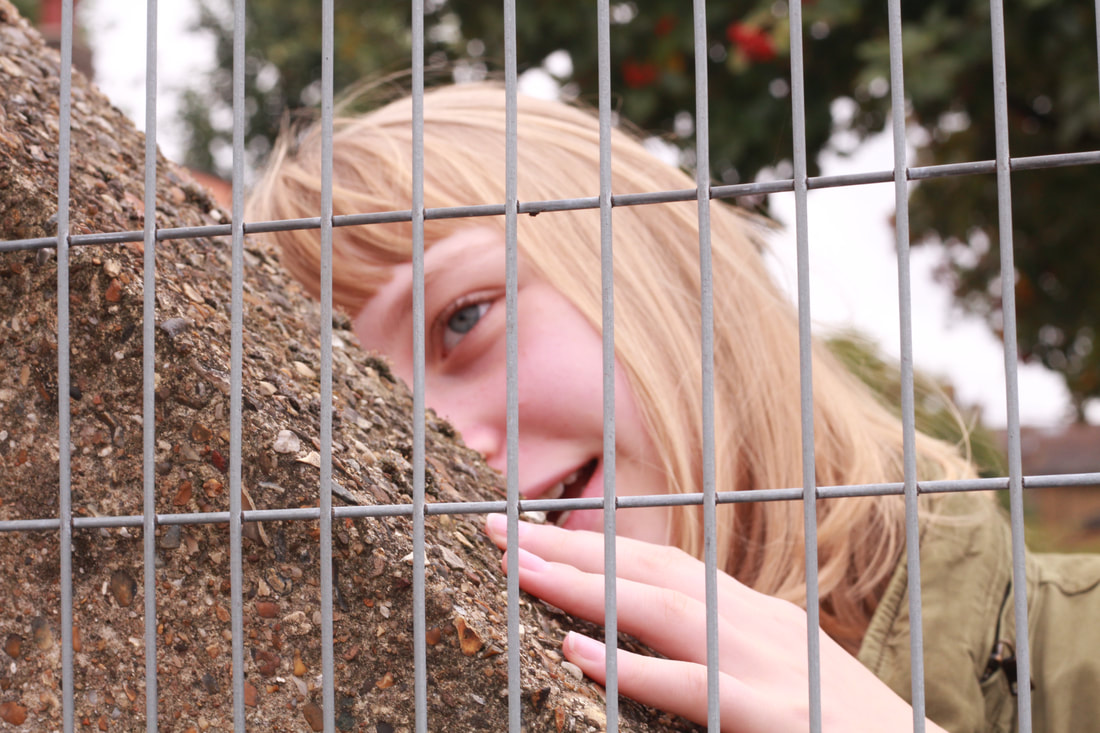
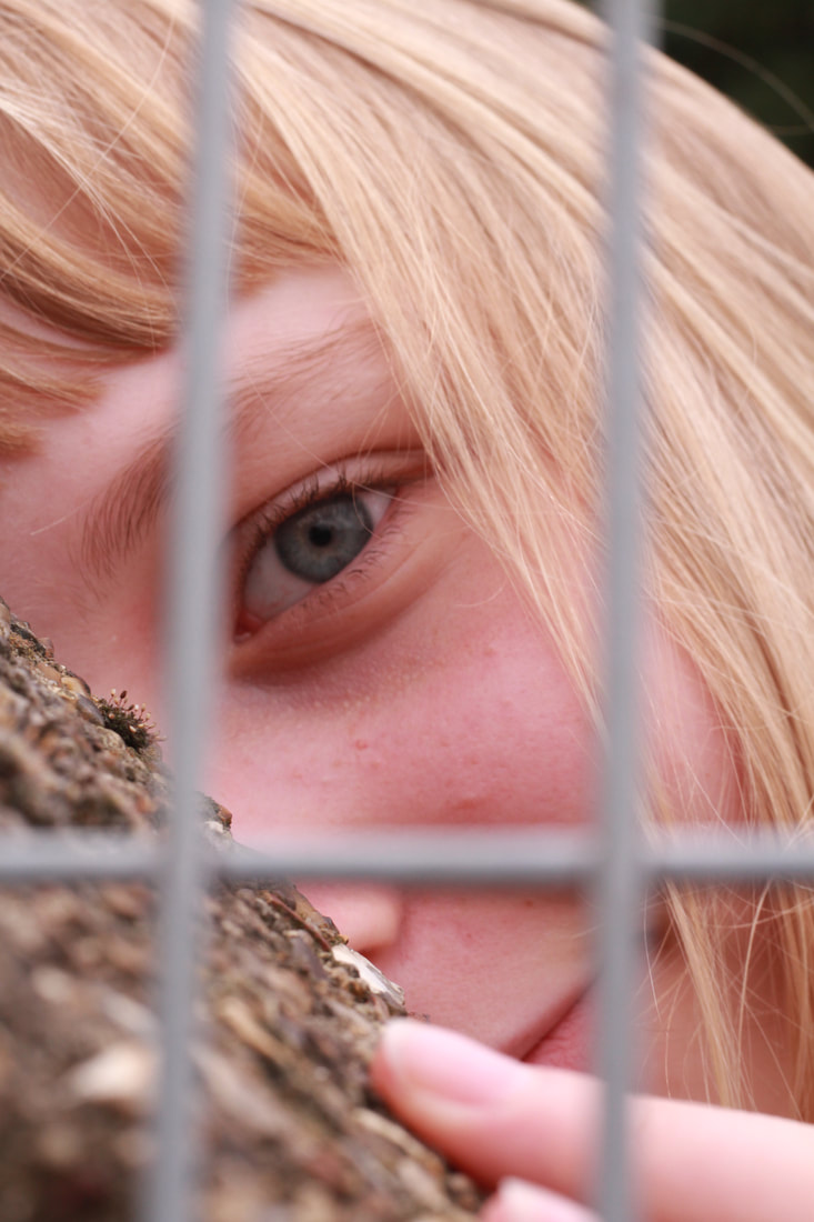
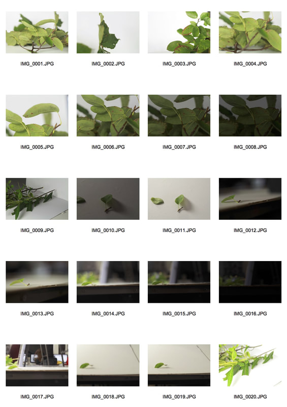
The Obscured Selfie
For the obscured selfie, I took photos of myself with objects obscuring my face. In the examples below I used a bunch of leaves and a table.
|
|
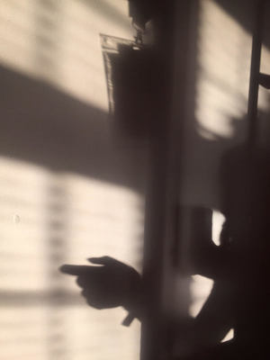
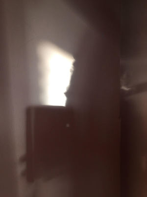
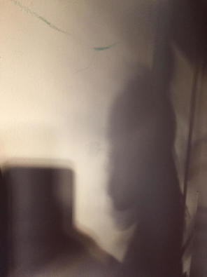
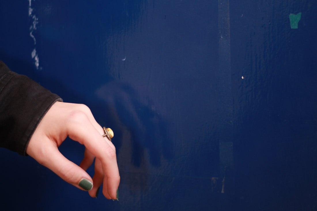
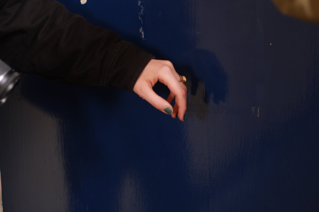
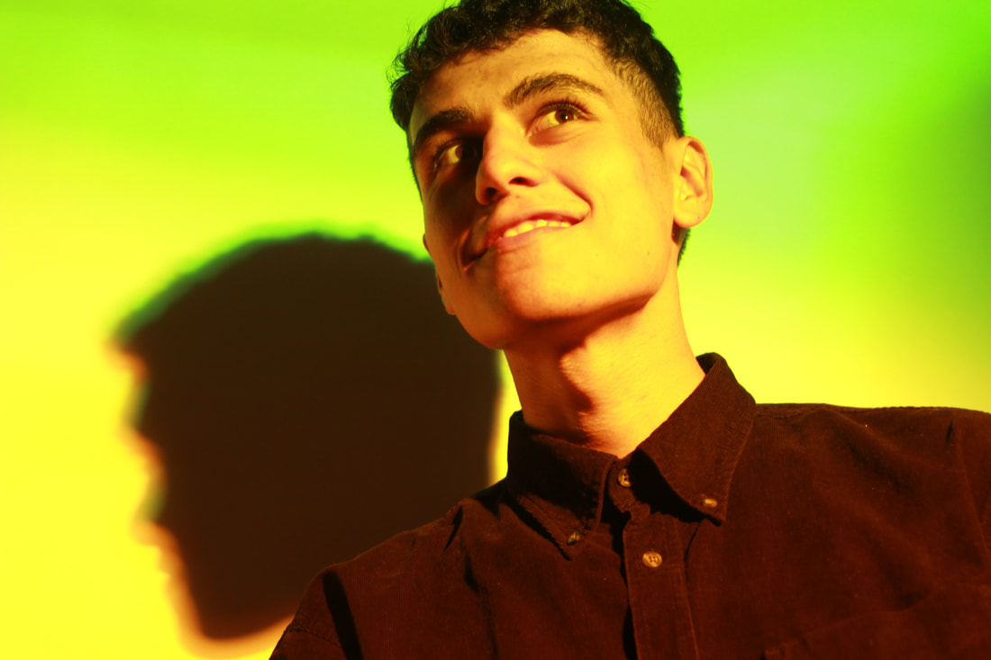
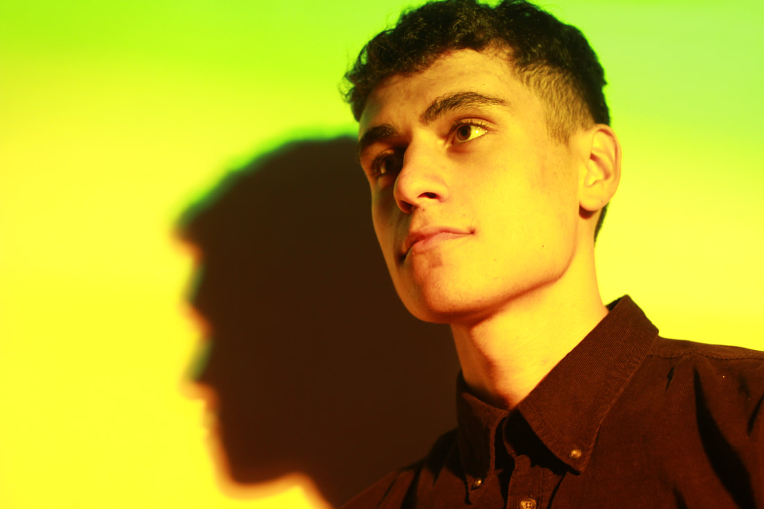
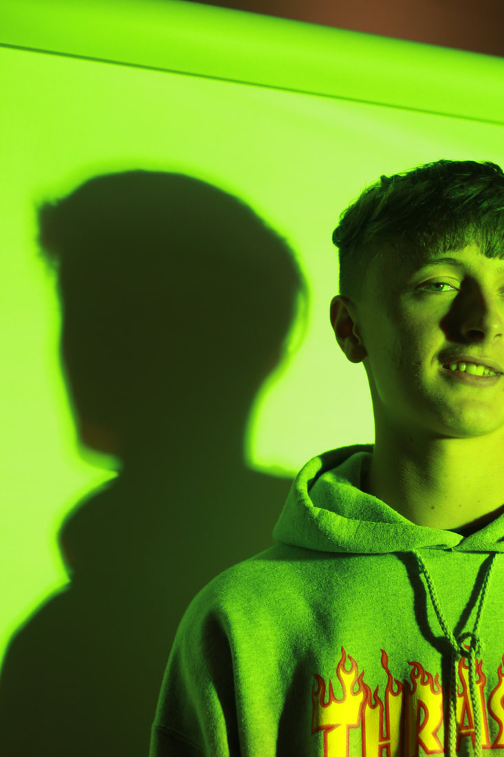
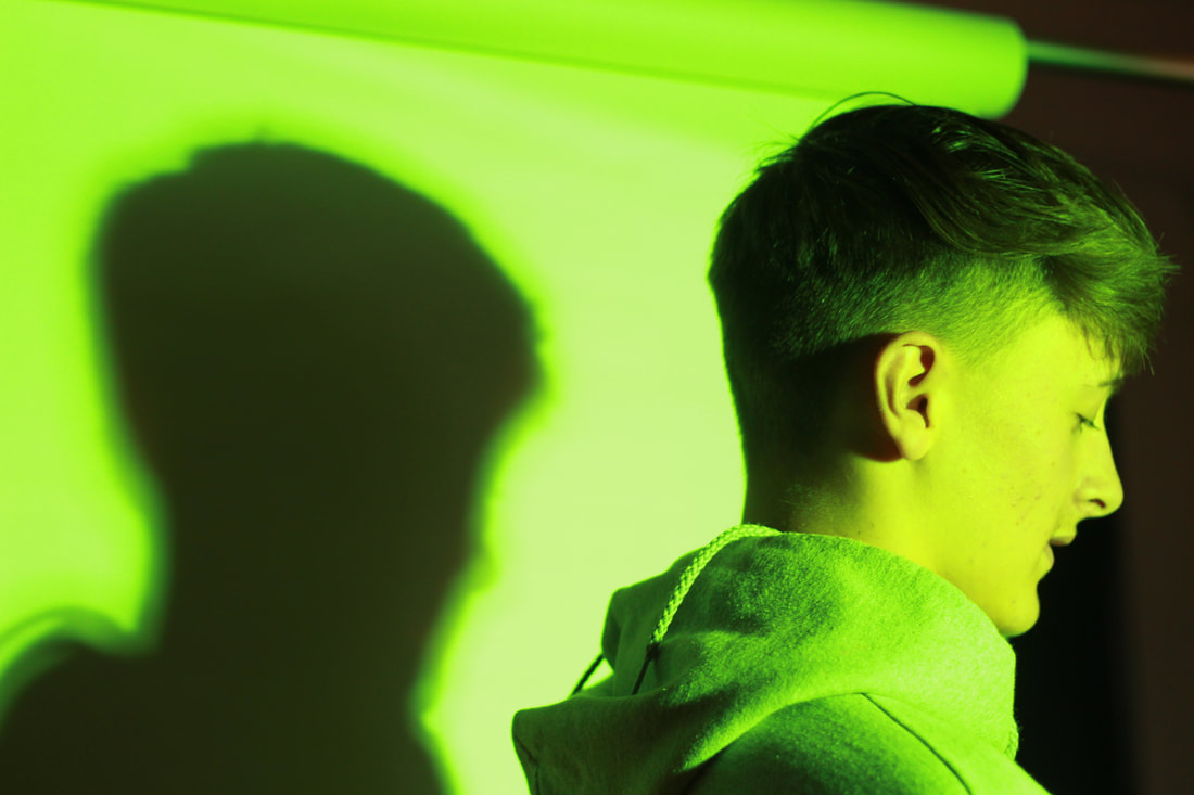
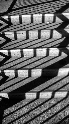
The Shadow Selfie
For the shadow selfie I took pictures when the sun was out. Although, I think I found this type of selfie the hardest to capture due to the change in lighting/the sun going in.
|
|
|
THE NON-SELFIE
The second task was to take normal photos (non-selfies) with the same categories in mind (reflected, shadow and obscured). From the images below, you can definitely sense the differences between the selfies and the non selfies. First of all, the selfies were taken on my iphone and therefore the images came out in a lower quality (compared to my camera). As well as this, being behind the lens enables you to think more about how the subject is presented in the shot. I believe selfies however, are not taken as seriously and not as much thought is put into them. With a camera you are able to change various camera settings, with a phone you take the selfie and the process is over.
Reflected
Here, I captured peoples' reflections in doors and cars.
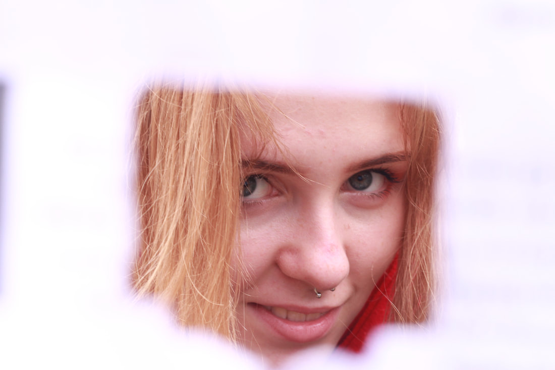
Obscured
Here, I photographed the obscured using bricks, fences, railings and more.

|
I found the photograph to the left extremely interesting. This was used to present the "obscured". During the shoot, I had a piece of paper in my hand and i wanted to include this in my photo somehow. I was not entirely sure where I wanted to take it. To capture this, I folded an A4 paper in half and tore a hole in the centre. Once I found the correct aperture and shutter speed settings to accommodate the photo, I held up the piece of paper in front of the lens and took the photograph. Throughout my experiment with the piece of paper, I found that the simplest of objects can be altered to create something interesting. I made sure the camera was completely focused on the model with the paper acting as an almost outline. It was as if the paper acted as a second lens.
|
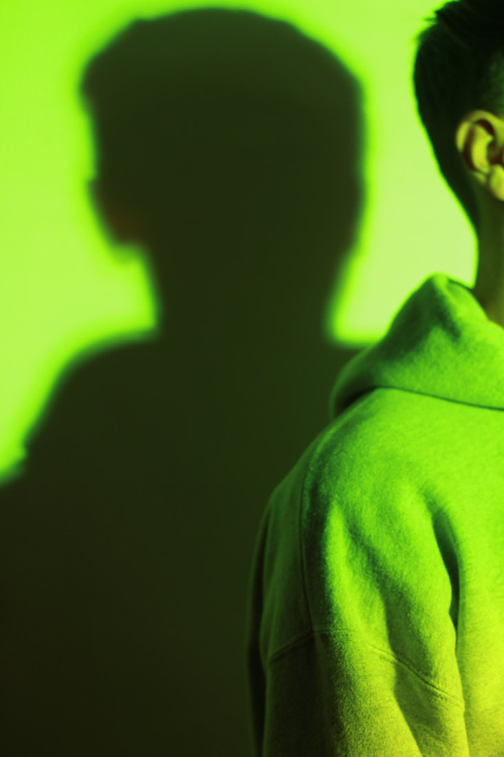
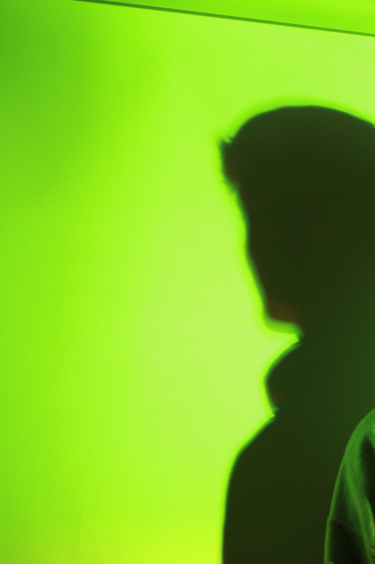
Shadow
Here, I photographed peoples' shadows against a backdrop with a studio light. I experimented by placing different coloured filters over the lights. This helped to produce some interesting looking shots.
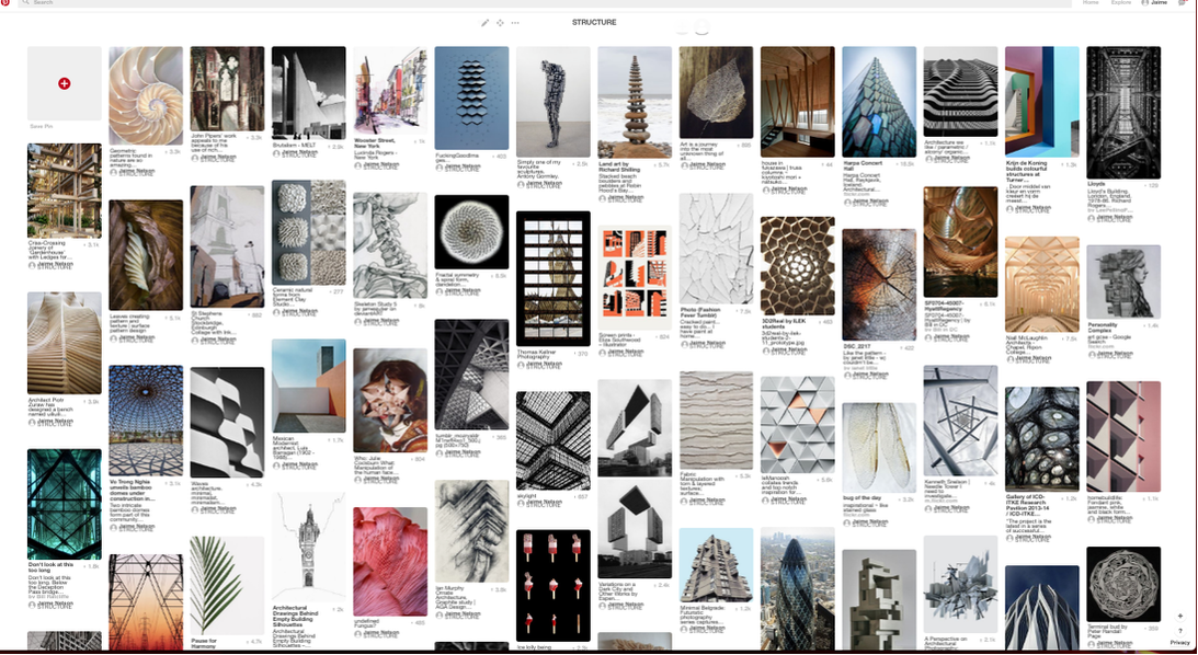
Structure Pinterest Board
I made a Pinterest board and searched "structure" for inspiration for my work. This definitely inspired me to think of original ideas and experiment with different ideas that I could use in the near future. To see the full Pinterest board, click the link: "https://www.pinterest.co.uk/jaimeonelson/structure/" . I found some intriguing photographs online. I noticed the majority of images consisted of regular and abnormal shapes which were sometimes arranged in an ordered fashion.
|
What Is Structure?
Structure is the construction, organisation, arrangement of elements in a piece of artwork. Likewise, in music, structure is how different parts of a song are put together in a certain way to create a piece (verse, chorus, bridge etc). Structure can be associated with different shapes, patterns, colour and contrasts between light and dark. Structure is much about composition and how elements within the photo are arranged/structured. |
STRUCTURE IN NATURE
|
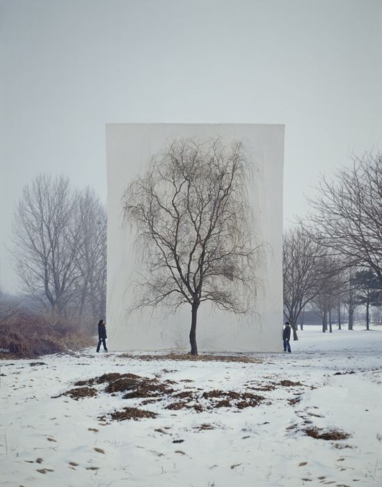
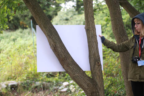
Myoung Ho Lee is a young photographer from South Korea who has produced some unusual, unnatural photographs of nature throughout his work. In some of his photos (with a large crew) he manages to fit a large white screen behind a massive tree. It is almost as if the artist is isolating the tree from it's normal/natural habitat. This looks fascinating on camera. He poses some thought provoking questions about representation, reality, art, environment and seeing. It is said that he is only able to make about 4 of these photos a year due to high production costs and the time and effort many people have to face to achieve at least one good shot.
|
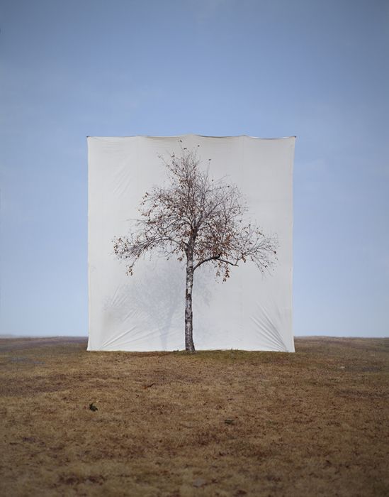
It is clear from his work that Ho Lee uses the rule of thirds throughout his photographs. This creates a sense of balance within the frame. I like the fact that in every picture the weather/scenery has changed. I would assume his style of work draws a large audience as it is something we are not used to seeing. Usually, we see a tree and forget about it. What Ho Lee does is isolate the tree, simply by placing a white backdrop behind it and only then will that tree stand out. I can also appreciate the contrast in colour in each photo.
|
My Response
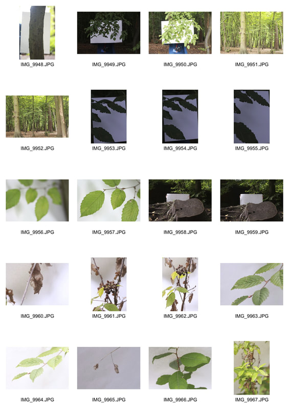
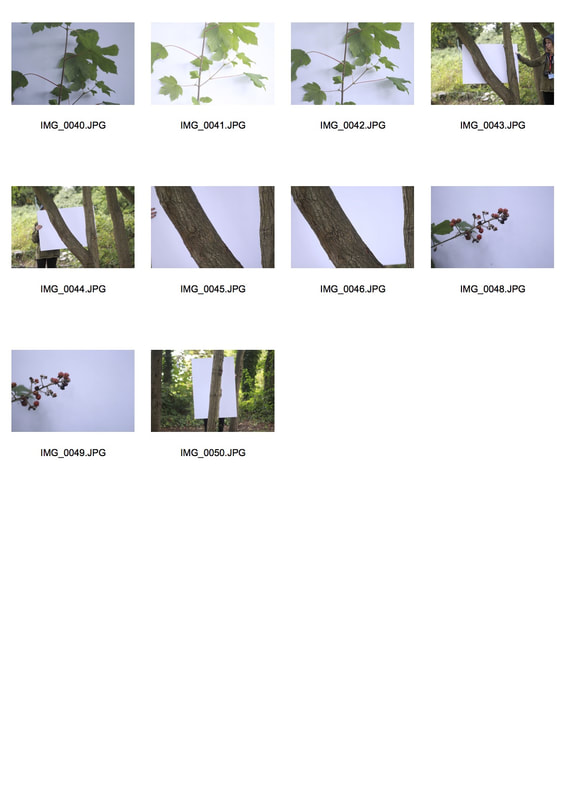
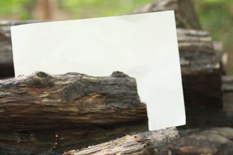
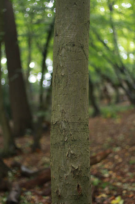
Below is my response to Myoung Ho Lee's work. Instead, I used a regular sized piece of white paper and got someone to hold it up behind a tree/plant etc. I took close ups of a subject against the background as well as wider shots. I found this task fascinating because it looked as if the photographs were taken in a studio. I experimented with having the white page fill the frame and also showing the context around which the photograph is taken. This depicts the theme of "structure in nature". The aim of this task was to depict how structure can also be recognised within nature as structure is usually associated with the modernist architecture of buildings. I found it interesting that structure can be found in nature.
|
|
|
|
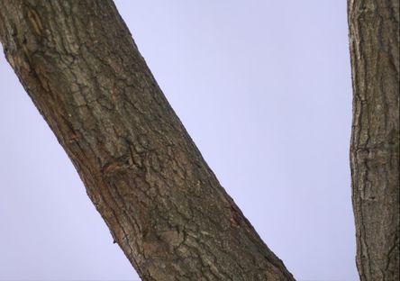
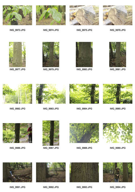
I found the set of photographs above worked successfully. This is because the closeup of the tree bark looks as if it's been taken in a studio. I used the natural lighting (sunlight) to produce this photo. I like the fact that the camera focuses on the bark in great detail. I used my 50mm fixed lens which enabled me to achieve a shallow depth of field more easily within my shots (along with a crisp and in focus subject). I also used the "rule of thirds" to help balance out the frame.
|
|
MY EDITS- USING PHOTOSHOP
|
|
The photographs portray the before and after editing in photoshop. I thought it would look rather interesting or unusual if I edited the people holding the paper out of the photo. This was completed by taking the original photo (with the piece of paper behind the tree) and a separate image of just the background. Once photos are loaded in Photoshop, I select the paper and tree/leaves and copy and paste it onto the photograph of the background. Adjustments to levels, brightness, vibrance etc. are made afterwards to make the photo look more realistic or to stand out. The images to the left depict the before and after editing. It presents the idea that nature can presented as unnatural/unusual as well as illustrating it's traditional, natural style.
|
Technical Focus- Aperture and Depth of Field
|
What is Aperture?
The primary purpose of the aperture setting is to regulate the amount of light that passes through the lens. Along with the shutter speed, it determines the quantity of light that reaches the camera’s sensor (or film) and forms a third of the ‘exposure triangle’. Aperture is measured in "F-stop". The lower the "F-stop" number the more light is let into the camera (the brighter the image- the wider the lens). The higher the "F-stop" number, the less light is let in (the darker the image- the narrower the lens)- as seen in the picture on the right. 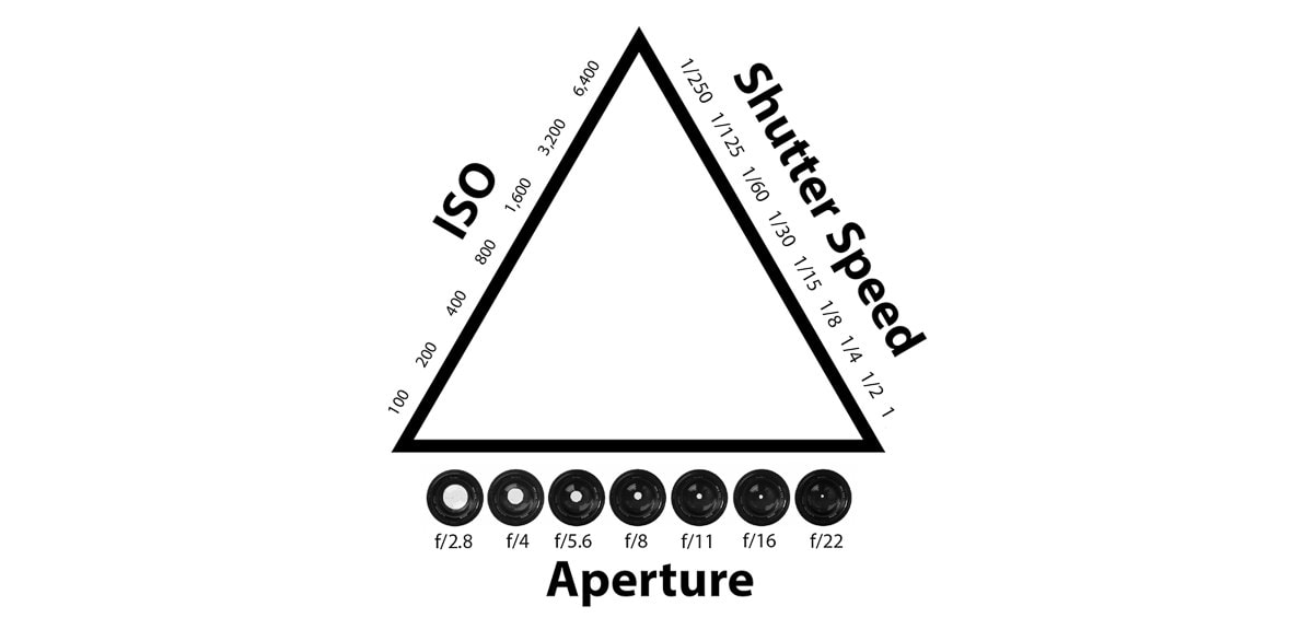
Exposure triangle
|
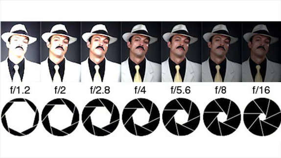
F-stops/apertures
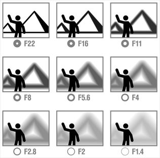
What is Depth of Field?
Three main factors that will control the depth of field are: aperture (f-stop), distance from the subject to the camera and focal length of the lens on your camera. The aperture you use will have an impact on the amount of focal range in focus in front and behind your subject. This is known as the Depth of Field. A wide aperture setting (such as f/2 or f/4) produces a shallow of depth of field. However, a narrow aperture setting (such as f/11 or f/16) will result in a deeper depth of field. RULE: Large aperture = Small f-number = Shallow (small) depth of field Small aperture = Larger f-number = Deeper (larger) depth of field |
|
Depth of Field continued...
A shallower depth of field will allow the subject to be in focus with a blurry background. A deeper depth of field will mean the entire photo/background is sharp. A deep depth of field is often necessary to make the background clear and add an additional layer of information and context to a photo. This is shown in the photograph on the right. |
|
Aperture continued...
|
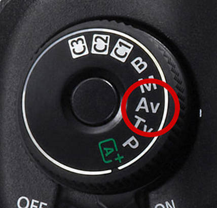
The photos below were taken in Coldfall Woods. I put my camera on the "Av" (aperture priority) mode. I found this a good exercise as it made me consider the effect of using different aperture settings when I take a photo. The "Av" setting helps you to decide which setting is most effective for the subject you are shooting. It enables you to set the aperture and ISO and the camera sets the shutter speed for you automatically (if you need a faster shutter speed, you have to raise the ISO). Aperture priority can be used on a sunny day where there is good light. On the day of the shoot, the weather kept alternating between sunny/overcast/rain which in some cases did not benefit my photos. Towards the end of my shoot, I chose to turn the camera to manual mode as I found it easier to capture my photos that way. As well as this, when I raised the ISO (in order to achieve a higher shutter speed) my photos became a little grainy which I did not like.
|
|
|
50mm fixed lens, Av, f/1.8, ISO 800, 1/50
|
50mm fixed lens, Av, f/1.8, ISO 800, 1/50
|
50mm fixed lens, Av, f/8.0, ISO 6400, 1/15
|
Second response
For my second response, I decided to experiment with f/stop settings in the studio. I purposefully used very high apertures to see what effect extremely low lighting would have on my images (as seen below). I then experimented with the complete opposite. I instead used a very low aperture which made my images rather over exposed. I also had to make sure the shutter speed was the right setting for my aperture.
|
|
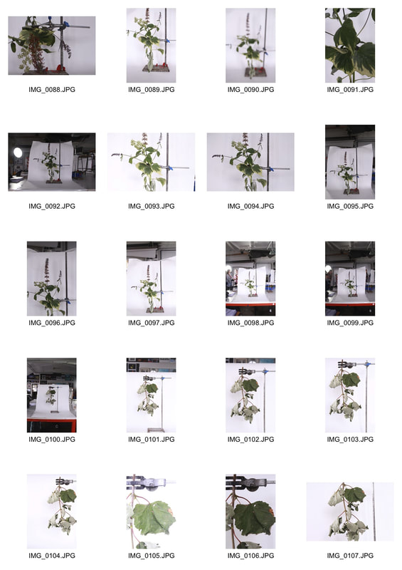
'Field Work' - Sanna Kannisto
During this project, Kannisto did field work 2/3 months a year where she worked alongside scientists and wildlife. She "wanted to step into a new territory" and "mix art with science". The artist photographed still life- birds, snakes, plants in a studio. She then progressed into hanging plants from science equipment. Sanna Kannisto is an artist/photographer from Hameenlinna, Finland. Her photographs present a delicate yet interesting approach to nature and she considers herself a "visual researcher" because she approaches natural subjects with a scientific edge. She spent extensive time in the Brazilian rainforest, France, Costa Rica and more- looking into nature. Her aim was to make the connection between science and art through the form of photography.
|
|
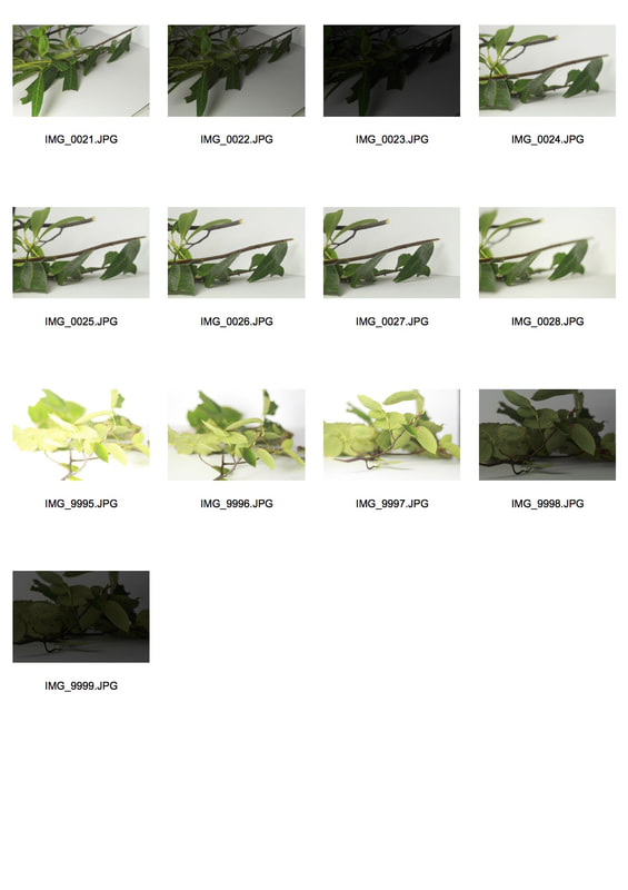
My Response
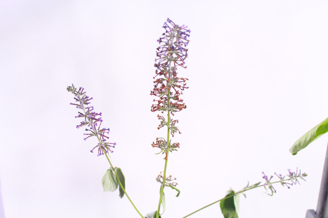
This is my response to Kannisto's 'Field Work' . My intention for this task was to compose an image/images in the same style as Kannisto. I found her work interesting as it is a type of photography I have never seen before. I was fascinated by the fact that the artist wanted to merge science and art together to produce an engaging piece. As well as this, the overall task was not very technical and I assume did not require much editing. For most photographs, I set my camera on a tripod and tilted my camera sideways in order to capture it in portrait. As well as this, I set my camera on "Av" (aperture priority) mode and therefore, needed a tripod to keep the camera steady and remove any signs of blurring. I used my knowledge of aperture, composition and white balance throughout the task.
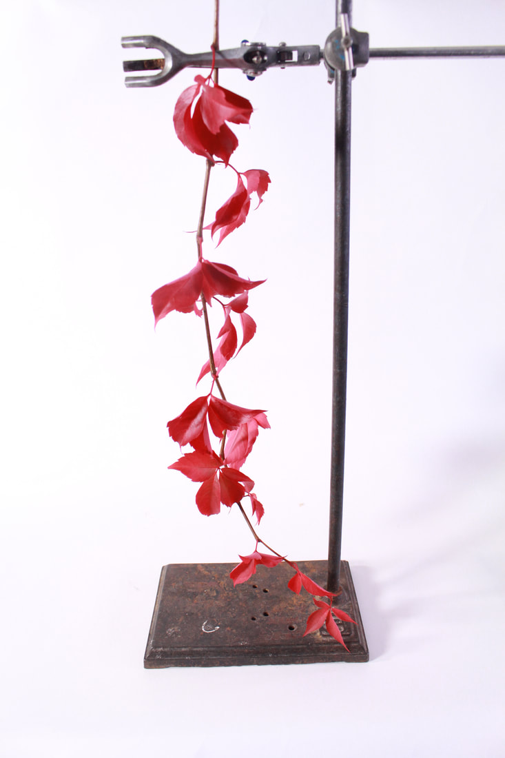
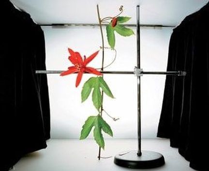
Personally, this was my favourite photo from the shoot, this is because the subject, red flower stands out against the white background. Furthermore, I altered my camera settings in order to work with the studio lighting. I chose to position the subject in the centre third of the frame. This is to create a feeling of balance within the photo. The light used within the photo is a soft light which creates a soft focus.
|
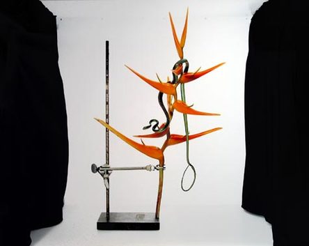
The Set-up To complete this task, we took large pieces of white paper and placed it on the table where it was held up by a stool. The paper was stuck to the table using celotape in order to keep the backdrop in one position. Plants were hung on a clamp using scientific equipment. On some occasions, we had to rearrange the plants to suit our liking. This was set up in the style of Sarah Kannisto's "Field Work". 
|
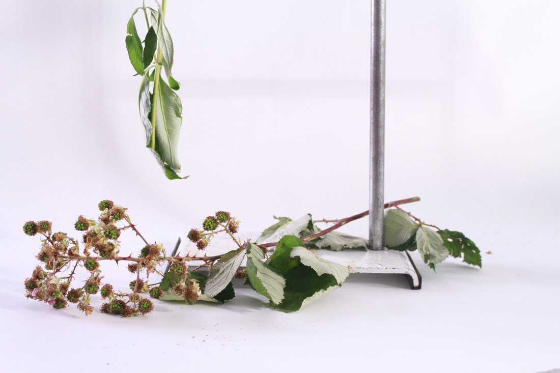
Here, I experimented with the depth of field and aperture in order to achieve these photographs. However, I did find that there were shadows in some of my photos due to the direction of the studio light. As a result, I decided to move the studio light around to reduce the shadow. This worked successfully although, there was still a little shadow. The images below depict how I solved the shadowing issue. To reduce the level of shadowing, we set up two soft box lights instead of using only one. I positioned them on either side of the table so the light was being directed from both angles. This created more of a balance and reduced any shadows. As well as this, I put my camera on aperture priority and used a tripod to prevent any shake.
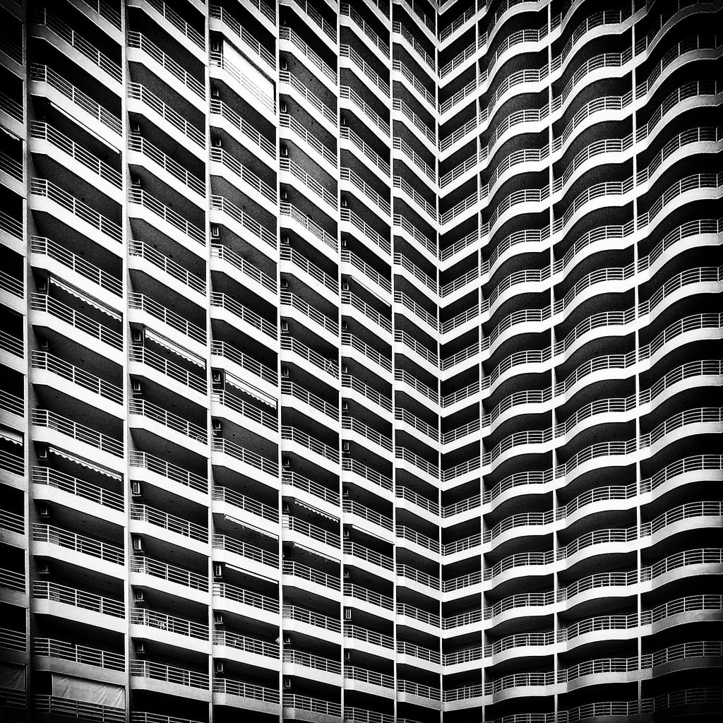
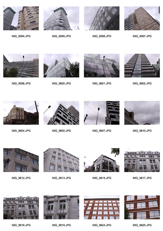
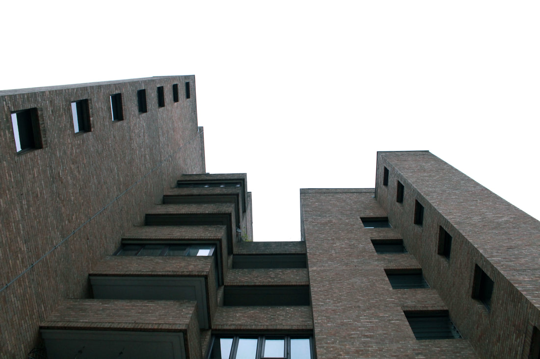
STRUCTURE IN ARCHITECTURE
Paul Strand
Paul Strand is an American photographer born in 1890 and died 1976 (aged 85). Paul Strand was an influential photographer and early icon of the “straight photography” school. Pictorialism, “Straight Photography” was a move to “pure photography” which was loosely defined as having stylistic traits that were not manipulated heavily to mimic other art forms such as painting. A modernist, Strand was highly influenced by Charles Sheeler and Alfred Stieglitz. His work had a huge impact on the f/64 school of photographers (Ansel Adams, Edward Weston and more). Strand was fascinated by modernist style photography , sculptures and paintings. It can be recognised throughout his work that the photographer focused on the structure of buildings as well as their shape and form. Personally, I find his work extremely interesting and unusual. I can appreciate the fact that some of the photographs are rather simplistic, though they are still intriguing to look at. The way Strand arranges the elements in the frame creates a feeling of illusion and balance.
Technical Focus- ISO and Photographing into the Light
ISO
|
ISO measures the sensitivity of the camera's image sensor. The lower the number the less sensitive your camera is to light and the finer the grain. An example of a low ISO would be (ISO 100), a high ISO would be (ISO 3200). Higher ISO settings are generally used in darker situations to get faster shutter speeds eg. an indoor sports event when a photographer wants to freeze the action in lower light. The disadvantage is that the higher the ISO you choose the noisier the shots will be. If you’re shooting an image that doesn't require a large depth of field, you can increase the aperture (thus allowing more light into the lens) and use a lower ISO. On the other hand, if a photographer does require a large depth of field, they need to use a smaller aperture which at the same time will make the image darker- less light is let into camera. Therefore, the ISO would need to be increased in order to create a correctly exposed image.
|
|
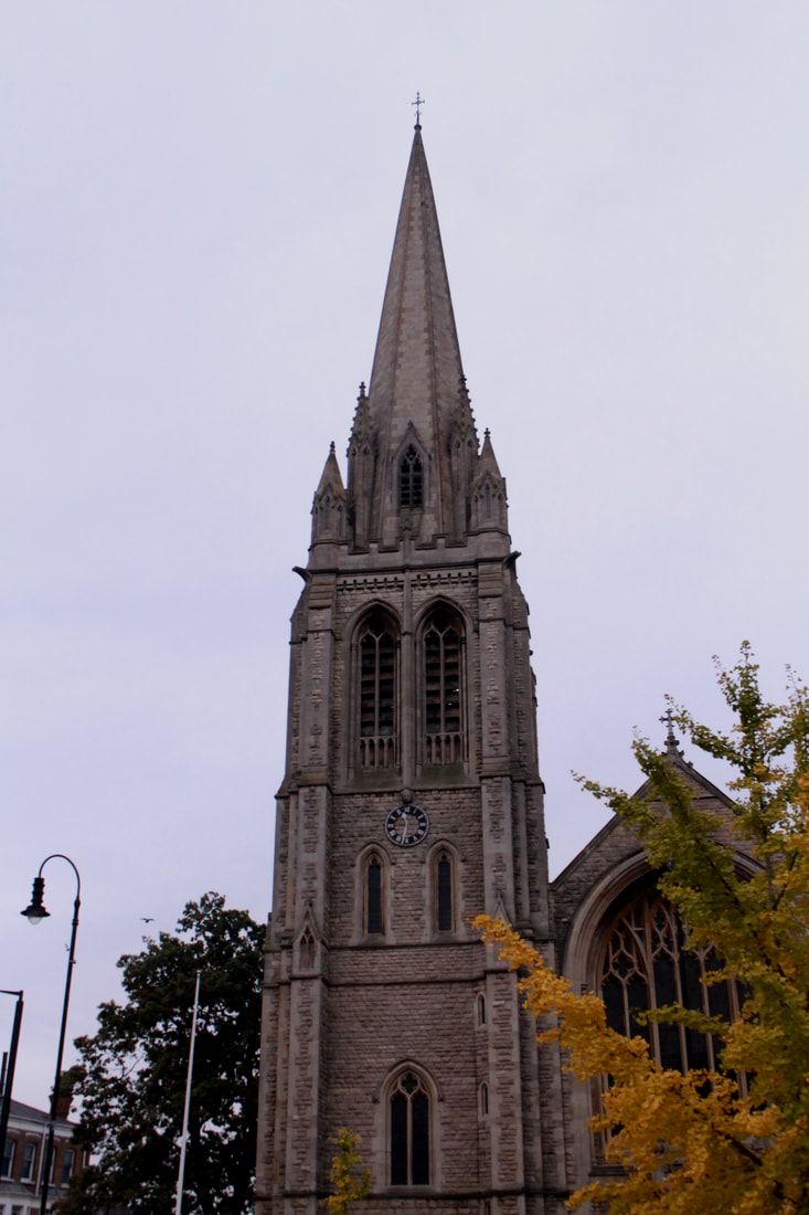
F/7.1, Shutter speed 1/80, ISO 100
|
F/7.1, Shutter speed 1/80, ISO 200
|
F/7.1, Shutter Speed 1/80, ISO 400
|
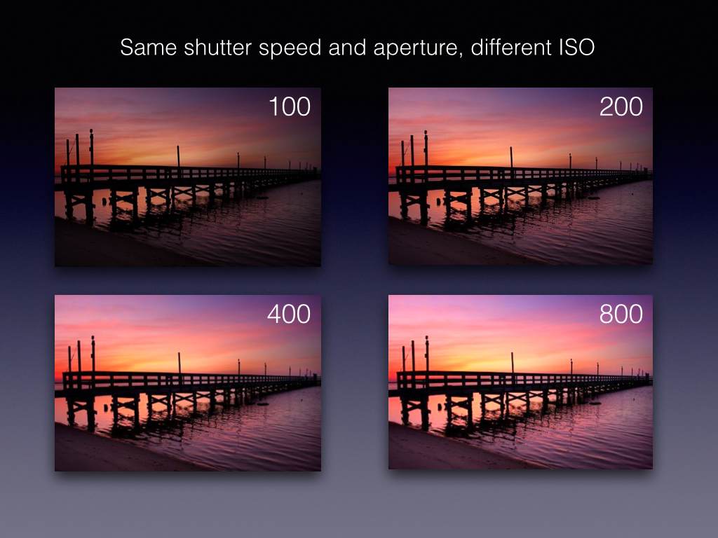
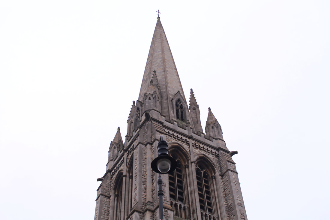
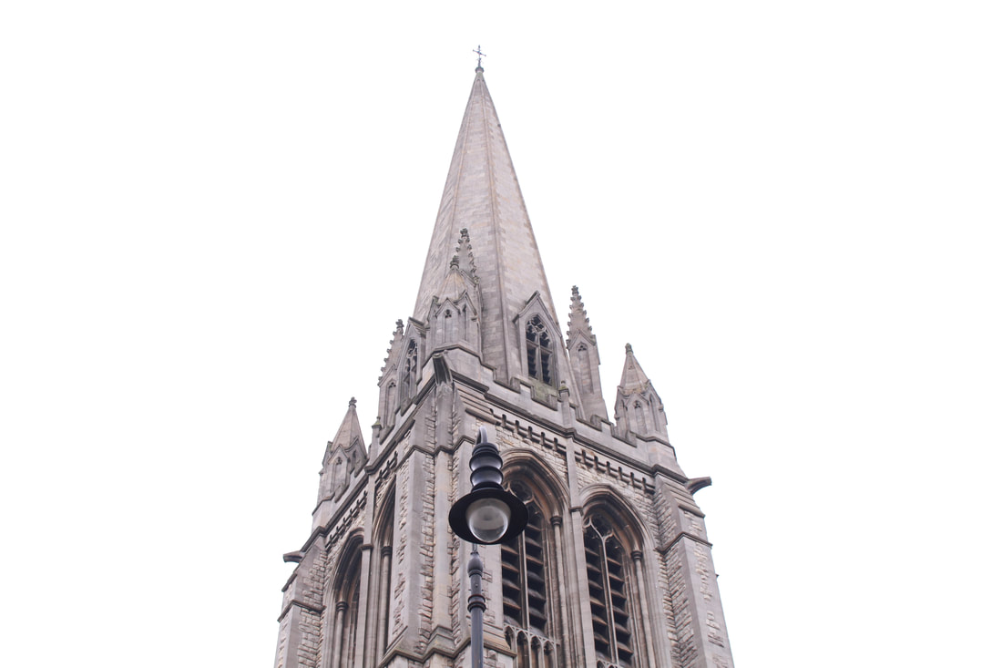
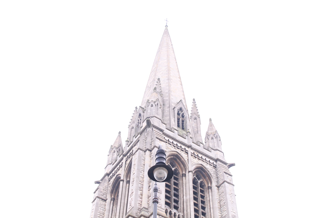
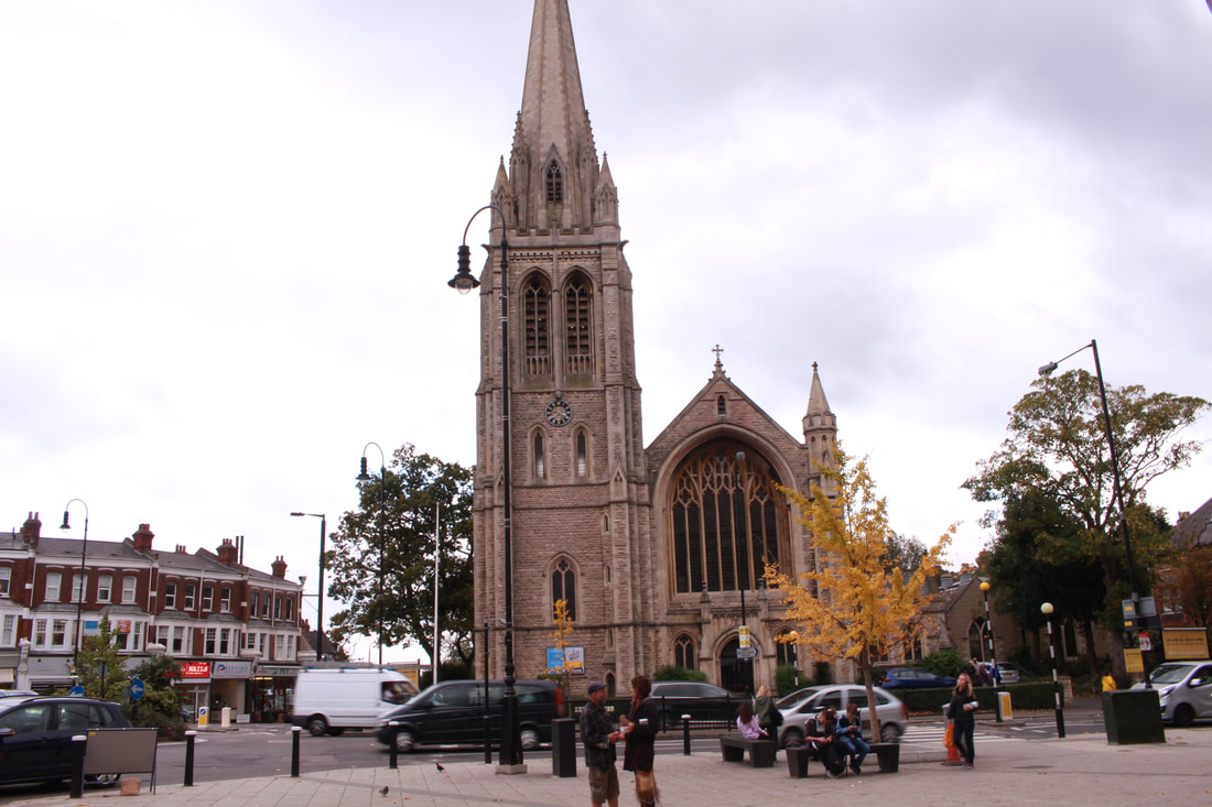
Above is my response to the ISO experimentation task. We were asked to photograph the church using different ISOs although keeping the aperture and shutter speed the same. My aim was to find the right ISO setting that best suit my photograph of the church. Personally, I found that ISO 200 was my favourite image out of the three. This is because the image was not too underexposed and not overexposed. I also observed the fact that as you increase ISO, the image gets brighter. It enables the audience to recognise the different details, patterns and textures of the outside of the building. I enjoyed this task as it broadened my knowledge of ISO and encouraged me to use this setting more often throughout my work.
Technical Focus- Photographing into the Light
During the second task, our focus was to photograph into the light. This was rather difficult on the day of the shoot due to the cloudy weather and lack of clear sunlight. If I were to do this again, I would go on a sunny day. This task was carried out after learning about white balance and exposure compensation. This helped me to photograph with the correct settings to suit my scene. Often the camera will become confused when photographing into the light, the information below illustrates how I was able to overcome this issue. When photographing into the light, the subject is lit from behind (backlit) and we do not necessarily see the sun in the photo.
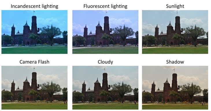
White Balance
|
The White Balance setting you choose will change the colour balance in your pictures, making it warmer or cooler depending on the type of light. I used to use Auto White Balance but I found that using different white balance settings made certain colours within the scene stand out more. I also found that the white balance added extra insight as to how I want the audience to feel about the photo... ie. if I was taking a picture of the beach, I would use a sunlight white balance to illustrate a happy mood with warmer tones. The camera's White Balance presets give you more control over colour.
|
|
|
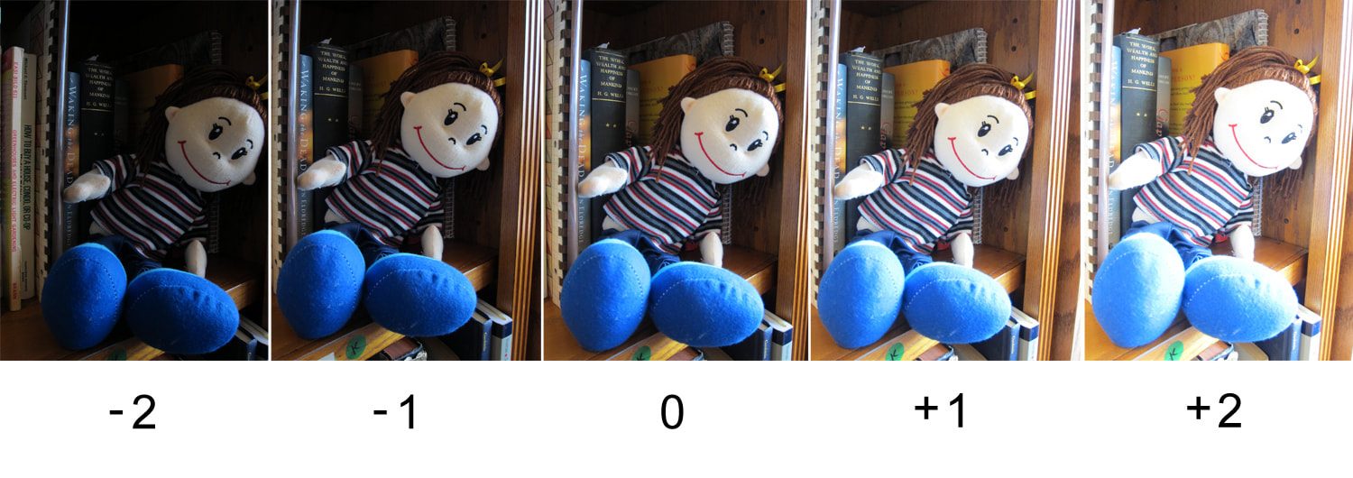
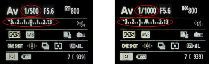
Exposure CompensationTo photograph into light, you may need to over expose your image otherwise the camera will mis-read the amount of light coming into the lens and the subject will be under exposed. This is what I did throughout the task. The setting is used to alter the standard exposure set by the camera. The dial starts at "0" balanced, you can then "+1" or "-1" to over and under expose the photographs. It can be used in any shooting mode except Manual. I used the Aperture Priority setting in my camera to capture these images below.
|
|
Before
|
After
|
On the left is a photograph of the church without using the exposure compensation setting. I found the subject seemed rather dull and a lot of its colour was lost or toned down due to the other settings. I then took a similar photo but overexposed my image to make sure that the subject (church) was not too dark. The settings for the image on the right was "F/16, 1/20, +1 exposure, ISO 200". I found there is a significant difference between the two photos. I appreciated the fact that by overexposing the photo, the textures and patterns of the church can be recognised more easily. The white balance setting used was the "Daylight" filter. Overall, the use of white balance and exposure compensation made my image look more interesting and vibrant. In my opinion, these technical foci have been extremely helpful and I will use these settings more often throughout my photography, especially when photographing into the light.
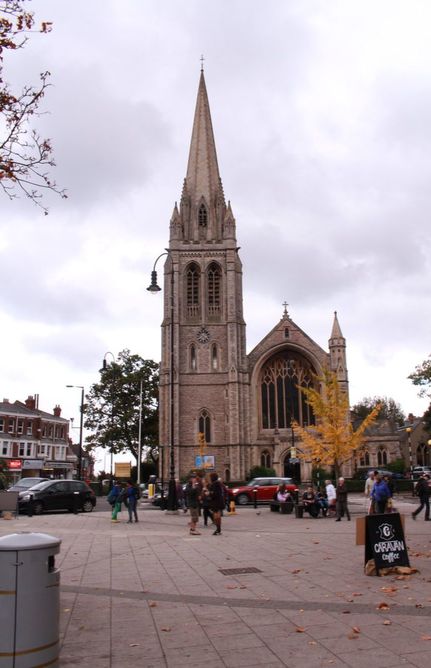
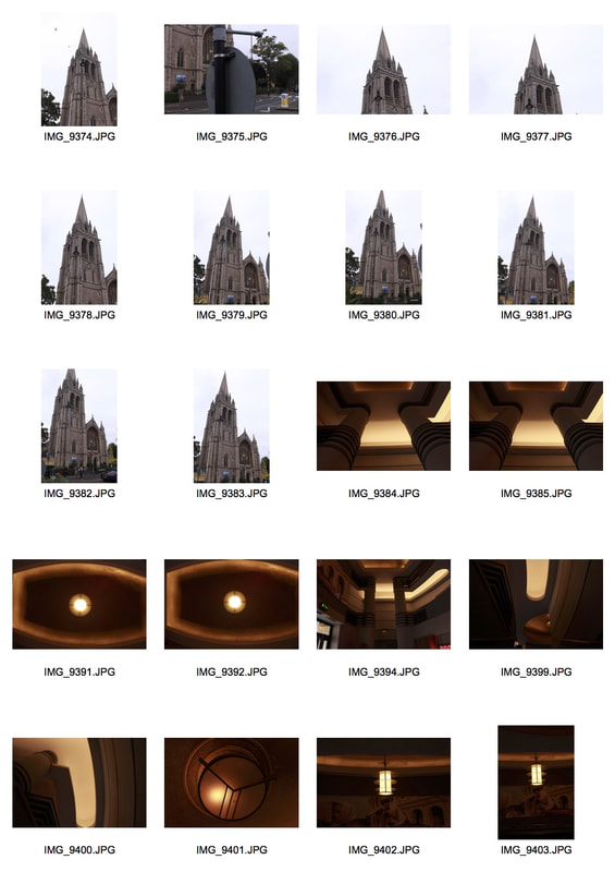
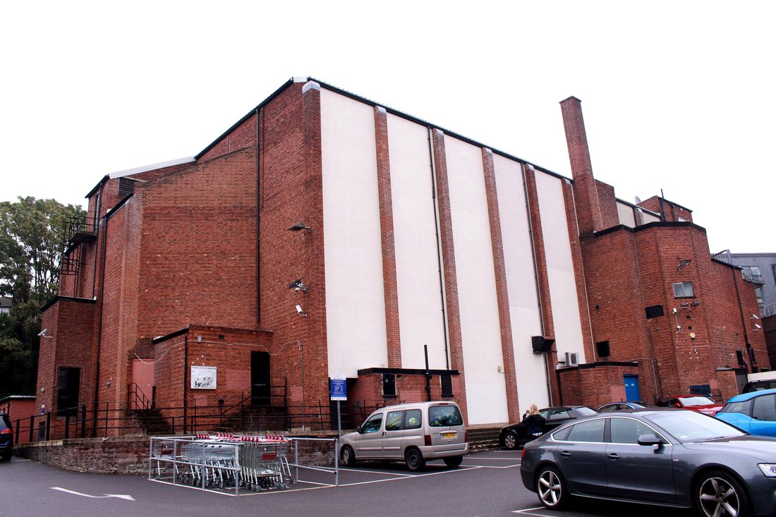
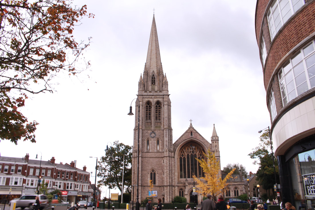
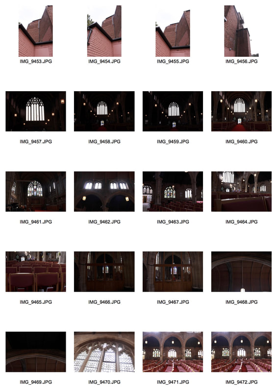
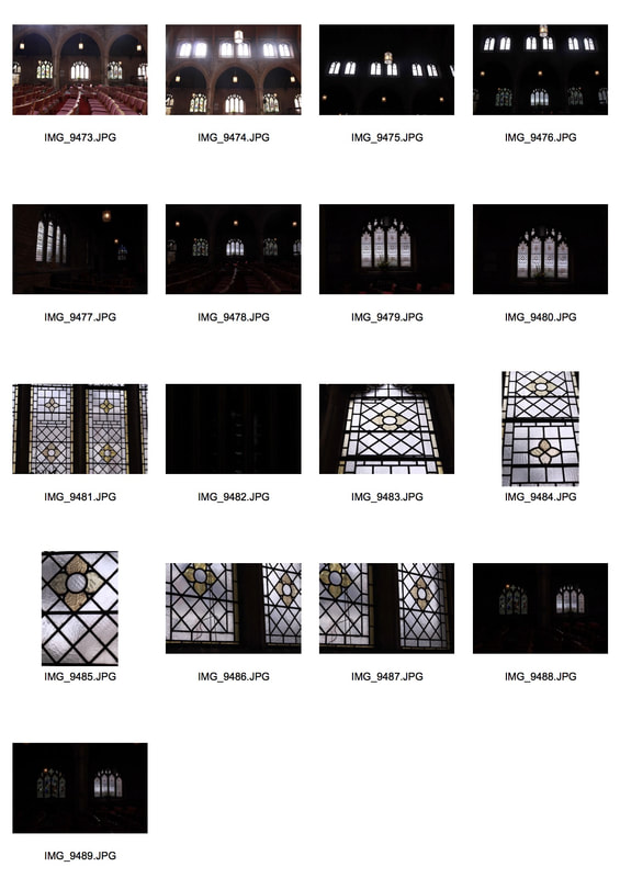
St. James' Church and the Everyman Cinema
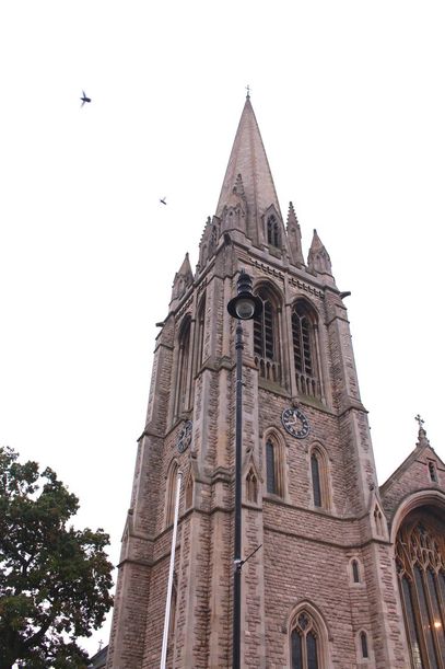
In the early 20th century it was felt that the camera was the best tool to document the Industrial Revolution. One way progress and industry was apparent in our environment was the rapid changes happening in cities, particularly in the western world. In this task, I went to St. James' Church and explored the Everyman Cinema to capture the different styles of architecture between the two. As well as this, I also took the task as an opportunity to experiment with my camera's ISO to find which camera setting worked best with each photograph. These two buildings sit opposite each other in Muswell Hill and have several similarities and differences. For example, both invoke some sort of worship.
|
|
|
|
Selects
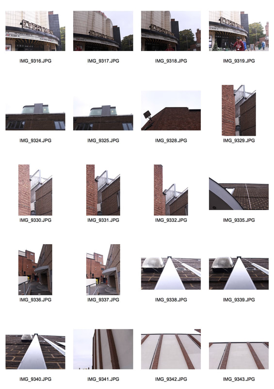
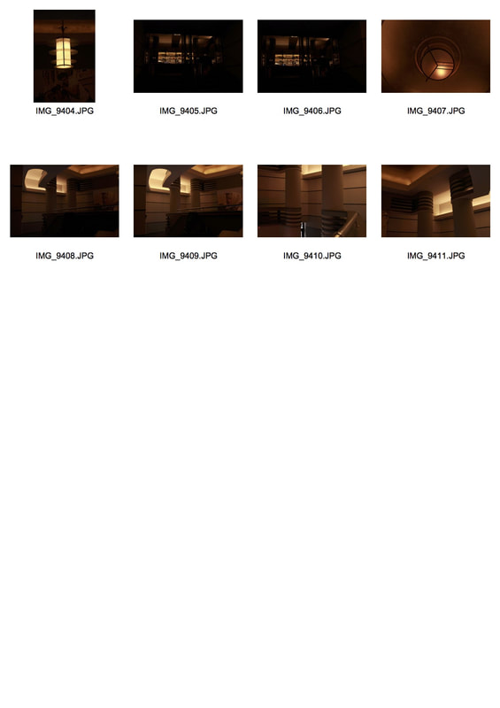
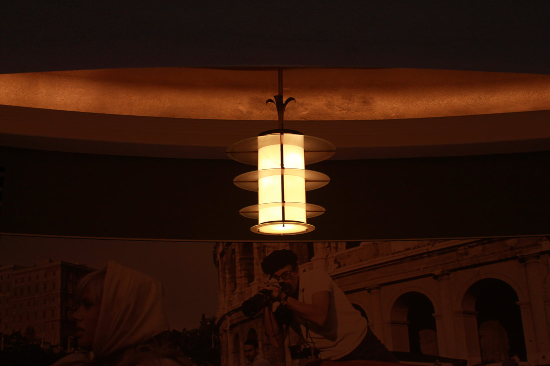
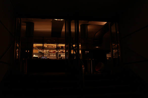
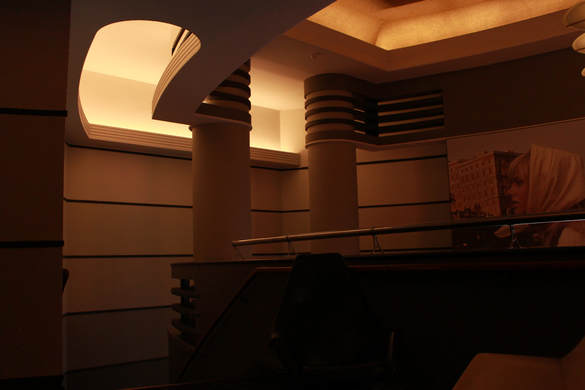
Everyman Cinema
The Odeon Theatre (now Everyman Cinema) was one of the original cinemas in the Oscar Deutsch owned Odeon Theatres Ltd. chain. It opened on 9th September 1936 with the British comedy film “Educated Evans” starring Max Miller. Inside the building, the decorative Art Deco styling is considered a prime example of 1930’s cinema styling and even created a style to itself, thanks due in this case to architect George Coles, it became known as the ‘Odeon style’. My aim was to analyse the linear structure created by different patterns, decorations or materials. I found that the church and the cinema both depicted a sense of 'structure' though they are represented in different ways. I chose these images below as my selects because I felt they best represented the structure in architecture. I found it interesting that the outside of the building completely contrasts with the aesthetic of the inside of the building.
|
|
|
|
I was intrigued by the modern interior of the cinema. The lines I found around the reception area created a sense of balance within the frame and emphasised its unique structure. However, I was not impressed by the outside of the building. This is because the outside structure of the building reminded me of a factory or a building constructed during the Industrial Revolution. I found the colours rather dull and its features are rather boring.
St. James' Church
The original building was consecrated in 1842, and the church was extended in 1874. The foundation stone for the current building was laid in 1900, and the completed church was consecrated by the Bishop of London (Rev. Arthur Winnington-Ingram) on 30 June 1902. The building was gutted by the World War II bombings, and the restored church was rededicated in 1952. As well as shooting the more modern side to structure in architecture, I also enjoyed photographing the more traditional take on structure. For this part of the task, I went to St. James' Church to analyse its shape and textures.
Overall, the negative space worked well within these photos. As a result of this, when someone looks at a piece, the viewer can effortlessly evaluate and appreciate the design. As well as this, the building's textures can be recognised from this angle- (the use of brick) which I found interesting. I used my knowledge of composition and the 'rule of thirds' to create my images.
|
|
Second Response
My intention throughout this task was to capture the close up details and textures of the two buildings as well as capturing some wider shots. I found that in my first response, I did not photograph many close up shots. Therefore, I wanted to improve this within my second response. In this task, I had the opportunity to actually go inside the church and photograph its interior. I recaptured the Everyman Cinema, photographing more of its warmer tones.
|
|
|
|
Selects
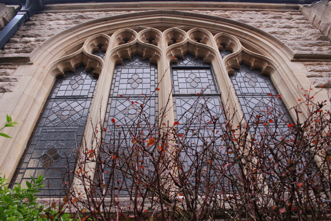
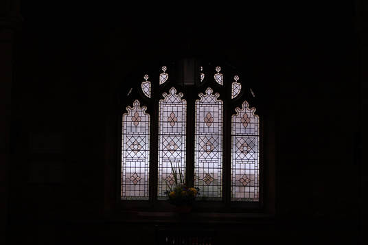
I chose these selects from my contact sheets as I found the architecture and modern design on the interior quite fascinating to view. I noticed line structure within the environment such as the image below. The use of line in my opinion creates a strong and intriguing piece. It adds more depth to the composition as well as the slight angle I used. It is almost as if the beams extend from the dark area in the lower third of the frame.
|
|
|
|
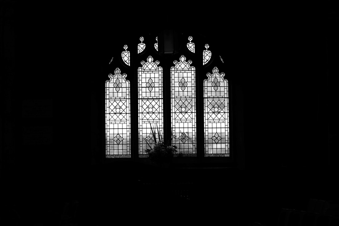
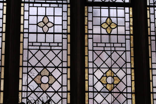
In this photograph, I used a small aperture meaning I had a deeper depth of field. To compensate for the lighting, I used a higher ISO so the image wasn't underexposed. I then edited the image in Photoshop so it was in black and white. I felt like this helped to highlight the lines and shapes (structure) found within the window.
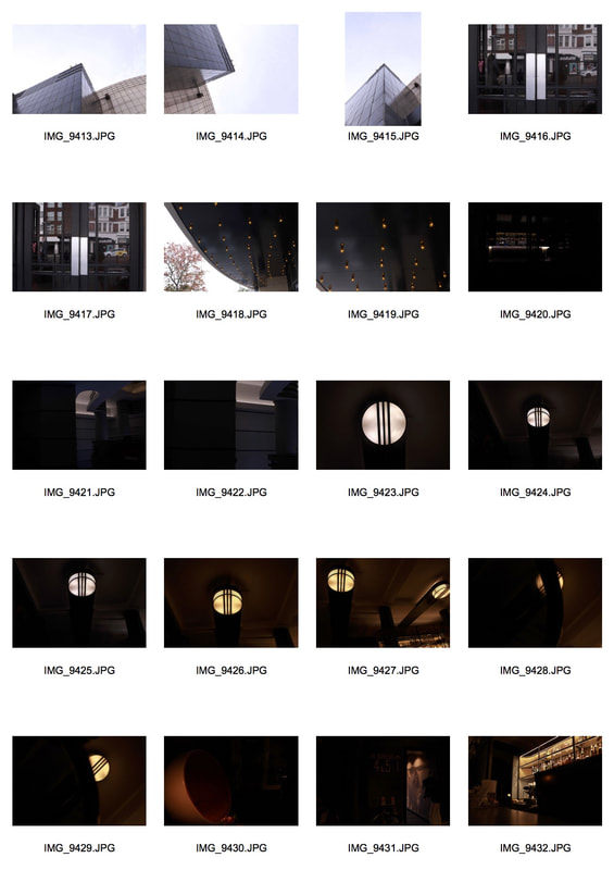
Extension- Structure in Architecture
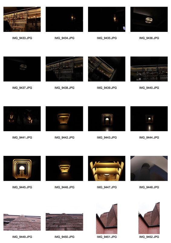
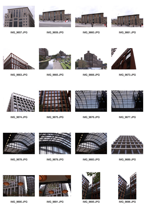
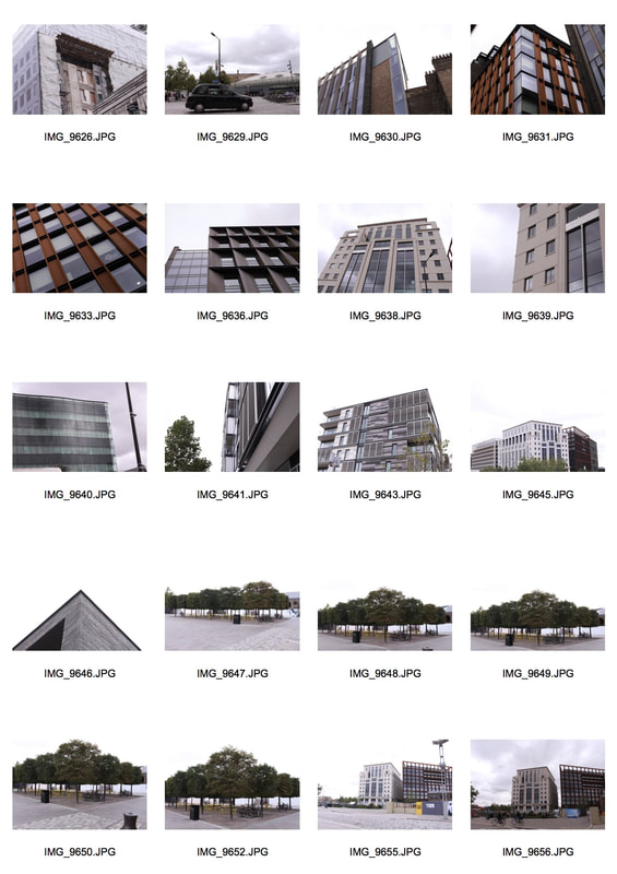
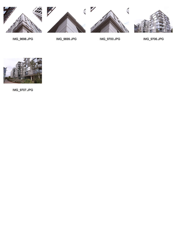
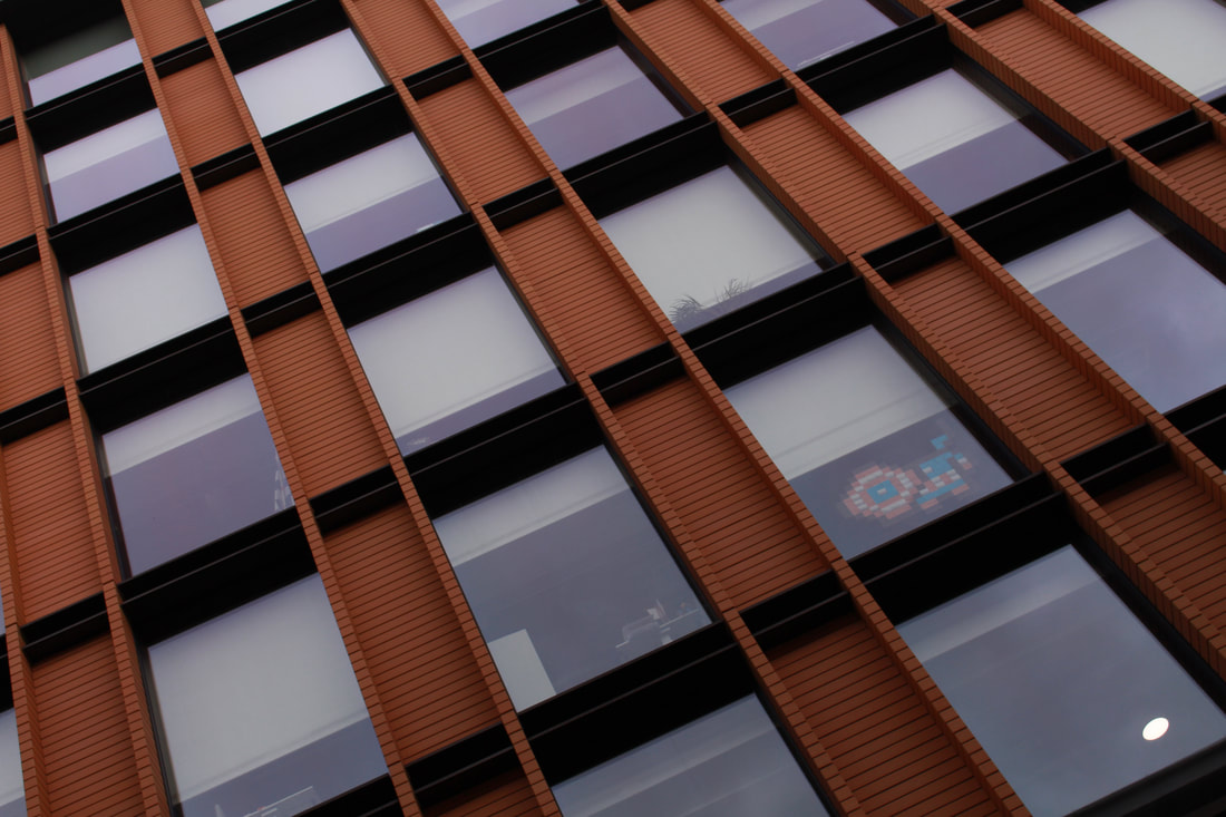
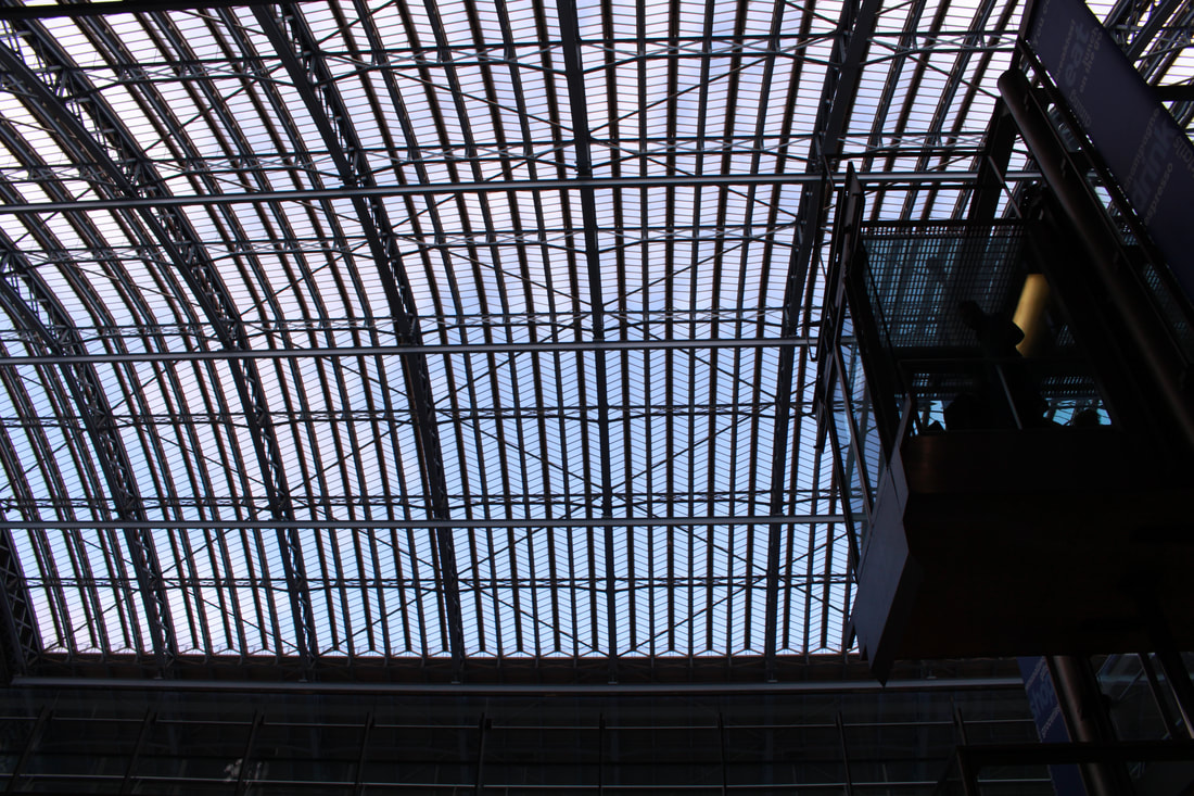
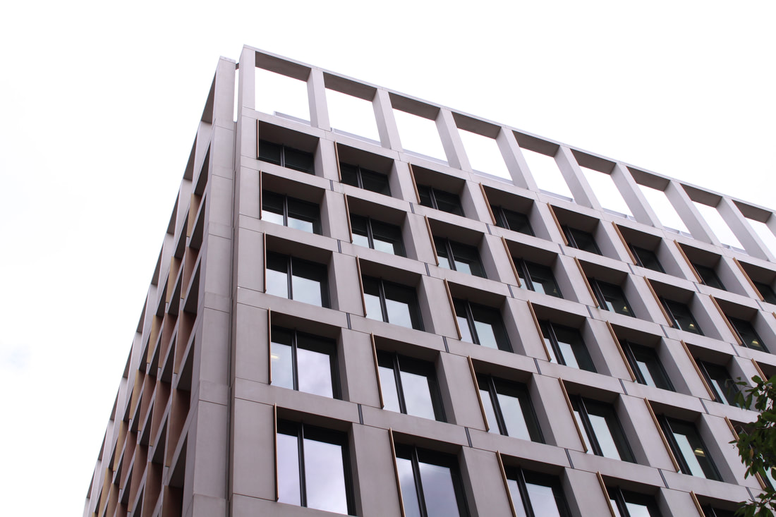
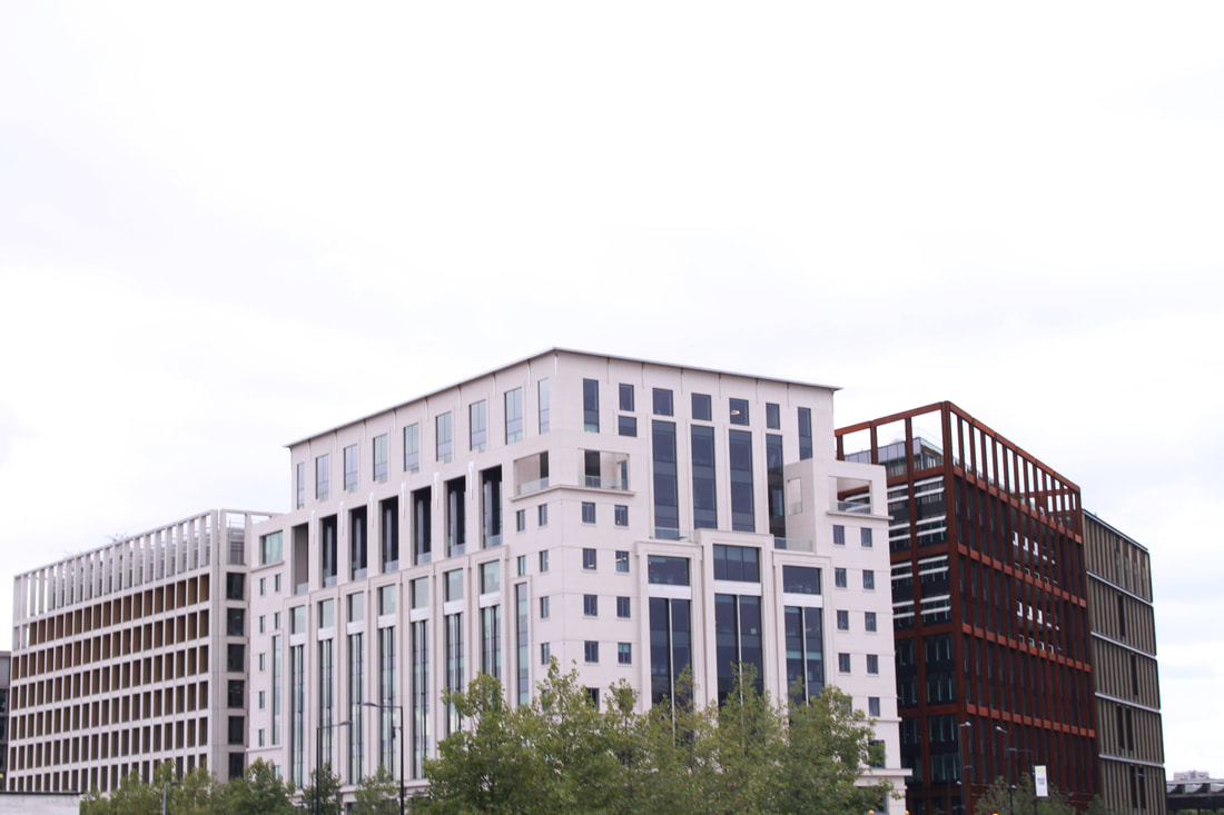
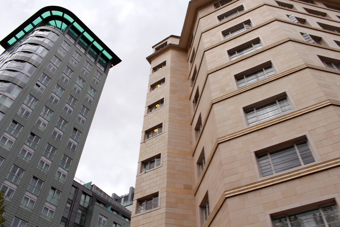
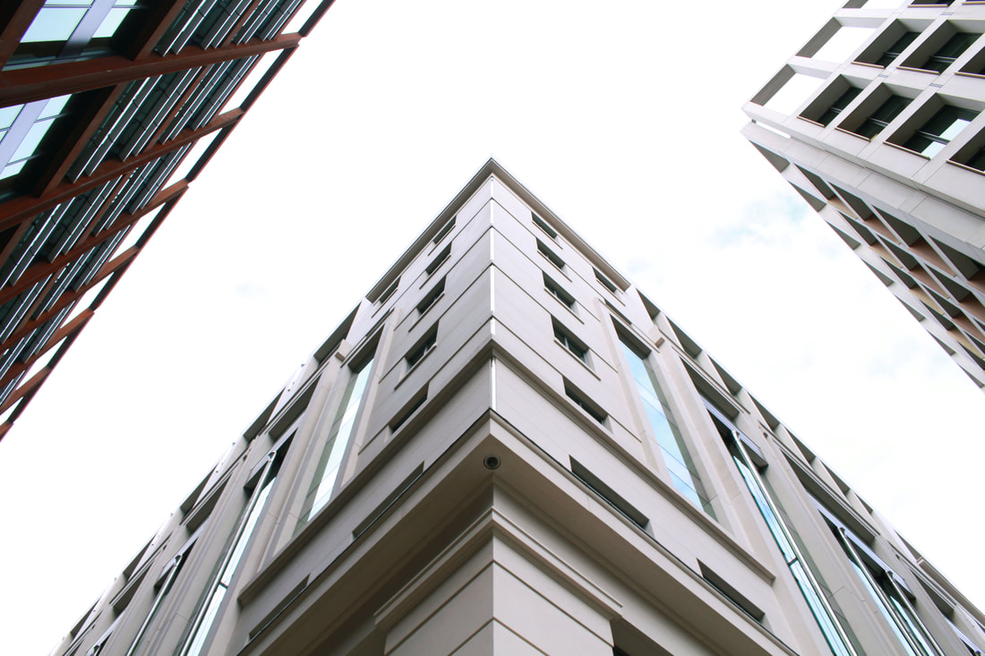
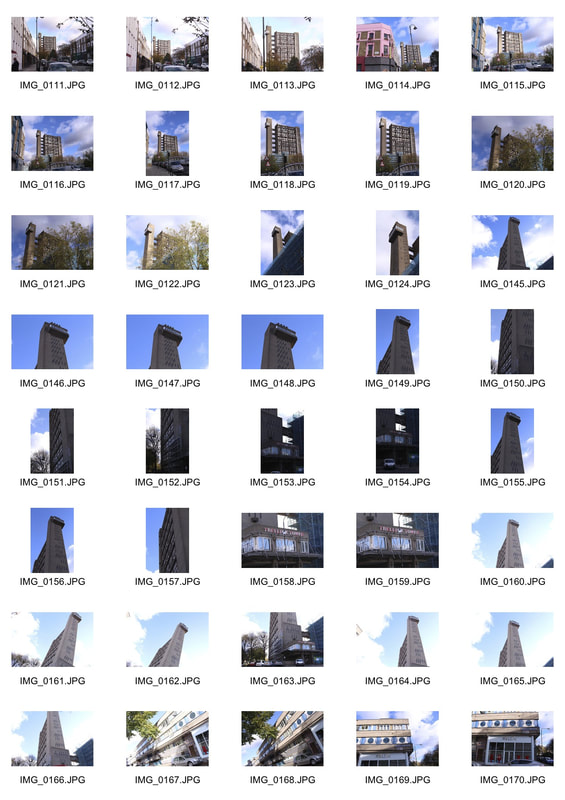
Around St. Pancras
Over the weekend, I went to an exhibition. On the way there, I stopped around different places in St. Pancras and photographed structure in architecture. I found this extremely interesting as I find modern architecture aesthetically pleasing and I find the shapes, textures and patterns pleasant to look at. I also like the idea of 'Imposing architecture' which I captured within my findings.
|
|
|
|
|
|
|
|
|
|
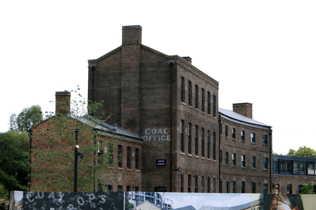
GALLERY EXHIBITION VISIT 1-
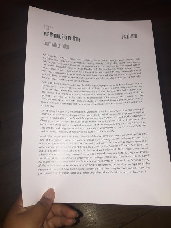
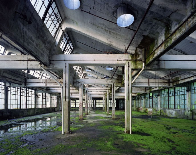
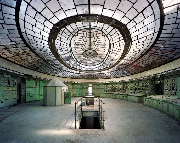
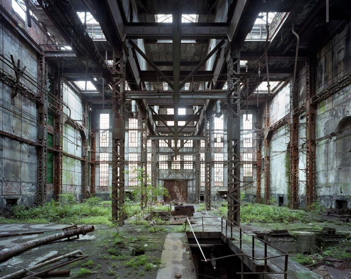
Yves Marchand & Romain Meffre- "Industry"
@TristanHoareGallery
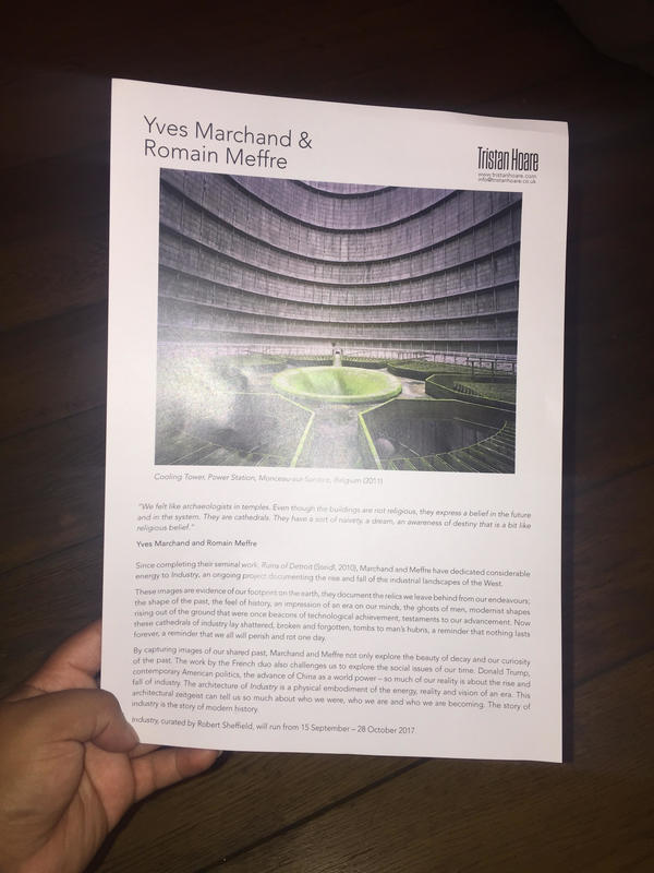
The "Industry" exhibition by Marchand & Meffre was held at Tristan Hoare Gallery, 6 Fitzroy Square, London. |
Some leaflets I collected at the exhibition stating information about the two French photographers and their work around the world.
|
|
|
|
The 'Industry' exhibition was being shown at the Tristan Hoare gallery, though the photographers are both Yves Marchand and Romain Meffre. They are two young French photographers who are passionate about contemporary ruins. They started their collaboration with the exploration of Parisian remains and later broadened their horizons to Europe (Belgium, Spain and Germany) before going to the United States and Asia. They said that "During our visits to ruins, we always try to focus on remarkable buildings, whose architecture embody the psychology of an age and a system, and we observe the metamorphosis of the process of decay". This exhibition exciting as I found the photos to be unique from each other and showing different ways structure can be portrayed within a piece. I like how the lines create an interesting perspective in each photo. I also found it intriguing that these were captured in a warehouse type setting which I didn't expect to see.
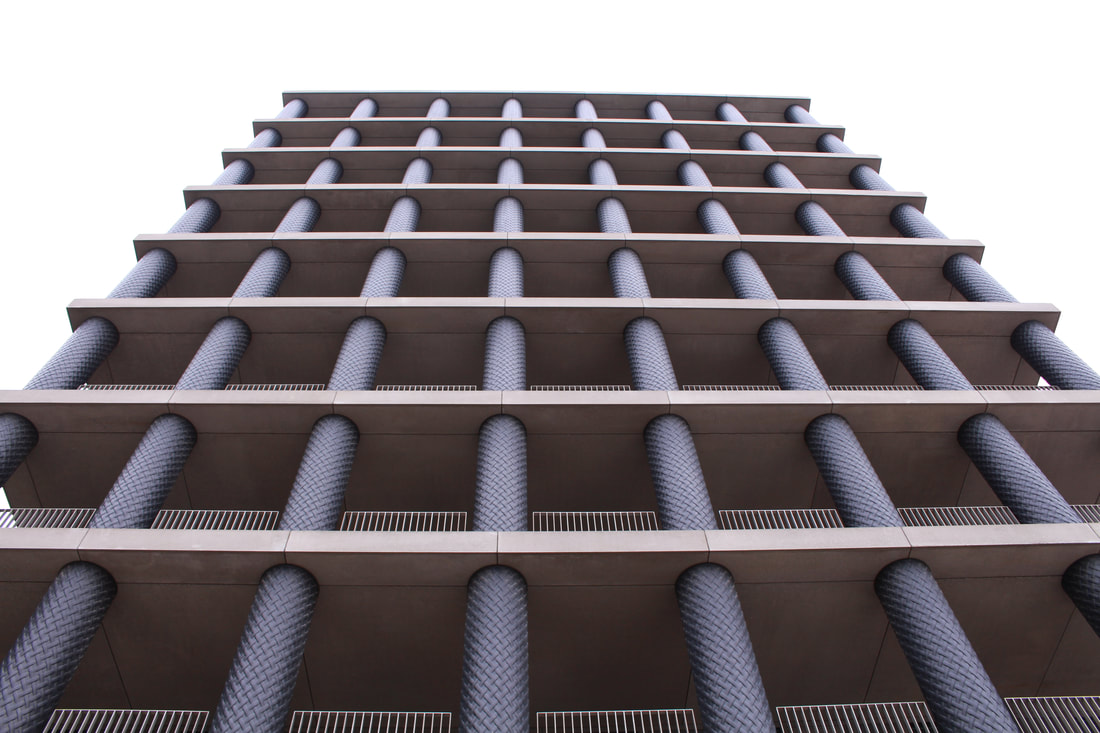
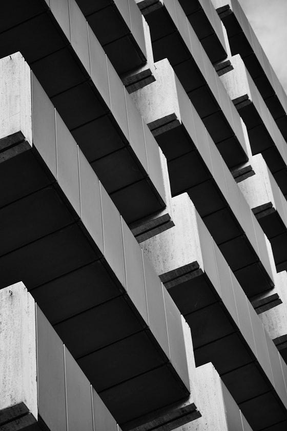
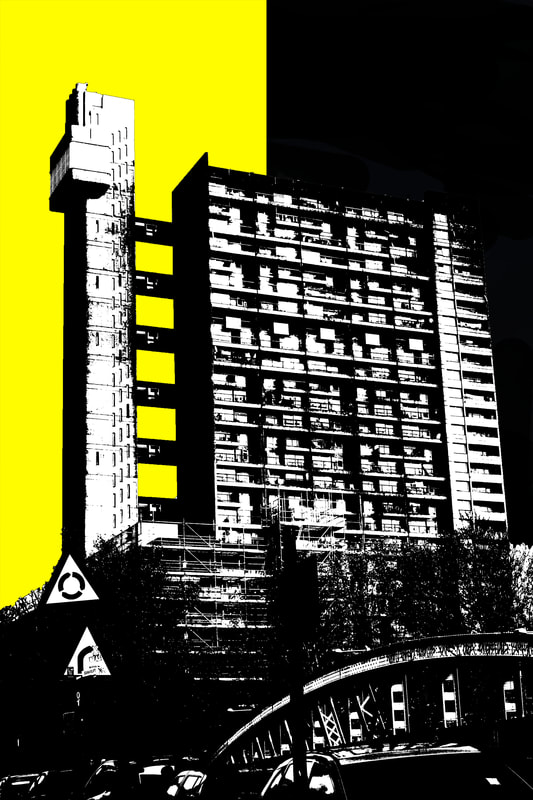
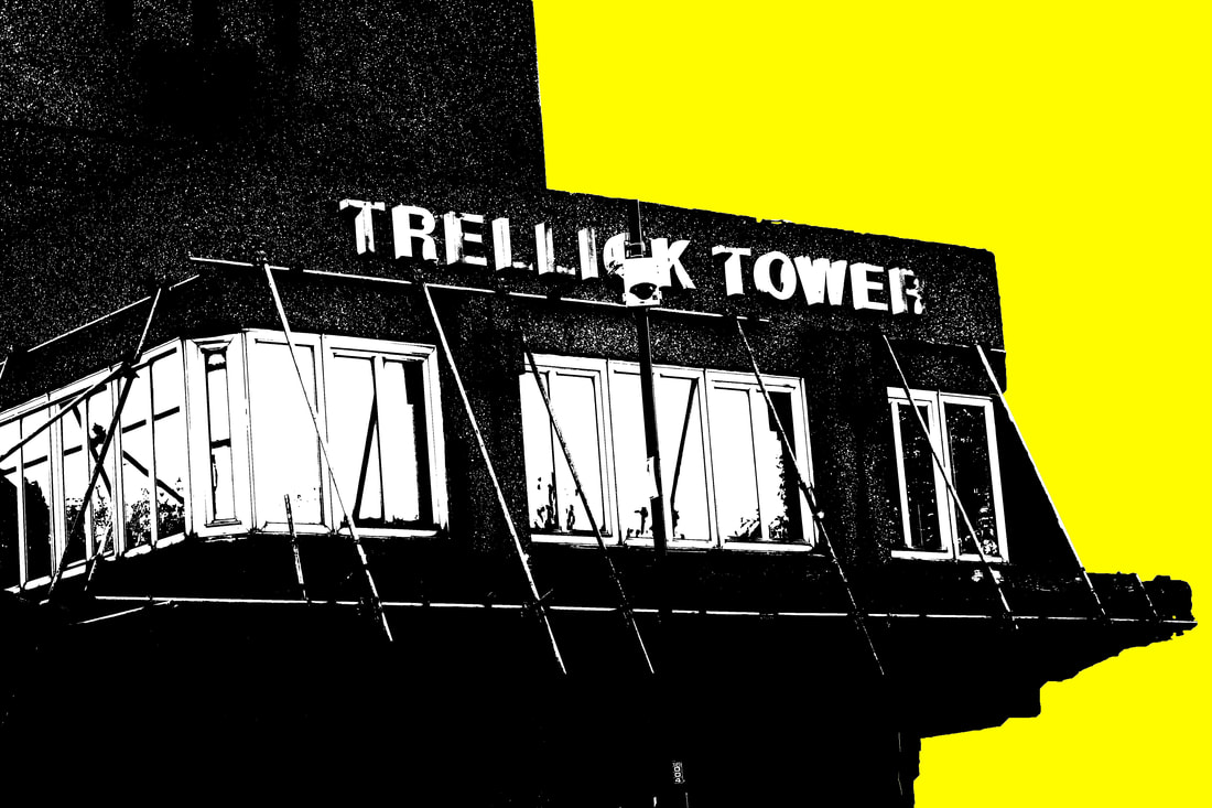
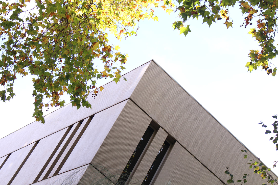
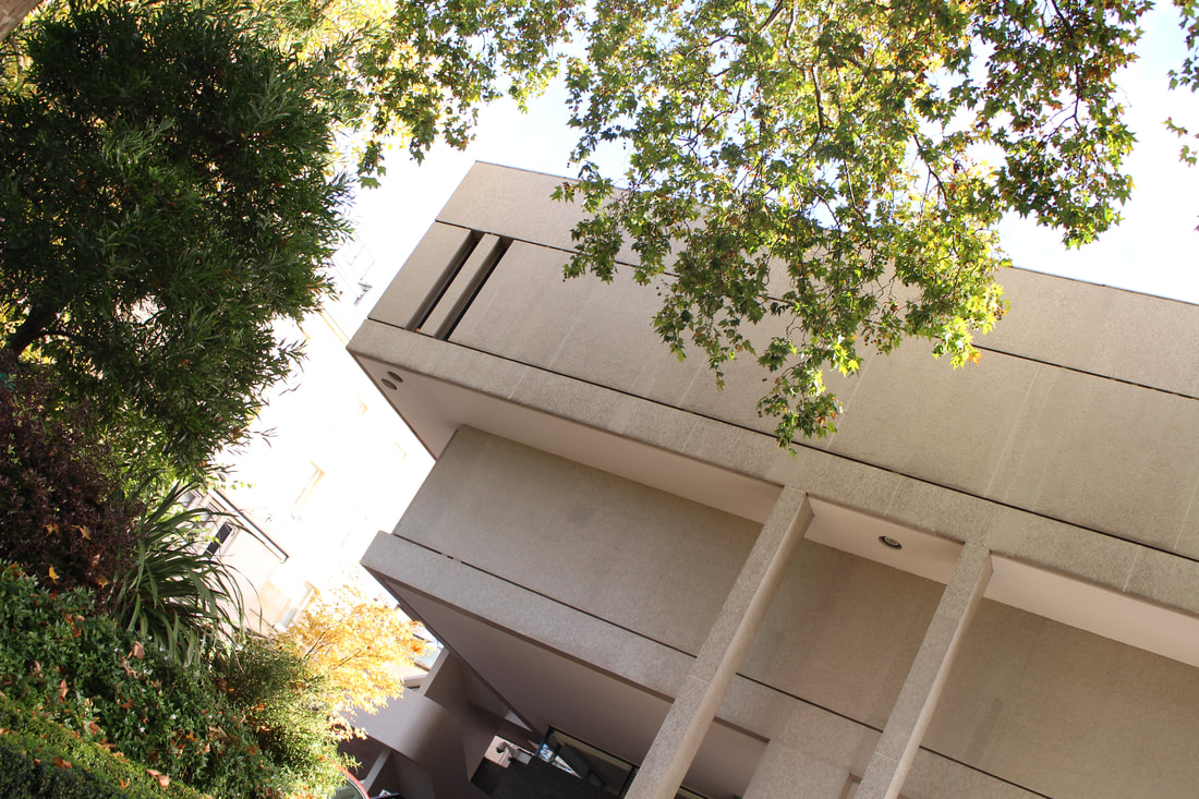
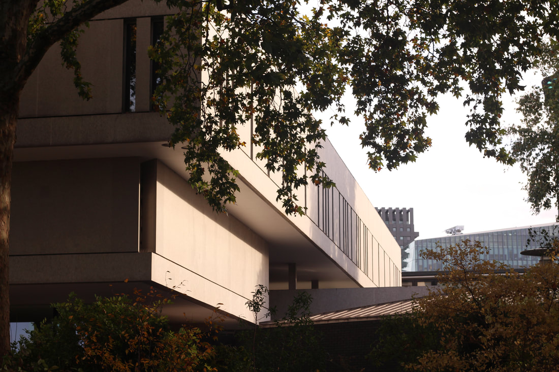
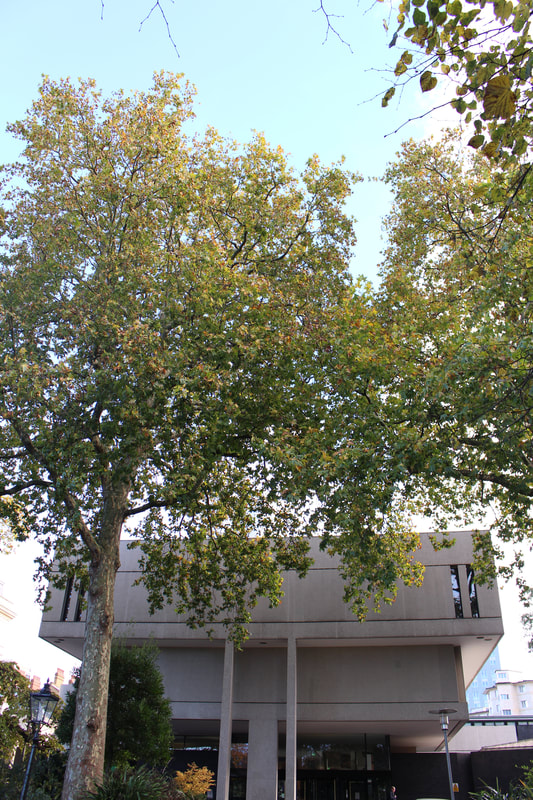
BRUTALIST STRUCTURE
"The city’s changing architecture is a kind of memorial of humanity’s endeavours and schemes, for all buildings have been fashioned according to the ideologies of their days".
|
Brutalist architecture is a style of architecture which flourished from the 1950s to the mid 1970s, spawned from the modernist architectural movement. The term "Brutalism" was derived from the French "Béton Brut" or raw concrete was the term used for the futurist architecture being created by Le Corbusier and others like him. Brutalism became associated with post- war British architectural offices/industrialised looking buildings and blocks of flats. Originally, tower blocks, such as the Trellick Towers were built post-war in order to accommodate for large numbers of people whose homes had been destroyed by the bombings of WWII. The architecture itself is characterised by the large size of the buildings and the use of raw unfinished concrete. They also make use of geometric forms in a way to attempt to communicate the building's function and what the rooms behind the slabs of concrete are used for.
|
Brutalist buildings are seen as very controversial in terms of appearance. Some people think of the style as 'ugly' due to its dull, dreary and negative tones. Its structure is bland and can be associated with times of misery (war). On the other hand, some people view brutalism as a fascinating style of architecture because of its uniqueness and variation in shapes and structure. One reason people are coming to appreciate it now is because of a generational shift.
|
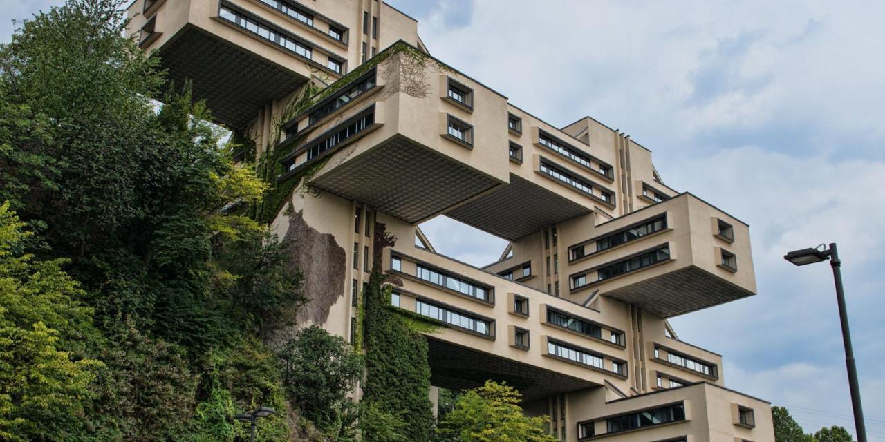
Ministry of Highway Construction, Tbilisi, Georgia. The aim of this building was to occupy as little ground space as possible with the various floors of the building opening out like branches from the central root of a tree. Personally, I like brutalist architecture because in some ways the structures are almost like illusions. They portray a type of pattern which looks extraordinary and its not necessarily something you see in everyday life. I like to capture images of the brutalist buildings, at the same time, I can understand why some people dislike it due to its gloomy atmosphere.
|
Simon Phipps
|
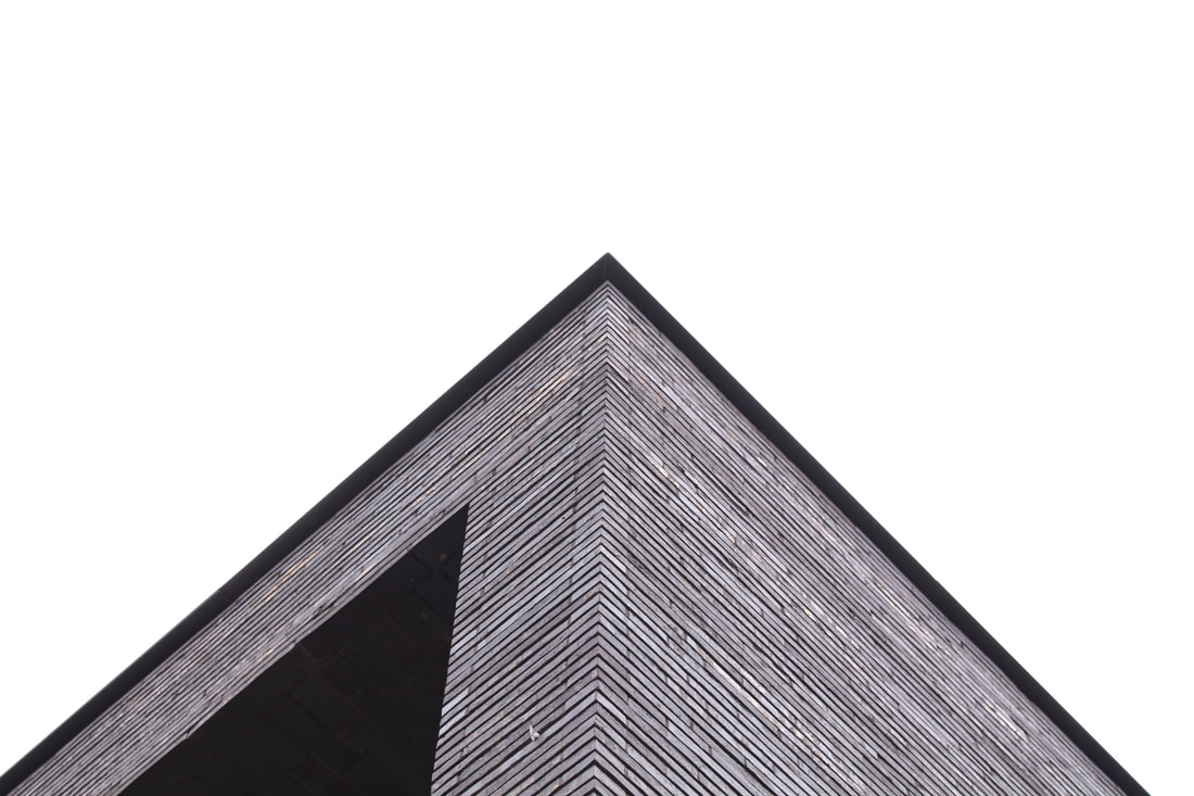
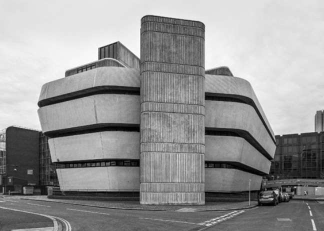
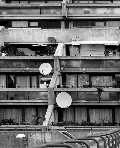
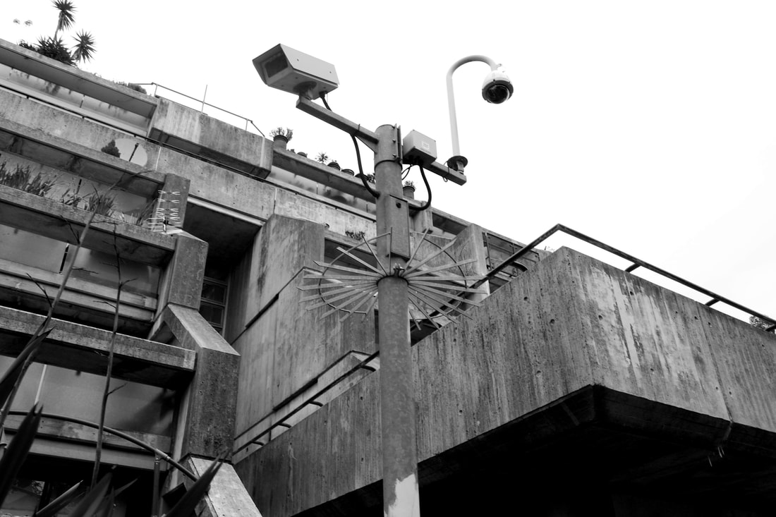
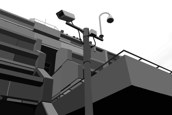
Simon Phipps is a fine art photographer operating in the UK and has captured a wide variety of subjects. His photography provides a unique perspective and portrays Brutalist architecture in a sensitive, realistic and distinctive manner. Phipps has spent the last 15 years photographing and documenting Brutalist and buildings in the UK, creating a survey of photographic images that demonstrate the breadth of this contentious architectural style. Many of the buildings Phipps captures have been abandoned and are not in use, this leads to the areas being used as places to vandalise. Again, this portrays brutalist structures in a negative light.
|
|
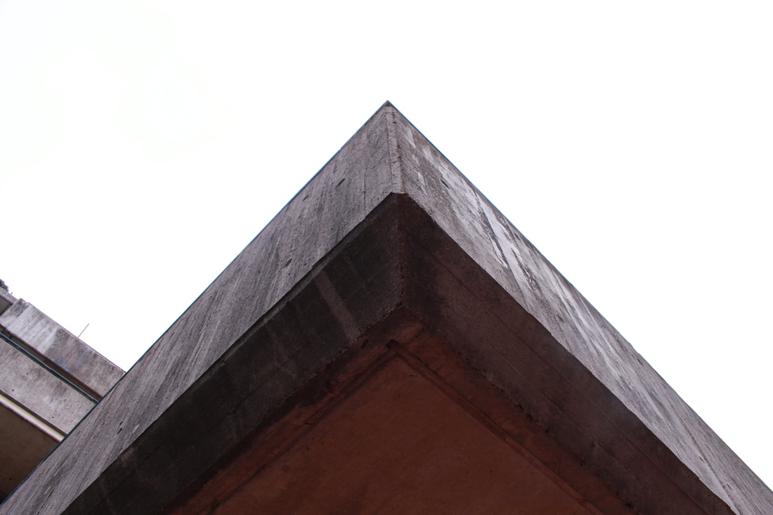
I like the fact that the photographer carefully captures the buildings' interesting structures/shapes which make them unique and different to each other. As well as this, Phipps makes his photos black and white which may emphasise the various textures and patterns within the frame. This can be noticed in the image to the right. A range of materials can be recognised- brick- rough surface which contrasts with the smoothness of the metal hand rails. I can also appreciate that the image itself looks like an illusion. The corner of the main building is in alignment with the hand rails on the stairs. It creates an idea of symmetry and works well against the negative space (cloudy sky). The shadowing adds to the mystery and darkness of the building and may further illustrate why some people dislike these brutalist structures.
|
|
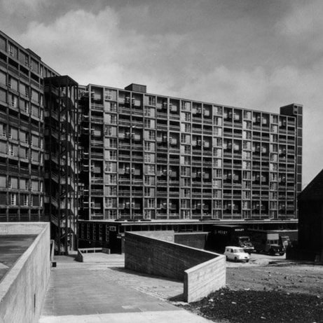
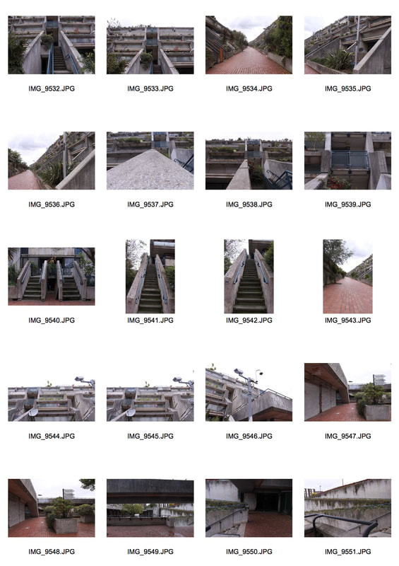
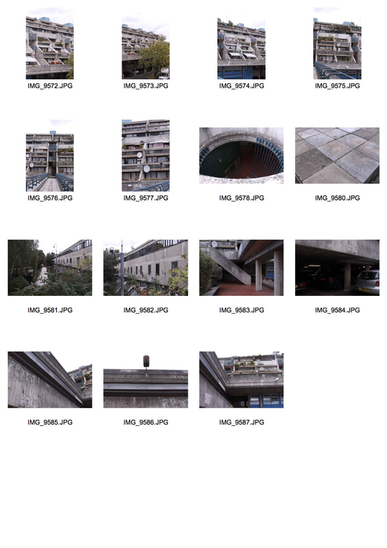
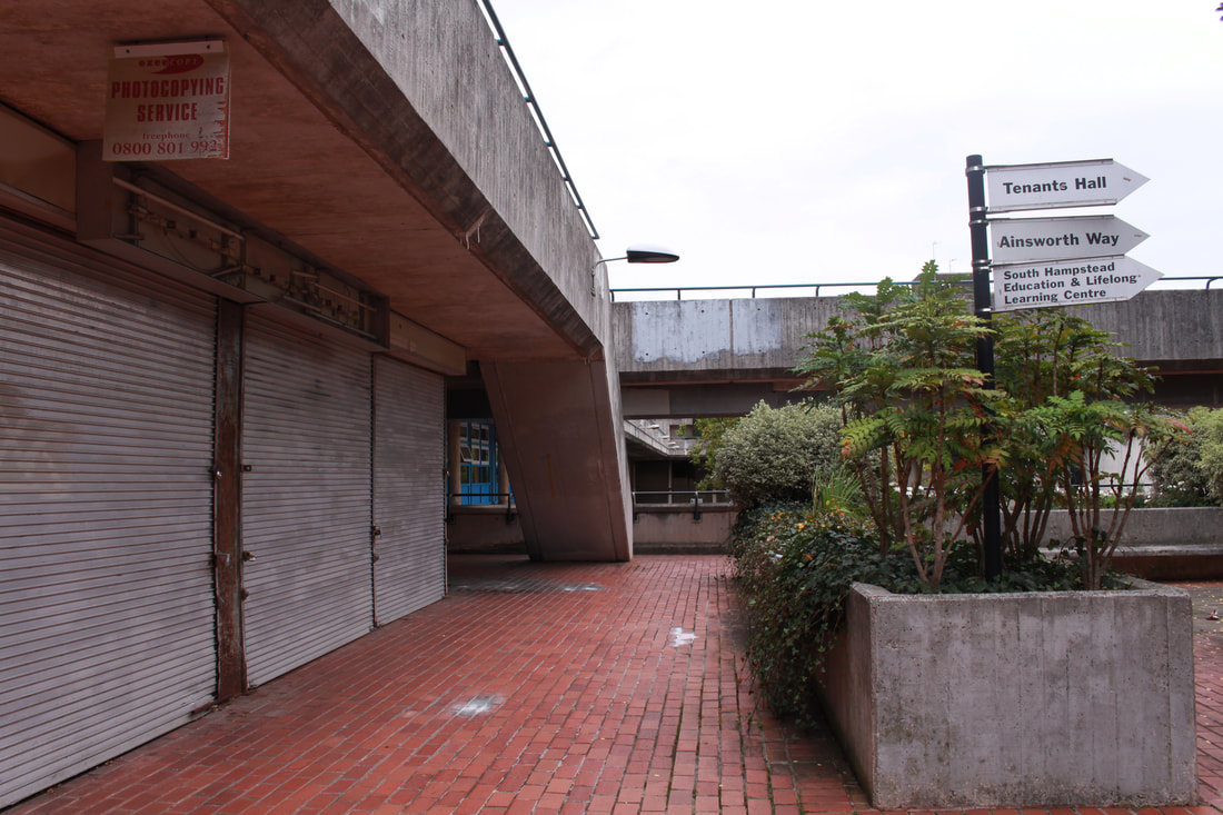
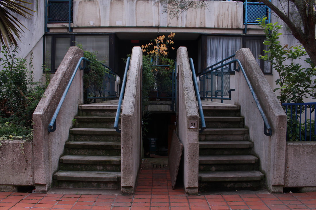
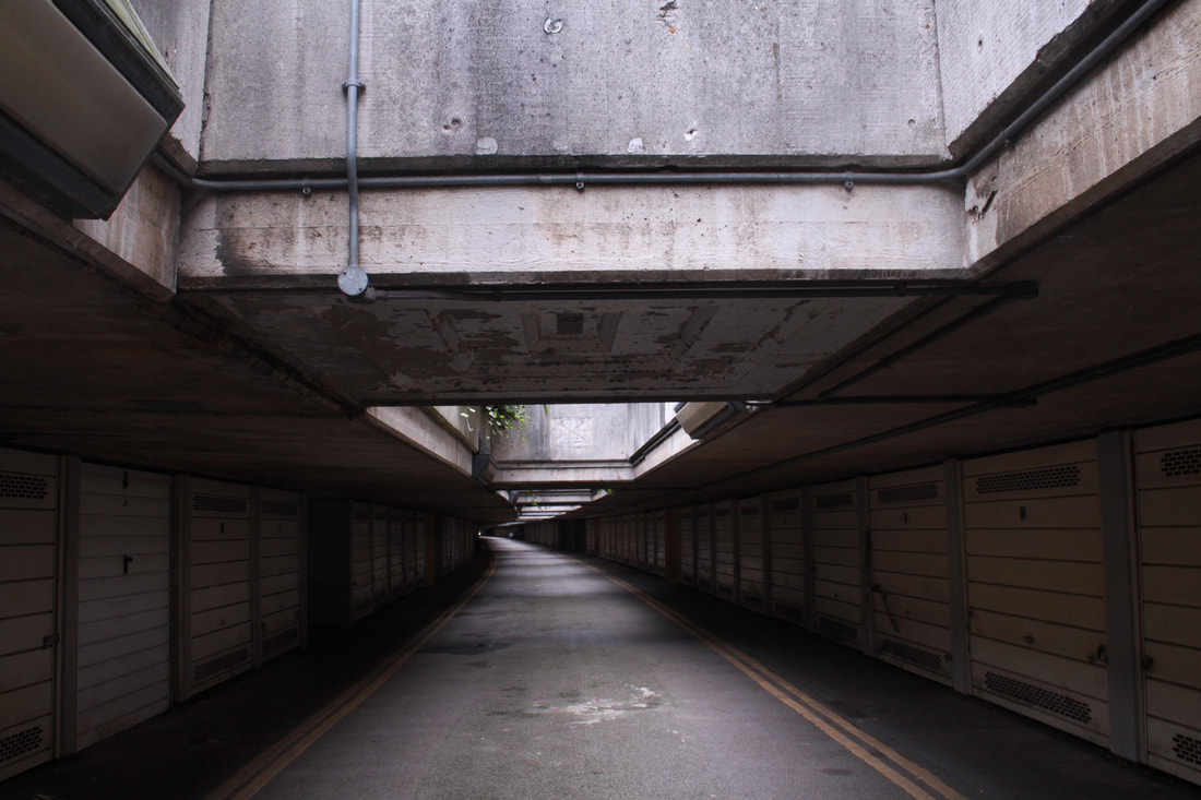
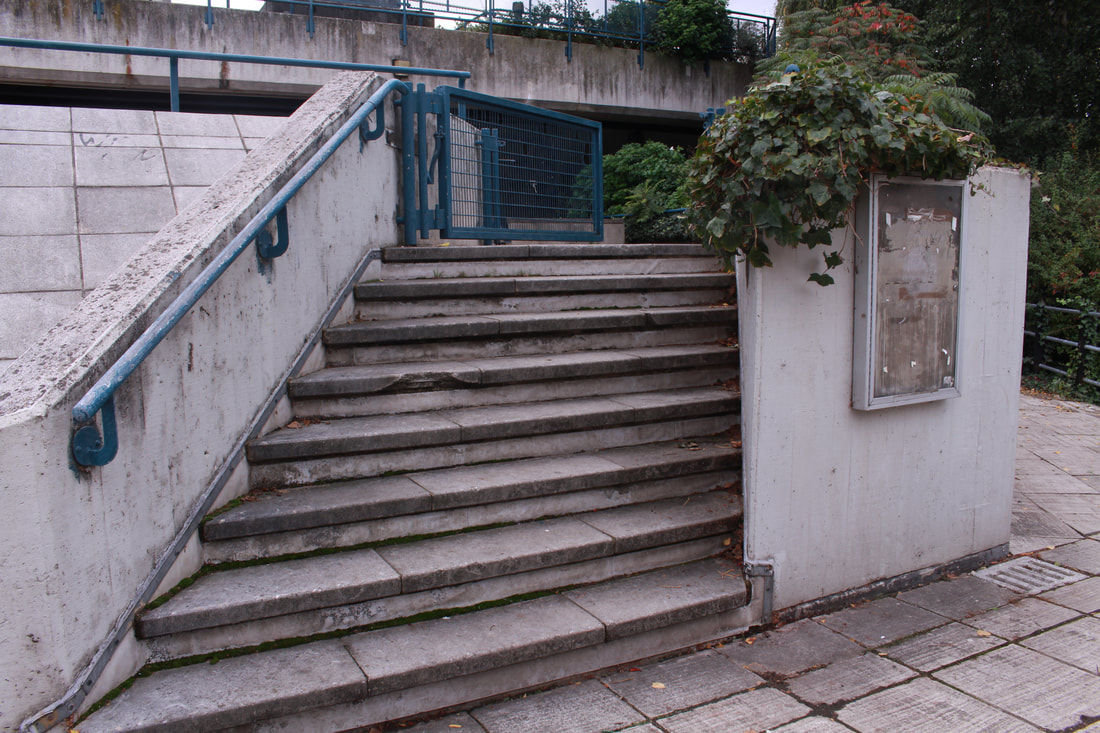
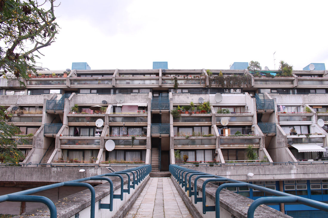
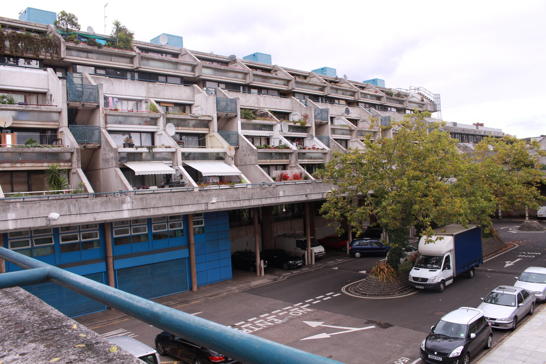
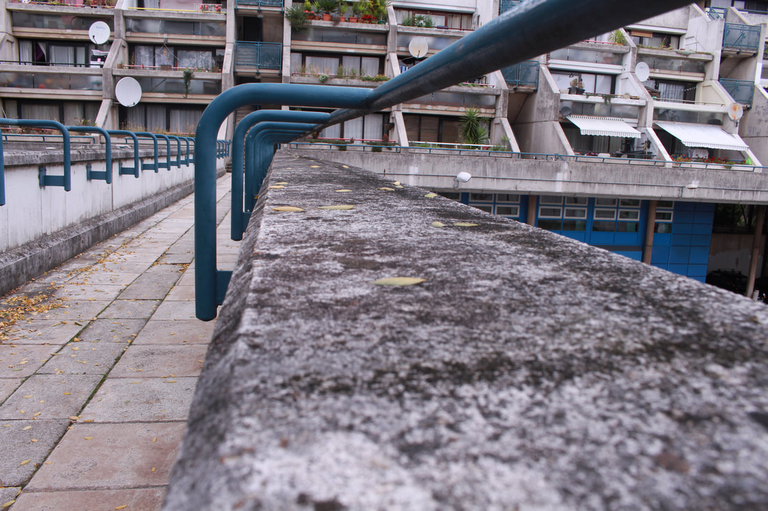
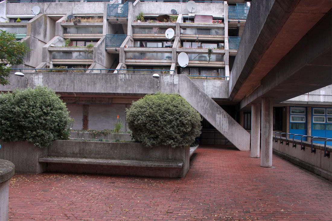
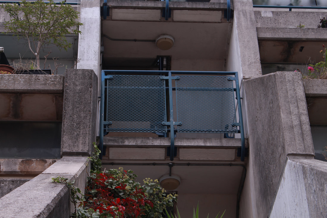
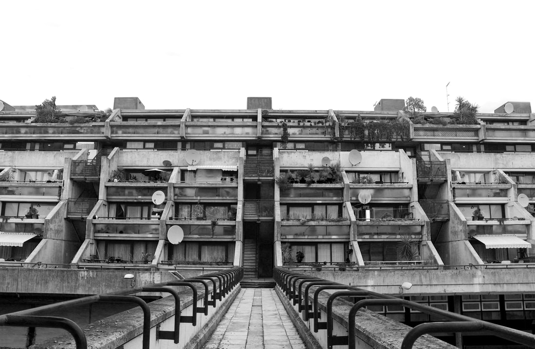
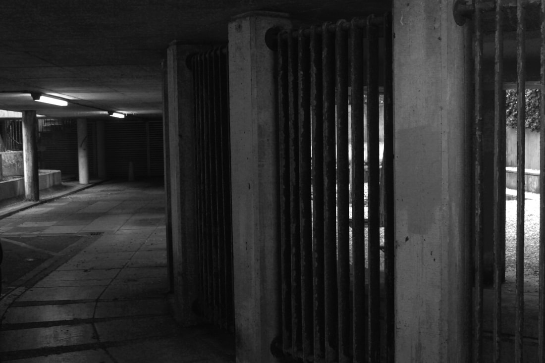
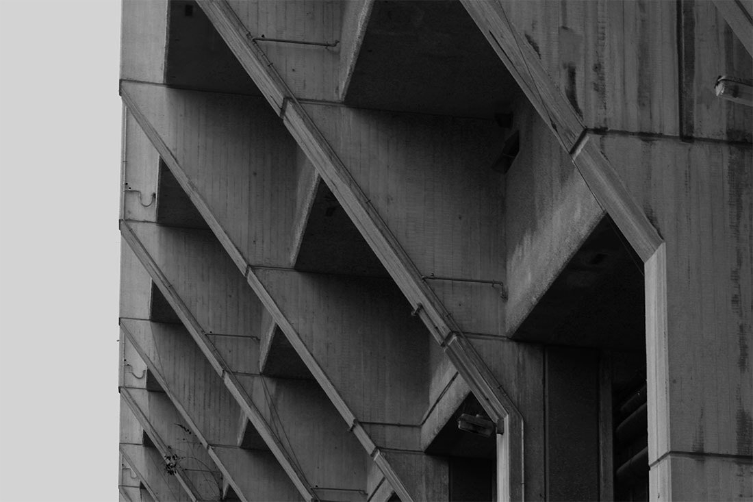
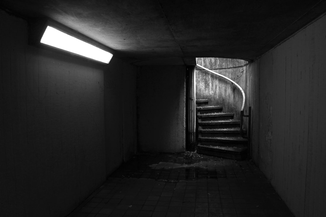
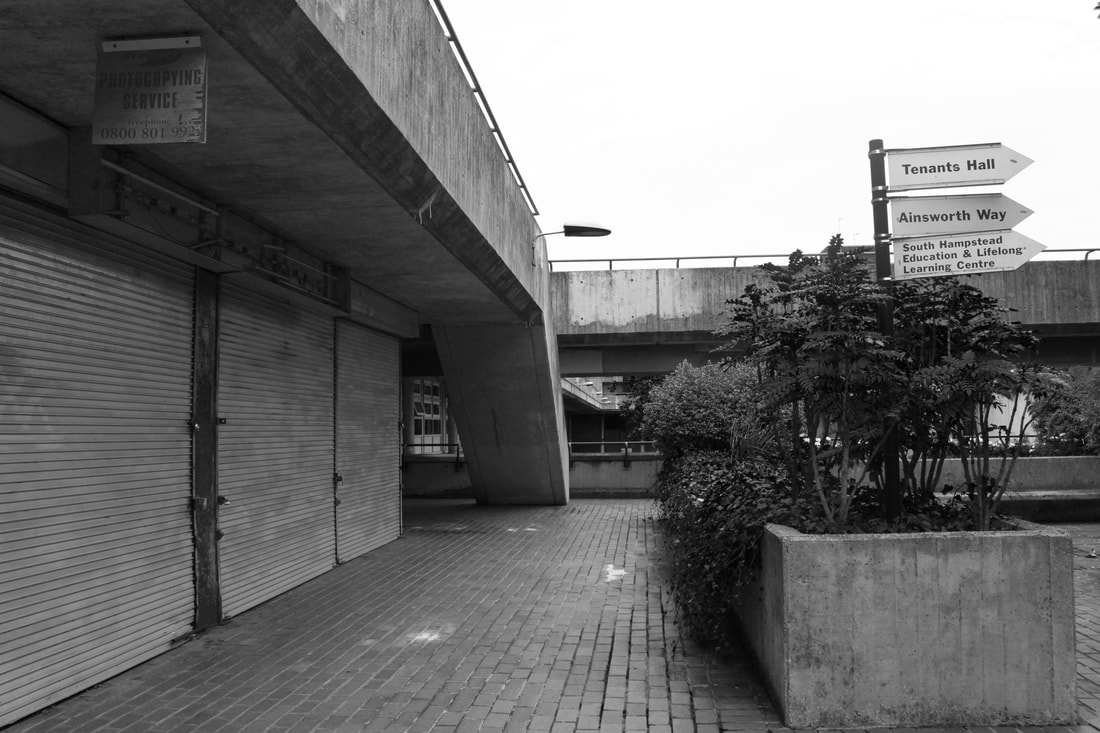
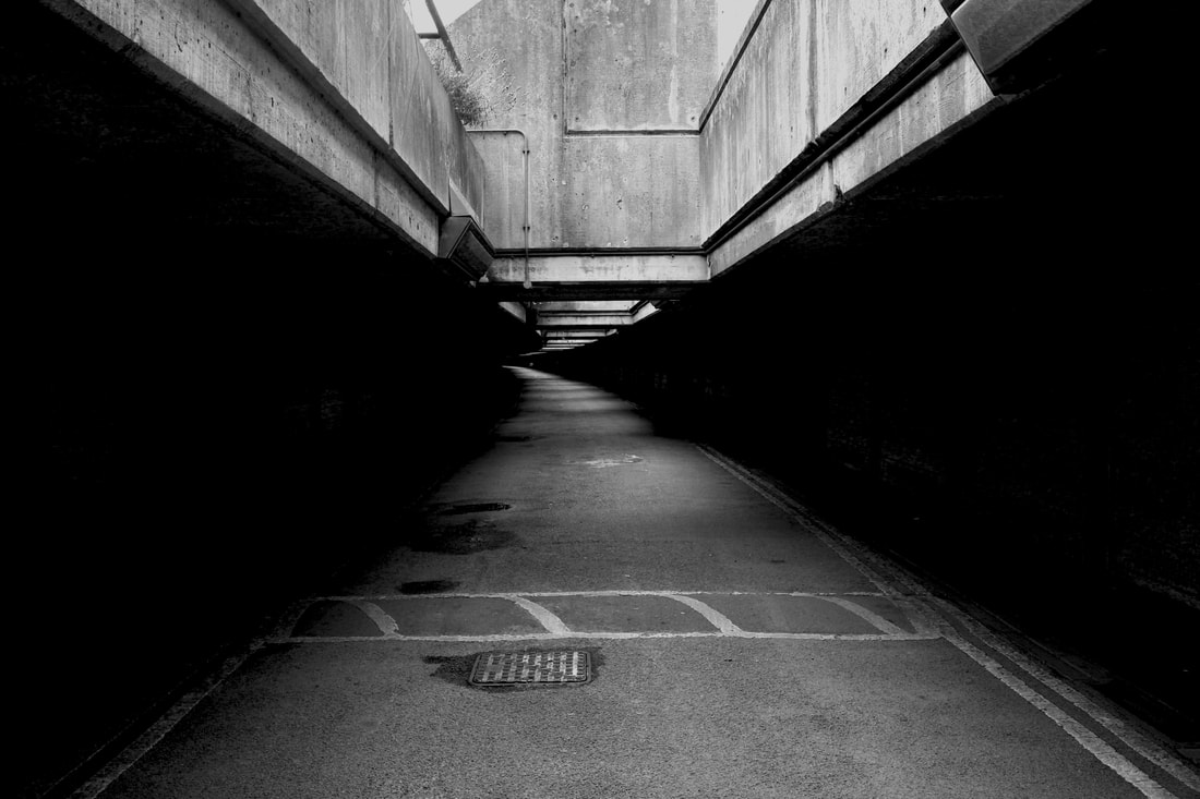
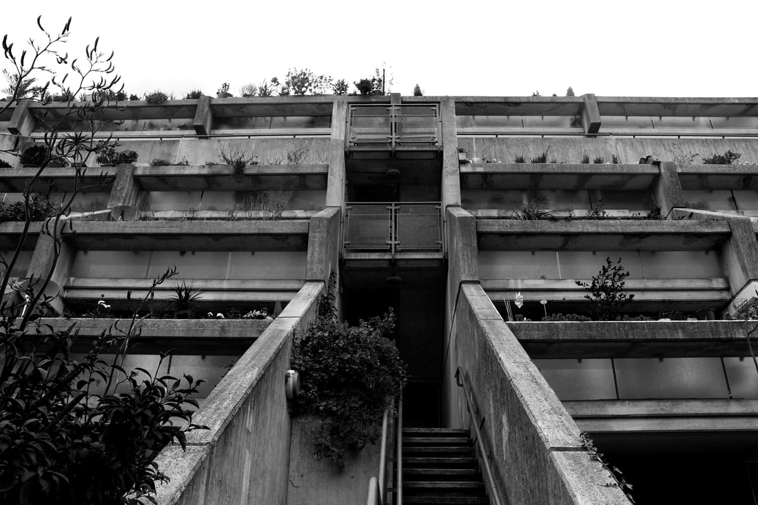
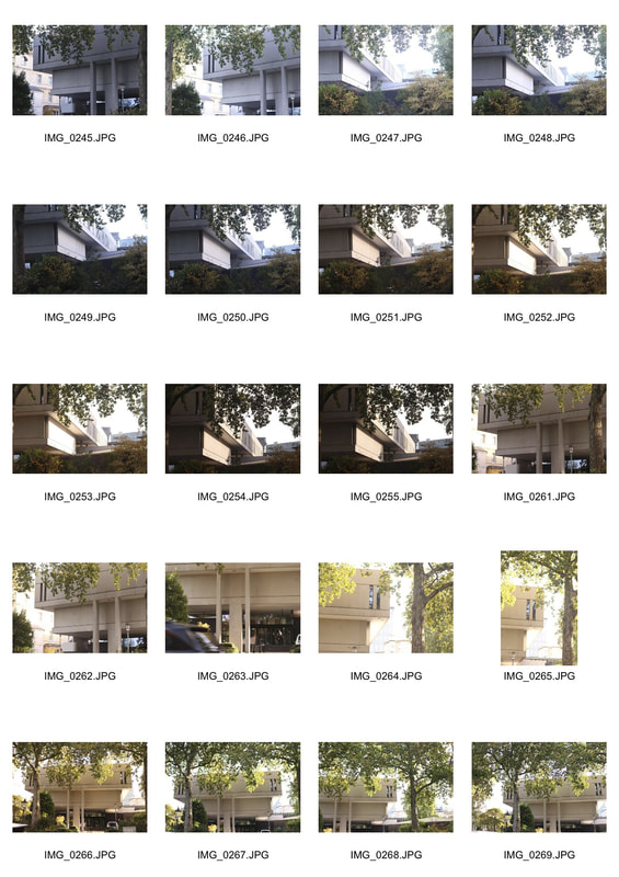
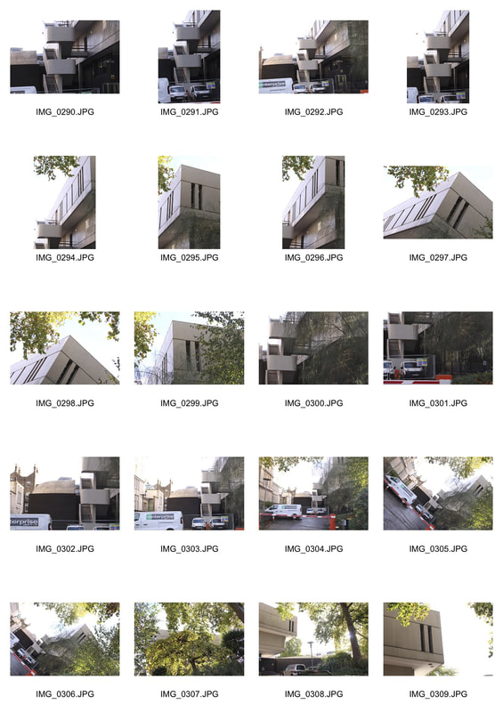
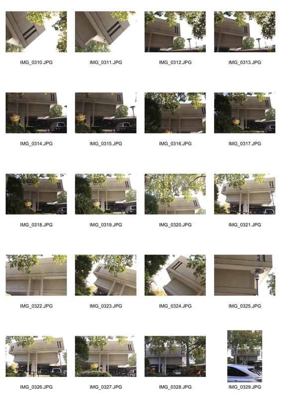
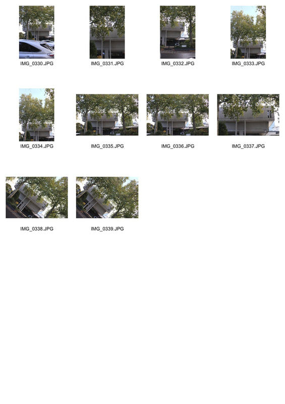
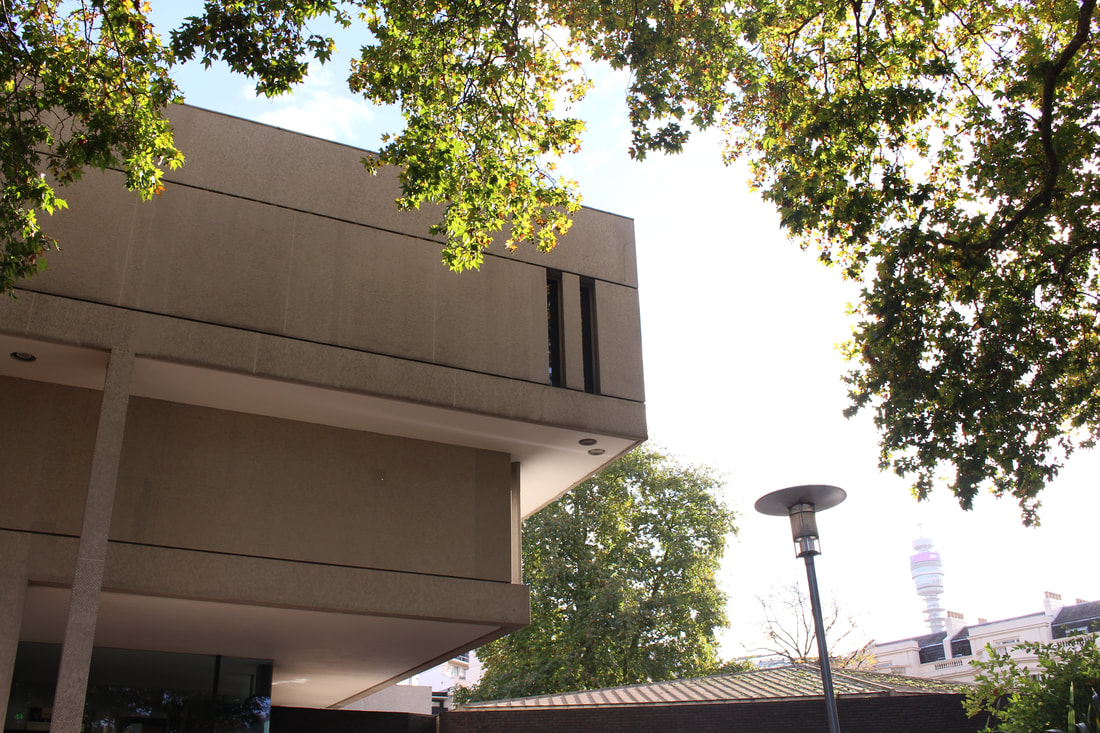
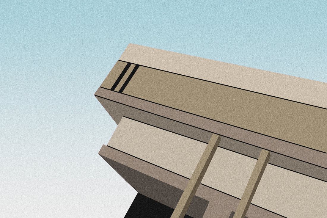
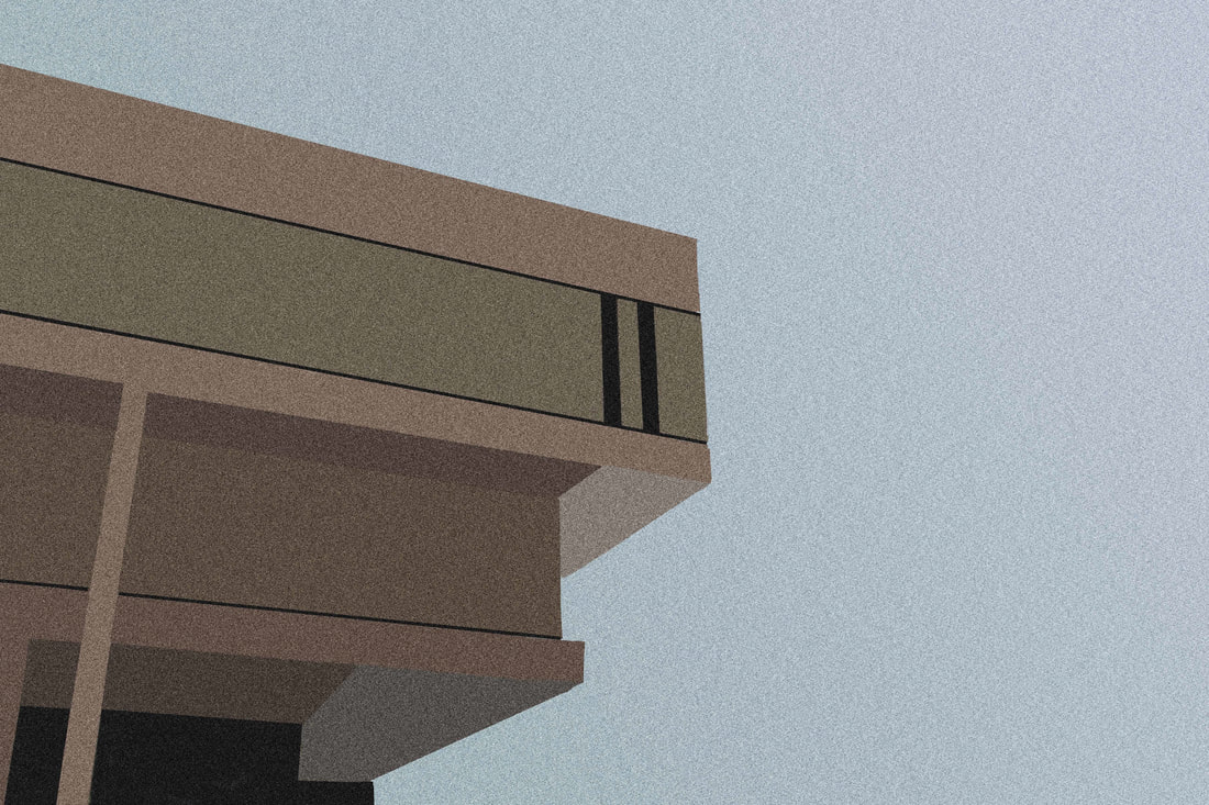
THE ALEXANDRA ROAD ESTATE
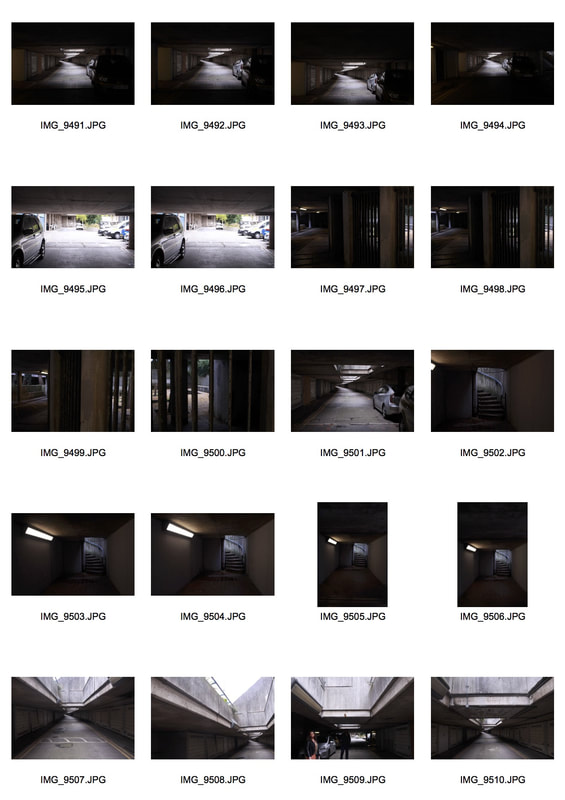
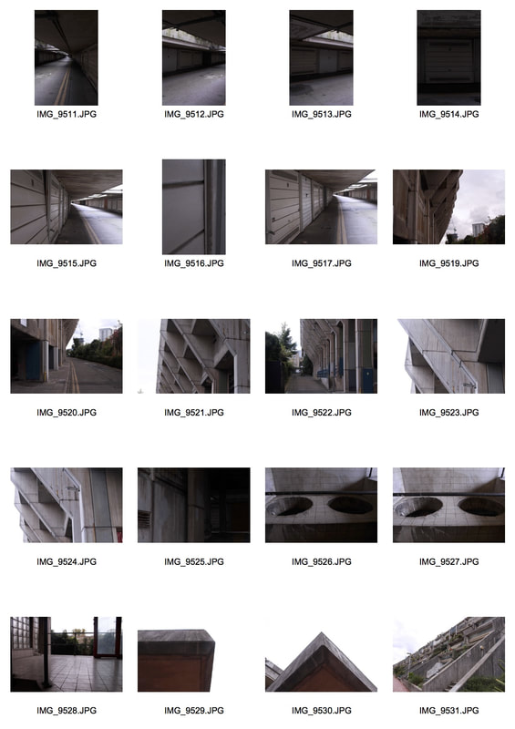
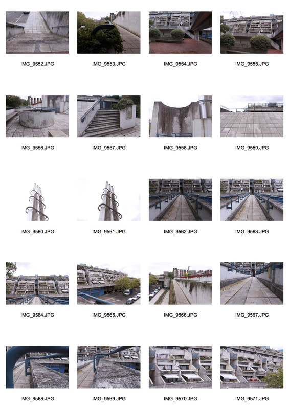
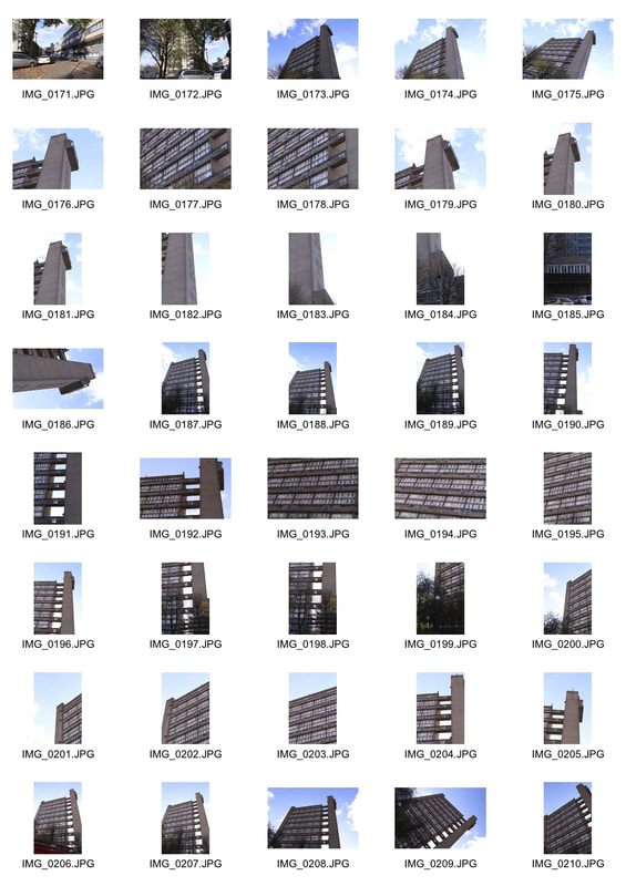
In response to the work of Simon Phipps, I went to Alexandra Road Estate in Camden to capture brutalist architecture. I found there was a lot to capture around the estate. Firstly, I went to the underground car park then explored around the flats themselves. I noticed the concrete and brick materials used throughout the building. The Alexandra Road Estate was designed in 1968 by Neave Brown of Camden Council's Architects Department. I chose to photograph this brutalist structure as the estate has been used for many films in the past. As well as this, I thought it had the most intriguing structure in comparison to the other brutalist buildings that were suggested to me.
|
|
|
|
|
My aim for this task was to capture the building's structure by photographing its levels, shapes, range in textures using my knowledge of composition, camera angles, aperture, white balance etc. I had my camera on manual mode which allowed me to alter various settings to find the exposure setting that best fit my scene. I wanted to present the estate as a fascinating structure through its unusual form. I liked the connection Brown has made between nature and the man made structure. This is evident by the many plants, trees etc found around the estate. In my opinion, the use of nature made the block look more colourful/happier as it contrasts with the dull concrete look.
Selects
Negative Space Form
Here, the subjects work well against the negative space. It defines and emphasises the main subject of the photo, drawing your eye to it. I like that I captured the plants in this composition on the left. It is almost as if the architect of this brutalist structure wanted to bring the 'country' or 'nature' to an environment in the depths of the city. In the photo to the right, I used the rule of thirds to position my subject in the centre. I used a worm's eye view which makes the audience feel small in comparison to the subject. It is almost intimidating. The negative space in this image creates the same effect seen on the left. Your eyes are automatically drawn to the subject. The white space creates contrast.
|
|
Shape
I experimented with shape throughout my photographs. I experimented in the way I used shadow within my pieces. (Middle image) As the majority of the frame is rather dark, your eyes are drawn to the areas of light. The contrast in lighting makes the photograph look peculiar. Shape is established here as the continuous line of garage doors look almost like an ongoing pattern along the road.
|
|
|
Perspective
These images contain a full range of tones in contrast with some of the other photos taken throughout the shoot. There are greens, greys, blues, beige and white tones within the photo. I took them using a wide angle view and the perspective is expanded. The natural light emphasises the building's concrete textures.
|
|
Other photographs
|
|
|
My Edits
In the style of Simon Phipps, I made my image black and white in photoshop. As well as this, I found that some trees and plants were covering the left side of the original photo (which can be seen in the section above). I wanted to achieve symmetry in structure within this photo, therefore, I copied and pasted a section from the right third of the image and flipped it on the other side. Additionally, I used the cloning tool, eraser tool etc to make the image look at realistic as possible so it was not obvious that I had carried out this process. The eye is automatically drawn to the centre of the photograph.
|
|
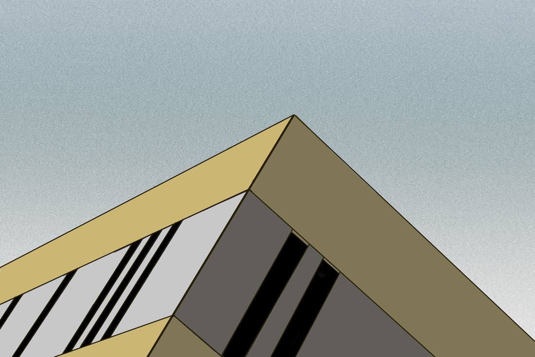
BRUTALISM- Extension Task 1
Thomas Danthony
Thomas Deanthony is a photographer who photographed Brutalist buildings and then simplifies these structures in Photoshop. He then in turn creates screen prints of his creations. His Brutalism project is a collaboration with Black Dragon press about Brutalism architecture in London. I find his work fascinating as he manages to turn a building with several layers, varies in textures, different shapes and forms into a simplistic piece of artwork. This is a process I would like to carry out at a point in the future.
|
|
Below is my response to Thomas Deanthony's work.
My aim for this task was to almost imitate the way Thomas Anthony captures structure in Brutalist buildings. This was completed using Photoshop though, the artist used screen printing in order to create his work. Initially, I found this task rather challenging depending on the location and how detailed or complexed the photo is. For this task, I chose to use my photographs from Alexandra Road Estate. I thought my attempt to recreate Deanthony's work was successful and I achieved his style of work on Brutalist buildings.
|
Before
|
After
|
|
|
|
|
|
|
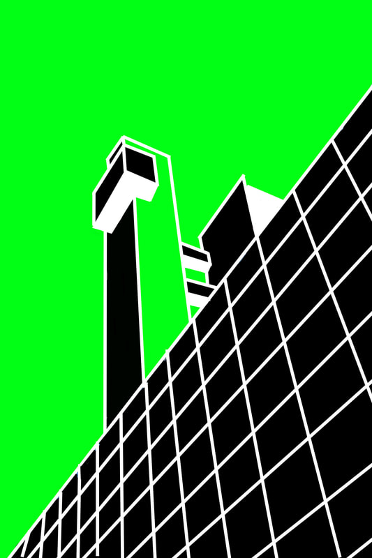
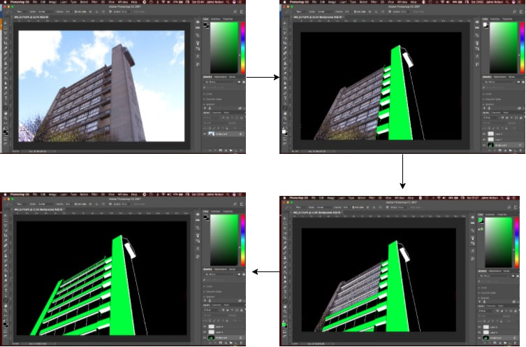
The Photoshop Process...
|
|
|
Brutalism- Extension Task 2
Evol
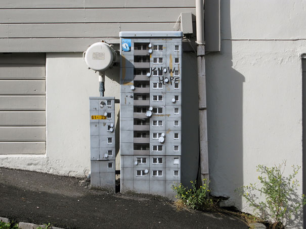
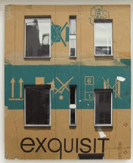
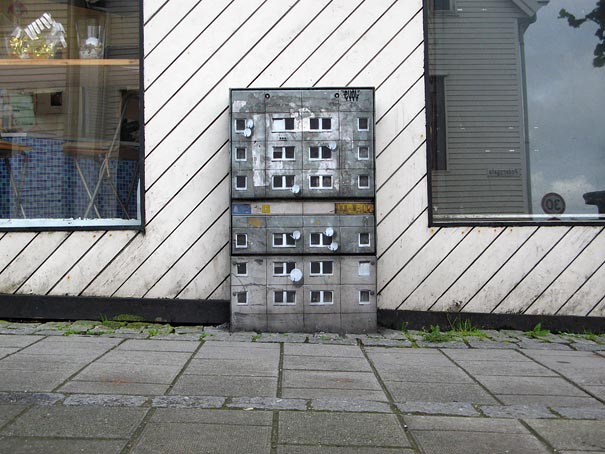
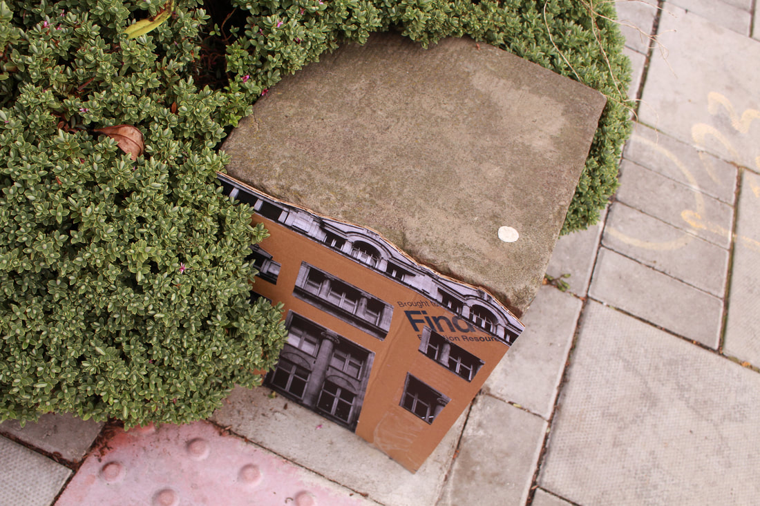
Evol is a German street artist who transforms banal urban surfaces into miniature lifelike buildings. He is similar to an urban planner, but unlike the others, he creates a city within the city. The artist uses complicated stencils and photographs to quickly transform powerboxes, and other worn urban surfaces into miniature apartment buildings or other structures. By drawing tiny balconies and satellite dishes onto the side of an electrical box, he is able to turn it into a realistic tiny skyscraper. The idea of proportion is very interesting throughout his work. Below is my response to Evol's work.
|
|
|
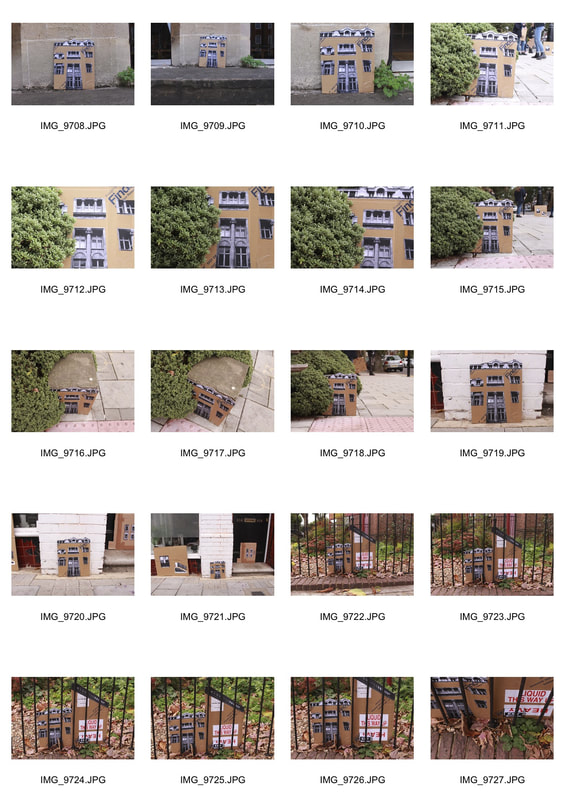
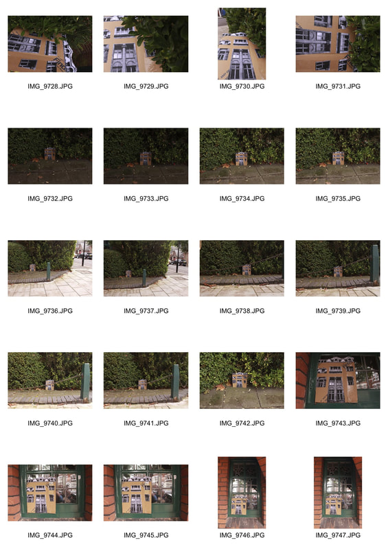
In response to Evol's work, we took photographs of buildings and printed them out in black and white. We then cut out different features of the building such as, windows, doors, railings and more. After, we stuck them onto a piece of cardboard to make it look like a real life structure. Next, I took my piece outdoors and took photos of it next to a lamppost, trees, on pavements and electricity boxes in order to create this effect. I experimented with different locations. In my opinion, the most effective photograph was when I put my building next to someone else's. I thought it looked rather unique compared to the other photographs which made it interesting to view.
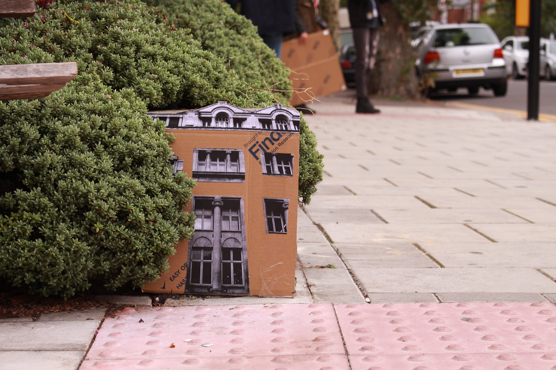
|
|
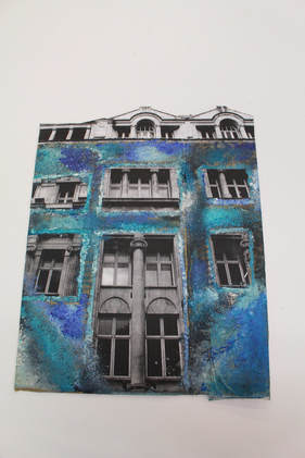
Finally, I added paint to my building and displayed them outside the classroom. I felt the blue tones contrasted and worked well with the negative tones. My aim was to make the fairly modern building appear rather old and worn.
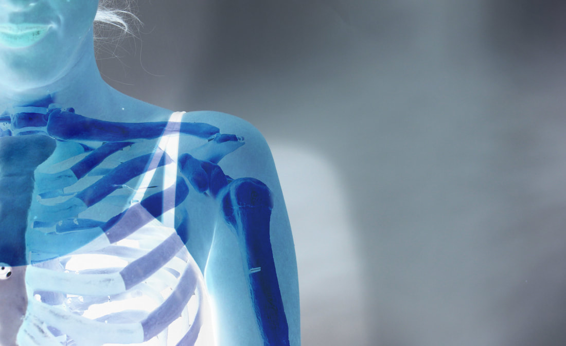
Skeleton
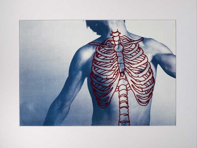
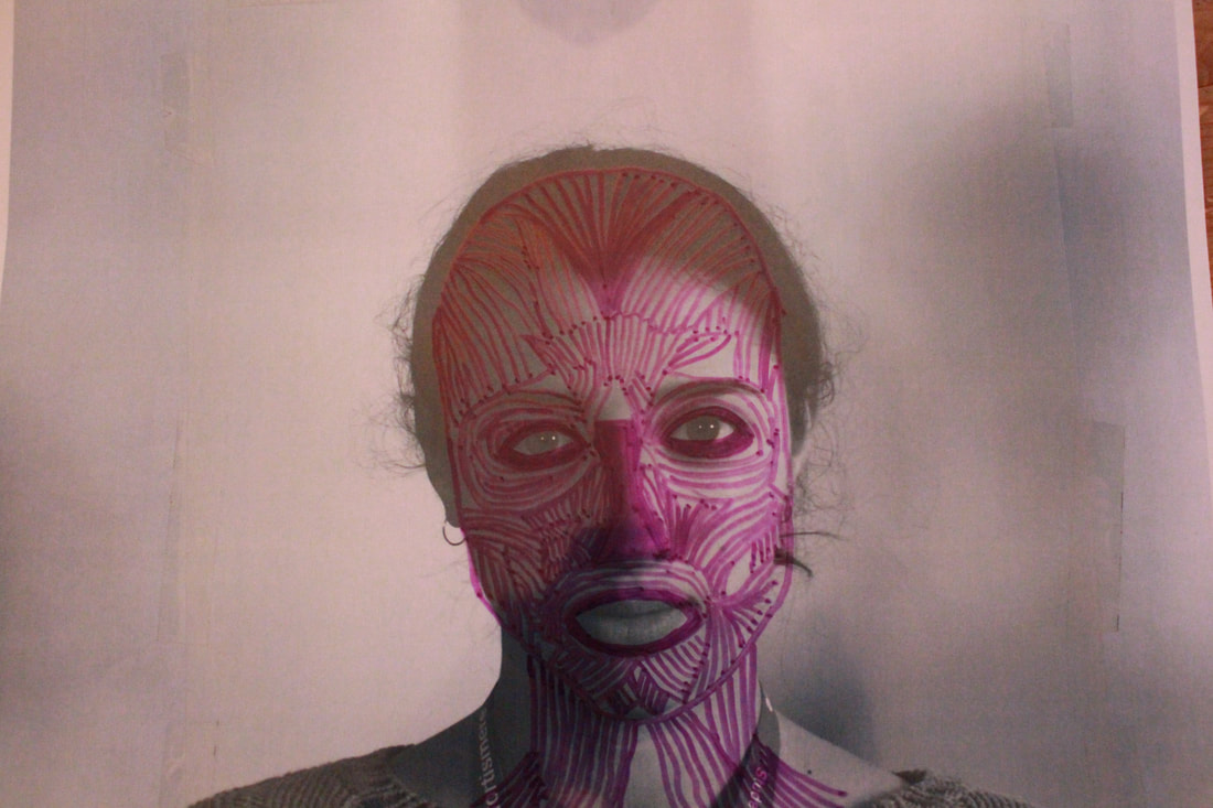
Structure of the Body
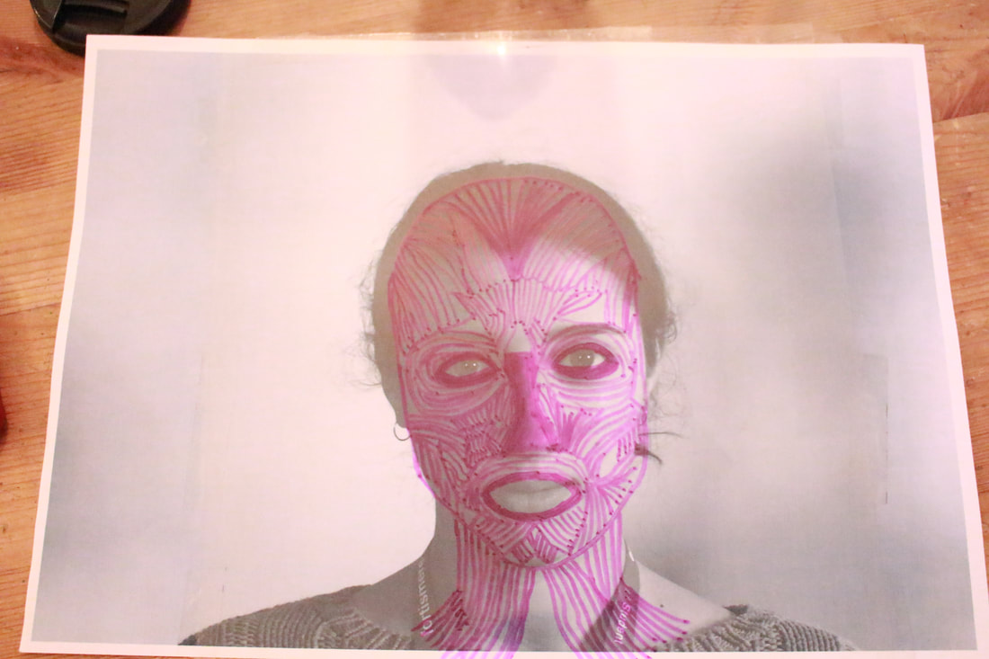
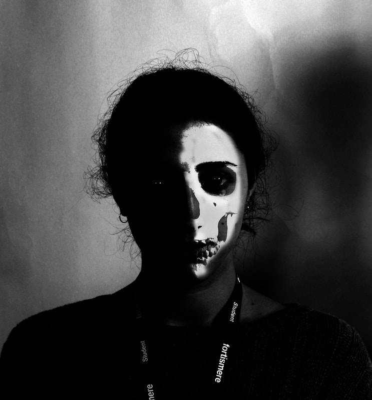
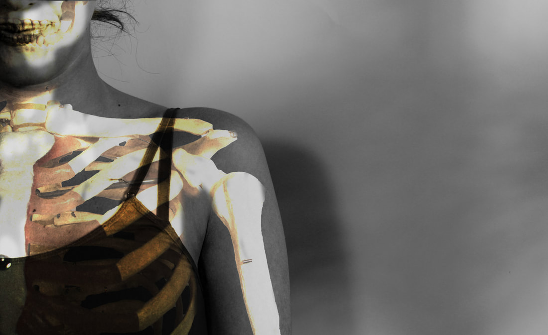
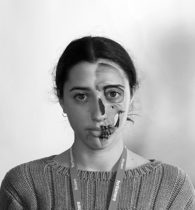
Peter Hickley
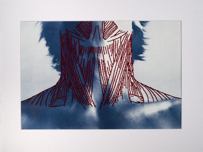
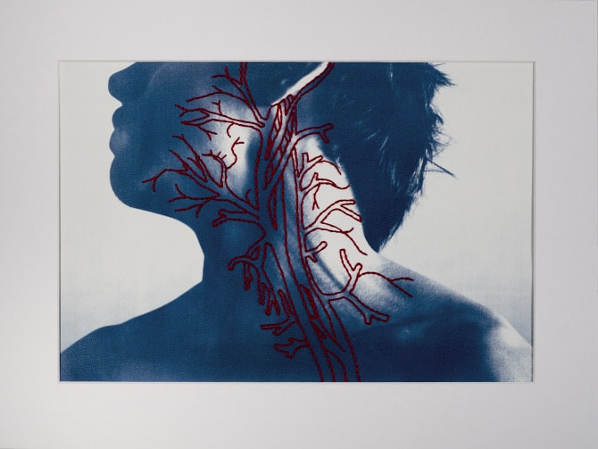
The body is made up of multiple layers and has an amazingly complex structure. Many artists have investigated the different parts and layers that make up this unique structure. Peter Hickley creates a series of hand printed cyanotypes on watercolour paper and hand stitched thread that represent the different muscle structures of the body. I find his work intriguing as he highlights structure that cannot be seen on the outside of a body. Here, I took photos of my subject and then found photos of muscles in the human face. I followed the line structure of the human face muscles and replicated that onto my portrait. Below is my response to his work.
|

Human Face Muscular Structure
|
|
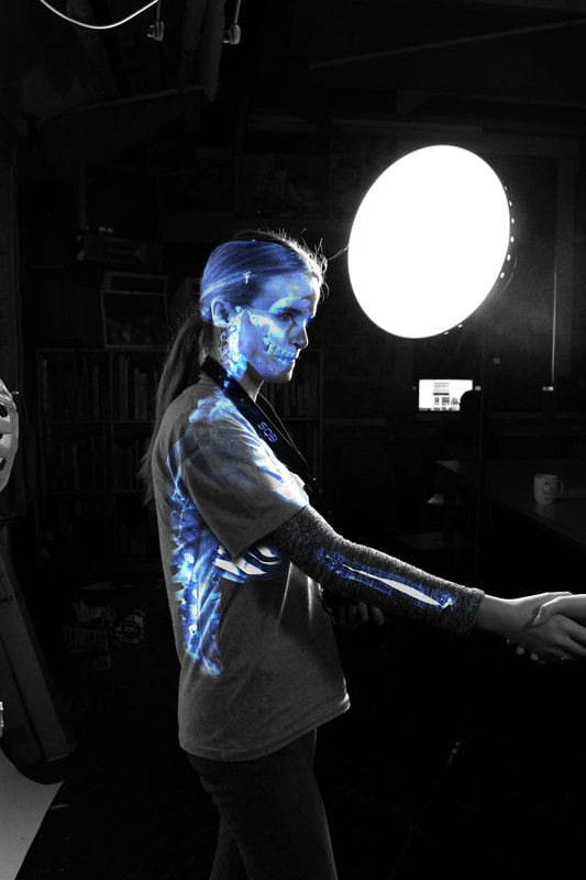
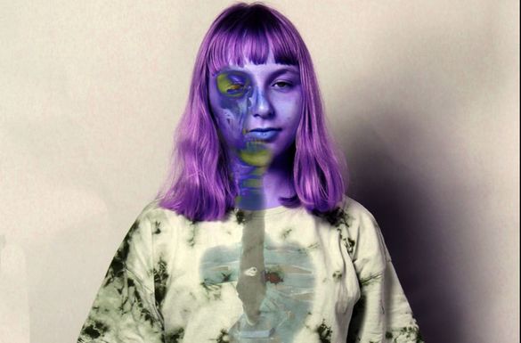
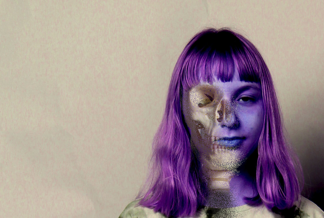
For the task below, I set up the skeleton in the studio and photographed parts of the bones against a white backdrop. Then I took a series of portraits of my classmates and then using photoshop and other experimental techniques, I merged the portraits with the skeletons and bones.
|
|
|
|
The Photoshop process...
Three Strands
Below, I have documented my three strands in response to the topic of "Structure".
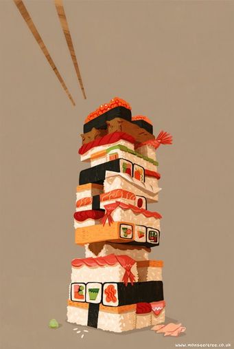
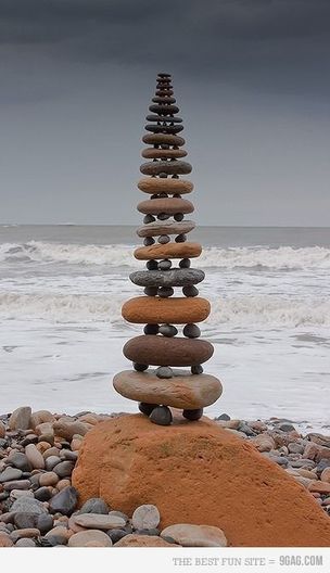
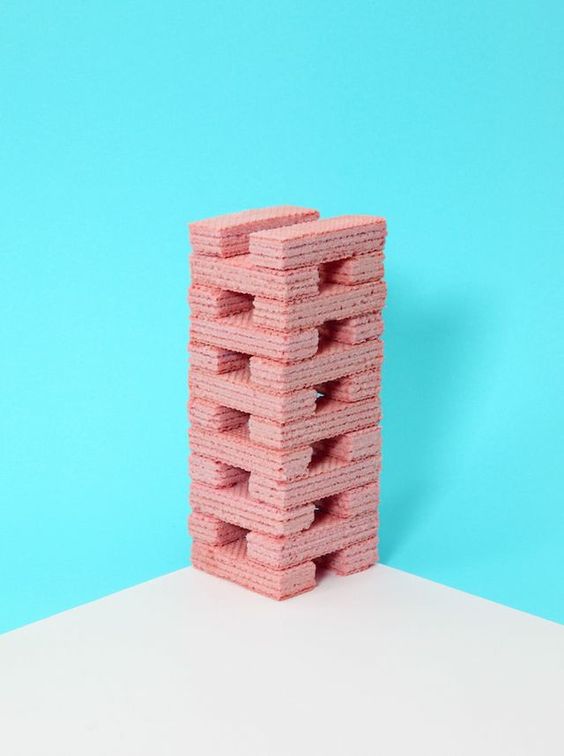
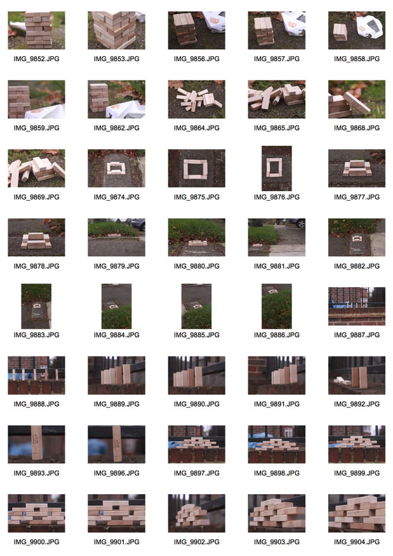
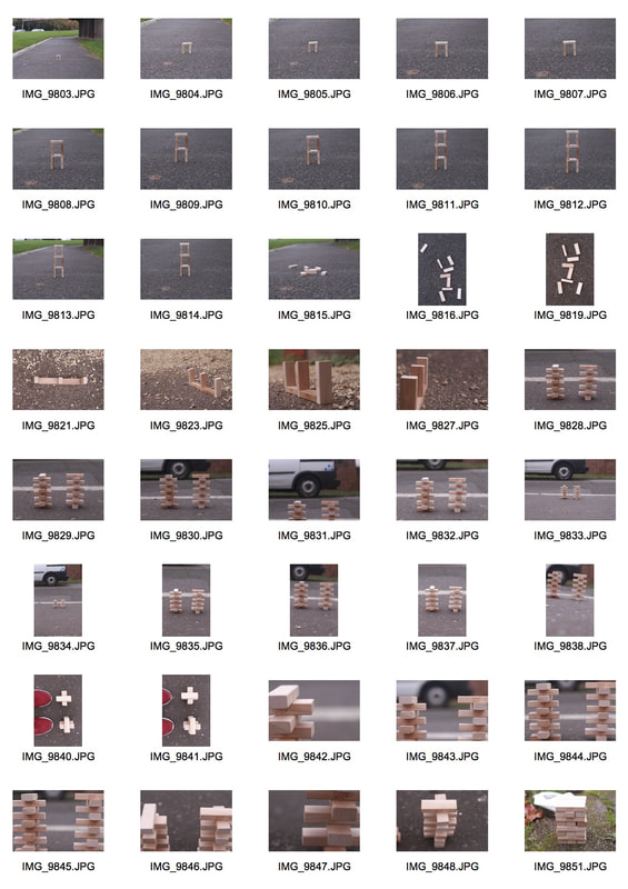
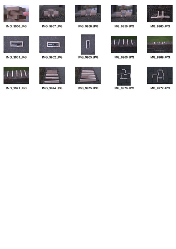
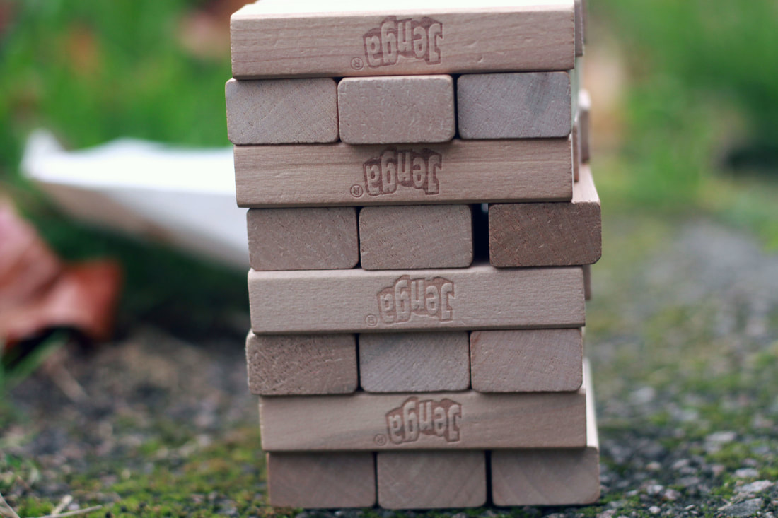
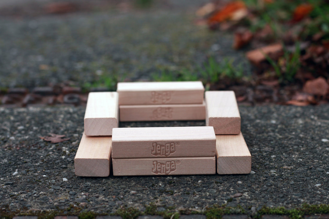
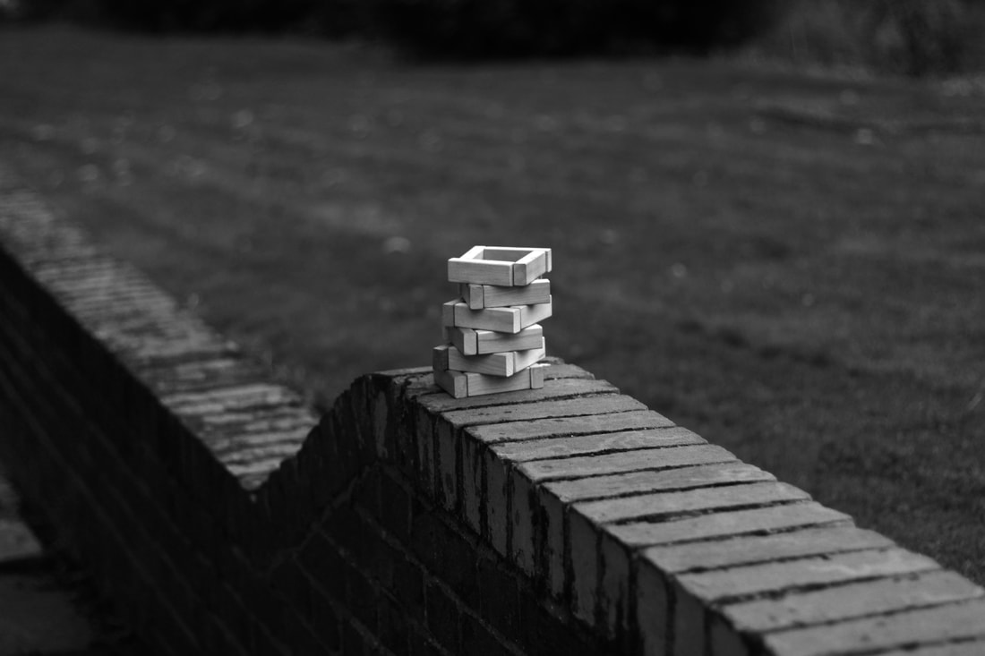
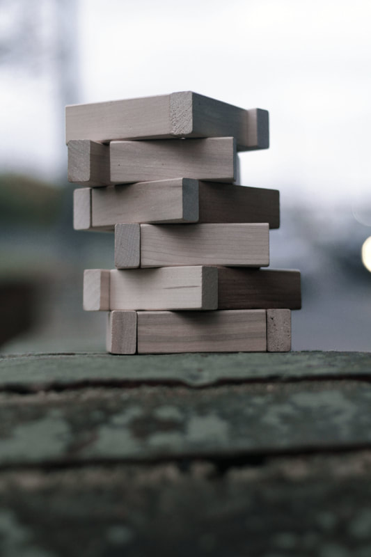
Strand 1- Jenga Structures
For my first strand, I thought it would be interesting to document structure found in Jenga constructions. I was inspired by the images below which I had discovered on Pinterest. I thought it would look intriguing to document the gradual building of a structure by photographing jenga blocks in the street. I chose to photograph how the blocks can be manipulated into different forms and shapes. I found it fascinating that such simplistic objects could create complexed and perplexing patterns when arranged in a certain way within the frame.
GALLERY EXHIBITION VISIT 2- Creative Unions Exhibition
@U.A.L (University of the Arts London)
|
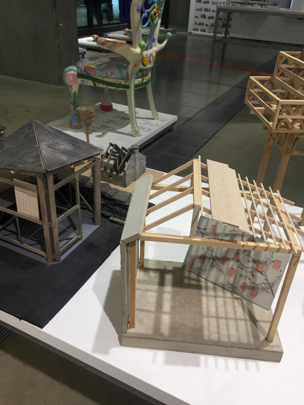
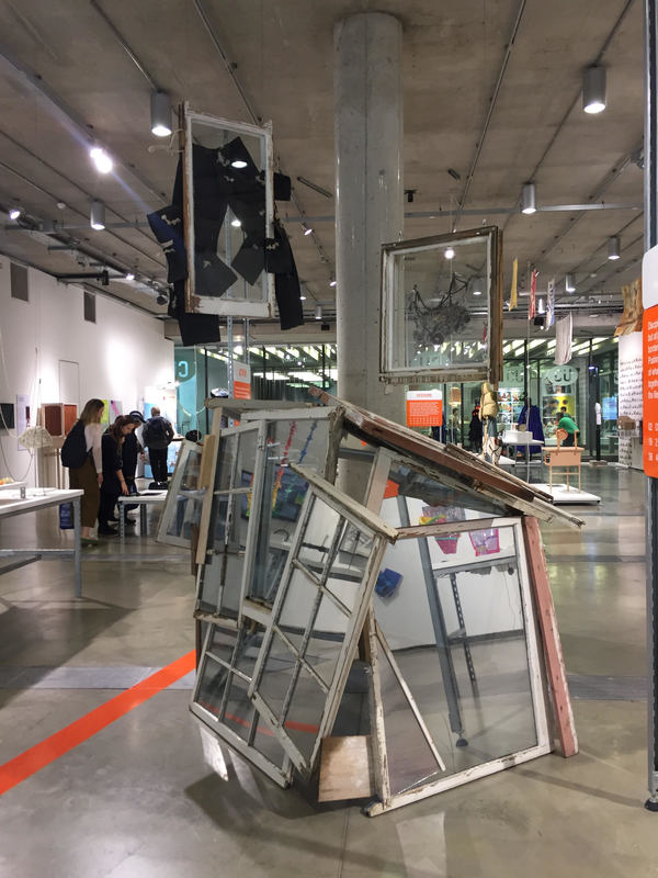
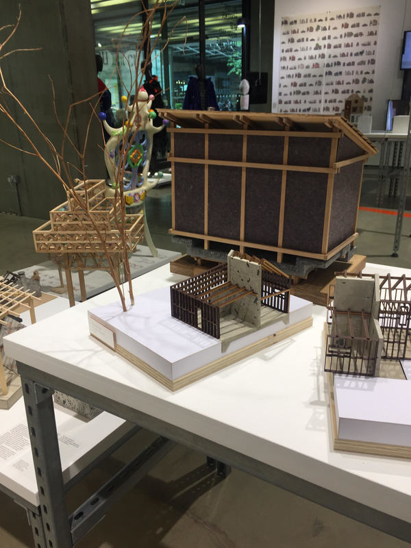
I also visited the Creative Unions Exhibition at the University Arts London (U.A.L- Central Saint. Martins centre). Although, this was an art exhibition that did not present any photography, I enjoyed it just as much as my first exhibition. Some of the contexts of the work on show at Creative Unions included : identity, collaboration, conflict resolution, community, alternative realities, technological innovation, social issues, the environment, activism, crossings etc. Miniature wooden structures were displayed and I found its linear structure and 3D design creative and impressive.
|
|
|
|
|
The wooden structures gave me an idea of how I could capture the brutalist structures as shown in the section below. I appreciated the little details and how the wooden blocks had been carefully placed to create these 3D structures. I found this linked well with my ongoing project as it allowed me to not only think about the structure in photos (in regards to patterns and shapes in the overall frame) but the literal, physical structure of the subject in a photograph. I was able to recognise the particular way in which a building is constructed and use it to my advantage (through different angles) to capture an interesting composition. Visiting this exhibition inspired me to explore using a range of different angles within my project. This can be seen in the sections below.
Inspiration
Below is my inspiration for this strand:
Sources: Pinterest
|
|
|
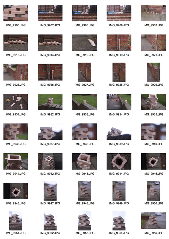
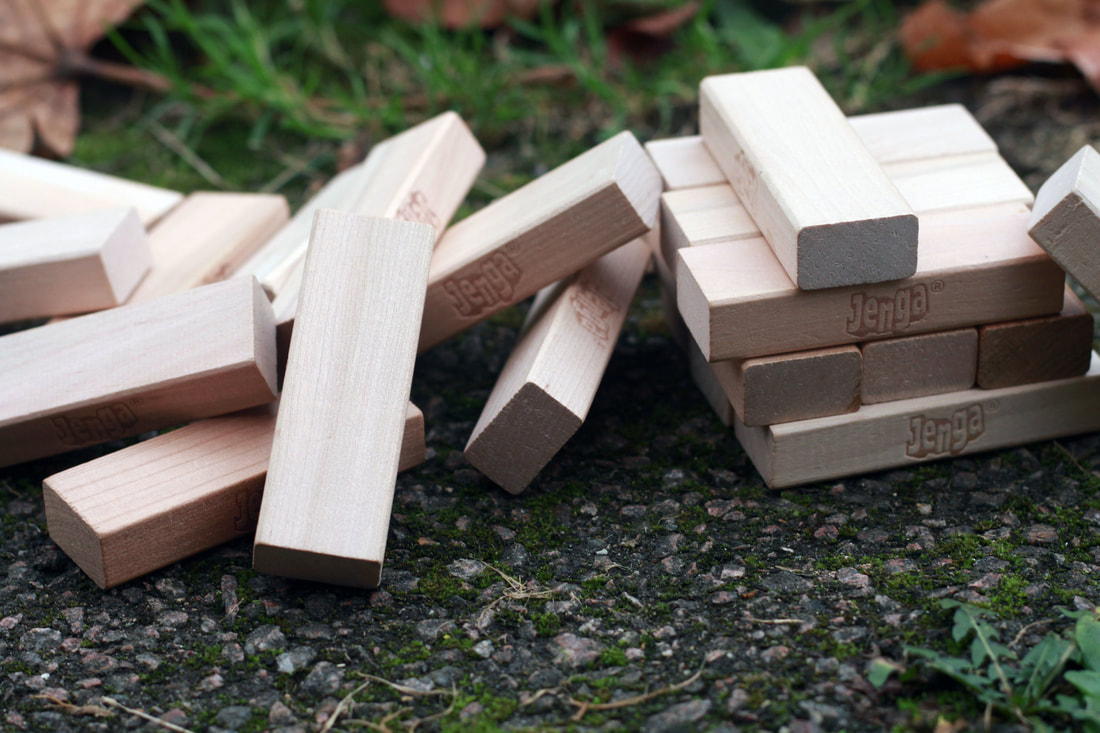
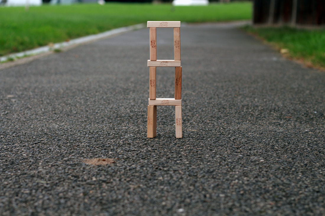
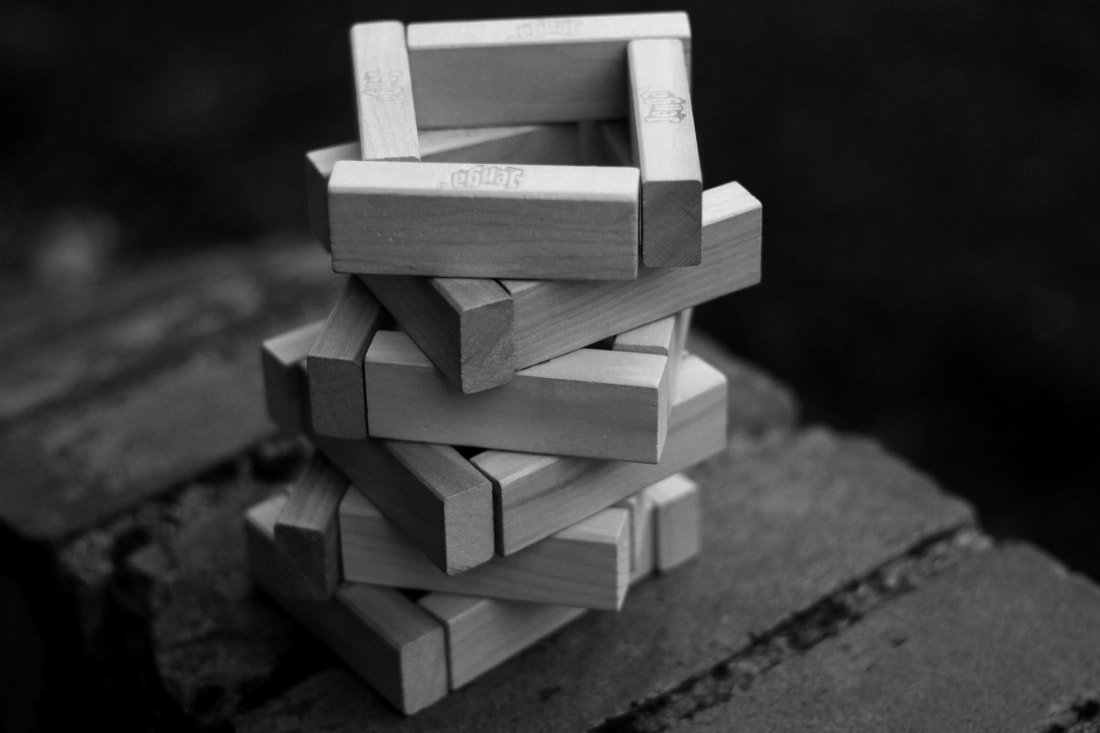
Here, I used the inspiration above as a starting point for which shapes I could create. This was the traditional and typical jenga block structure where I placed three blocks on top of each other in alternate directions on each layer. I then progressed to arranging the blocks to produce various patterns and shapes. My aim for this task was to portray structure through a physical form (through construction). I think this was successfully achieved as I portrayed the idea of structure by experimenting with balance, form and space. I chose to photograph the jenga in the street because I thought the wood would compliment and look interesting against the naturalistic backgrounds (greenery, old leaves). Throughout the shoot, I found that some of my structures were continuously knocked over by the wind. Initially, I found this rather frustrating though, I chose to take advantage of the situation not only by taking photos of the completed structure, but also after it had been demolished. I found that the variation in form would contrast quite well in my documentation and therefore, I kept the photographs of the flattened constructions. Perhaps this may illustrate the immense power of nature and the effect nature can have on structure.
|
|
|
|
Edits
|
|
|
|
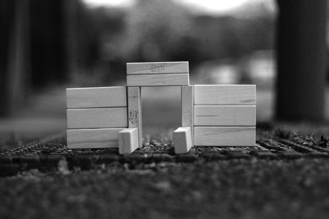
I found this set of images intriguing to capture. My aim was to photograph jenga blocks using a variety of structures/designs, some images presented less structure than others (fallen structures). At first, I found my photographs lacked experimentation in terms of angles. As I continued on my shoot, I found the simplicity within my camera angles drew the audience's attention directly to the jenga structure alone. Soon I realised my intention for the project was to present complexed looking structures in a traditional and less experimental way (in terms of shot types). I felt if I were to use more abstract angles including slight tilts of the camera, the audience would be drawn less towards the subject. The simplicity of my photographs made them even more interesting. I used symmetry and my knowledge of the rule of thirds to create a sense of balance within my frames. The use of soft lighting in some images almost replicate a studio photoshoot effect (the black and white photos).
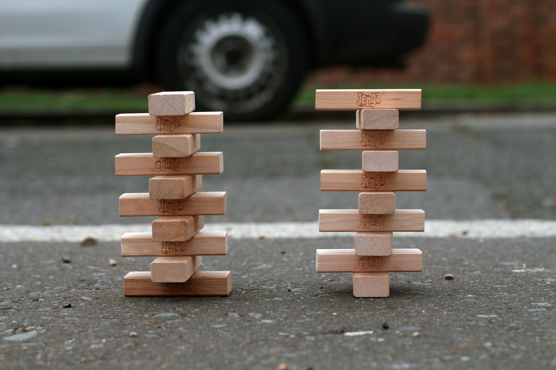
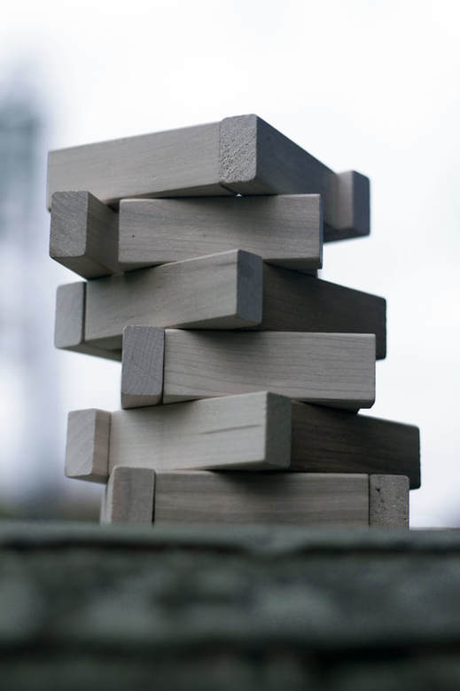
In this photo, the structures are made to look almost intimidating due to the symmetry within the frame. I used my knowledge of composition and imagined that I had split the photo in half and placed the blocks on either side. The use of balance and soft focus made the structure look powerful and important. I took this photo by the road in order to mix reality (road) with toys associated with child-like (fantasy and imagination). The direction of light hits the back of the subject making the subject backlit.
|
|
|
Artist & Me
Krzysztof Kusy
The image in the centre was taken by a photographer called Krzysztof Kusy. This image features a detailed shot of one of the buildings at Syntagma Square in Athens. I think this is a great abstract pattern which can be compared to Jenga or Tetris. Therefore, I felt it would be appropriate to compare his photograph with mine. The artist has photographed and cropped the image in such a way that the pattern becomes more important than the structure. As well as this, the black and white was quite effective in the sense that it emphasises the pattern without distraction. Similar to my photos, I have presented the structure in a way that exaggerates the pattern achieved within the frame. Both the artist and I use close up shots to capture the subject. Nonetheless, my images contain large amounts negative space which surround the subject. This perhaps made the structures look rather small in terms of scale. In contrast, the artist uses perspective and a titled worm's eye view to suggest the large scale of the building.
|
|
|
Strand #2
Cubism Photography
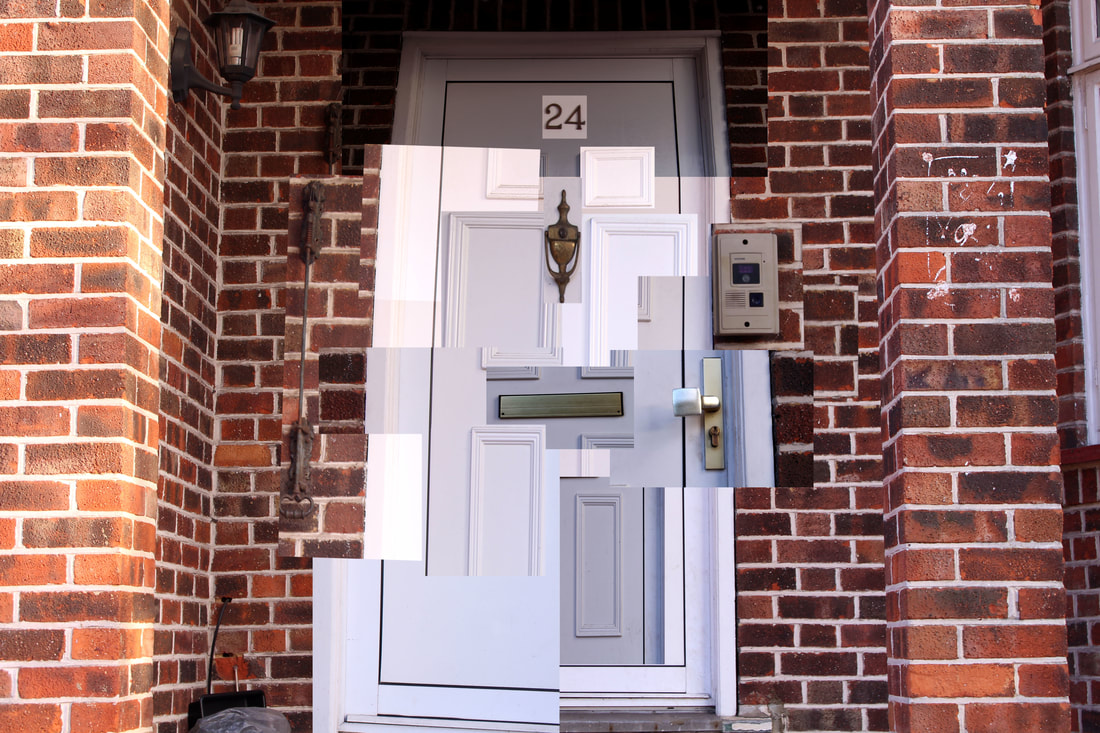
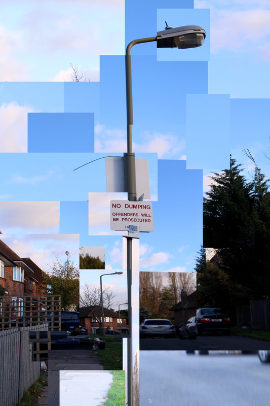
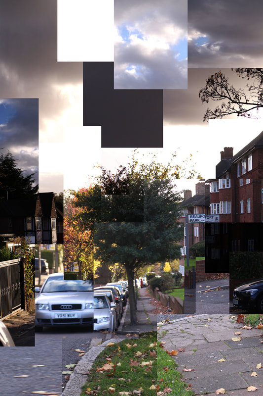
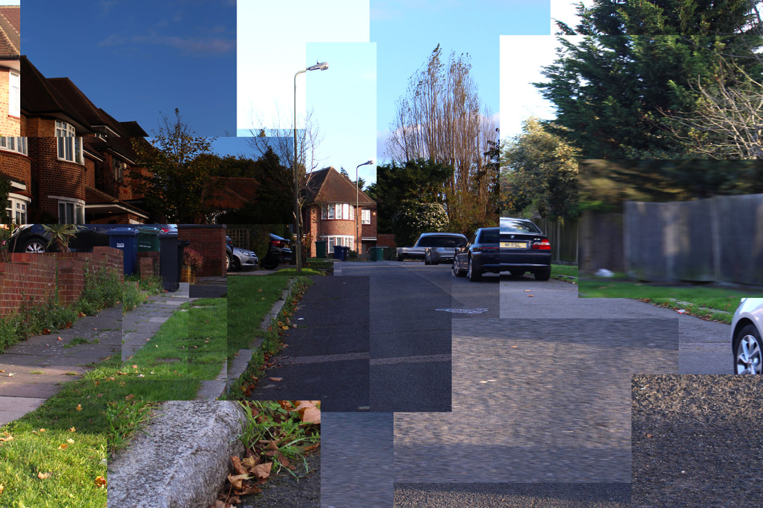
For my second strand, I decided to capture cubism photography. Cubism is an early 20th century art movement which brought European painting and sculpture historically forward toward 20th century Modern art. Cubism is the representation of different views of the subject pictured at the same time using multiple perspectives/different angles. I chose to investigate this strand as I found this style of work depicted structure in an abstract fashion which came of interest to me. I noticed it is as if the photo's structure has almost been disrupted, parts of the frame appear to be chopped and placed somewhere else. Below I have documented my inspiration for this task.
Inspiration
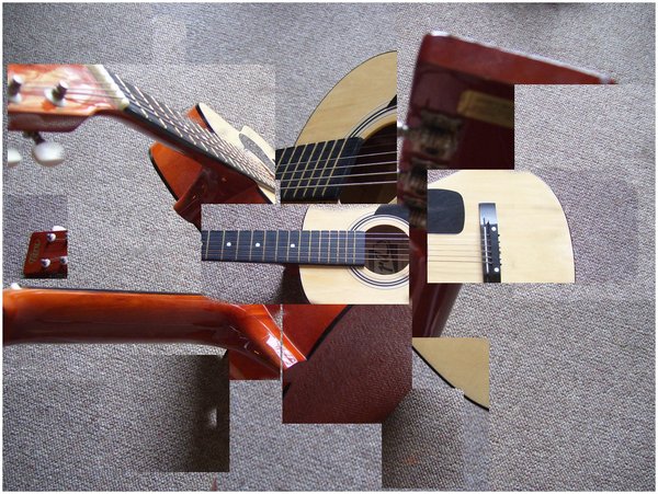
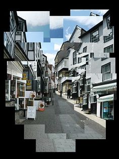
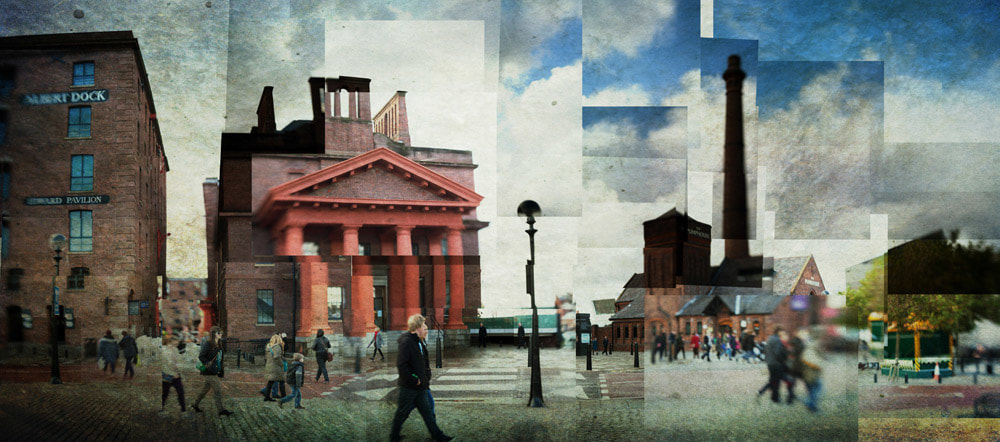
The strange configuration of these photographs may illustrate the destruction of structure. I like the fact that the fragmented-ness makes the piece seem abstract and interesting to view. I enjoyed documenting this as I found it unusual that everyday objects which normally follow some form of structure can be divided and become dismantled. I chose to take photos of the same location at different times in the day. I put all of the selections together to create a collage-like effect. I began by experimenting with zoom lengths (varying the distance I took the photo helped to achieve the typical cubist aesthetic). I zoomed in on trees, the sky, grass etc. I used my knowledge of composition to capture this scene. Due to the nature of these images, I do not believe there is only one subject, although, I can recognise that the subjects (tree and lamppost) in the centre thirds of each frame stand out the most.
My Response
|
|
I recognised that although the photographs I took for each piece were of the same location, they were able to disconnect themselves in terms of their traditional structure and create an array of images with the same contexts when put together. I found it intriguing that the overall photograph still shares the same meaning or story.
|
|
|
The Photoshop Process: |
Strand #3
Pop Art Inspired Structures
For my third strand, I decided to explore the structure of buildings using various colours. I chose to take photographs, outline their structures and shapes and finally alter their colours to make an almost pop art effect. To achieve this, I used bold colours such as green, red, blue and yellow along with black and white. I found it interesting that colour can play such an important role in outlining a structure. In particular, I found Eliza Southwood's (see below) work intriguing as she only uses 3 sets of colour within her piece (orange, white and black). The use of negative space within my first 8 sets of images creates colour contrast between several parts of the frame. I tried to achieve a variation in camera angles throughout my work. I completed this by using worm's eye view, close ups, wide shots etc. Within my first strand, I mainly photographed modern looking structures. I would like to continue developing this strand, perhaps by capturing Brutalist buildings.
Inspiration
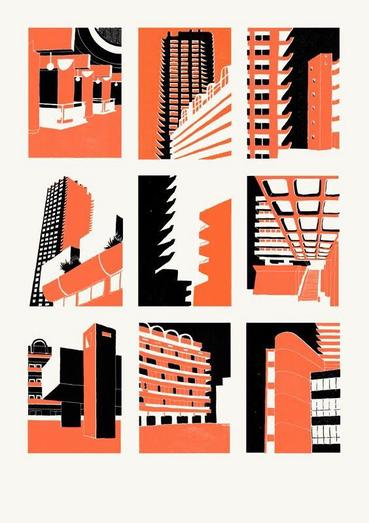
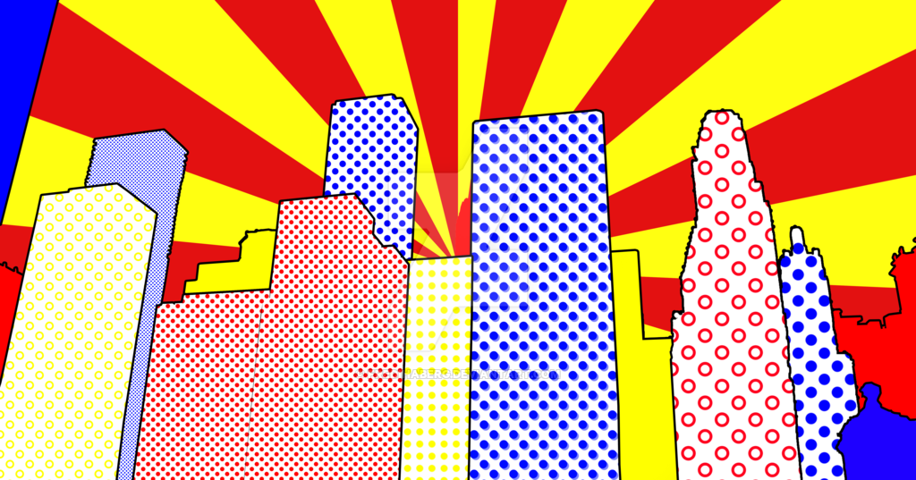
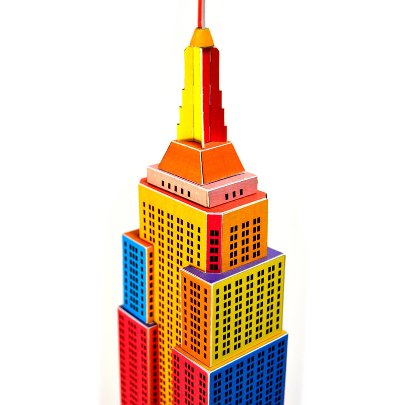
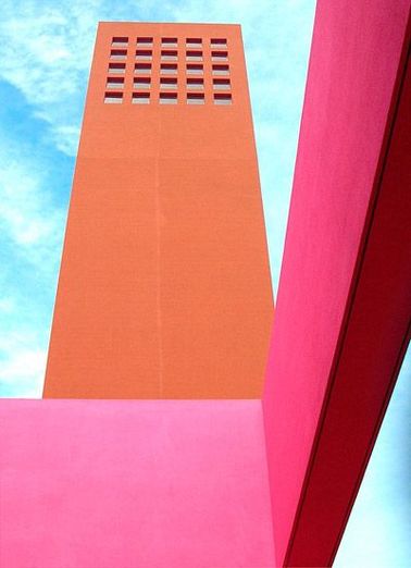
From left- Eliza Southwood, Fredihaberg, From 'Touchofmodern.com', Luis Barragan
Original Photographs:
I decided to use these images below to create my first set of pop art structures because I found they were the most interesting compositions to use in terms of experimental angles such as (worm's eye view at a 45 degree tilt, long shot almost an establishing shot and more). I felt they best represented the buildings I was capturing.
Edits
|
|
Colour Thought ProcessI set a rule to use three different colours per image. In the first set of photos I used light blue, white and black, in the second I used red, black and white. My intention was to use one vivid colour (primary colour) along with black and white to perhaps neutralise the bolder tones. This, I recognised in the artist's work on the right. Each photograph follows the same rule as mentioned above. This i felt was effective and relevant to my pop art (1950s) colour palette.
|
|
|
|
The Photoshop Process...
The slideshow below illustrates the process of making the edits in the above section.
Development #1
Pop Art Inspired Structures Continued...
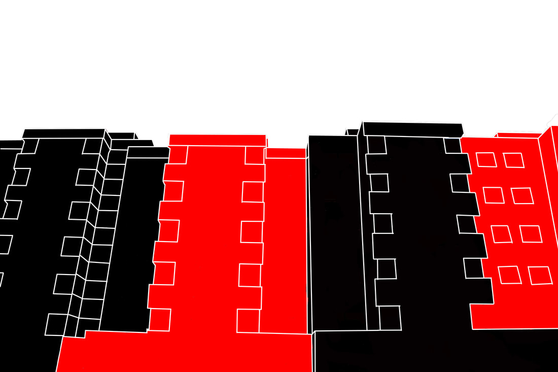
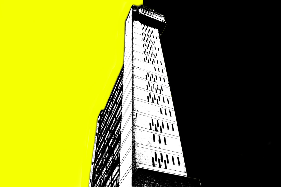
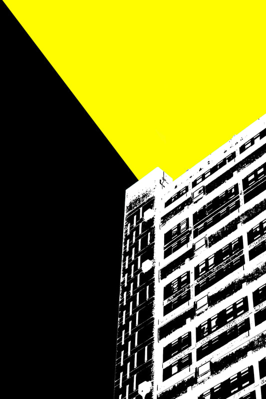
For my first development, I chose to continue with pop art structures and exploring a building's structure through a range of colours. I experimented with changing the background colours. In this development, I made the decision to continue photographing Brutalist buildings for the rest of my project. I found it interesting that by using various colours would almost transform the traditional, dull and dreary look of Brutalist buildings to more abstract and fascinating pieces of art. It could be interpreted that the aim of my work is to almost reinvent /update the idea of Brutalism by using brighter and more vivid colours.
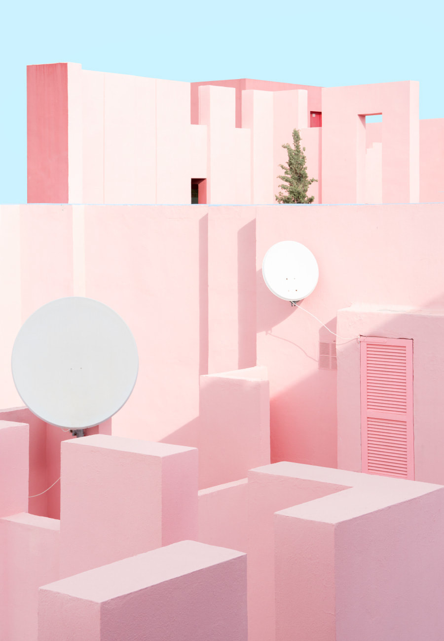
My Response- Trellick Tower
|
|
|
Inspiration
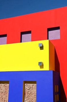
|
Both images on the left/right are pieces I found whilst researching into Pop Art Structures and Modern Architecture on Pinterest. These two photographs stood out the most due to their vivid and bold (typical pop art) colours- especially the left. In my opinion, the colours in the image on the left has been edited (perhaps to enhance the colours). I did find that this made it look rather artificial but I found it intriguing. As you can see below, I used the same palette of colours in my work because I wanted to experiment with the pop art genre. I like the use of shadowing within both photos, it brings a sense of realism to the compositions- it's not all plastic and becomes more naturalistic.
|
|
|
|
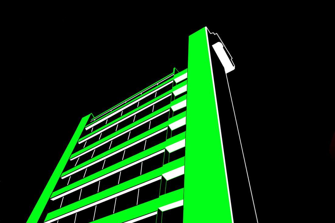
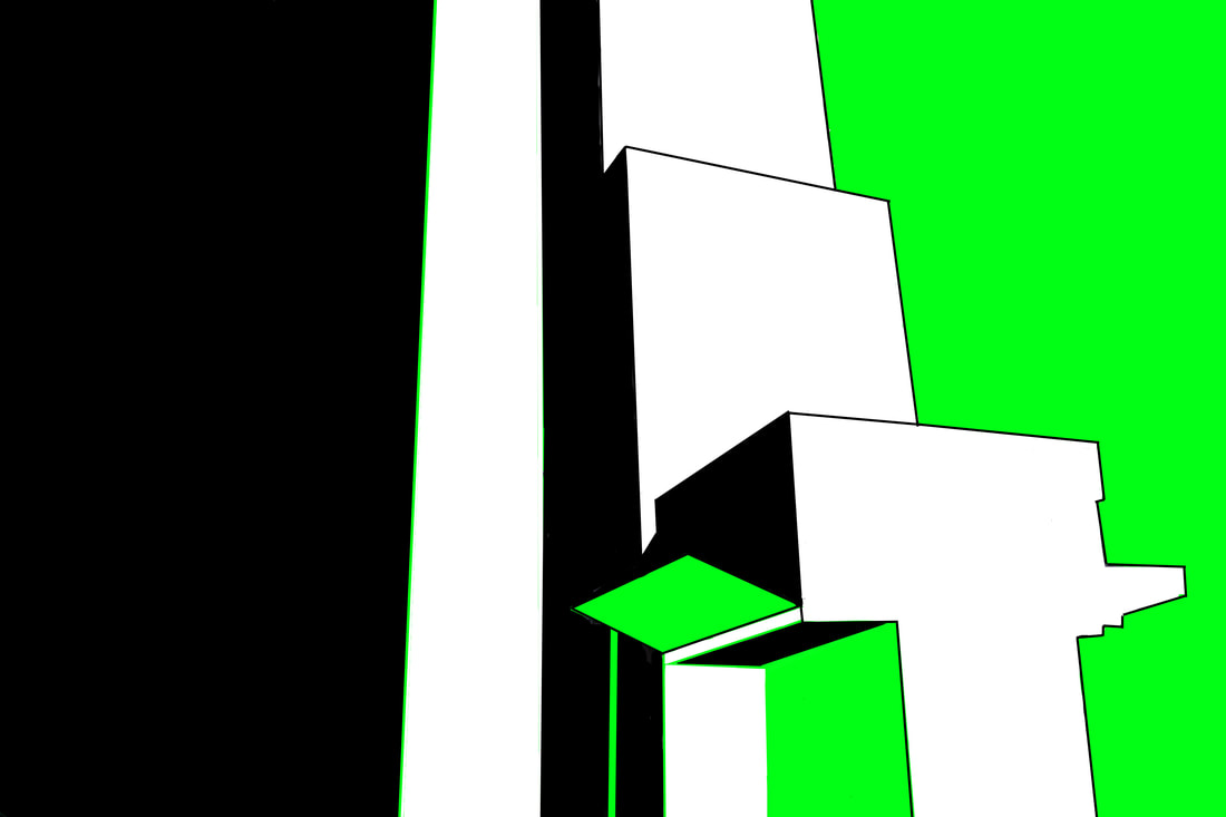
Artist & Me
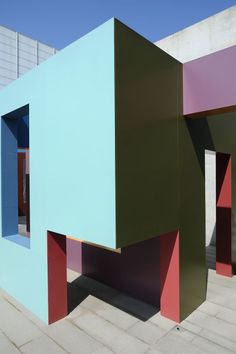
Nick Frank
Nick Frank is a photographer based in Munich, Germany who focuses on capturing architectural photography. In this project, he photographed the La Muralla Roja complex (Spanish for 'The Red Wall,'). The complex is a housing project located within the La Manzanera development in Spain's Calpe which was designed by Ricardo Bofill. The building makes clear references to the popular architecture of the Arab Mediterranean Area, a result of the architects' inspiration. The striking colours that cover the outer and inner facades are selected to either contrast with nature or complement its purity.
|
Me
|
Artist
|
Although, the building uses a palette which highly contrasts with the palette I chose to use within my photos, I noticed that without it's pink tones the building would have seemed rather bland or not as fascinating. Similarly, this is also what I recognised within my pieces. Without the use of these eye catching colours (greens, whites) the Brutalist structure would look rather dull and would be presented differently. Therefore, I will continue to experiment with the use of colour within my project and explore with the effect colour can have on an image. I can recognise that both Nick Frank and I use composition in the best way that would compliment the building's intriguing structure.
|
|
The Photoshop Process...
To achieve this style of work, I used the same Photoshop process as shown above in my Pop Art Structure strand. Below illustrates the step by step progress of making the photo.
Development 2
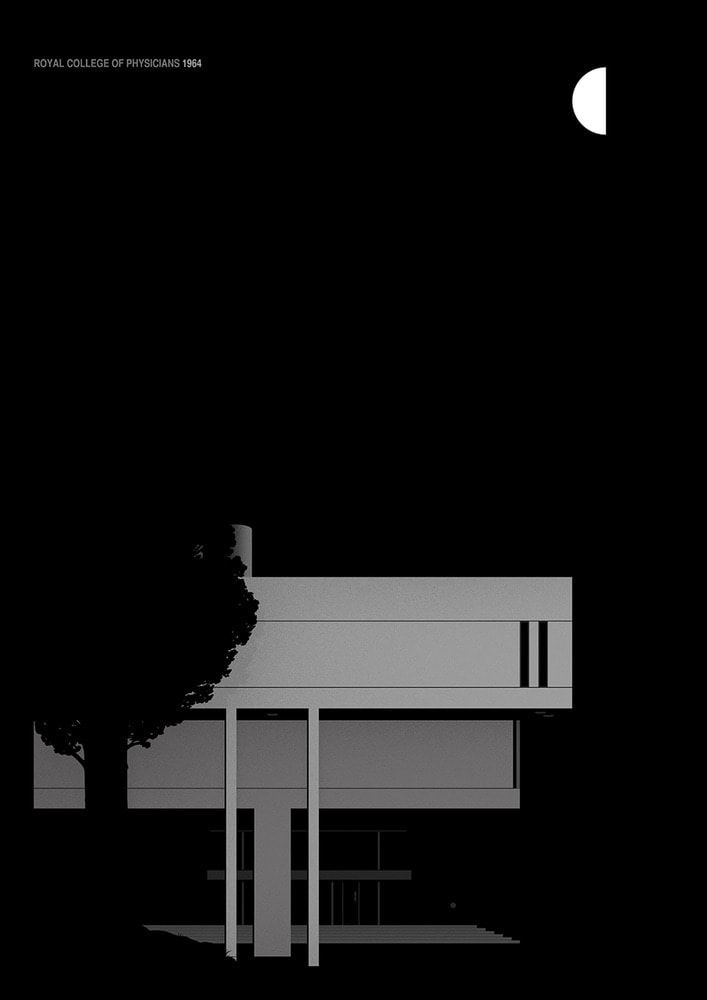
The Royal College of Physicians
In contrast to the previous section, for my second development I decided to use less acidic and bold colours within my pieces. Instead, I researched into the authentic colours of the 1950s/60s. I found this to be an interesting idea as it meant I was able to make a link between the history of the subject and the colours used. As mentioned further up on the page, many Brutalist buildings were built around 50s/60s (the reconstruction process after WWII).
Above is a colour palette from 1954- a resemblance between the colours here and the tones used in my work can be recognised. I used less saturated colours (browns, dull yellows, greys).
Marta Colmenero
Artist & Me
|
Marta Colmenero (Left)/(Right)- My own
Colmenero is a Spanish designer who captured Brutalist buildings and turned them into illustrations. I enjoyed viewing this artist as I like the fact there are both real and fictional aspects to their work. The photograph was taken in a real location, though it carries a cartoon-like/screen print inspired feel. I can also appreciate how a sense of structure is presented throughout Colmenero's project. The use of shadowing within the frame also allow the audience to recognise the perspective at which the photo is being taken. |
For this development, I was inspired by Colmenero's work. Similar to the artist, I decided to create a sky background. This was achieved by making a gradient in Photoshop (process explained later). I like my use of composition within the photo. Perhaps it would present the structure as powerful due to it being the only subject in the frame. I added grain to the composition in order to make it seem like it had been printed on a textured paper which I found interesting.
Contact sheets
|
|
|
|
|
|
|
The Photoshop Process:
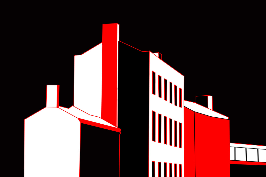
Development 3
Screen Printing
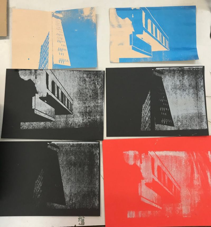
In relation to my second development, (which carried some screen print inspired elements), I decided to carry out the real screen printing process. Initially, it seemed difficult, though after some trial and error the majority of the prints were successful. My images express my intentions which were to create screen prints of Brutalist buildings.
What is Screen Printing?
Screen printing is a printing technique whereby a mesh is used to transfer ink onto a substrate, except in areas made impermeable to the ink by a blocking stencil. A blade or squeegee is moved across the screen to fill the open mesh apertures with ink, and a reverse stroke then causes the screen to touch the substrate momentarily along a line of contact. This causes the ink to wet the substrate and be pulled out of the mesh apertures as the screen springs back after the blade has passed.
Ed Ruscha
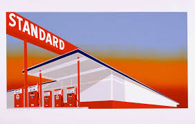
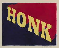
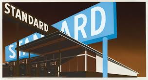
Edward Joseph Ruscha (born in 1937) is an American artist associated with the pop art movement. He has worked in the media of painting, printmaking, drawing, photography, and film. Ruscha lives and works in Culver City, California. Some of his work can be found at the Tate Modern. Above are some of his screen prints which I found intriguing to look at. Here he combines quite vivid colours which again reflects the pop art movement.
My Response
This links to the theme because it highlights the structure of buildings through the use of colour. Although, some prints did not go according to plan I could recognise that my technique improved the second time I carried out the process. I found screen printing challenging, though fascinating as it is a rather old method which has some interesting outcomes. I used the photographs I had taken previously of the Trellick Tower and The Royal College of Physicians (both Brutalist buildings).
|
|
|
|
|
|
|
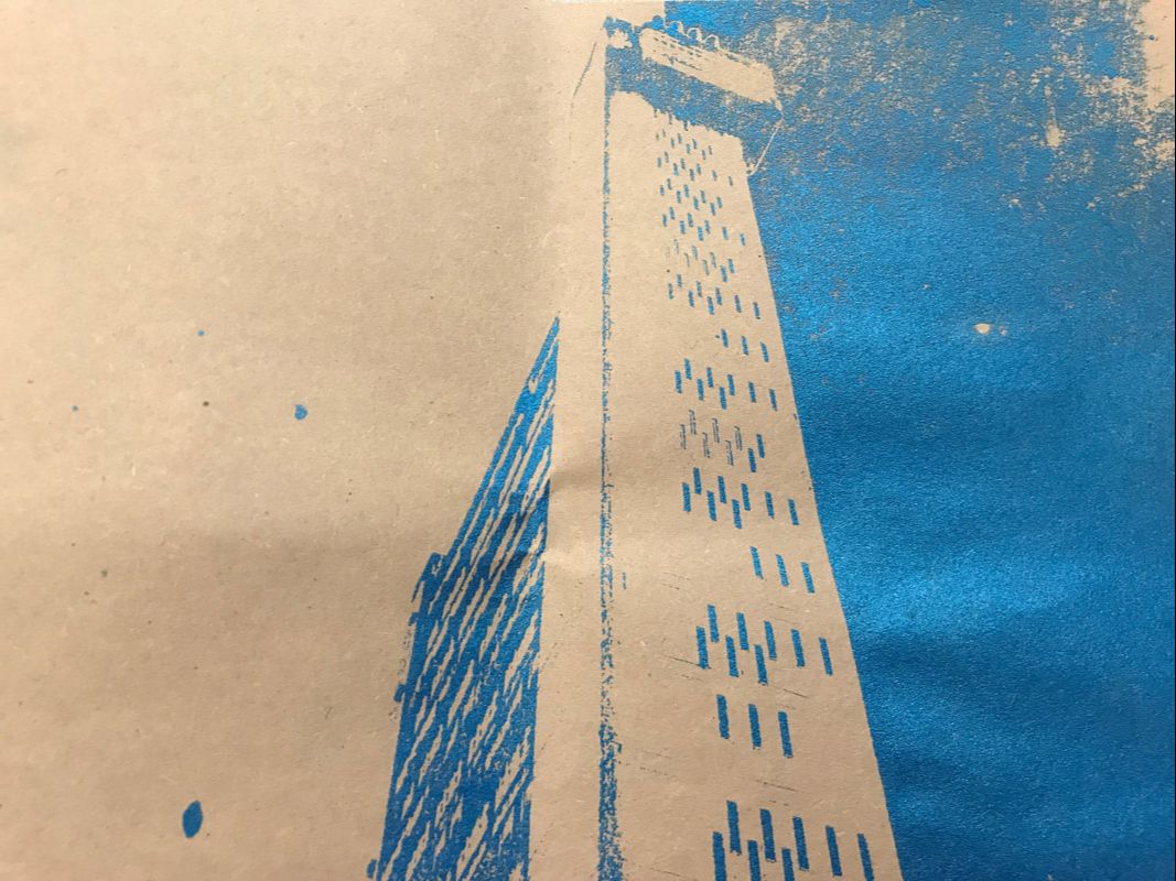
A photograph of my screen ^^^
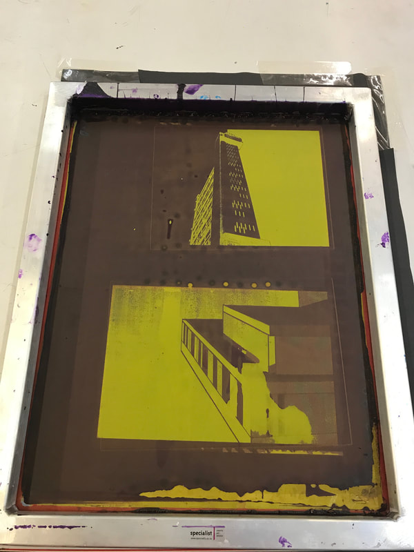
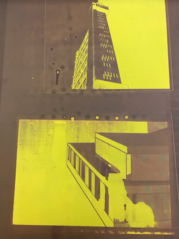
The Process...
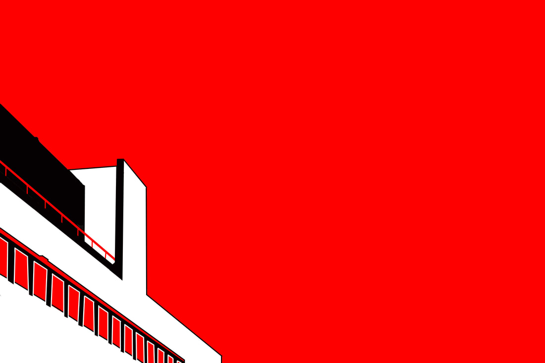
Development 4
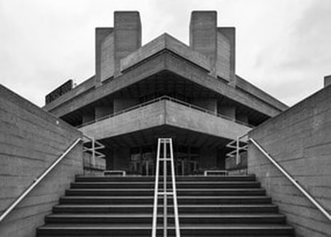
Fiction vs Realism
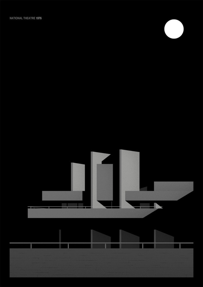
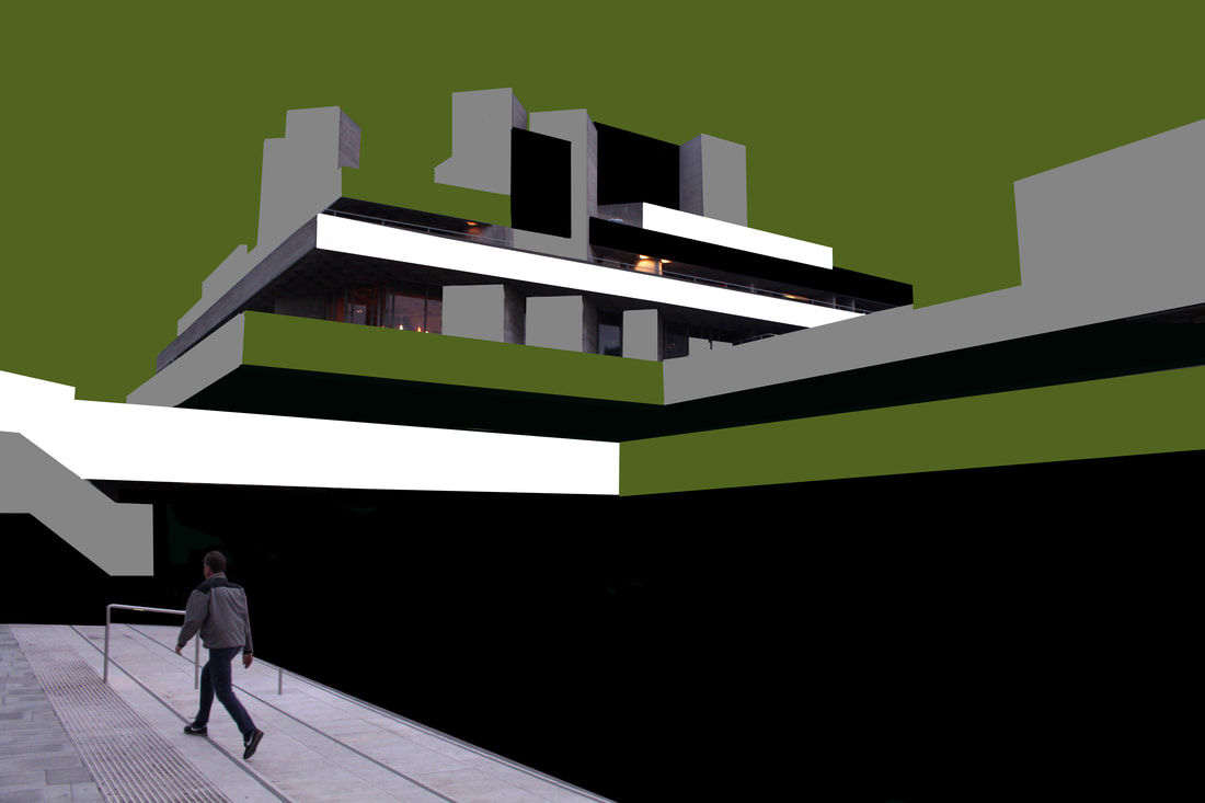
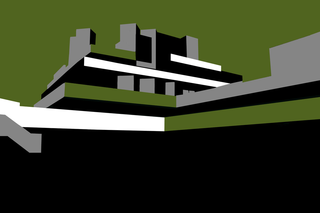
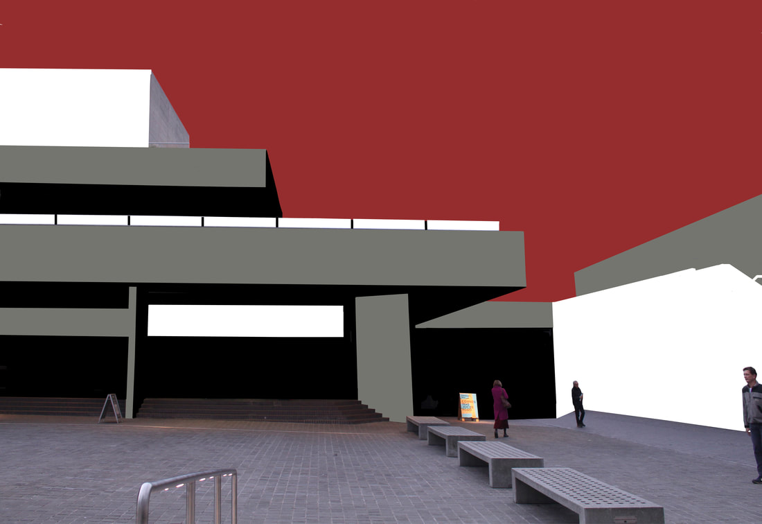
In this development, I decided to continue with the idea of screen printing. In contrast to my third development, I chose to do create this effect through Photoshop. I took photographs of the National Theatre with people in the frame. I then made a screen print edit but I kept some elements of the original photograph in the image. Afterwards, I continued the edit to produce a finished, traditional looking screen print. I found it would be intriguing to make a connection between fiction and realism (fiction being the cartoon-esque screen print and realism being the aspects of the original photo I decided to include). The images on the left display 'Realism', the photographs on the right show 'fiction'.
The National Theatre Contact Sheets
|
|
|
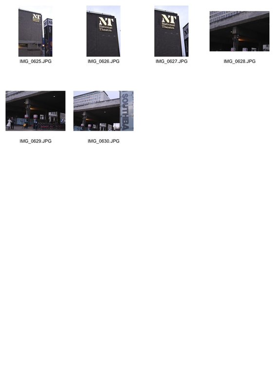
|
|
Realism
|
Fiction
|
|
|
Stephen Millership
Millership is a Manchester based freelance Illustrator who specialises in artwork influenced by the golden age of the travel poster with a modern twist. In his project, 'Lost Destinations', again a screen print like effect is portrayed through several Brutalist structures as well as other buildings. I really enjoyed looking at his work and it also help inspire me to create the images above.
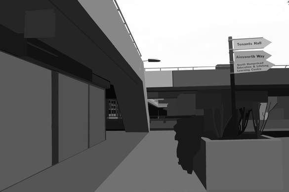
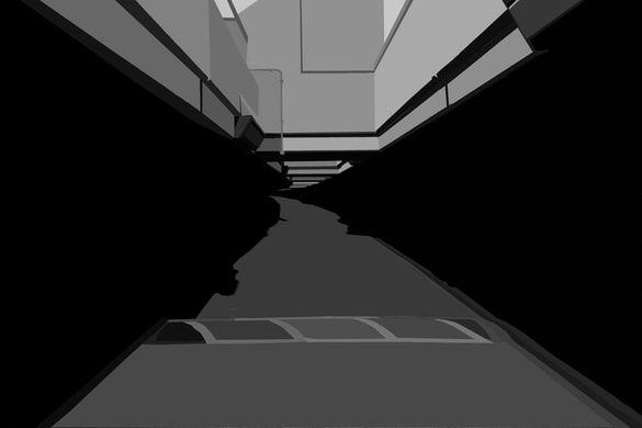
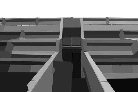
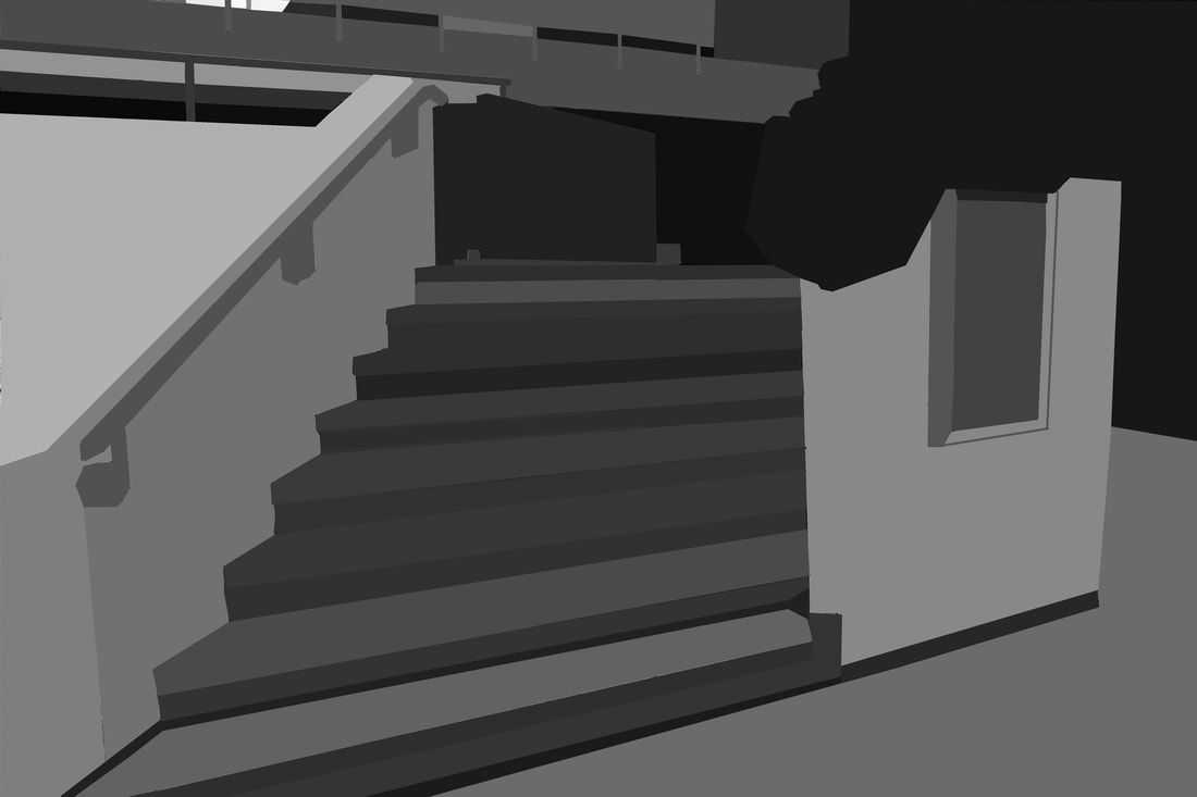
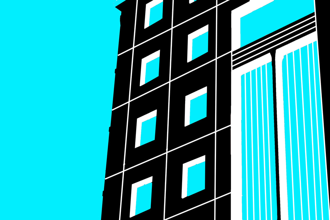
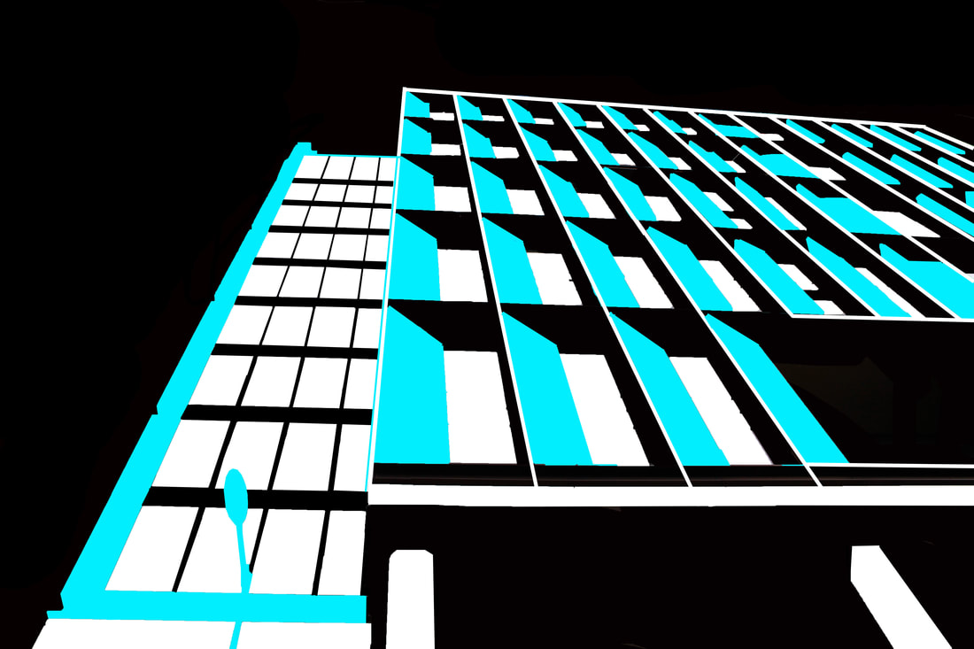
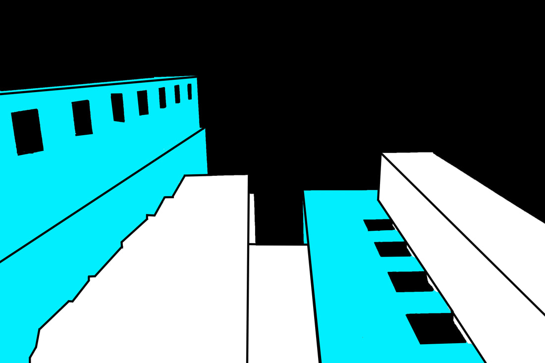
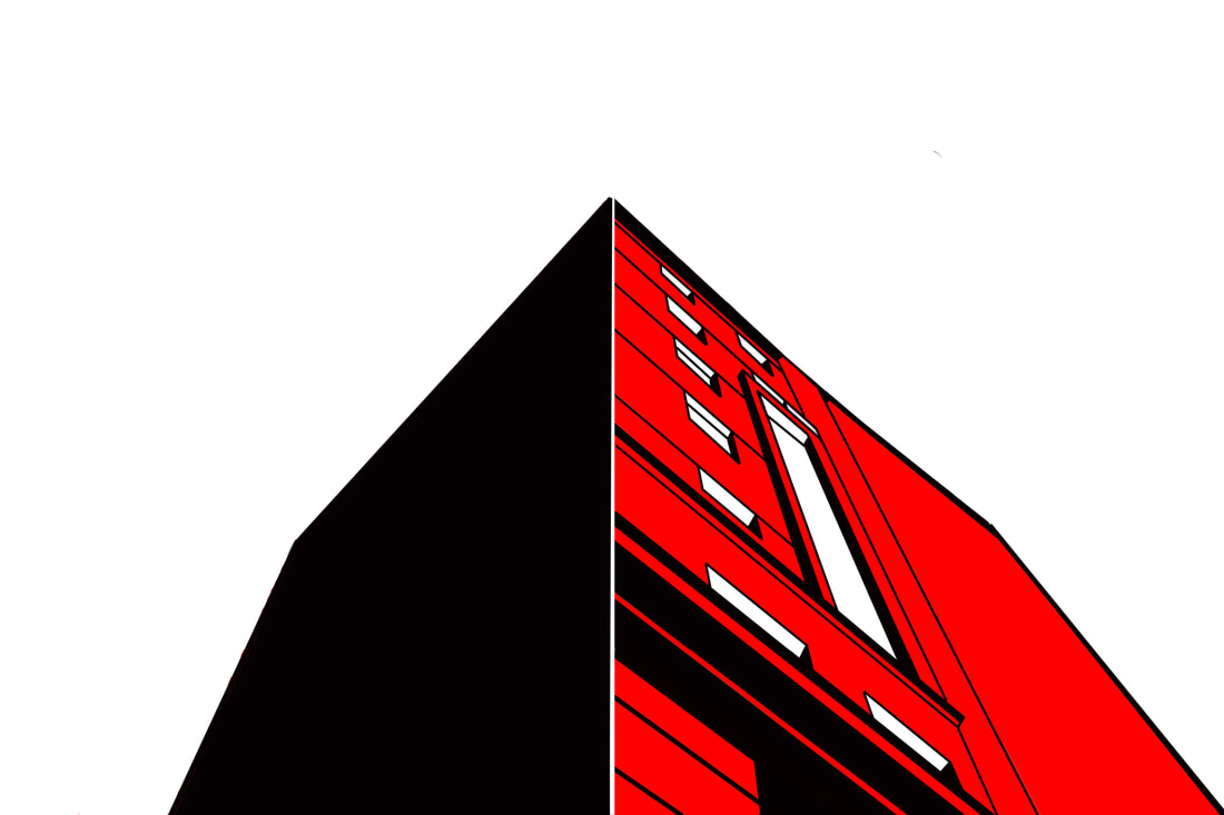
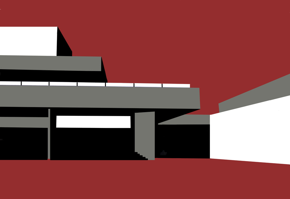
FINAL PIECE
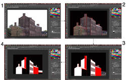
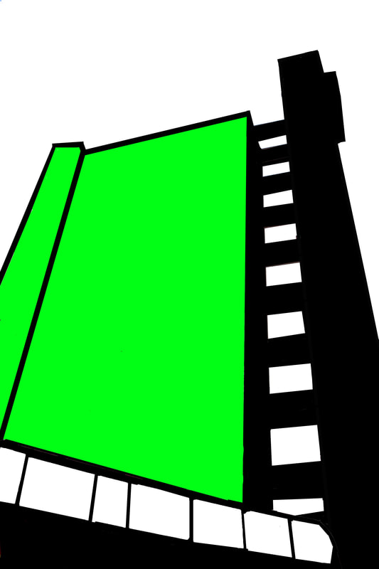
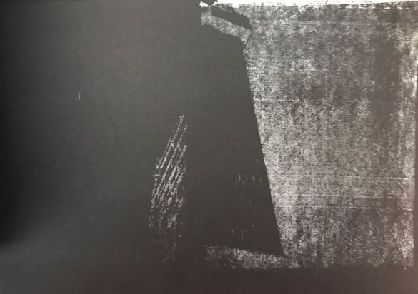
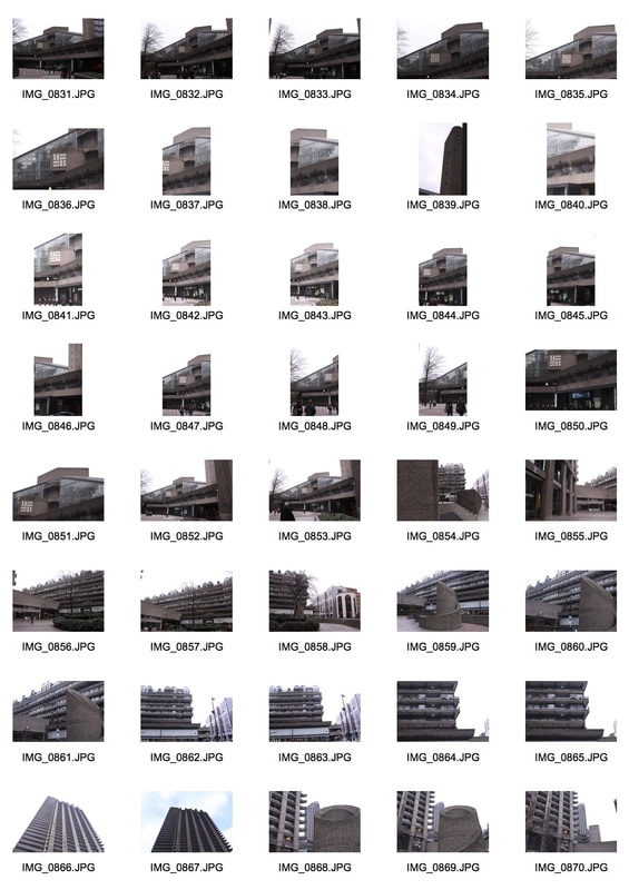
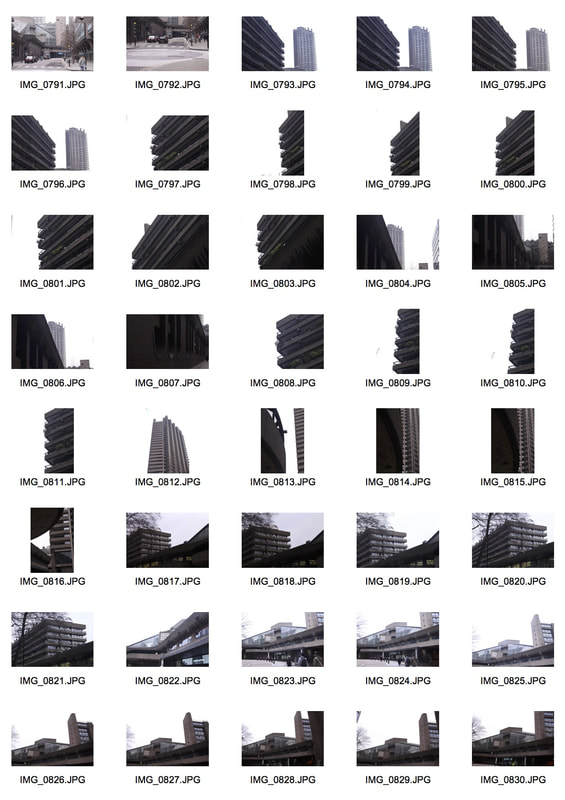
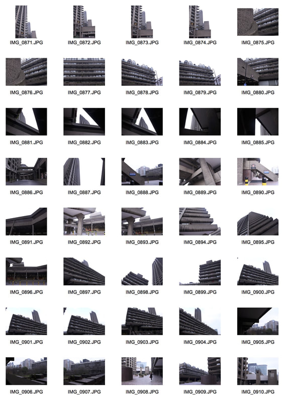
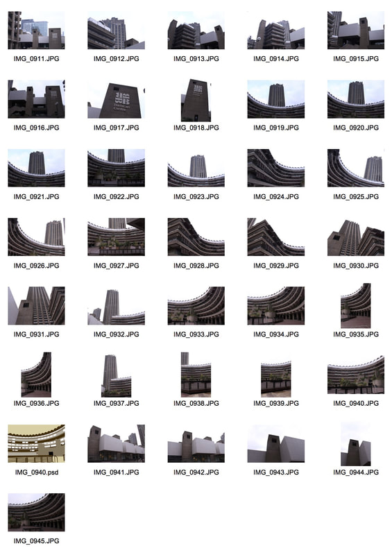
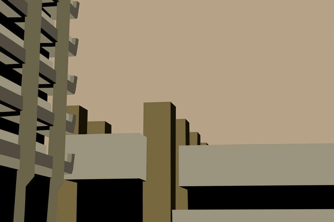
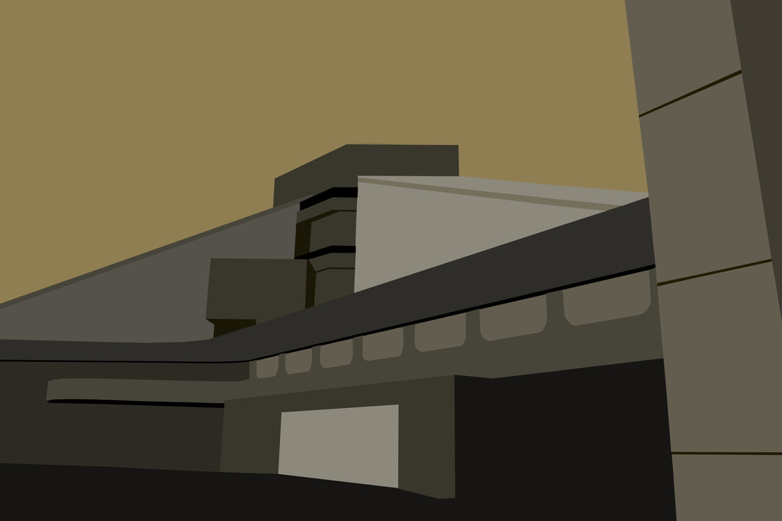
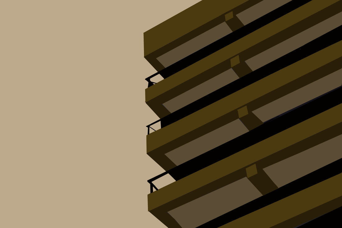
For my final piece, I decided to discontinue with the work of my fourth development "Fiction vs Realism" and instead continue with the animated, screen prints alone. I found I preferred to edit out all element of real life and instead take the audience into a fictional world. In this task, I captured photographs at the Barbican Centre (continuing with the brutalist building theme) and around the Barbican Towers. I found the images to be rather abstract as it does not present life in a traditional sense.
Contact Sheets
|
|
|
|
|
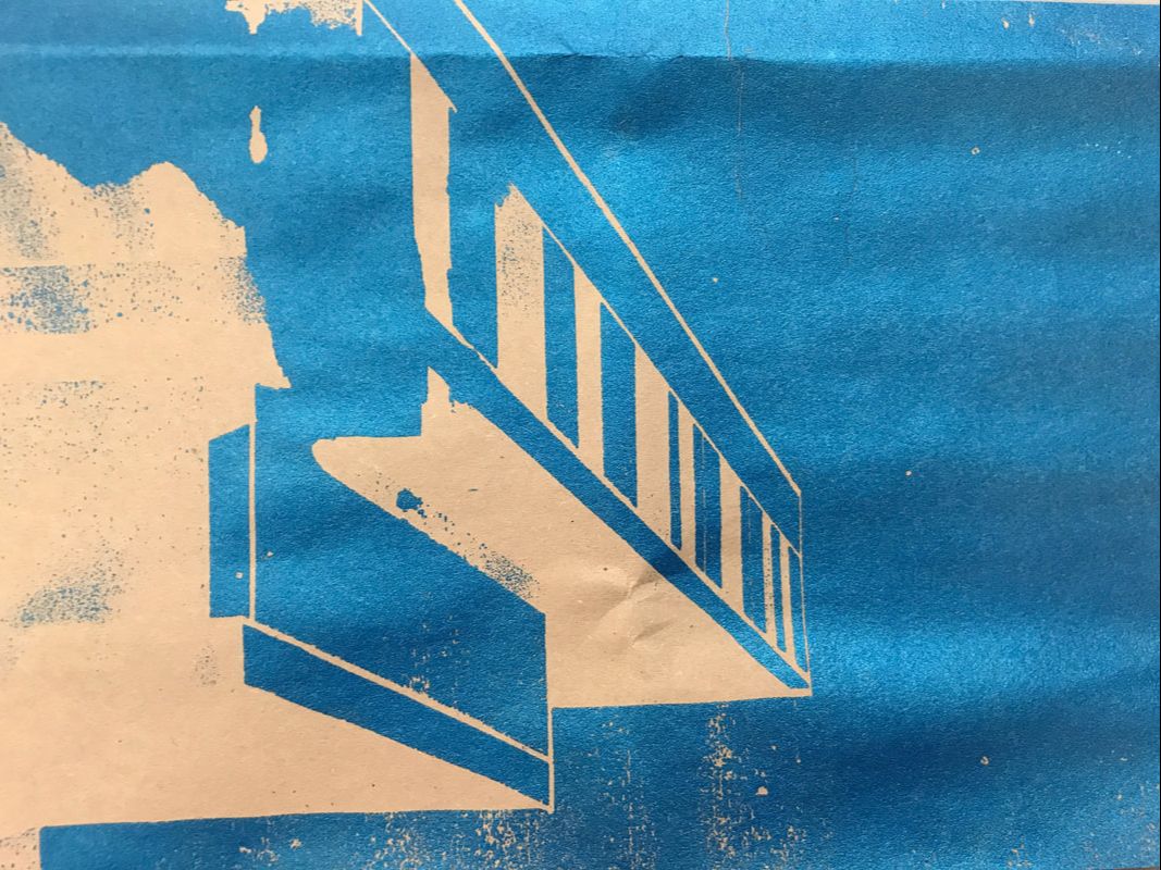
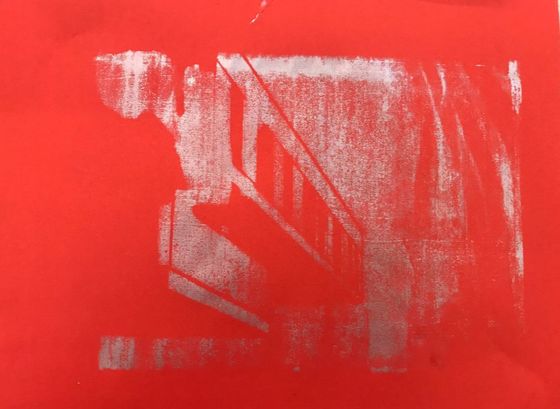
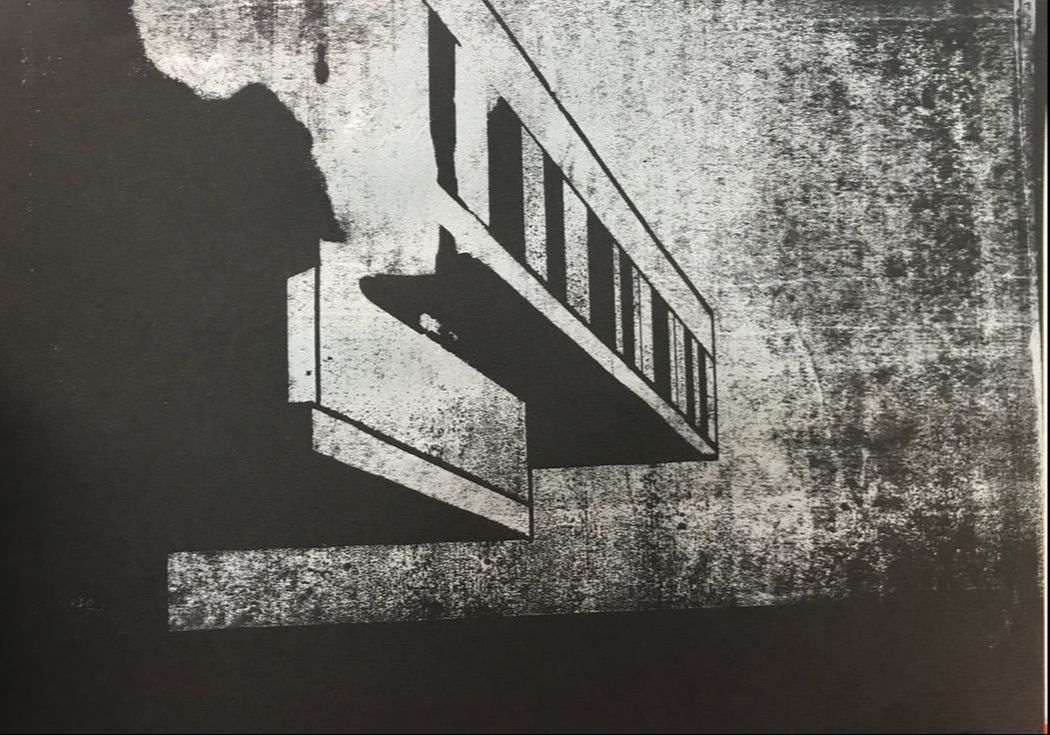
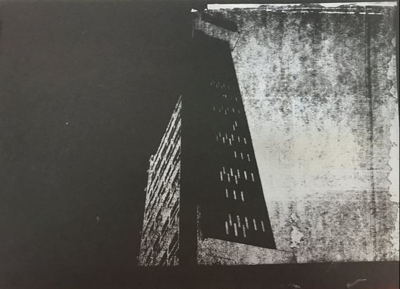
I felt I have improved my work from my previous development because I chose to return to using a 1960s colour palette which includes dull, pastel tones. Again, this was accomplished to draw a link between the reason for choosing certain colours and the Brutalist structure itself. This can be recognised to the left.
|
Please click on the image to enlarge.
|
|
|
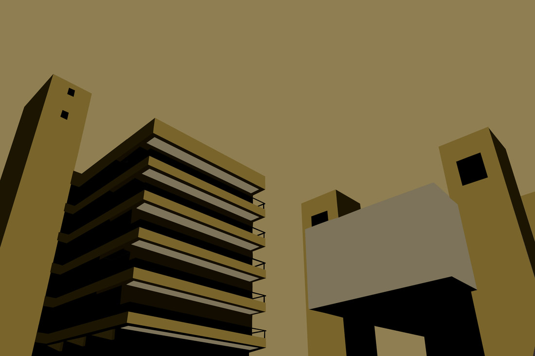
The final image is my favourite image of my final piece. I felt it best captured the essence of brutalist structures. The use of shadow was used effectively to present a three dimensional subject. I use line efficiently to further express the wide shot/worm's eye perspective. I used slightly different shades of the same colour for the building in order to illustrate the direction of light which would have been present in the original image. At first, I was only going to convert the left half of the frame from the original. In retrospect, I am glad I completed both structures in the composition. Due to the intense angles of the buildings, it creates the effect as if they are are caving in on the viewer. Throughout this topic, I felt I have successfully demonstrated the process of portraying brutalist structures in a new light.
